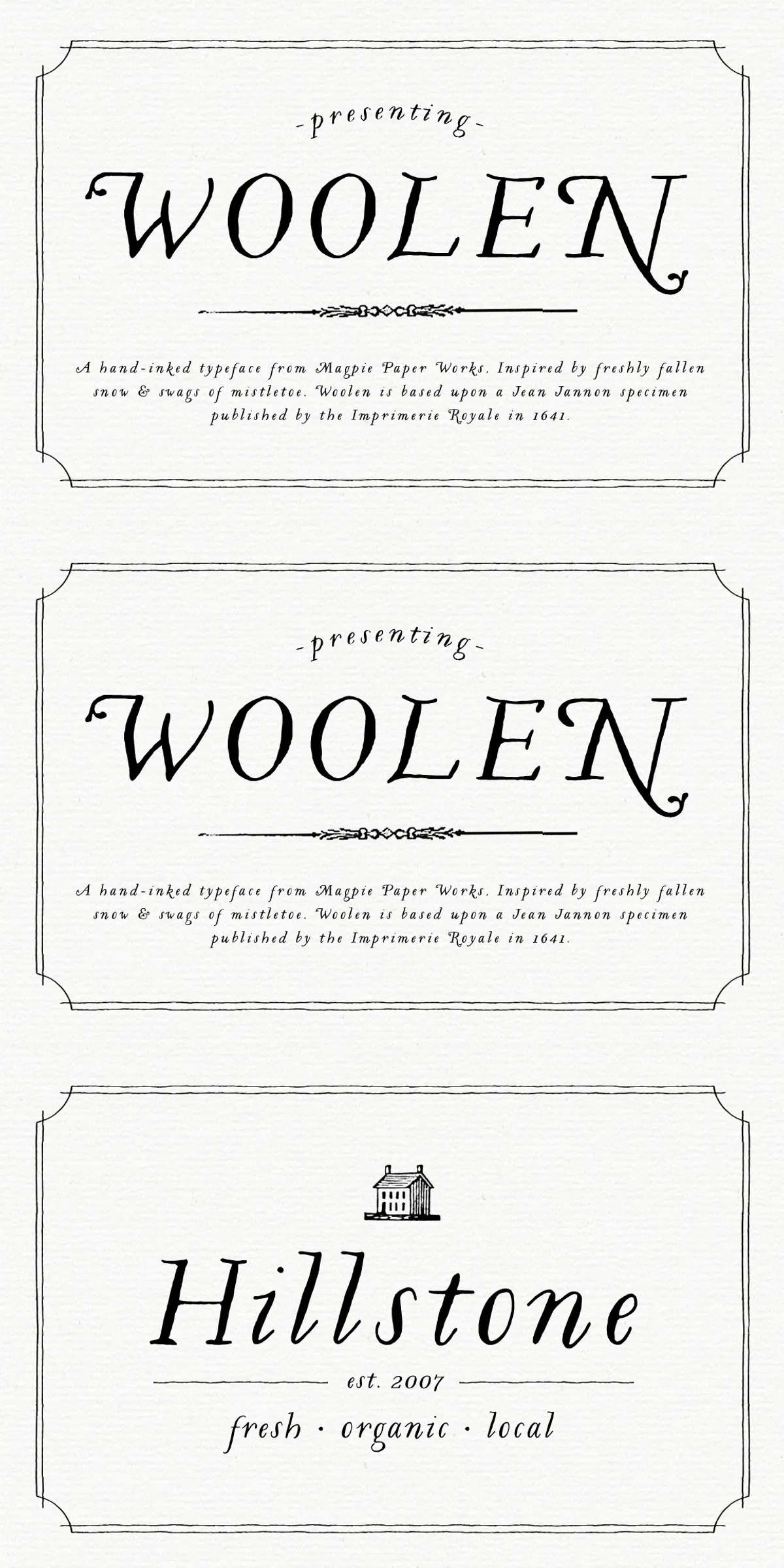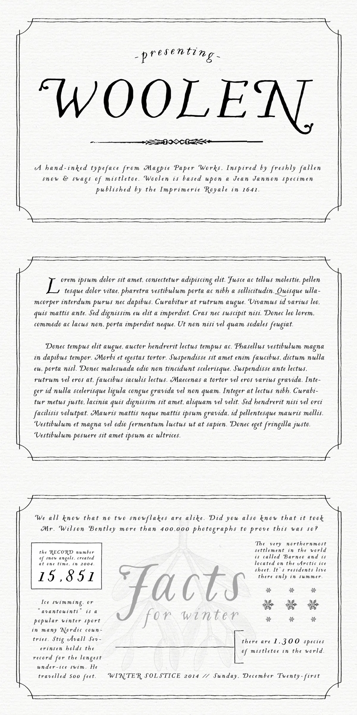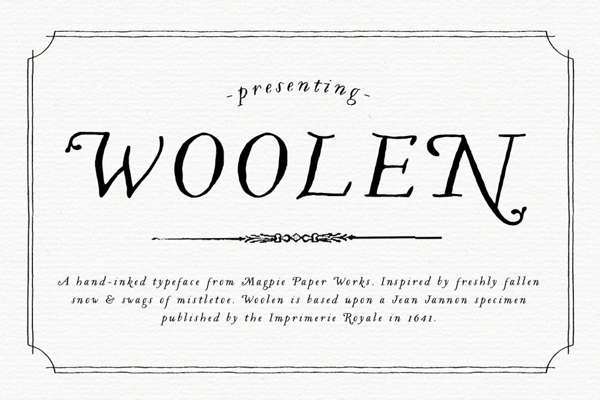
Woolen draws clear inspiration from a 1641 type specimen by Jean Jannon published by the Imprimerie Royale. The design translates that classical pedigree into a contemporary, usable italic serif with a soft, organic voice. Many capital letters are adorned with delicate sprigs that suggest mistletoe or spring leaves, giving Woolen a handcrafted, botanical character without overwhelming legibility. The result reads as warm and historical while remaining practical for modern design tasks.
Technical Details And Character Set You Should Know
Woolen presents an italic posture derived from historical models but refined for today’s workflows. The slanted letterforms retain clear counters and consistent stroke contrast so they perform well at display sizes and in extended text. Several capitals include optional decorative swags and small botanical ornaments; these details function as contextual alternates that add subtle personality when used selectively. Because the typeface emphasizes readability, it remains comfortable as body text while offering stronger presence in headlines and logos.
Ideal Applications For Woolen Typeface In Branding And Editorial
Woolen excels in identity systems for retail, hospitality, and artisanal businesses — think farm shops, cafés, boutique restaurants, and lifestyle brands that benefit from a warm, cultivated aesthetic. Use Woolen for wordmarks and logotypes where the botanical capitals can become a distinctive brand signature. Its graceful italic rhythm also enhances editorial spreads, packaging, and stationery, where the slightly slanted forms convey motion and personality. Designers will find Woolen especially effective when they want a serif voice that feels handcrafted rather than decorative for its own sake.
Practical Usage Tips To Maximize Woolen’s Impact
- Reserve decorative capitals for prominent marks, opening lines, or display headlines to preserve readability in longer text.
- Use the regular italic letterforms for body copy in carefully chosen sizes; the font’s balanced contrast supports sustained reading when set at appropriate sizes and leading.
- Combine Woolen with a neutral sans-serif for body or secondary text to create clear typographic hierarchy and modern contrast.
- Test the botanical details at production scale for print and embroidery to ensure the fine sprigs reproduce cleanly across materials.
Pairing, Color, And Layout Recommendations For Designers
Pair Woolen with geometric or humanist sans-serifs when you want a clean supporting voice that highlights Woolen’s historical warmth. For packaging or signage, place Woolen on neutral or softly textured backgrounds to let its subtle ornaments read clearly. Use restrained color palettes and generous spacing to emphasize the typeface’s elegant shapes; avoid overly busy backgrounds that compete with the small botanical details. When crafting a logo, experiment with capital alternates to create a custom mark that remains consistent across brand touchpoints.
Licensing, File Formats, And Support Guidance
Before deploying Woolen across commercial projects, review the delivered license to confirm permitted uses for web, print, and product packaging. Check file formats included with your purchase and confirm that your design software accesses any alternates or stylistic sets provided. If the font package includes a glyph map or specimen PDF, consult it to review all decorative capitals and alternates. If you discover spacing or rendering issues in specific workflows, contact the vendor or designer so they can advise on fixes or updates.
Why Choose Woolen For Your Next Project
Woolen offers a rare combination: historical authenticity with organic ornamentation, and the practical clarity required for contemporary design. It invites designers to create brand voices that feel cultivated, welcoming, and slightly whimsical without sacrificing professionalism. Whether you set menus, design packaging, or craft a new identity, Woolen provides a typographic solution that reads beautifully and differentiates your work through subtle, nature-inspired details.
Closing Suggestions And Next Steps For Implementation
Start by testing Woolen in real contexts: mock up a logo, a label, and a short editorial spread to evaluate how the botanical capitals perform at different scales. Pair it with a clean sans-serif for body or secondary elements, and proof final art in both RGB and CMYK to confirm how stroke weight and ornament detail reproduce. If you need help with pairing or technical setup, reach out to the type designer or vendor for recommended workflows. Set your next project in Woolen and let its historic warmth and organic charm enhance your visual story.