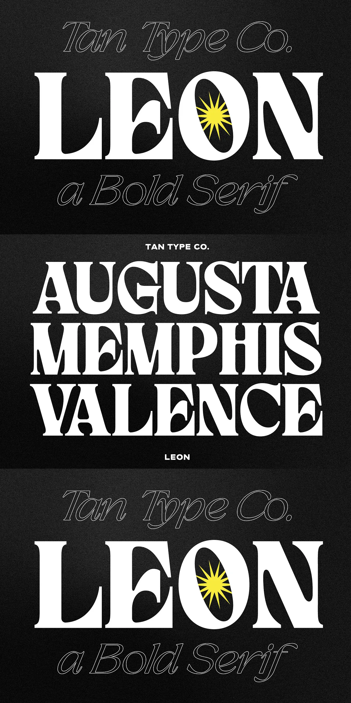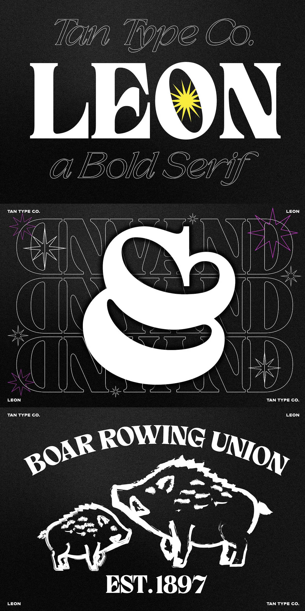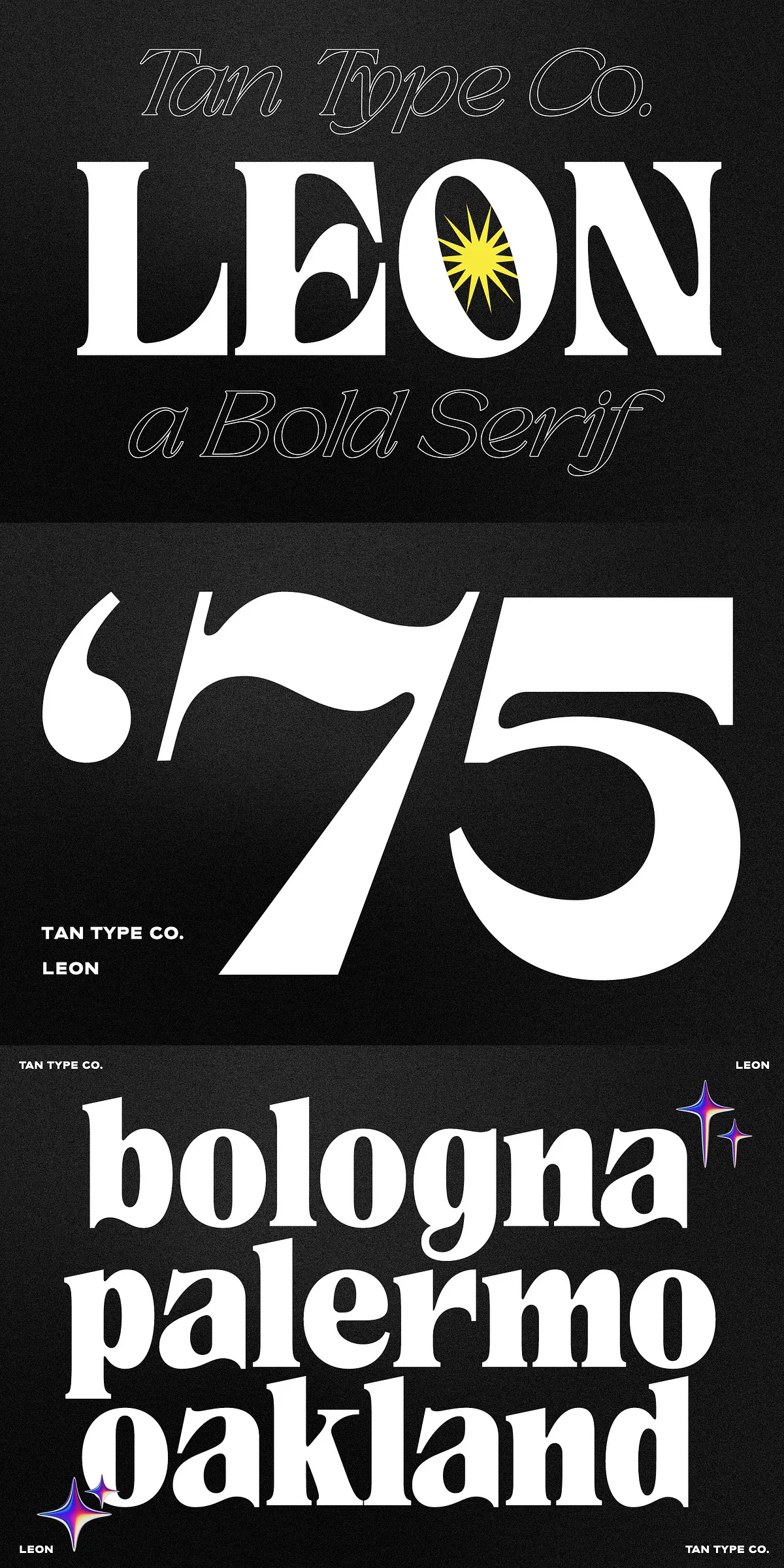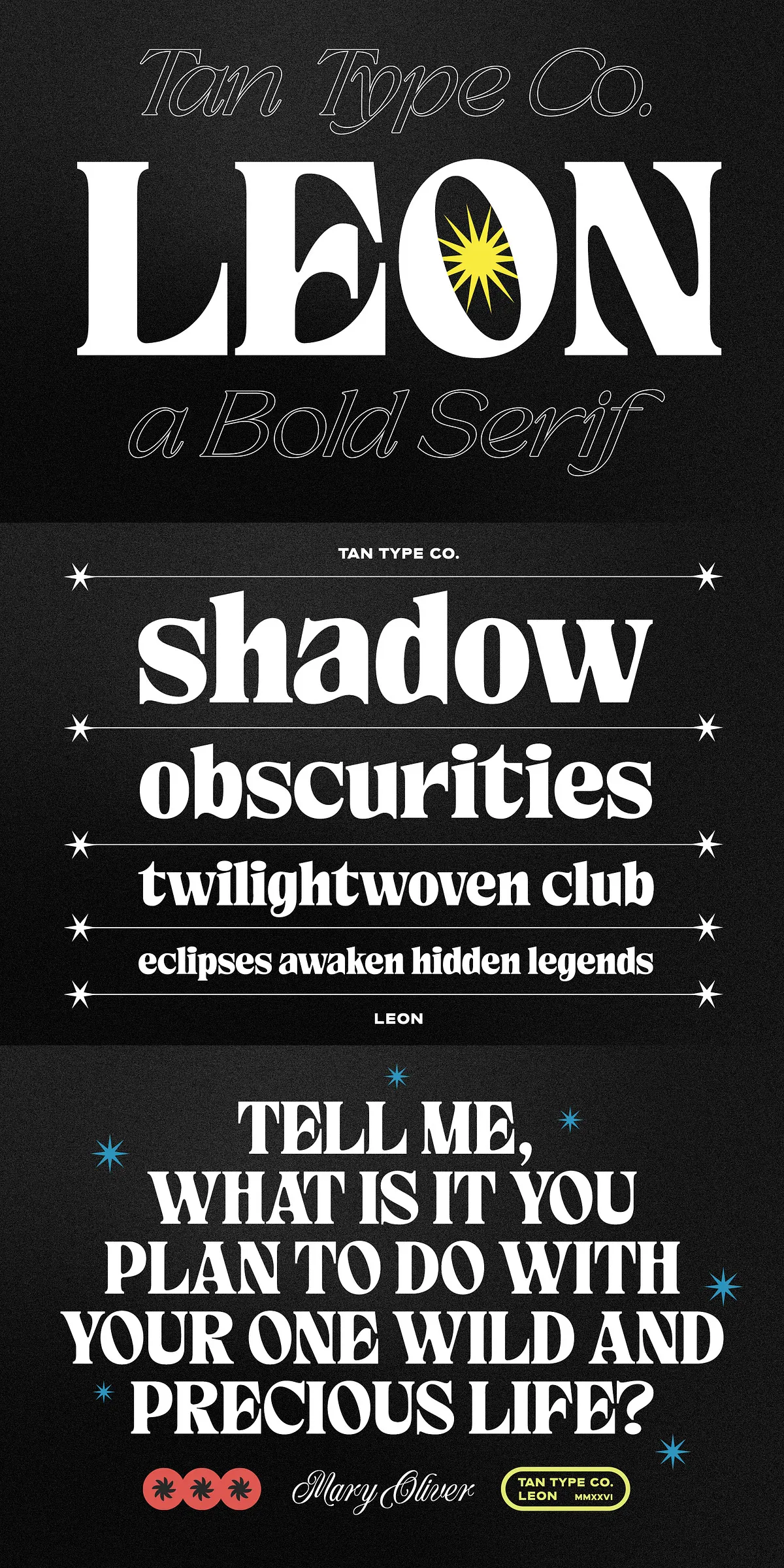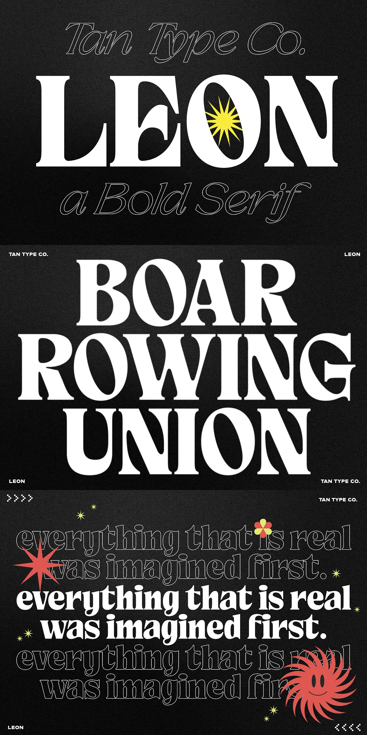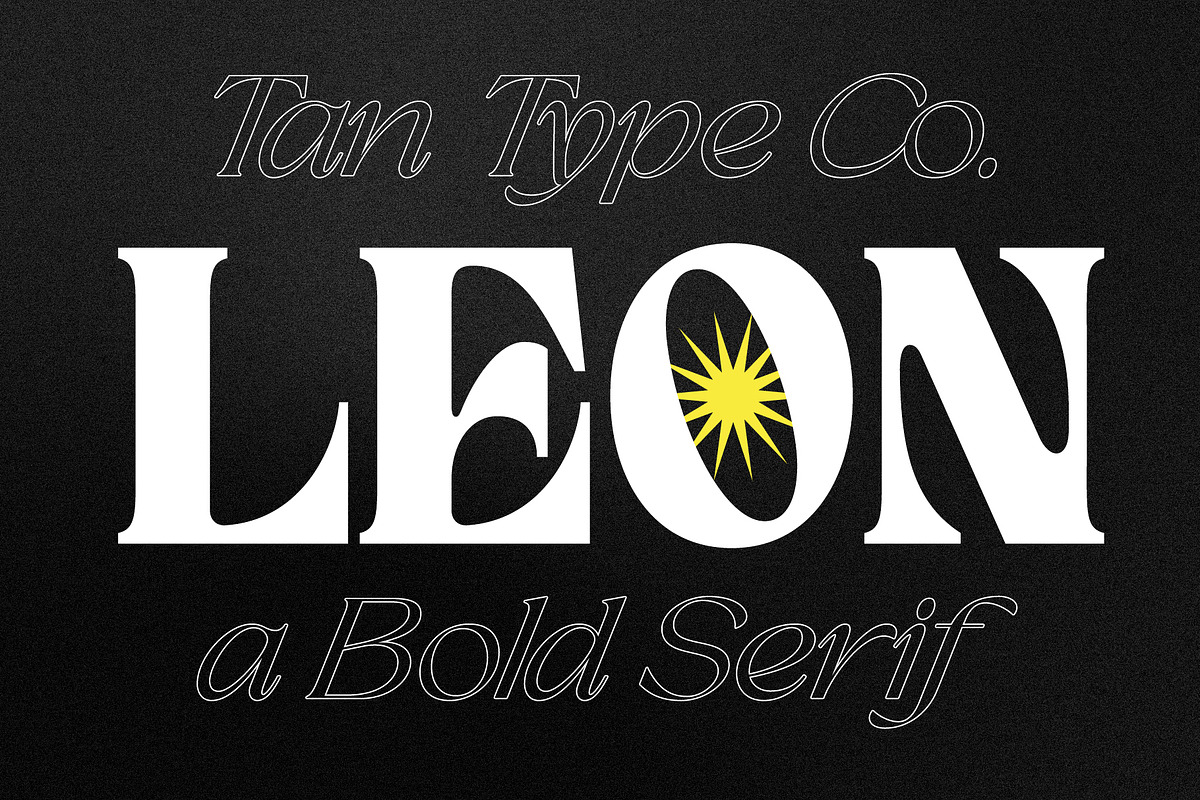

TAN-LEON is a bold serif designed to make a statement. It combines strong silhouettes with sharp wedge serifs and measured soft curves to create a voice that reads both assertive and refined. The design prioritizes clear shapes and purposeful contrast so that the typeface performs at large display sizes while remaining balanced in editorial contexts. TAN-LEON feels contemporary without abandoning classical serif proportions; it intentionally preserves readability while amplifying character and presence in every application.
Distinctive Letterforms And Structural Details That Attract Attention
The letterforms of TAN-LEON emphasize vertical posture and crisp terminals. Sharp wedge serifs add momentum to strokes and create striking negative space; soft internal curves temper that energy to avoid harshness. These combined features produce letters that command attention on posters, headlines, and logos. The typeface deliberately avoids excessive ornamentation so that its core geometry reads clearly at a distance, and its refined endings support close reading when used at medium sizes.
Versatile Applications And Practical Uses Across Projects and Media
TAN-LEON works across a wide range of projects. Use it for luxury logos, editorial headlines, premium packaging, posters, and clear brand statements. The typeface excels when you need bold hierarchy: headlines cut through complex visuals, mastheads define identity, and packaging copy commands shelf presence. Pair TAN-LEON with warm scripts for an artisanal look or with clean sans serifs for a modern luxury mix. Its adaptability makes it an efficient choice for identity systems that require a consistent voice across print, web, and social media.
Examples Of Effective Pairings And Implementation Strategies
- Combine TAN-LEON with a neutral geometric sans for minimal luxury identities.
- Pair TAN-LEON with an elegant script to create contrast between authority and warmth.
- Use TAN-LEON Contrast styles for mastheads and display sized headlines.
- Reserve lighter weights or tighter tracking for subheads and short captions.
Font Features, Technical Support, And Production Guidance For Designers
TAN-LEON ships with features designed for professional workflows. The family includes full uppercase and lowercase sets, numerals, punctuation, and currency glyphs. It supports multilingual Latin scripts and includes OpenType features such as standard ligatures, discretionary alternates, and carefully tuned kerning pairs. Files arrive in common desktop and web formats so you can deploy confidently across platforms.
Compatibility Notes And Recommendations For Best Results
Our fonts are compatible with most professional design applications. To use ligatures and alternate characters, enable OpenType features within your application. Please note that while TAN-LEON can be uploaded to platforms like Canva, Canva offers limited support for advanced OpenType features—some ligatures, alternates, and special glyphs may not be accessible there. For full functionality, use design apps that expose OpenType controls.
Licensing, Updates, And Customer Support Information You Should Know
The TAN-LEON package includes free future updates and clear licensing options appropriate for brand identity, editorial, and commercial packaging use. Review the license included with your purchase to confirm embedding and redistribution terms. If you need help installing files, accessing alternates, or confirming licensing choices, contact our support team at support@yourdomain.com (replace with your official support email) or through the platform where you purchased the font.