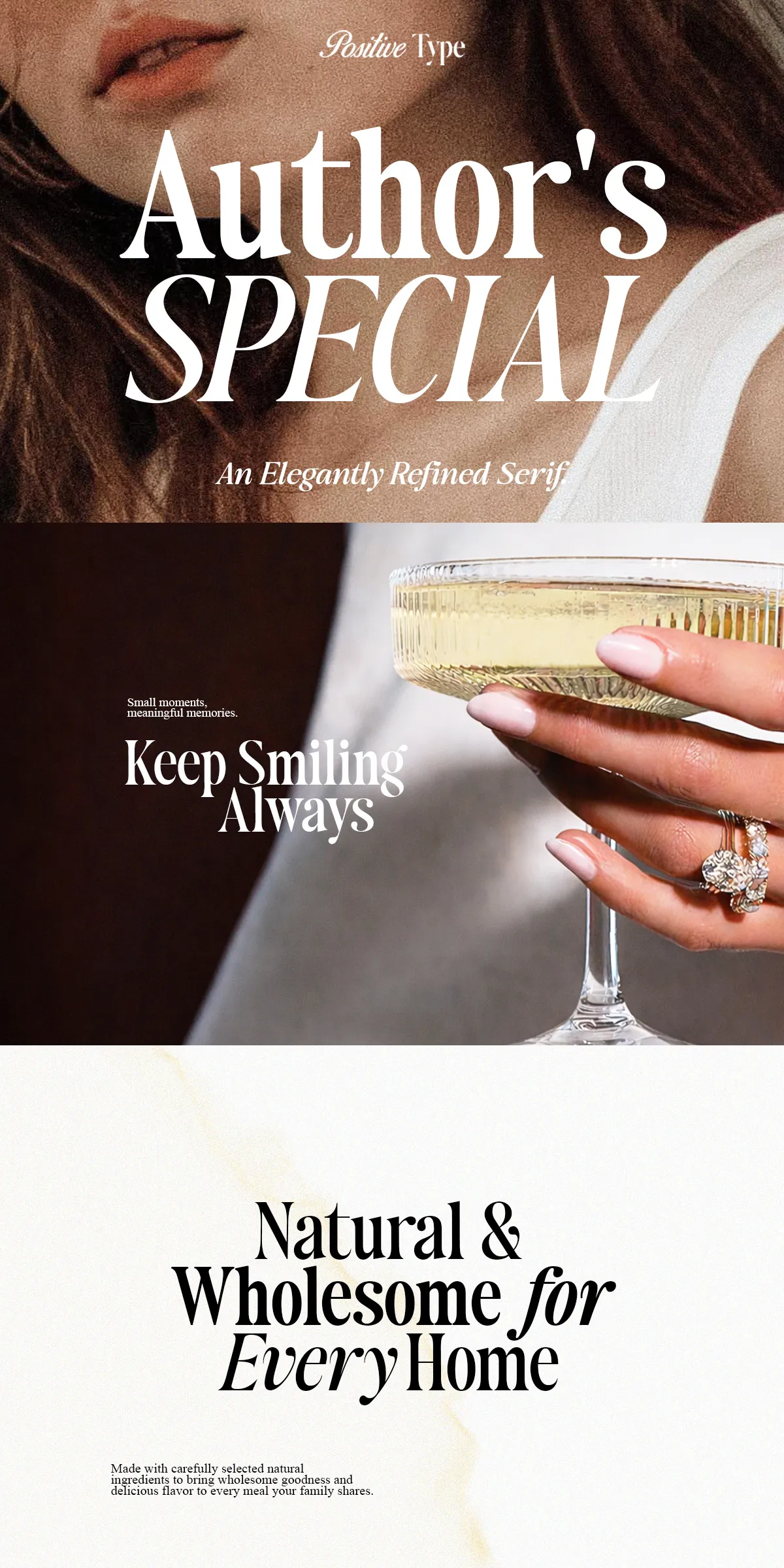
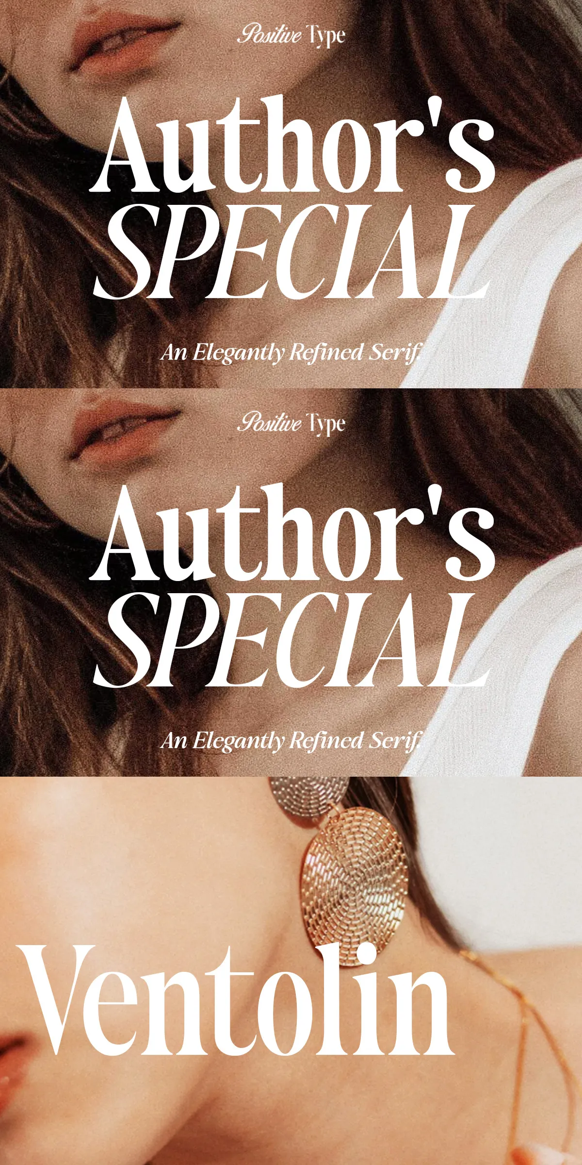
Author’s Special delivers a purposeful balance of refinement and functionality. Designed with graceful curves and high-contrast letterforms, this serif family actively elevates the tone of any project. The typeface reads with clarity across sizes: the Regular style supports comfortable long-form copy while the Contrast styles assert presence in display settings. Every weight and style performs with editorial calm and branded confidence, making Author’s Special an immediate choice for designers who demand both poise and performance.
Design Details That Matter
The letterforms exhibit carefully tuned proportions and elegant terminals that create a timeless silhouette. High-contrast strokes sharpen headlines and lend sophistication to logos. The italic and Contrast Italic introduce controlled motion and expressive emphasis without sacrificing legibility, allowing designers to shape nuanced typographic hierarchies that communicate with precision.
Rich Feature Set Built For Professional Workflows
Author’s Special ships with a complete set of practical features that integrate smoothly into modern design workflows. Use the family across print and digital platforms with confidence—each file includes OpenType features, PUA-encoded glyphs, and multipurpose alternates that enable creative typographic treatments.
Included Font Features
- Uppercase and lowercase character sets with robust kerning
- Numbers, punctuation, and currency glyphs tuned for editorial layout
- Multilingual support for Latin-based languages
- Standard ligatures plus discretionary ligatures for refined typesetting
- Stylistic alternates to refine logo and headline treatments
- PUA encoding that allows easy access to alternates in popular apps
- Delivered as desktop and web-ready font files
Versatile Styles For Distinctive Applications
Author’s Special includes four complementary styles that let you craft cohesive identities and layered editorial systems. Each style asserts its role while contributing to unified typographic language across brand touchpoints.
How to Use Each Style
- Regular: Use for refined body copy, program notes, catalogs, and extended editorial text where readability and grace matter.
- Italic: Use to add subtle emphasis, captions, and narrative accents that require a human, literary tone.
- Contrast: Deploy for dramatic headlines, mastheads, and wordmarks that must command attention.
- Contrast Italic: Use in feature spreads, editorial pull-quotes, and expressive subheads to create sophisticated contrast.
Recommended Pairings and Practical Applications
Pair Author’s Special with neutral sans-serifs for modern editorial systems or with minimal geometric sans for contemporary luxury branding. Its high contrast and elegant terminals complement photography-driven layouts, premium packaging, and wedding stationery where refined tone and legibility must coexist.
Perfect Projects for Author’s Special
- Luxury branding and identity systems
- Fashion magazines and editorial spreads
- Wedding invitations and event stationery
- Book covers and chapter headings
- Cosmetic and beauty packaging
- Restaurant and café branding
- Certificates, premium marketing collateral, and website hero headlines
Usage Guidance, Licensing, And Support
Author’s Special is designed with precision and attention to detail. For best results in print, choose papers and inks that preserve fine contrast and crisp terminals. On the web, implement font fallbacks and test across breakpoints to maintain visual hierarchy. The package includes desktop and web files as well as instructions for accessing PUA-coded alternates. Confirm license terms for commercial use and embedding in digital products.