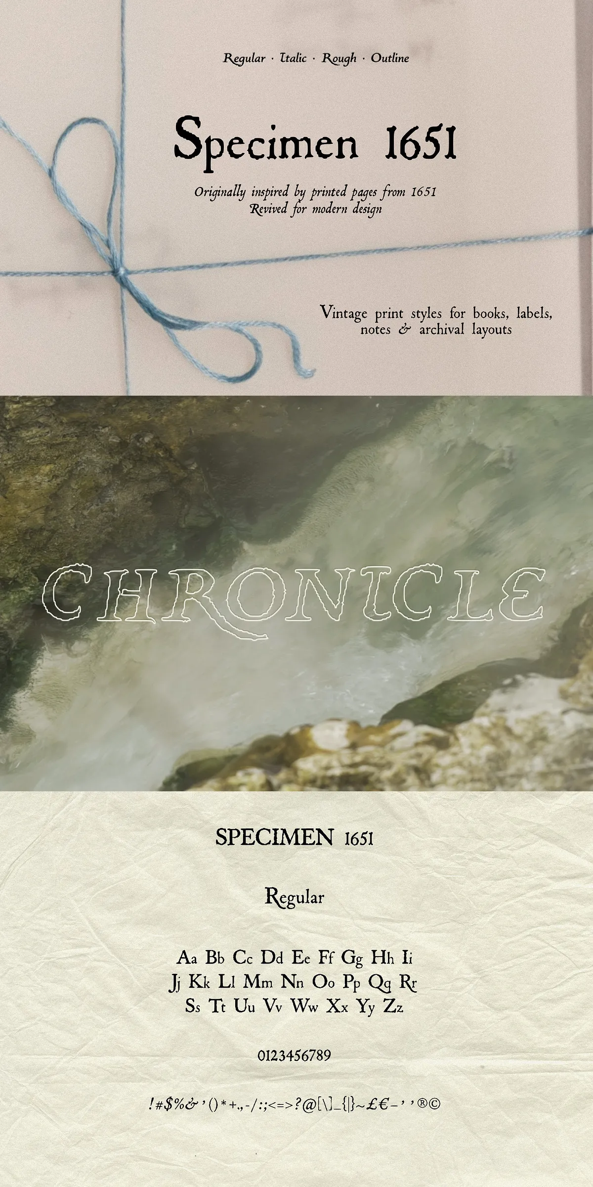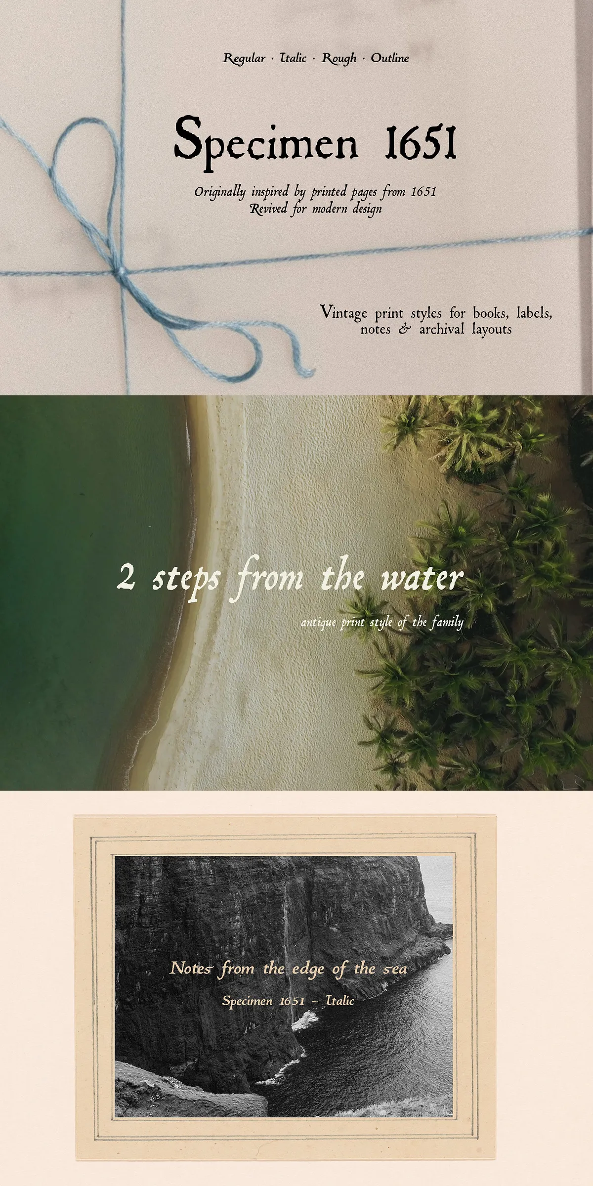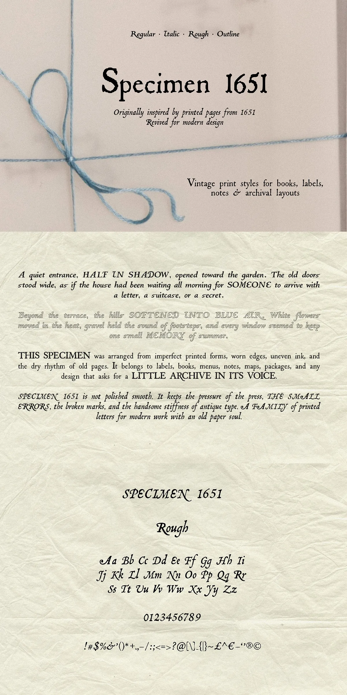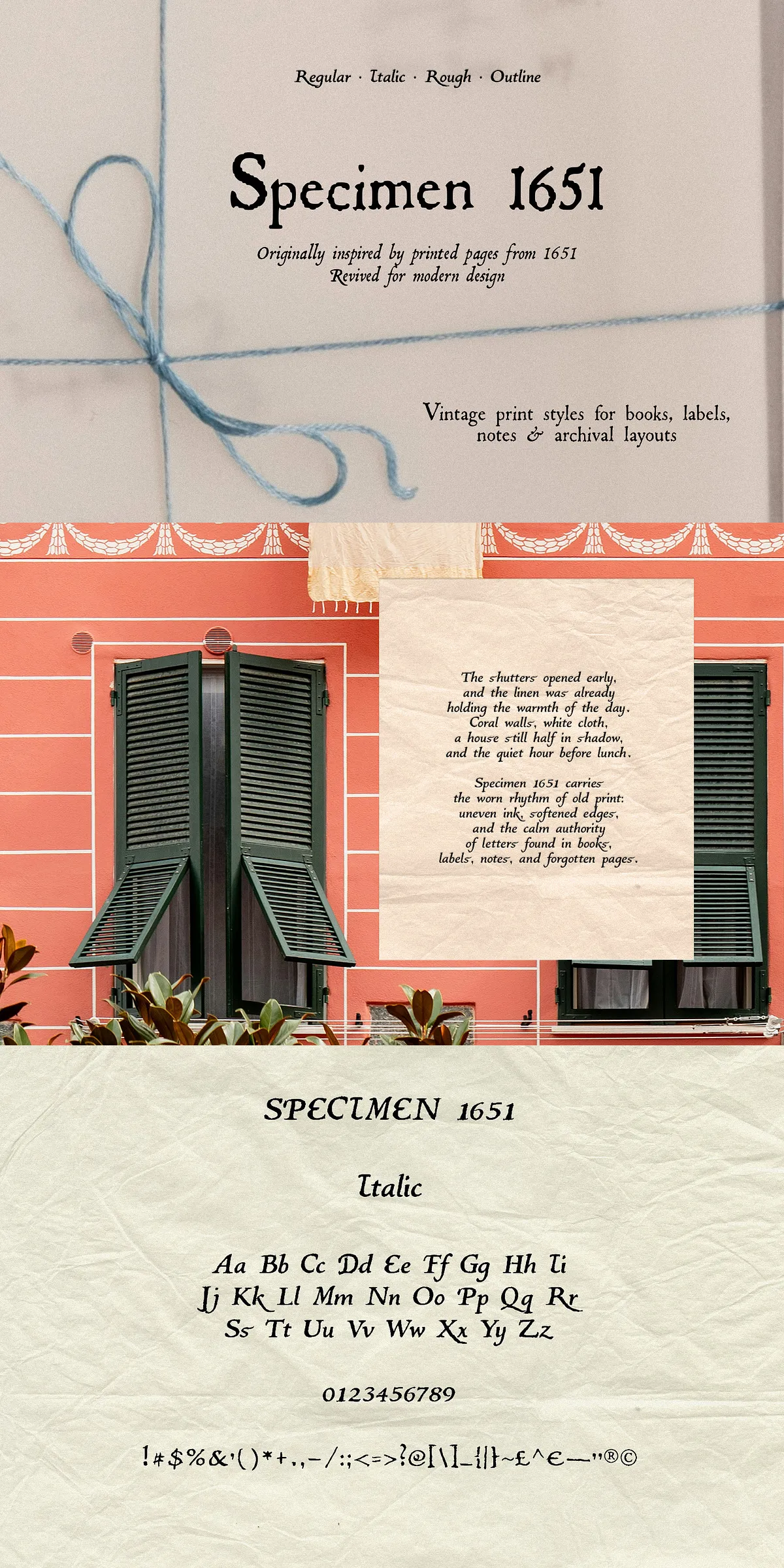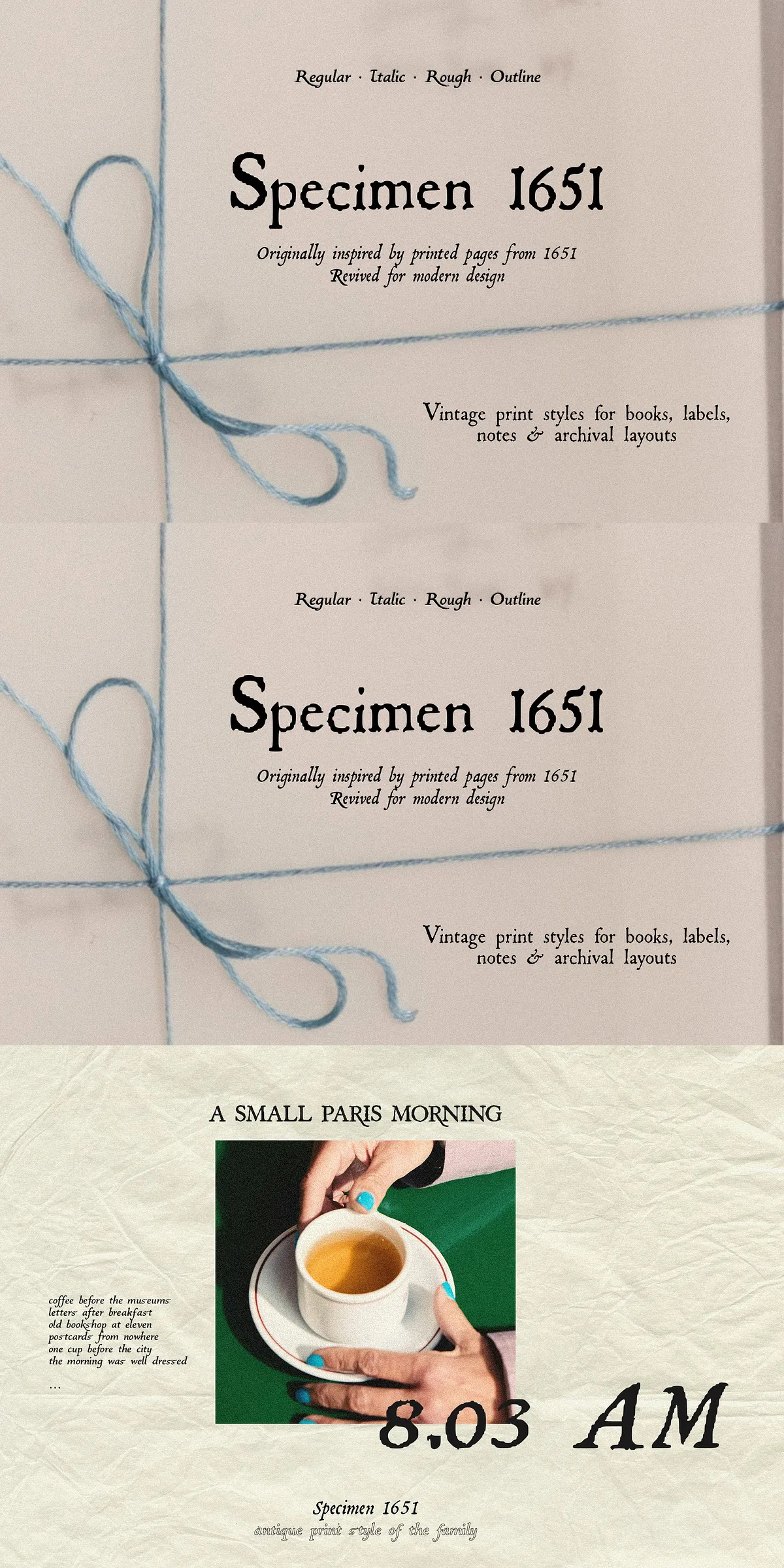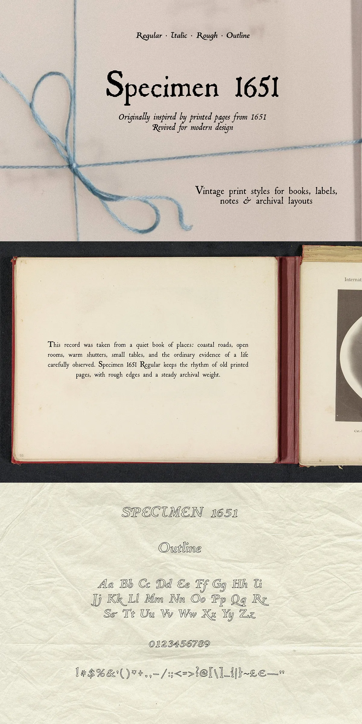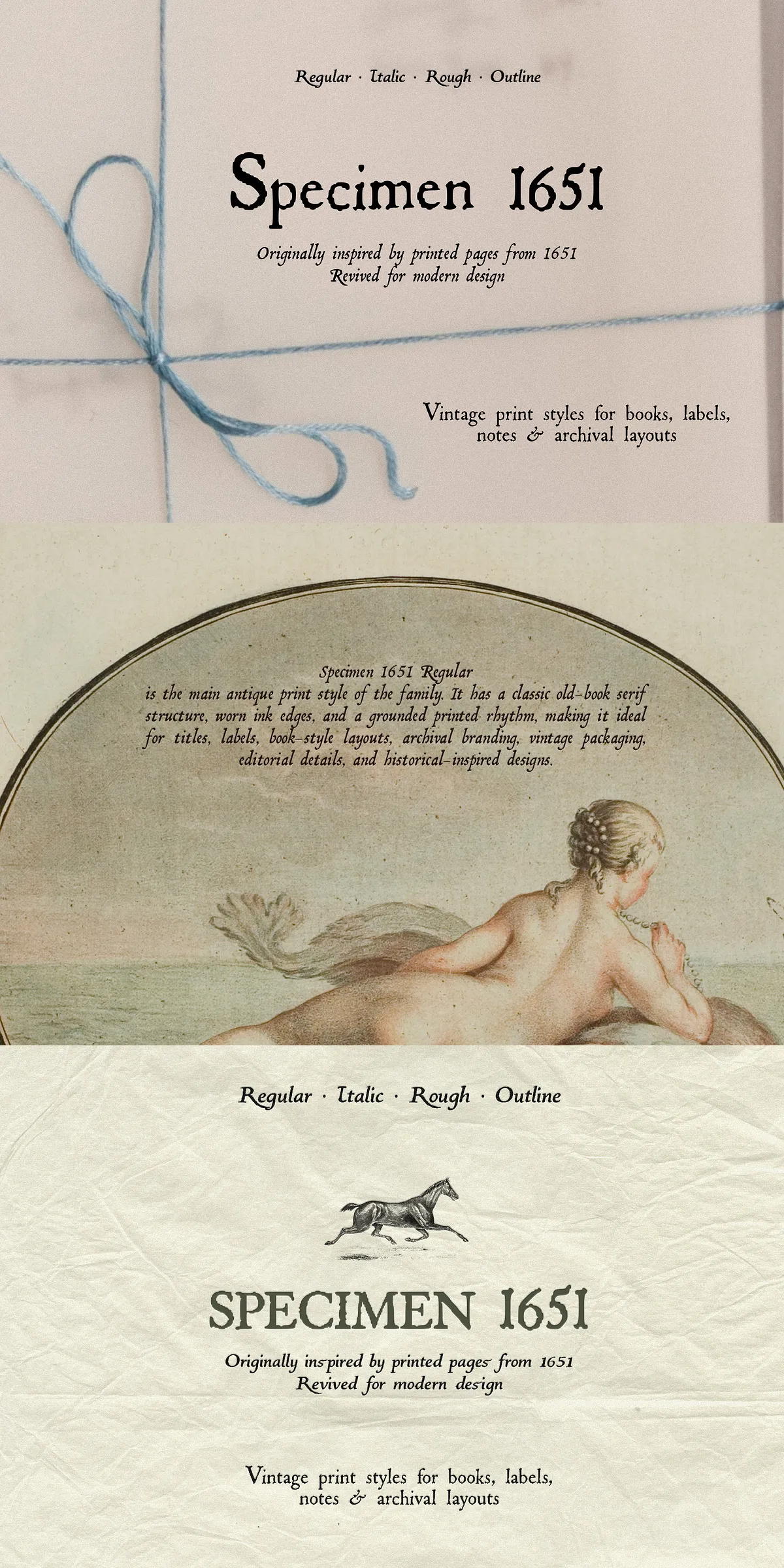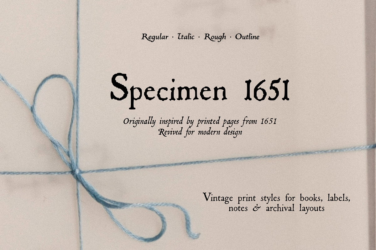

Specimen 1651 revives the tactile warmth of old press pages and channels it into a practical, production-ready font family. Designed to retain the pressure marks, ink breaks, and softened counters of archival typesetting, this family speaks with historical authority while integrating cleanly into modern workflows. Each style emphasizes a different facet of traditional printing: Regular anchors designs with a printed serif voice, Italic introduces a flowing literary cadence, Rough presents concentrated distress and texture, and Outline provides a decorative, layered display option. Use Specimen 1651 when you want typography that feels salvaged from an archive but tuned for contemporary design.
Design Inspiration And Historical Character Details Behind The Typeface
Specimen 1651 draws visual language from antique book pages, letterpress artifacts, and hand-set printing. The family intentionally preserves irregularities: uneven stroke weight, softened terminals, minute breaks where ink failed to fully transfer, and the granular texture that emerges from decades of handling. These characteristics do more than look old; they transmit mood and narrative. Designers can exploit the font’s archival imperfections to evoke authenticity, craft a period atmosphere, or create layered typography that reads as both historical and purposeful.
Individual Styles And Their Distinctive Uses Within The Family
Regular functions as the primary printed serif. It reads confidently in titles, labels, and book-inspired layouts where a grounded serif voice is required. Italic tilts into a literary rhythm; apply it for captions, pull quotes, epigraphs, and secondary passages that benefit from a softer, more narrative tone. Rough intensifies the press texture: use it for darker display headlines, gritty packaging, or project elements that demand historical grit. Outline offers a lighter, ornamental option for specimen layouts, layered headings, and decorative display where contrast and composition play a central role.
Practical Applications And Recommended Use Cases For Designers
Specimen 1651 performs strongly across editorial, packaging, and identity projects that call for period authenticity. Deploy it on book covers to anchor a narrative, on packaging to suggest heritage and craftsmanship, and on menus or stationery to add curated detail. For posters and album covers, combine Rough with bold imagery to deliver tactile presence. For refined editorial spreads, pair Regular with a neutral sans to balance texture and legibility. Outline excels when layered over photographic or textured backgrounds to create depth without overwhelming copy.
Pairing Strategies And Visual Implementation Recommendations For Best Results
- Pair Regular with a clean sans-serif to preserve legibility and emphasize the archival texture.
- Use Italic for emphasis in longer reads and to create typographic hierarchy within text blocks.
- Reserve Rough for headline use at display sizes where the distress reads clearly and purposefully.
- Layer Outline with a filled style (Regular or Rough) to create stamped or embossed effects.
- Adjust letterspacing and leading to compensate for irregular textures when setting extended copy.
Installation Licensing Files And Delivery Details Included With Purchase
The Specimen 1651 package contains essential desktop-ready fonts and a preview specimen to accelerate production. Install OTF files into your operating system or import them into design software. Review the included license to confirm permitted uses and contact the vendor if you require extended or commercial embedding rights. The family provides robust display coverage suitable for Latin-based projects and is optimized to preserve the subtleties of ink and texture across print and digital outputs.
What You Will Receive Inside The Download Package Provided
- Specimen 1651 Regular OTF — core printed serif style for titles and labels.
- Specimen 1651 Italic OTF — literary slanted style for captions and quotes.
- Specimen 1651 Rough OTF — distressed press texture for bold display use.
- Specimen 1651 Outline OTF — decorative outline for layered display compositions.
Final Creative Considerations And Encouragement For Exploration
Choose Specimen 1651 when you want typography to communicate craft, history, and character. The family encourages experimentation: layer styles for depth, combine textures with duotones or paper grain, and treat letterforms as visual artifacts that contribute narrative weight. Whether you design museum-inspired identities, period editorials, or boutique packaging, Specimen 1651 supplies a measured, archival voice that designers can deploy confidently to evoke authenticity and charm.