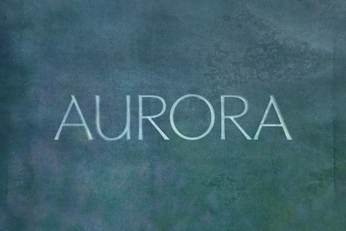

SUMMER SOLSTICE 2026. VERSION 3: JUNE 22, 2026. May Aurora reimagines letterforms chiseled in stone for contemporary design. I designed this family to pair the solidity of Roman carved letters with the movement and warmth of calligraphic italics. The result reads as both monumental and approachable—equally at home on fashion covers, editorial spreads, and architectural identities.
Distinctive Chiseled Romans Meet Calligraphic Italics In Harmony
May Aurora activates contrast: rigid, confident flared serifs anchor the design while custom italics introduce softness and human gesture. I intentionally raised the x-height to modernize the silhouette and improve legibility across scales. Where many Roman-style families omit italics or rely on simple obliques, this family includes purpose-built calligraphic italics that complement the base forms instead of merely slanting them. The italics breathe life into the typeface, allowing designers to move fluidly between authority and expression without changing tone.
Design Intent And Concept That Inspire Creative Use
I named the typeface after the Goddess of the Dawn and the atmospheric phenomenon where solar winds dance in the upper sky. That interplay—sun meeting atmosphere—guided the aesthetic: a meeting of two forces that creates color, motion, and visual drama. I explored photosynthesis and auroral movement while designing letterforms, which led me to emphasize interaction and intersection in the shapes. May Aurora’s letters perform like light on stone: clear, colorful in use, and emotionally resonant.
Technical Features That Support Contemporary Workflows
Functionality underpins the expressive design. The raised x-height maintains strong readability at small sizes, while the flared terminals preserve character in display settings. Kerned pairs and balanced proportions let you set confident headlines, while the italic complements enable refined subheads and expressive pull-quotes. Use the family confidently across print and digital platforms; it adapts to editorial column grids, packaging hierarchies, signage, and web typography with consistent impact.
Practical Applications And Recommended Pairings For Designers
- Fashion branding — set elevated, editorial wordmarks and campaign headlines that demand attention.
- Editorial design — craft covers, feature headlines, and pull-quotes that balance monumentality and movement.
- Architecture firms — present proposals and identities with a carved, architectural tone tempered by human italics.
- Product identity — use the regular for structured labels and the italic for descriptive subtext or taglines.
- Design-forward projects — apply the family anywhere the intersection of tradition and modernity matters.
How May Aurora Enhances Visual Language And Brand Voice
May Aurora actively strengthens brand voice by offering two complementary attitudes in one family: the regular style reads as confident and assured; the italics read as expressive and approachable. This duality makes it easier to build systems that communicate both credibility and creativity. When you need hierarchy, use the regular for primary headlines and the italic for emphasis or narrative details. When you need contrast, set the flared forms against a neutral geometric sans to let the serifs hold visual weight without competing for attention.
