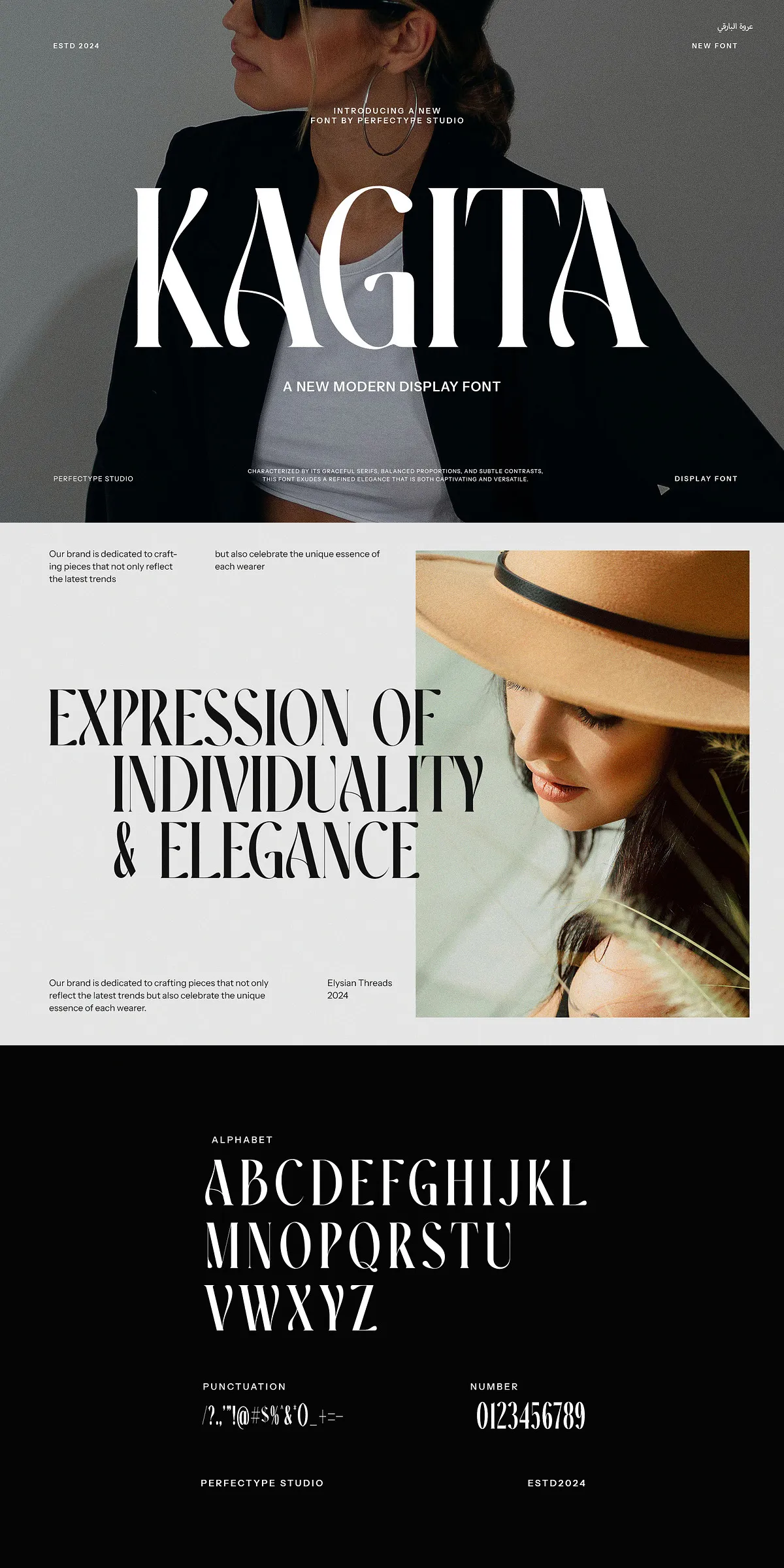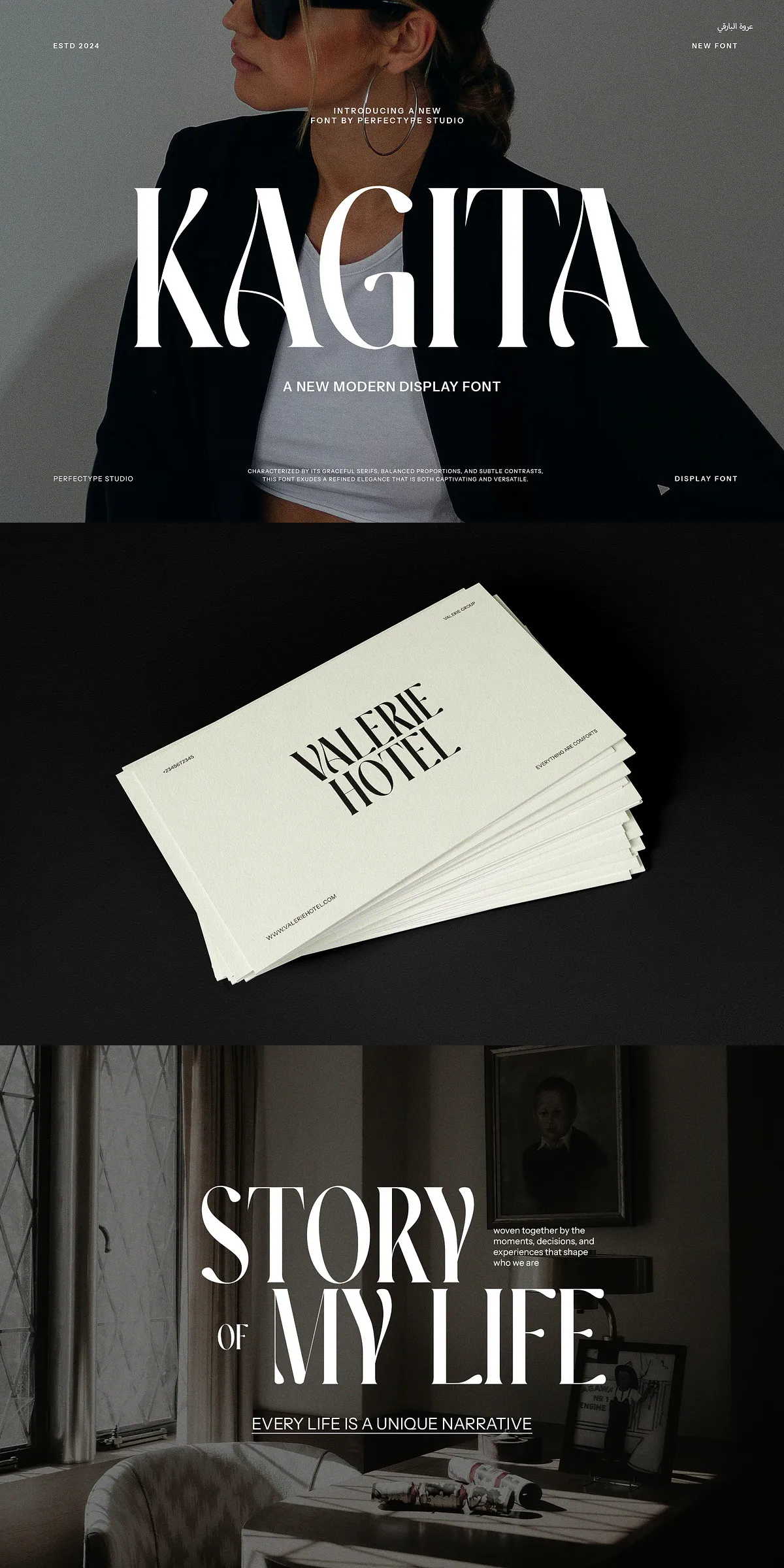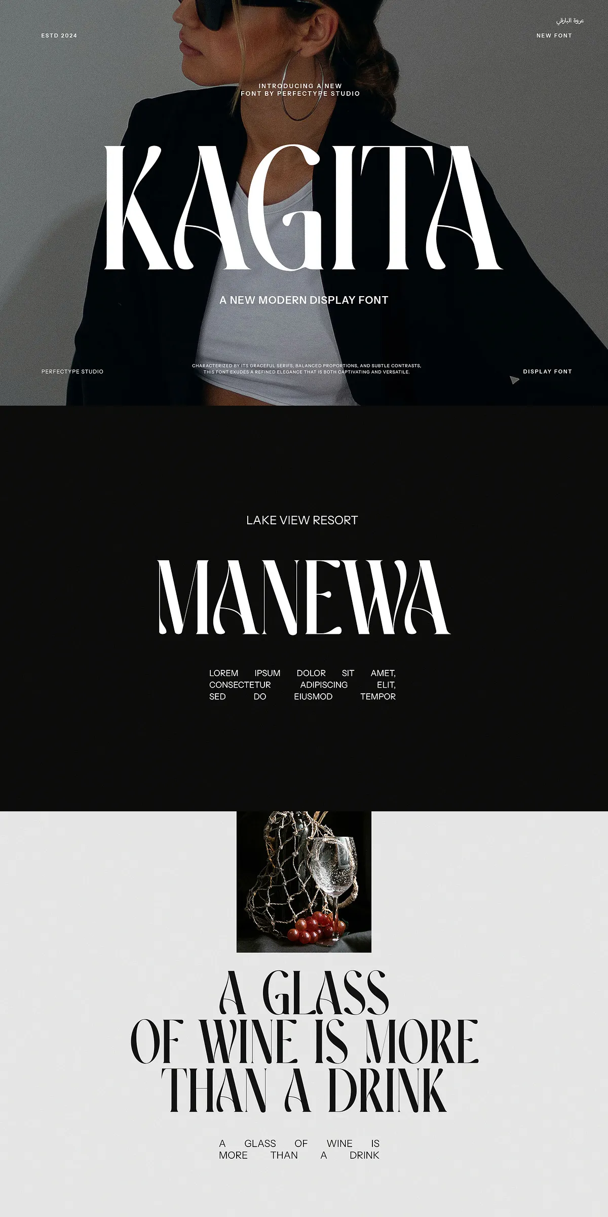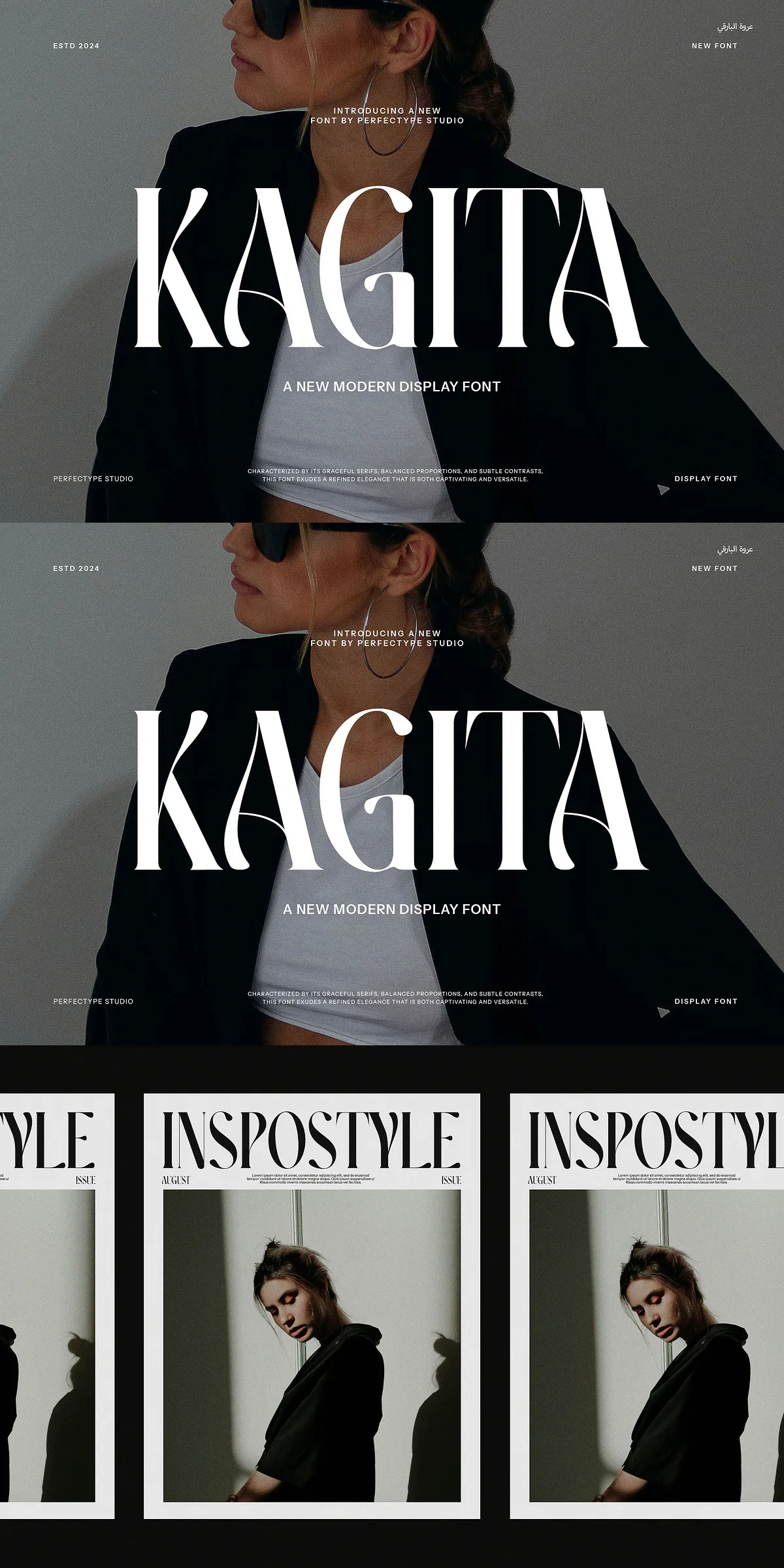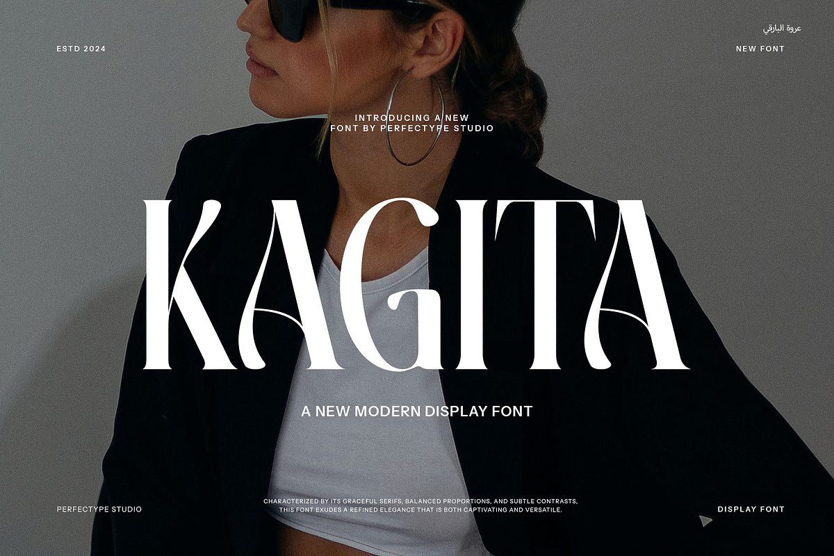
This serif font delivers a polished, high-end appearance designed specifically for branding and logo applications. It combines classical serif proportions with contemporary details so your wordmarks and logotypes command attention without appearing dated. The letterforms present confident vertical stress, graceful terminals, and balanced contrast that read clearly at display sizes and translate beautifully into print, digital, and on-product environments. Use this typeface to give brands an instant sense of heritage, quality, and sophistication.
Extensive Ligatures And Alternate Characters For Creative Control
Built with an extensive set of ligatures and alternate glyphs, the typeface gives designers precise control over typographic tone. Elegant swashes, contextual alternates, and discretionary ligatures allow you to tune logos, headlines, and invitations to feel romantic, minimal, or boldly traditional. These alternates let you craft subtle flourishes on select letter combinations or create dramatic headline treatments without manual vector edits. The result: polished, production-ready typography that still feels handcrafted.
How To Access Alternates And Ligatures In Design Software
OpenType features make alternates and ligatures straightforward to use in common tools. In Adobe Illustrator or InDesign, enable OpenType or Stylistic Sets from the Character panel or the Glyphs panel to reveal alternates and discretionary ligatures. In Photoshop, open the Glyphs panel and choose alternates from the menu. For apps that do not support OpenType features, access alternates through the provided alternate font files or use glyph substitution tools within your workflow. Clear documentation and a character map are included to speed access during production.
Versatile Applications Across Media And Product Types
This font serves multiple use cases: logo design, brand identities, product packaging, labels, editorial mastheads, wedding invitations, social media headers, and photography watermarks. Its strong presence works exceptionally well on premium packaging and stationery where tactile finishes like embossing, foil, and letterpress accentuate the letterforms. At smaller sizes, carefully chosen alternates and tracking adjustments preserve legibility, making the face suitable for both decorative and functional typographic roles.
Pairing Strategies For Balanced Visual Systems
Pair this serif with a neutral sans-serif to maintain readability in body copy while retaining an upscale headline voice. For lifestyle and luxury brands, combine it with a light geometric sans for minimal contrast or a humanist sans for warmer compositions. When pairing with other serifs, select a simpler companion with reduced contrast to avoid competing details. Use color, spacing, and weight contrast to maintain visual hierarchy and ensure the serif remains the focal point in brand lockups and packaging layouts.
Technical Notes, Formats, And Licensing Considerations
The font ships in standard OTF and TTF formats for broad compatibility across desktop and web environments. TrueType hinting and well-kerned tables provide reliable rendering across platforms. Confirm the licensing terms for your intended use—desktop, webfont embedding, app integration, or merchandise production may require specific license types. The package includes documentation, character maps, and recommended usage guidance so you can integrate the font quickly and confidently into client deliverables.
Production Tips For Print And Digital Output
For print production, test the font on target substrates and with intended production techniques (foil, embossing, spot UV) to adjust stroke weight and spacing as needed. In digital contexts, use webfont formats and preload strategies to ensure consistent rendering. When using alternates in UI or responsive layouts, provide fallback glyphs or CSS techniques to maintain graceful degradation on platforms that do not support OpenType features.