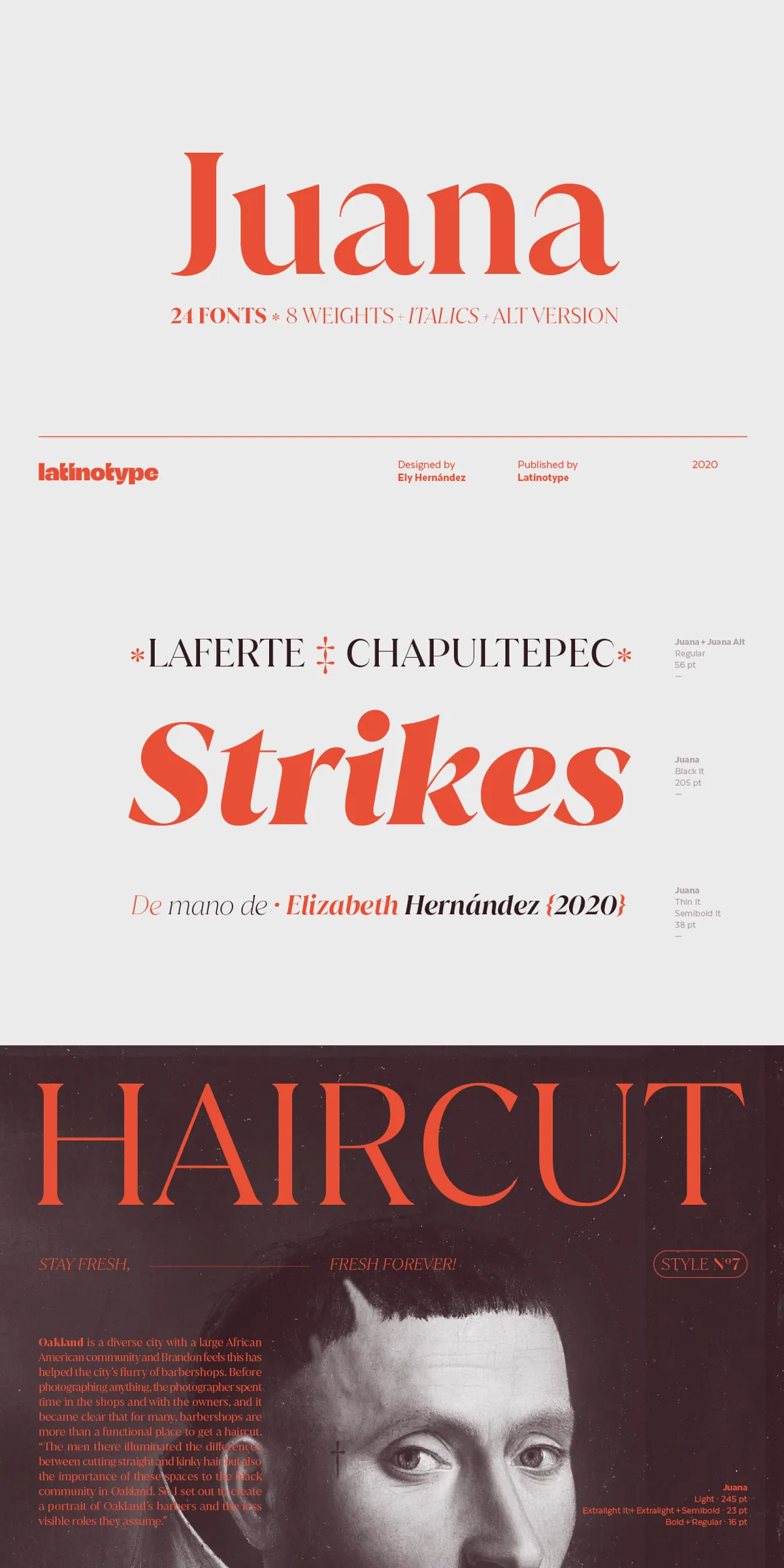
Juana emerges as a refined result of a creative journey toward self-discovery and continuous exploration in type design. Inspired by the Jazmín typeface, Juana elevates its predecessor’s essence by introducing a more developed and polished design that balances tradition with modern sophistication. This typeface stands out through its striking contrast between thick and thin strokes, creating a harmonious and stylish visual impact that commands attention.
Design Characteristics and Visual Appeal
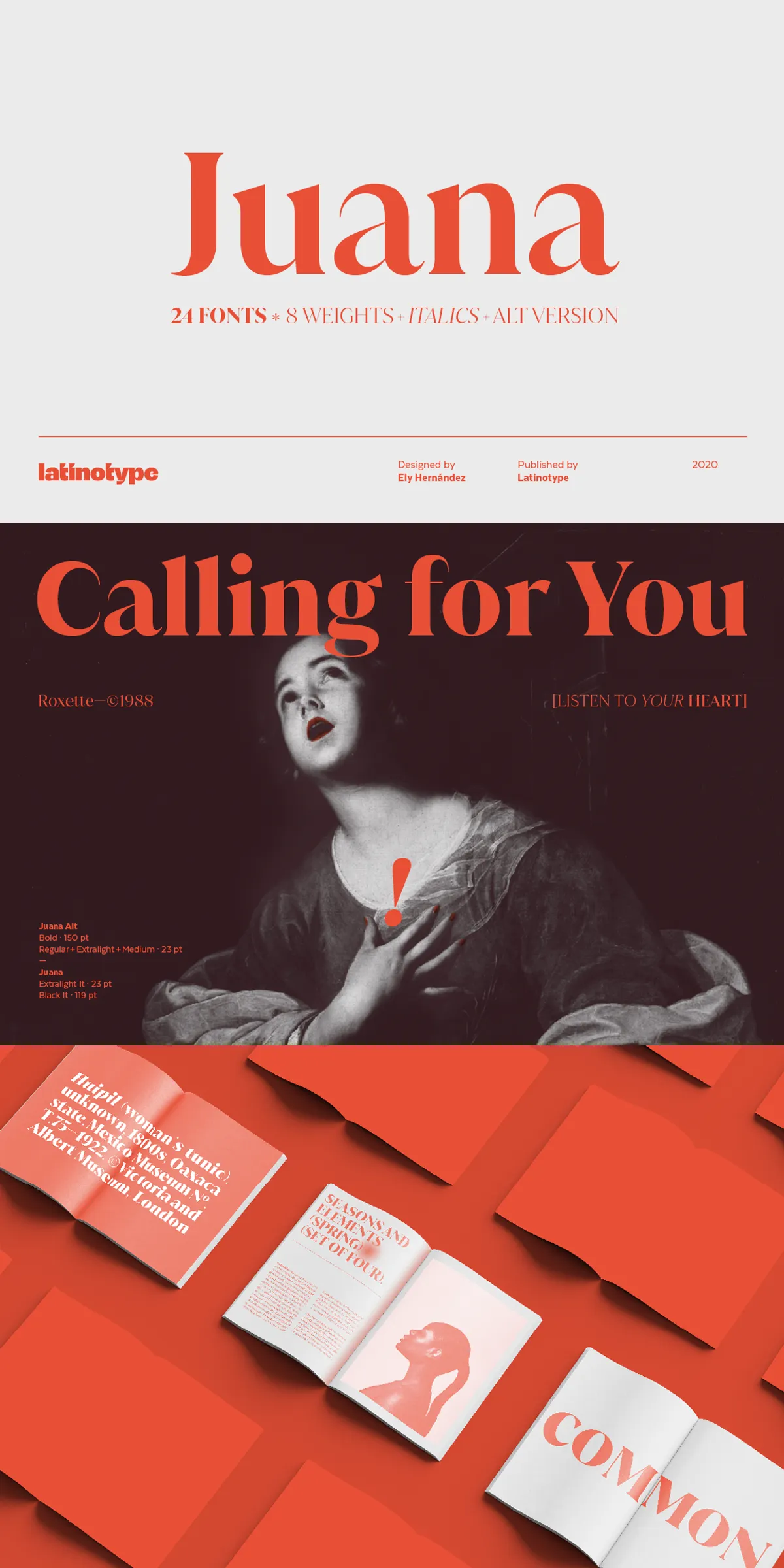
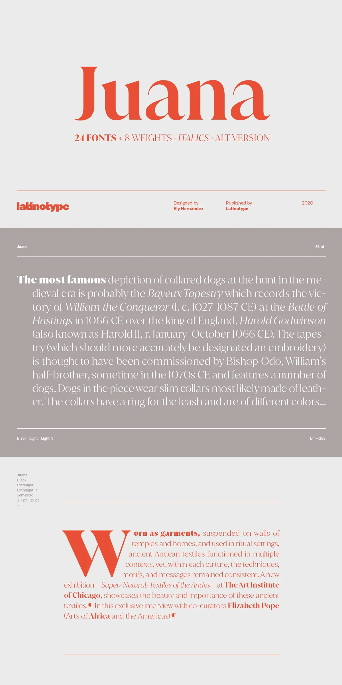
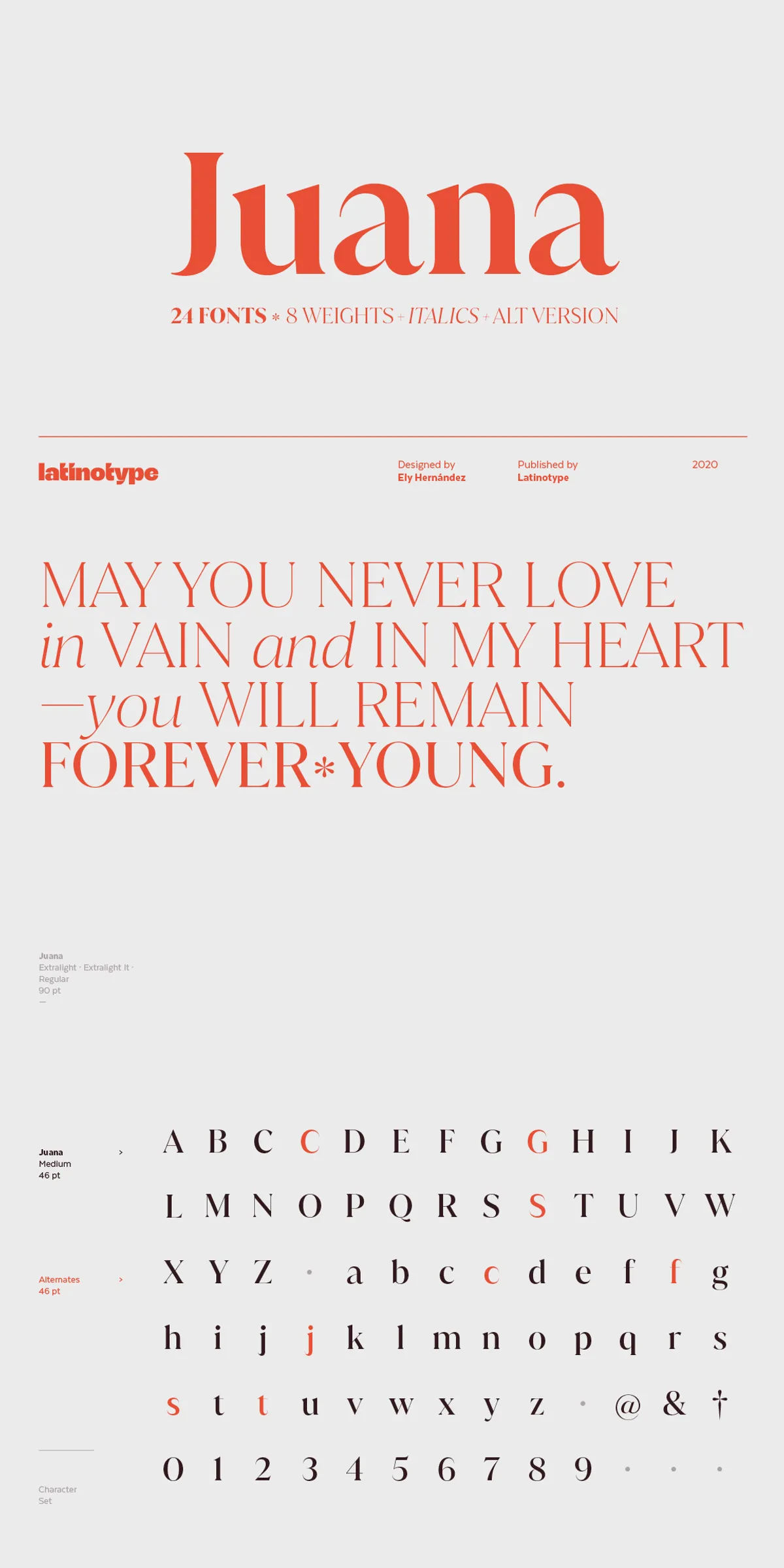
At the core of Juana’s design is the extreme contrast between its thick and thin strokes, which lends the typeface a dynamic rhythm and elegant flair. This contrast not only enhances legibility but also adds a distinctive personality that makes Juana suitable for a wide range of creative applications. The carefully crafted letterforms maintain a balance between classic serif influences and contemporary aesthetics, resulting in a typeface that feels both timeless and fresh.
Comprehensive Weight Range and Italics
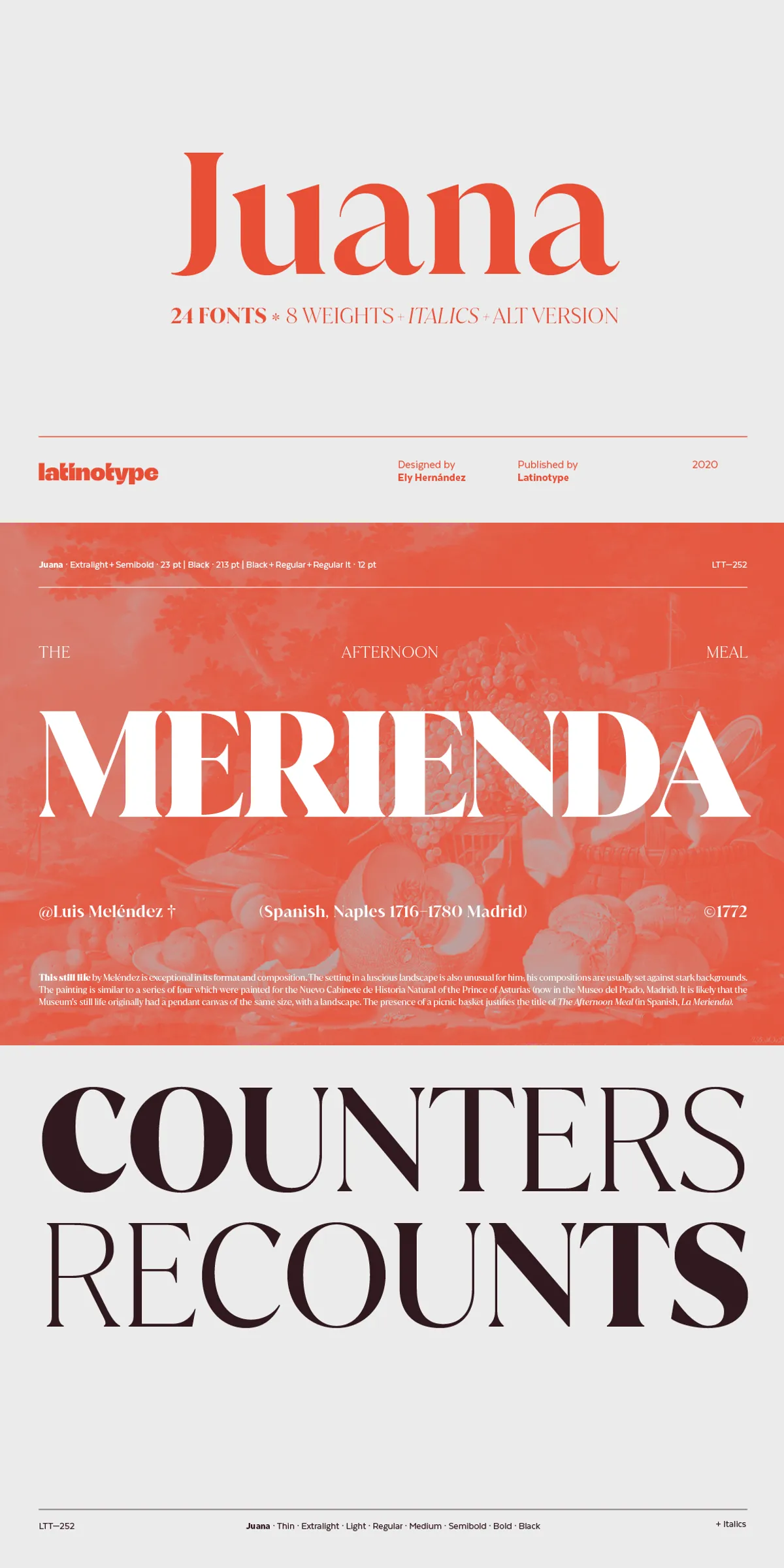
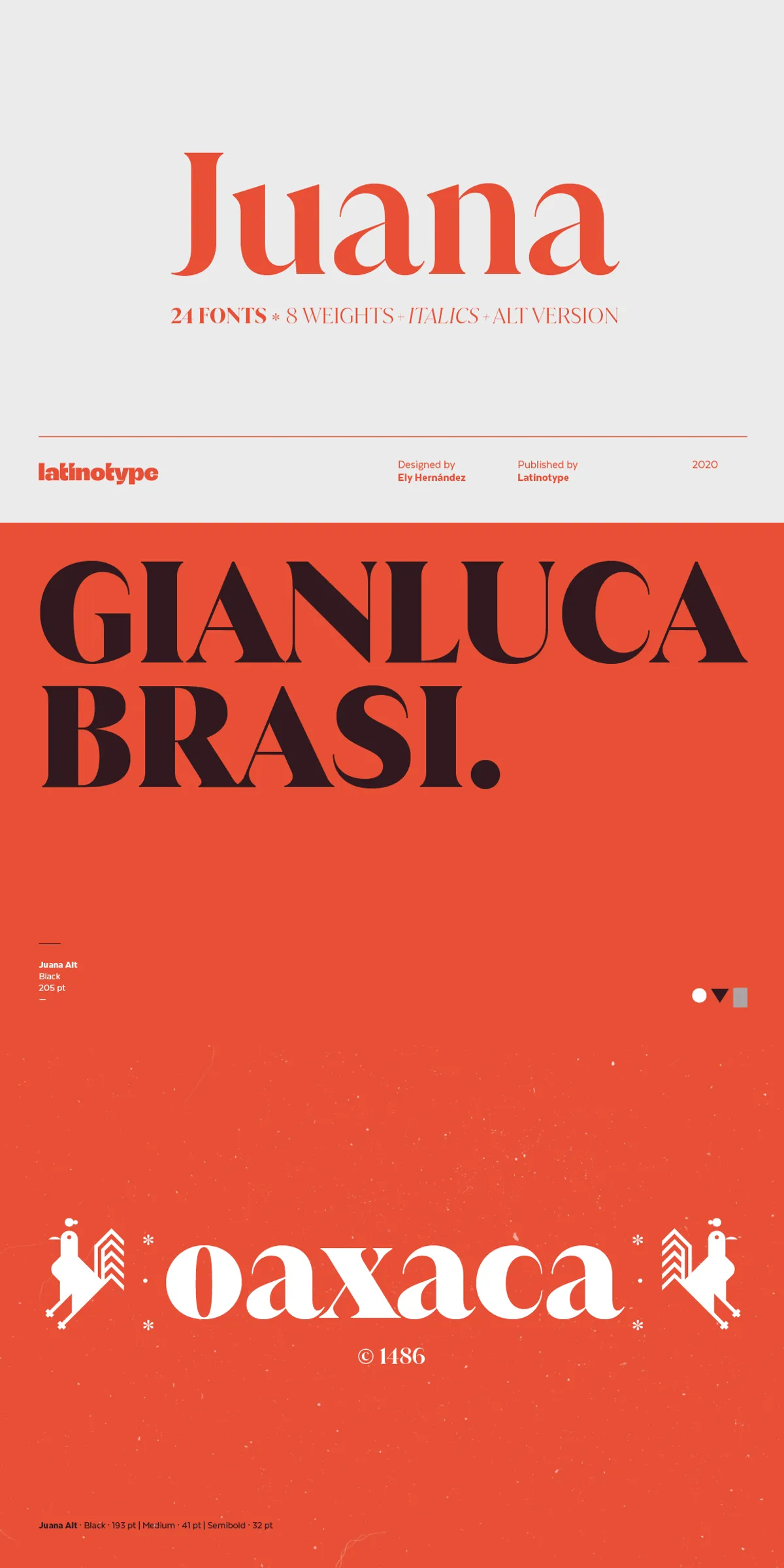
Juana offers an extensive family of 8 weights, each paired with matching italics, providing designers with a versatile toolkit to create nuanced typographic hierarchies. From delicate thin styles to bold, commanding weights, Juana adapts seamlessly to various design needs, whether for subtle body text or impactful headlines. The inclusion of an alternate version further expands creative possibilities, allowing for stylistic variation and customization within projects.
Extensive Language Support
One of Juana’s standout features is its robust support for over 200 Latin-based languages. This broad linguistic coverage ensures that Juana can be employed in diverse cultural contexts without compromising on typographic integrity. Whether you are designing for international publications, global brands, or multilingual editorial content, Juana provides reliable and elegant typographic solutions.
Ideal Applications for Juana
Juana’s sophisticated design and versatile weight range make it perfectly suited for a variety of professional design projects, including:
- Editorial Design: Magazines, newspapers, and digital publications benefit from Juana’s readability and stylish presence, enhancing both body text and headings.
- Branding and Logos: The typeface’s elegant contrast and refined letterforms create memorable brand identities that convey professionalism and creativity.
- Headings and Titles: Juana’s bold weights and italics provide strong visual impact for headlines, banners, and promotional materials.
- Packaging and Advertising: Its distinctive style helps products stand out on shelves and in marketing campaigns.
Why Choose Juana?
Choosing Juana means embracing a typeface that combines artistic exploration with practical versatility. Its design reflects a thoughtful balance between heritage and innovation, making it a valuable asset for designers who seek to communicate elegance and clarity. The extensive weight options and language support further enhance its adaptability, ensuring that Juana can meet the demands of complex, multilingual projects without sacrificing style.