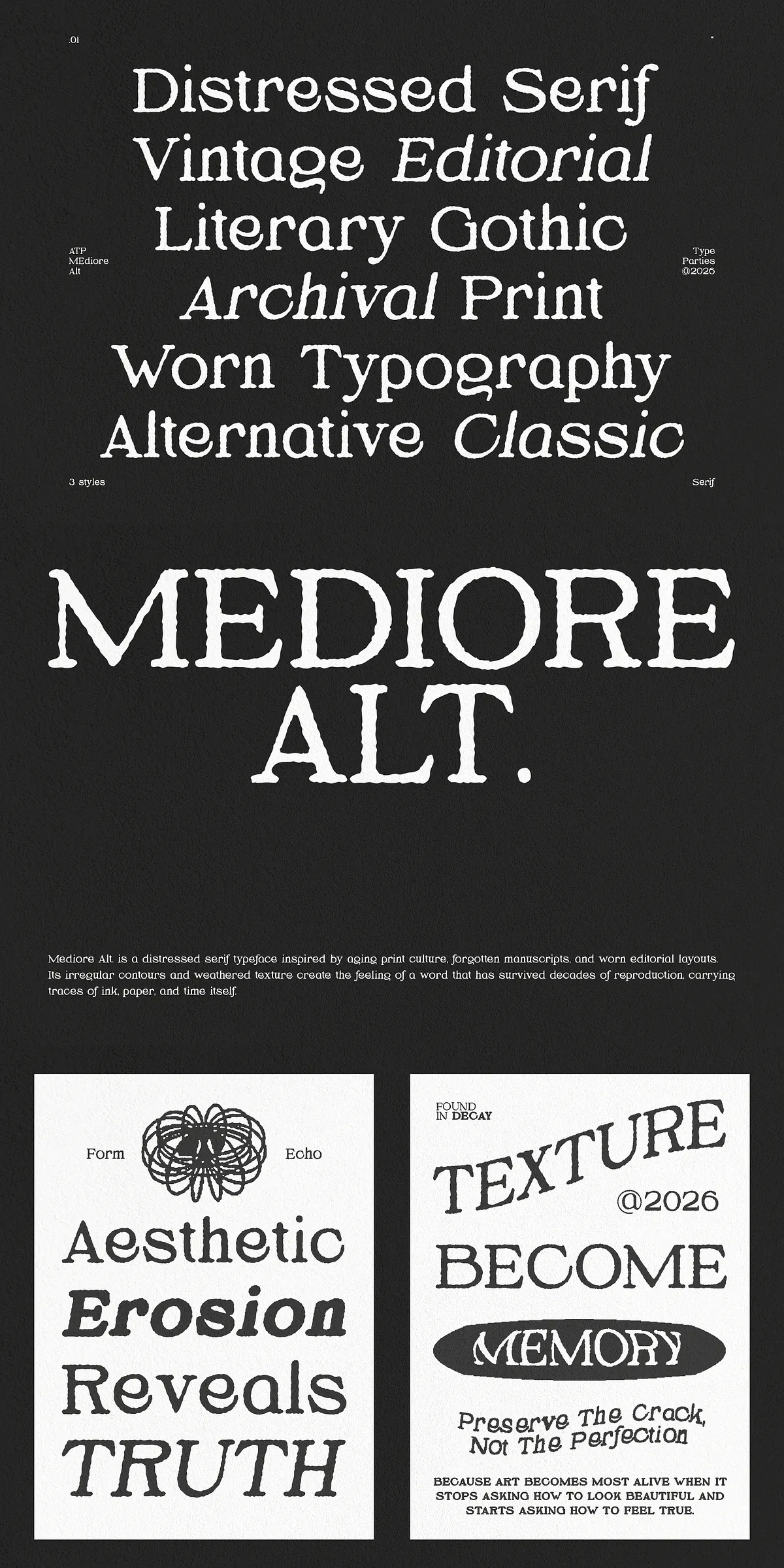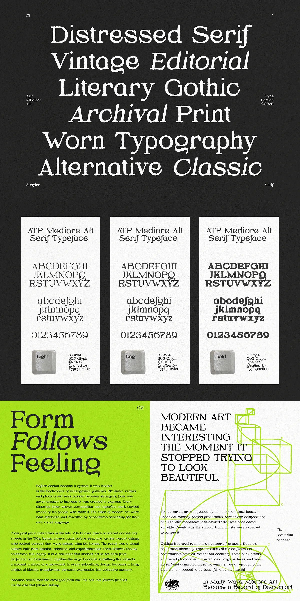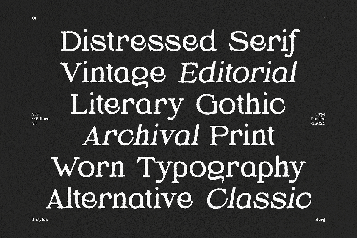

Mediore Alt channels the look and feel of aging print culture to deliver a serif display that reads like a recovered page from a forgotten press. Its irregular contours, subtle erosion, and weathered ink textures create an immediate sense of history and authenticity. At the same time, the face preserves classical serif proportions and clear counters so designers can deploy it confidently across both display and editorial contexts. Use Mediore Alt to communicate heritage, craft, and cinematic mood with bold presence and dependable legibility.
Timeless Distressed Aesthetic For Editorial And Branding Applications
Mediore Alt evokes the tactile traces of paper, ink, and time. The type’s slightly eroded edges and organic imperfections actively suggest use and provenance rather than manufactured distress. These details add warmth and credibility: headlines feel like they belong to archival magazines, book covers read like carefully handled volumes, and brand identities gain a narrative tone that feels lived-in and considered. Designers will appreciate how Mediore Alt supports storytelling by introducing texture without sacrificing clarity.
Visual Characteristics That Convey Aged Authenticity
- Weathered contours: Slightly eroded terminals and irregular strokes mimic press wear and aged ink deposits.
- Balanced proportions: Classical serif structure underpins the distressed surface to preserve reading comfort and typographic rhythm.
- Handmade warmth: Imperfections read as intentional craft — they humanize the typeface and enhance brand personality.
- Readable texture: Distress levels tune for display use while maintaining strong legibility at various sizes.
Designed Purposefully For Cultural And Cinematic Projects
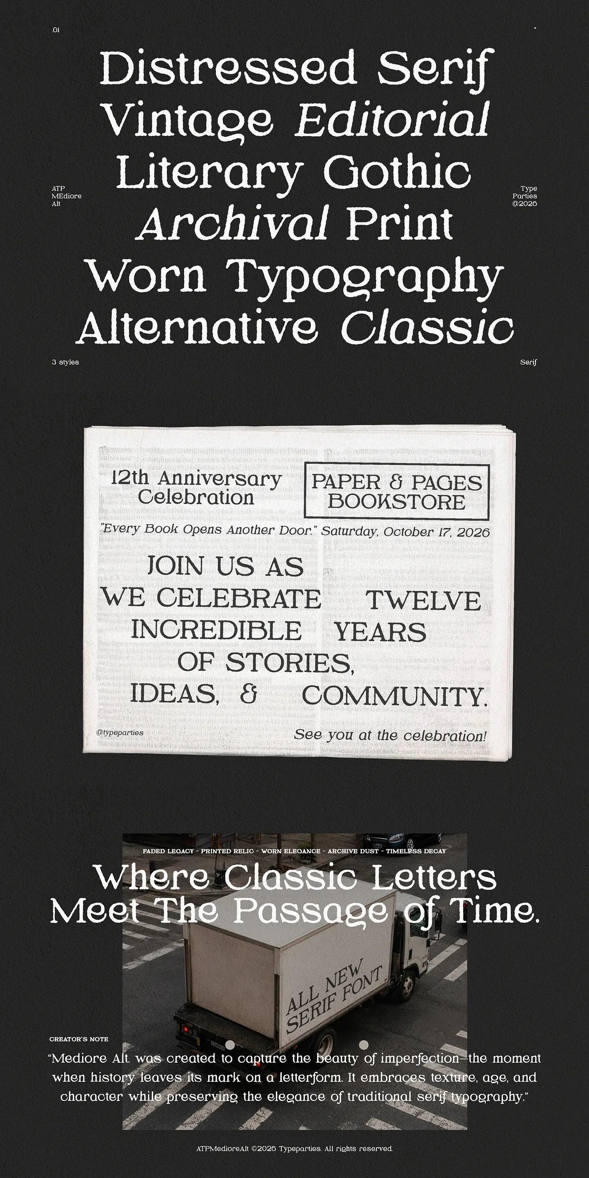
Mediore Alt performs strongly where heritage, mood, and editorial weight matter most. It commands attention on book covers, headlines, and cinematic titles, where a hint of decay suggests depth and narrative. Independent magazines and archival-inspired brands will use the type to reference analog traditions while remaining modern in layout and production. Because the face reads clearly, it also supports packaging and posters that need both texture and message clarity.
Practical Applications Across Design Projects
- Book covers and chapter titles that demand character and atmosphere.
- Independent magazines and editorials that require authentic, tactile typography.
- Cinematic title sequences and promotional posters that benefit from weathered tone.
- Branding systems for artisanal, archival, or heritage-driven products.
- Packaging and labels where distressed texture signals craft and provenance.
Included Files, Language Support, And Technical Compatibility
The Mediore Alt package includes the essential font formats and character sets to integrate smoothly into modern design workflows. Install the provided files and deploy across print, digital, and motion projects without additional conversion. The face supports multilingual text via extended Latin coverage, ensuring it performs for global audiences and diverse editorial requirements.
File Formats, Character Sets, And Feature List
- Formats included: .otf, .ttf, .woff, .woff2 — ready for desktop, web, and production environments.
- Character sets: Uppercase, lowercase, numerics, punctuation — complete for headline and display use.
- Multilingual support: Latin Extended coverage to support international typography needs.
- Use-ready features: Clear punctuation and numerals that align with distressed letterforms for consistent visual rhythm.
How To Use Mediore Alt Effectively In Your Designs
Deploy Mediore Alt where texture enhances meaning. For immediate impact, set short, bold headlines or wordmarks and let the distressed details tell the story. Pair the face with a neutral sans or a clean modern serif for body text to preserve readability while highlighting the display voice. Proof for substrate and ink in print applications to ensure the erosion reads as intended; adjust size and tracking to balance distress and legibility. In motion or film, use the type at sizes and resolutions that retain the subtle texture without introducing noise.