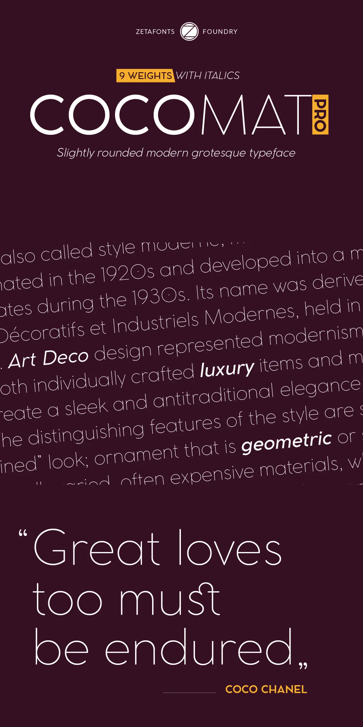
Cocomat brings a clear geometric skeleton and humanistic proportions together to create a versatile sans-serif that carries a subtle vintage spirit. Designed by Francesco Canovaro and Debora Manetti as a development of Cosimo Lorenzo Pancini’s Coco Gothic family, Cocomat retains open forms, slightly rounded corners, and low contrast proportions. These choices deliver an assertive, contemporary appearance that also evokes early twentieth-century letterforms—making Cocomat ideal whenever you want modern clarity with a period mood.
Design History Origins And Key Visual Characteristics
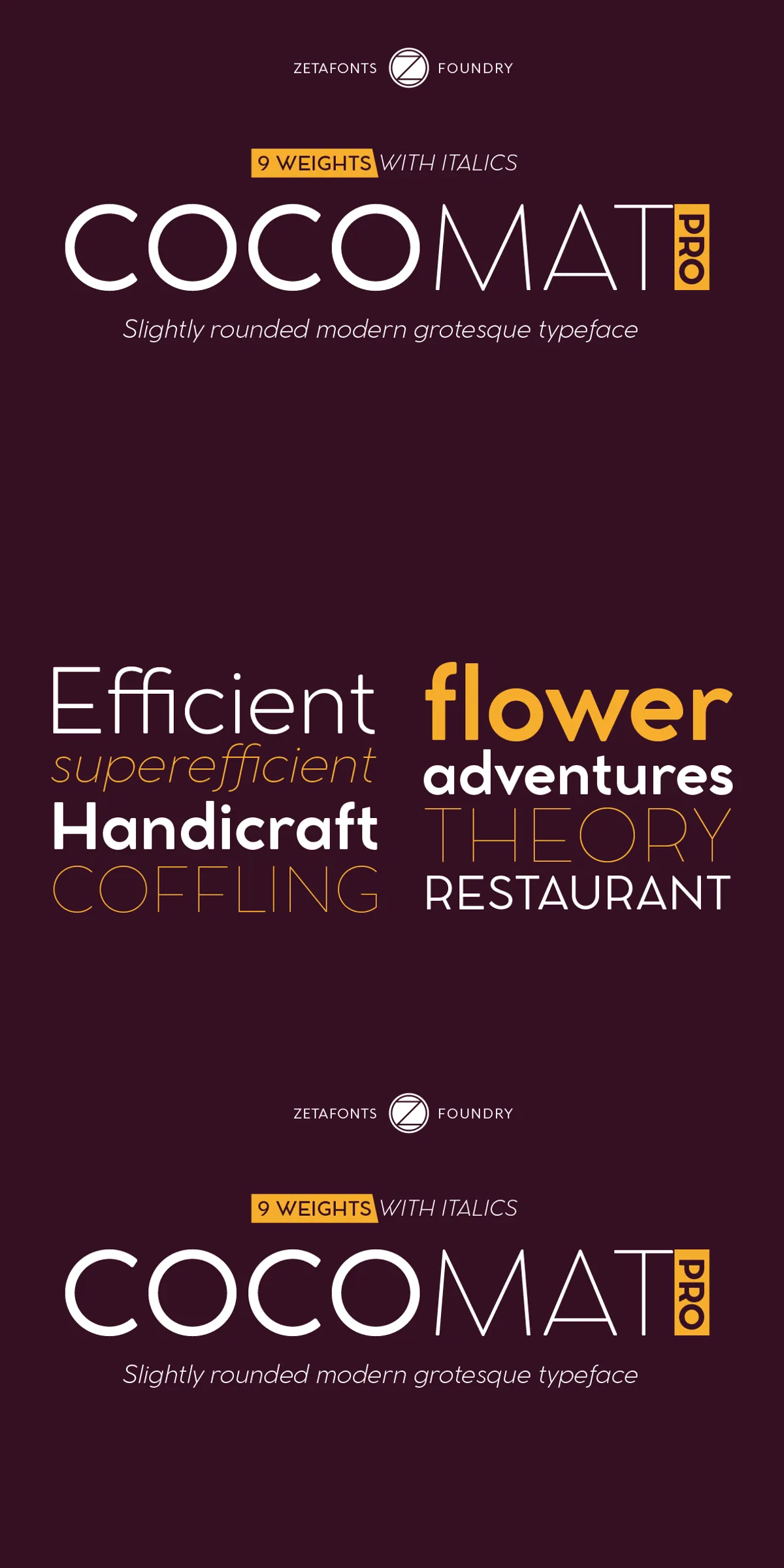
Cocomat evolves the Coco Gothic system by introducing deliberate, measured alterations in both uppercase and lowercase glyph structures. The uppercase characters exhibit a vertical unbalancing that nods to Art Deco aesthetics: forms like E, A, F, P, and R display subtle shifts that add personality and historical reference without sacrificing legibility. Lowercase letters receive optical compensation on stems—seen in n, m, p, and q—so text retains rhythm and balance across weights. The result reads clean and confident in display roles and comfortable in extended text settings.
What Differentiates Cocomat From Other Sans Serifs
Where many geometric sans fonts emphasize strict symmetry and mathematical neutrality, Cocomat intentionally blends geometry with humanist nuances. It omits heavy optical compensation on horizontal strokes in bolder weights, producing an almost inverted-contrast feel in the strongest styles. This treatment provides a distinctive, contemporary edge that designers can use to craft memorable headlines, refined logos, and packaging that calls back to a curated, vintage era.
Cocomat PRO Update And Expanded Functionality Explained
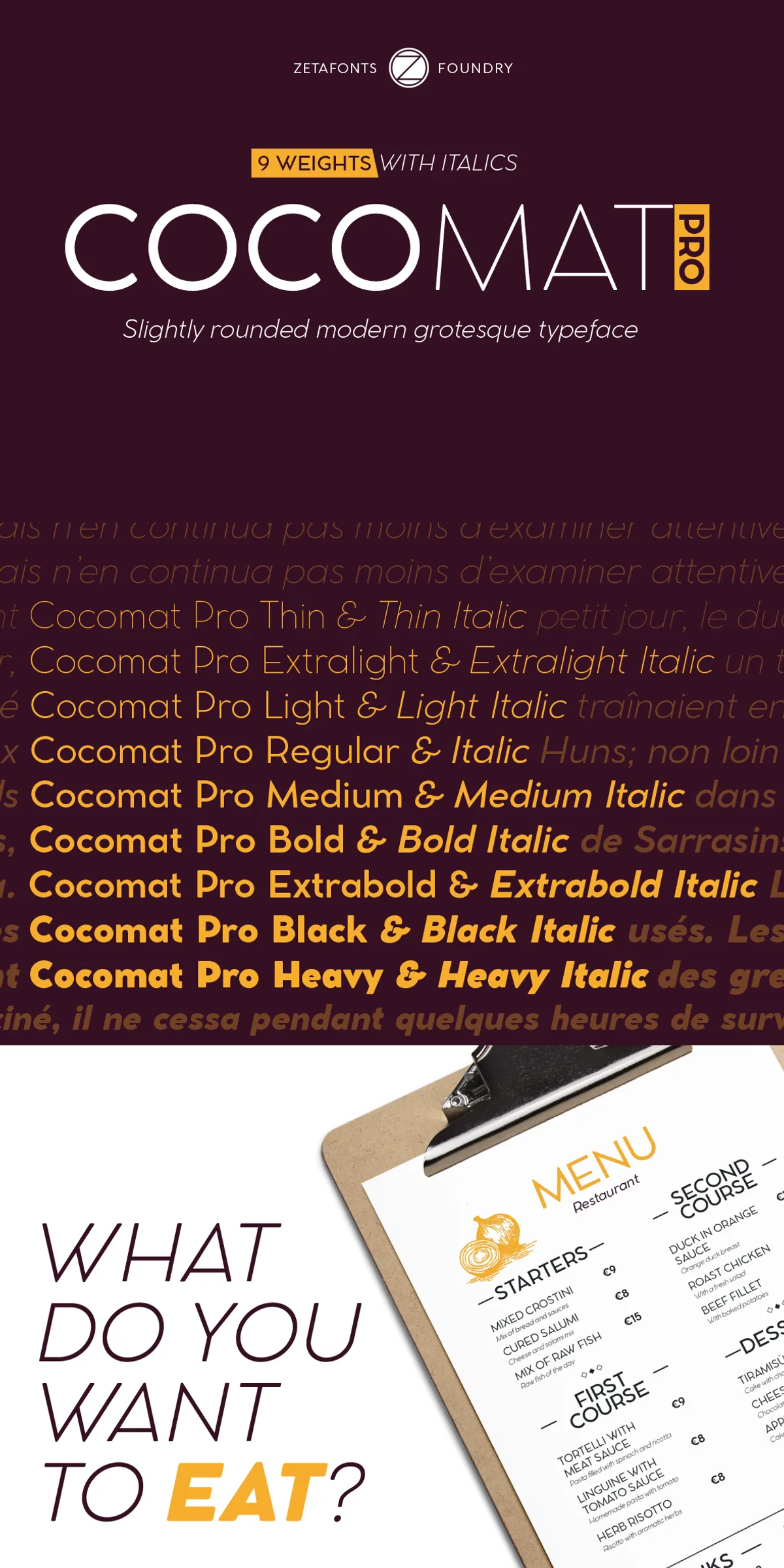
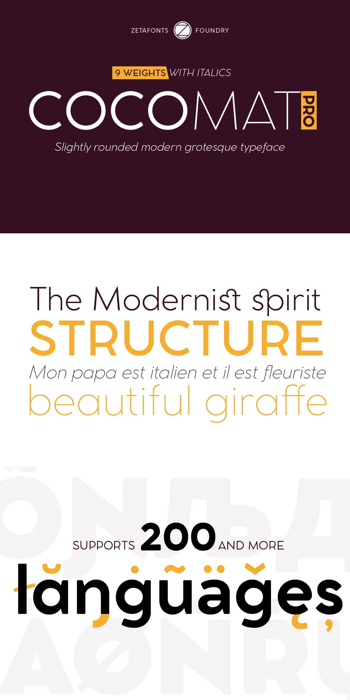
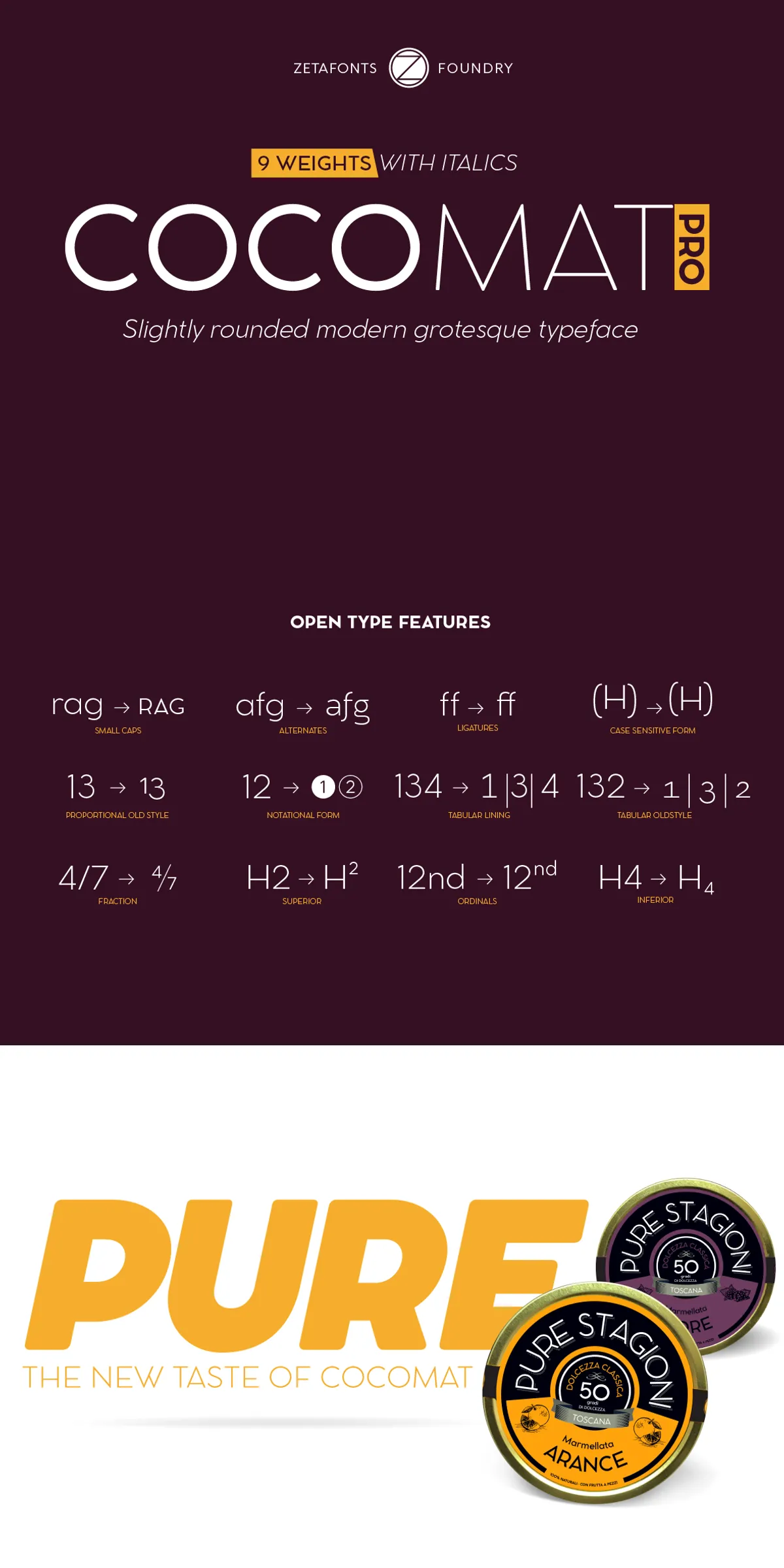
Originally published in 2014, Cocomat underwent a comprehensive redesign in 2019 and re-emerged as Cocomat PRO. The PRO release adds eight additional weights—thin, medium, black and heavy, each with roman and italic companions—broadening typographic range for nuanced hierarchy and expressive typographic systems. The update also introduces extended OpenType features including alternate glyph forms and positional numerals, enabling designers to fine-tune tone and responsiveness across contexts.
Language Support Glyph Coverage And Technical Strengths
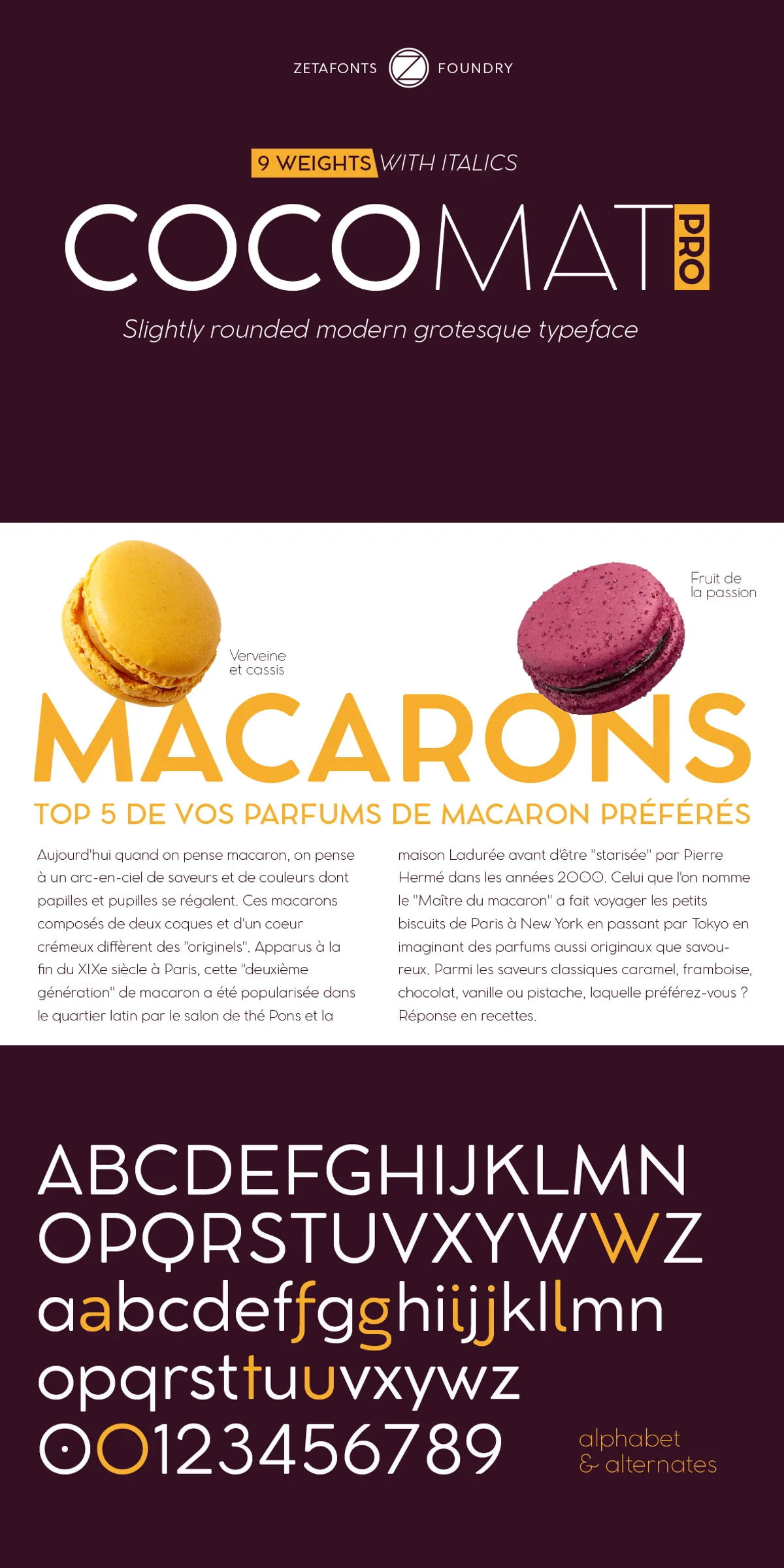
Cocomat PRO significantly expands language coverage to support over two hundred languages across Latin, Cyrillic, and Greek scripts. The family includes carefully drawn diacritics and language-specific forms, ensuring typographic integrity in international projects. OpenType features and alternates give designers control over stylistic outcomes while consistent stem widths and spacing maintain visual coherence across sizes and media.
Recommended Uses And Practical Application Tips
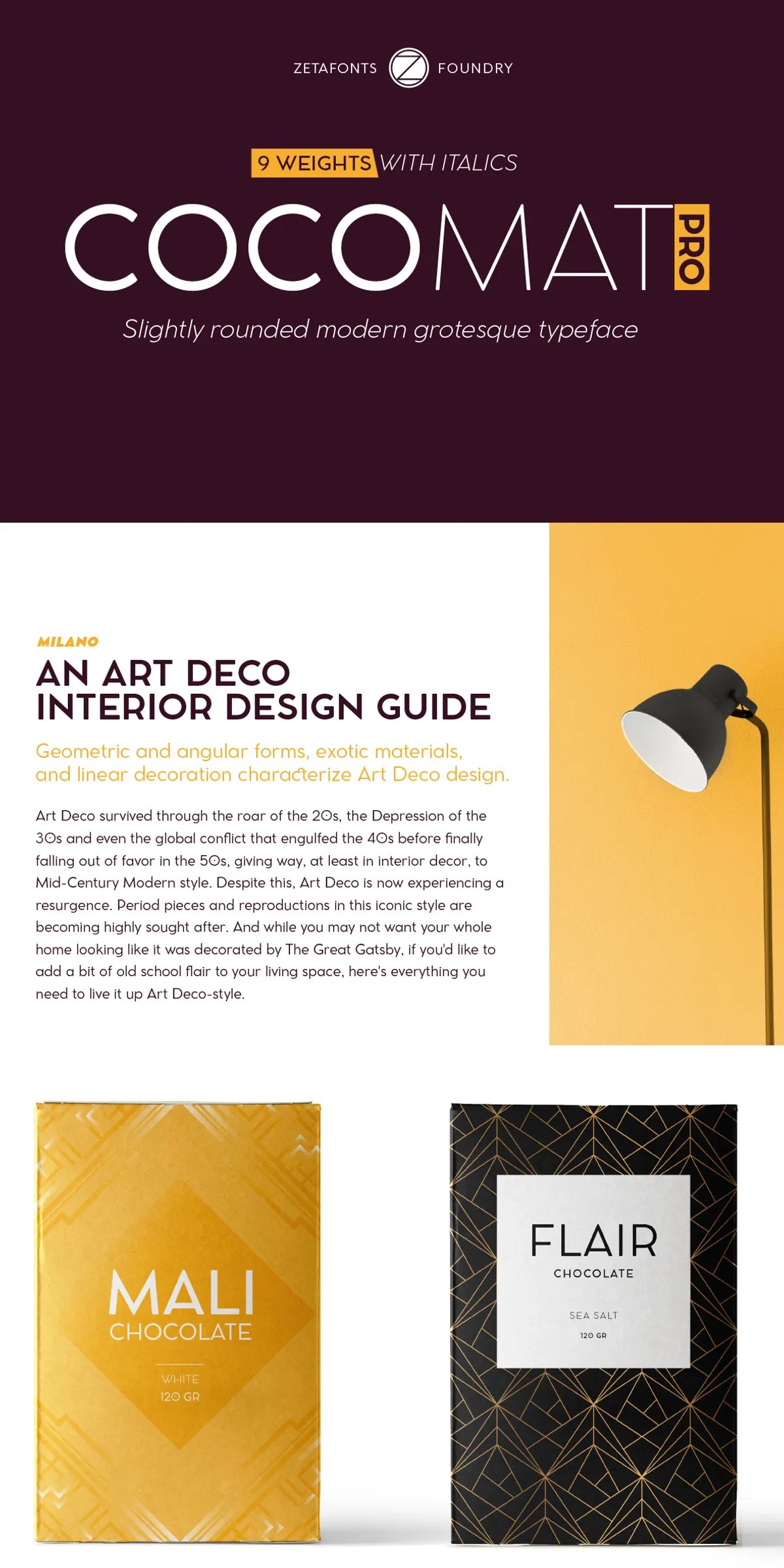
Use Cocomat to add refined historic flavor to modern layouts: it excels in food and luxury branding, editorial mastheads, packaging, signage, and identity systems where period nuance enhances perceived value. Pair Cocomat with a neutral humanist serif or a light grotesque for extended reading, or combine it with a decorative script for contrast on premium packaging. For logotypes, leverage the uppercase character quirks to create distinctive lettermarks. For body copy, choose mid weights with italics for emphasis and maintain comfortable leading to preserve readability.
Design Workflow And Production Considerations
When implementing Cocomat in production, test typographic color across weights and sizes to preserve its unique inverted-contrast character in bold styles. Use OpenType alternates and positional figures to match historical or contemporary contexts. For multilingual projects, verify glyph substitution and kerning in target languages. Export high-resolution assets for print and create properly hinted webfont subsets for online performance to ensure consistent rendering across platforms.