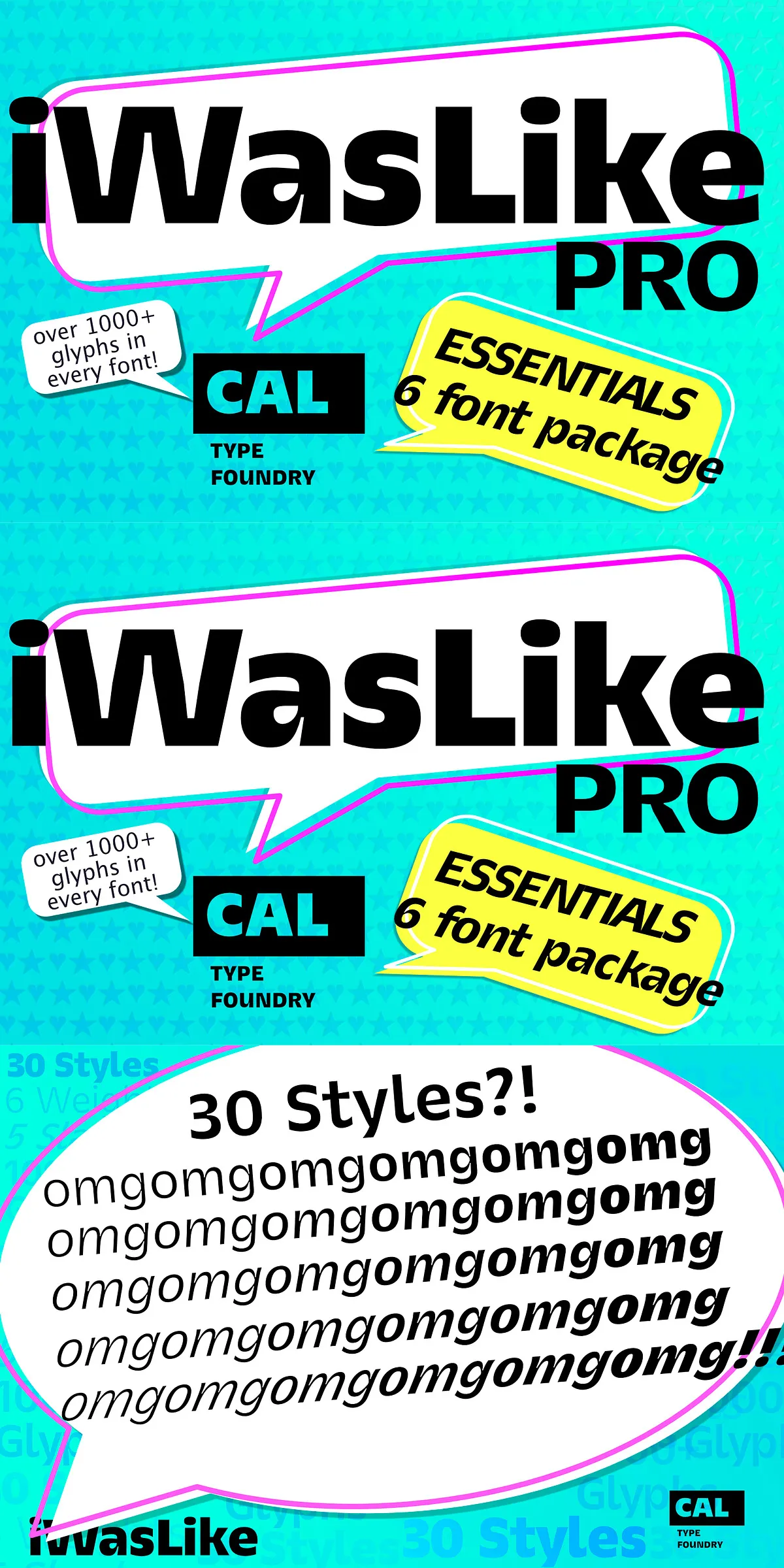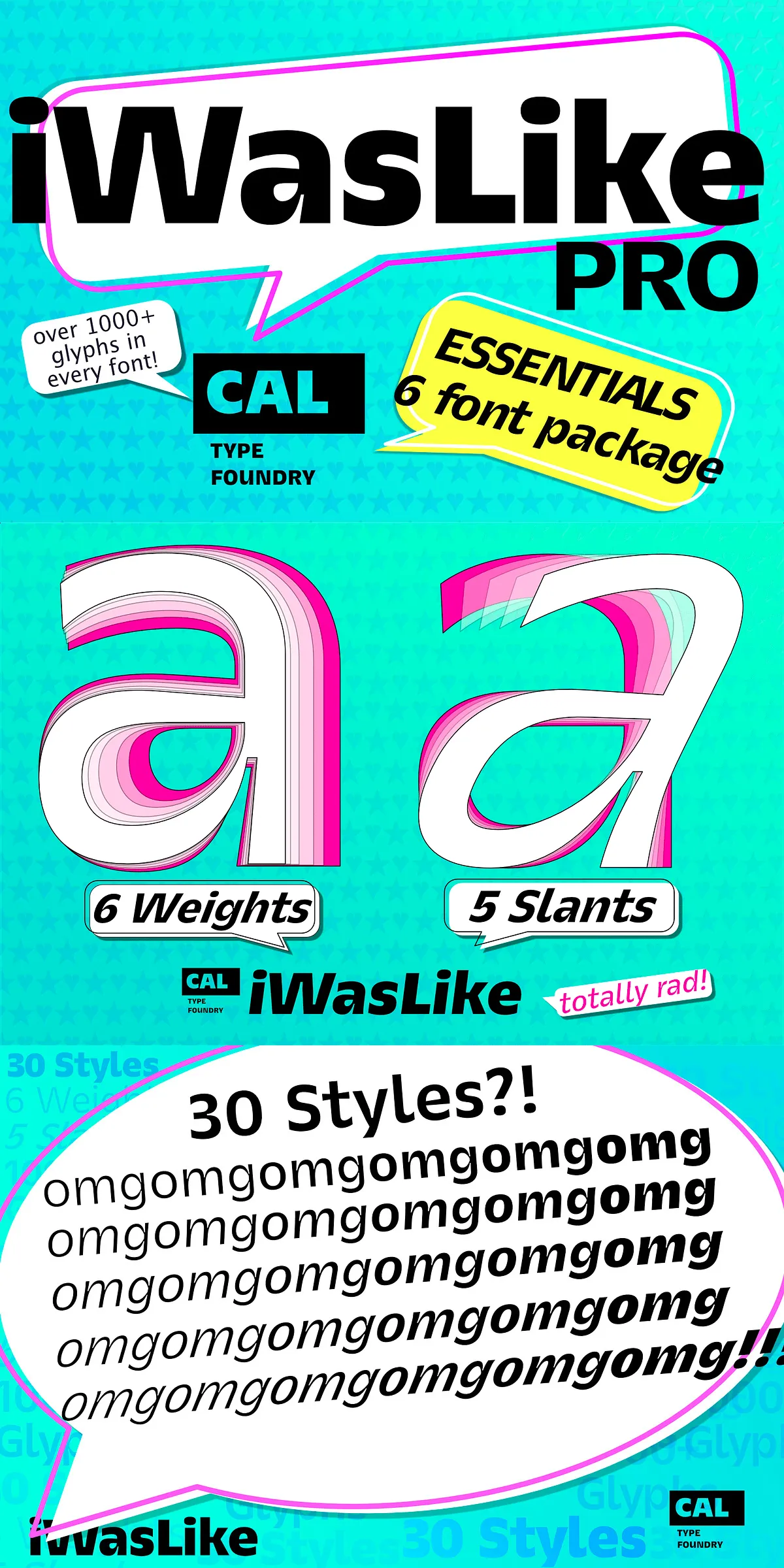
CAL iWasLike™ Pro is a purpose-built, conversational sans-serif family that brings warmth and clarity to paragraphs, captions, and user interfaces. This Essential Package contains the most popular weights — Regular, Semibold, and Bold — plus matching obliques so you can apply emphasis and hierarchy without introducing inconsistent tone. The design targets comfortable on-screen reading and robust medium-resolution print reproduction, making iWasLike Pro an excellent choice for websites, apps, editorial layouts, and long-form digital content.
Designed for consistent readable paragraph text across devices and prints
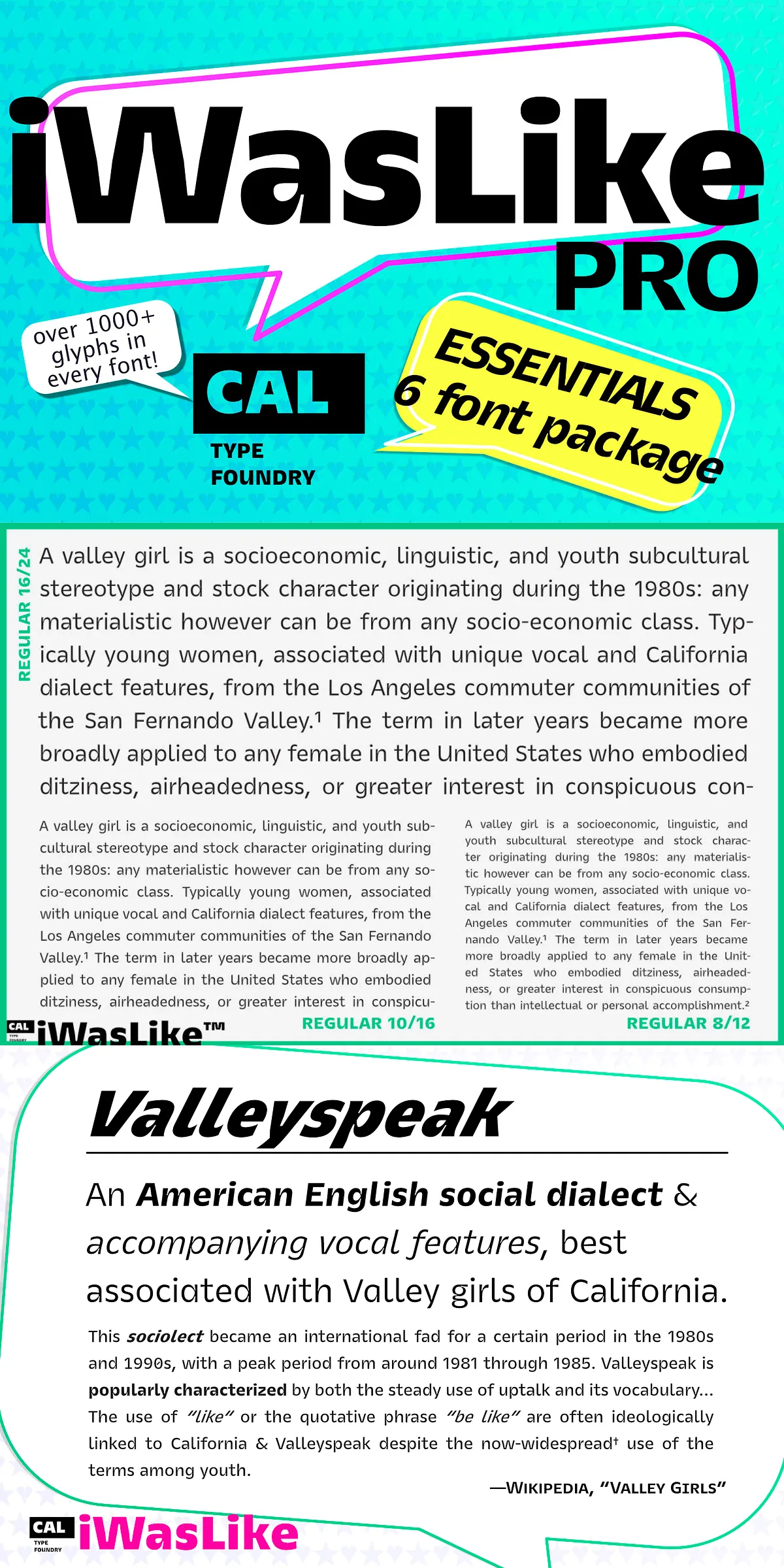
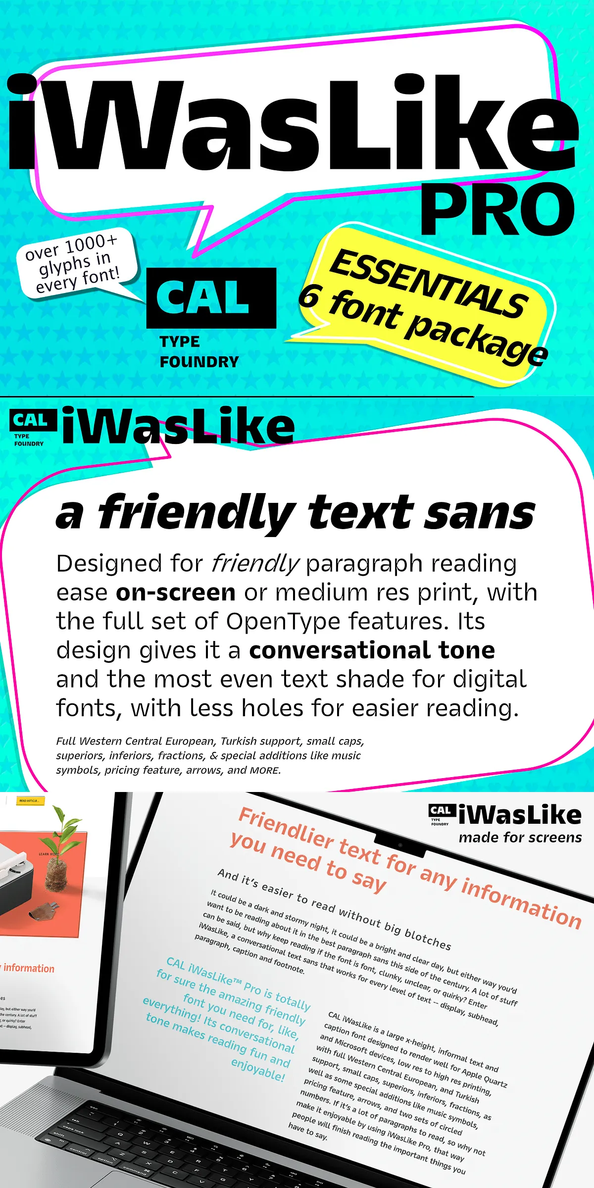
iWasLike Pro features a large x-height and generous counters that create an even text color and reduce distracting holes in text blocks. Those design choices deliver reliable legibility across Apple Quartz and Microsoft rendering environments, and they perform well from low-resolution screens up through high-resolution print. The family’s letterforms remain stable at smaller sizes while still providing attractive display potential for captions and headings. When your project needs approachable, human tone without sacrificing professionalism, iWasLike Pro accomplishes that balance.
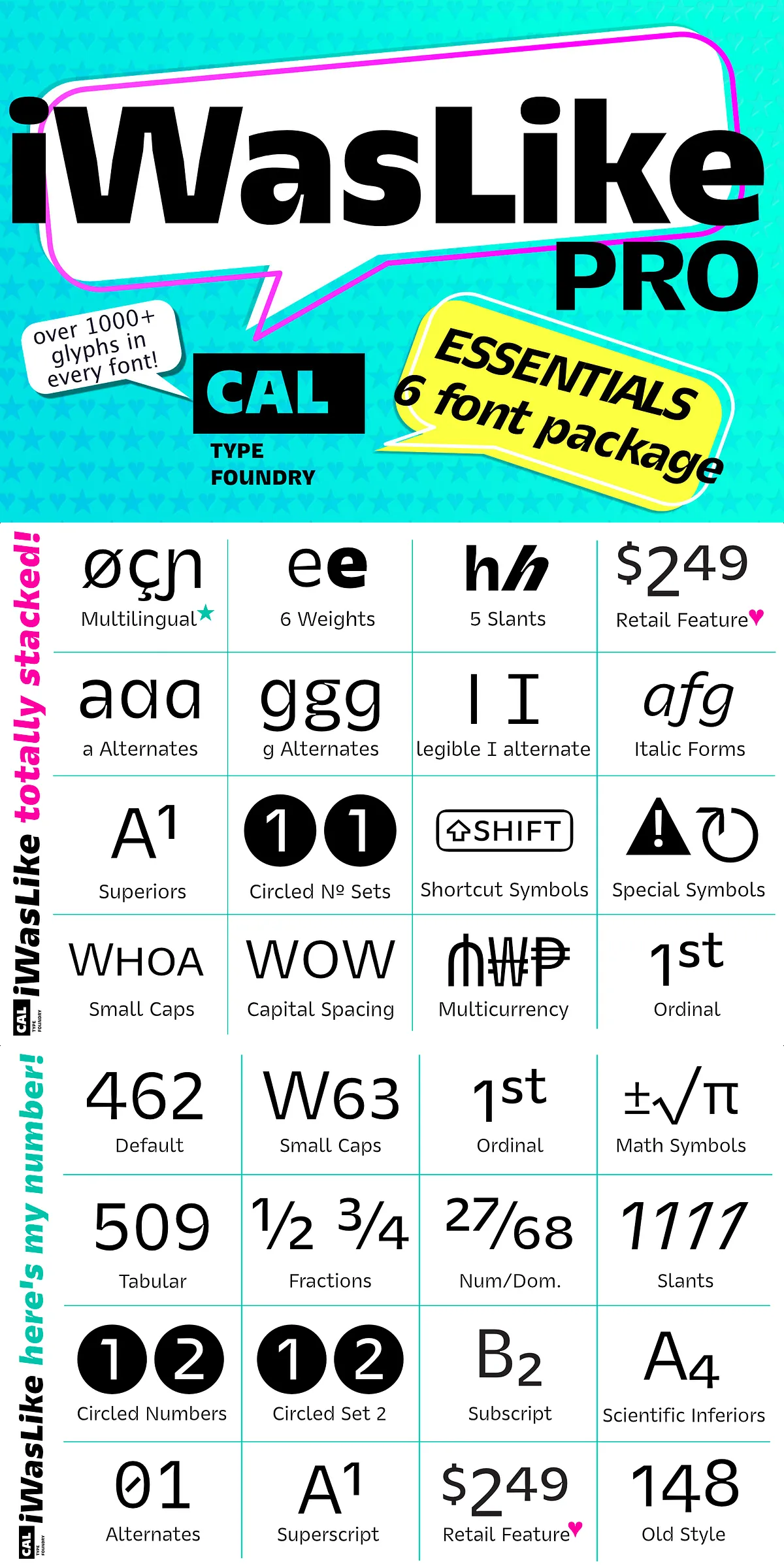
Comprehensive OpenType features and practical typographic tools included
The Essential Package ships with a full complement of OpenType features to help you fine-tune typographic rhythm and expression. Expect small caps, superior and inferior figures, fractions, and multiple sets of numerals including circled numbers. Special additions such as music symbols, arrows, and a pricing feature give designers ready-made assets for interface labels and product pages. Alternates and oblique styles make it seamless to introduce emphasis or craft custom labels without switching families.
Because iWasLike Pro provides both coherent body text and flexible display options, you can build consistent systems: use Regular for body copy, Semibold for subheads and labels, and Bold for strong calls to action. The included obliques preserve the family’s voice for emphasis and stylistic contrast while maintaining spacing and weight harmony, reducing kerning adjustments and layout surprises.
Broad language coverage and production-ready file formats
The family supports Western and Central European languages plus Turkish, allowing global projects to keep a unified typographic voice. Files ship in modern desktop formats such as OpenType (OTF/TTF) and include web-friendly formats for efficient web deployment. The fonts’ technical construction considers common production workflows, and the clear vector outlines render faithfully for print and on-screen output.
Practical workflow advice for designers and developers
For web use, implement WOFF/WOFF2 files and apply font-display strategies to minimize layout shift and preserve perceived performance. In editorial or print contexts, set body copy at moderate tracking levels and test small caps or superior figures selectively to maintain even texture. Because iWasLike Pro was engineered for consistent text shade, test at target output sizes and adjust leading to preserve comfortable reading rhythm. Leveraging the oblique styles rather than simulated slants will keep your typography crisp and phase-accurate across platforms.
When to choose iWasLike Pro and upgrade options available
Choose iWasLike Pro when your project needs a friendly, conversational voice with professional clarity: digital articles, documentation, help text, captions, product descriptions, and interface elements. Its balanced shapes and thoughtful feature set reduce typographic friction in multi-platform projects. If you require a wider palette of weights and slants for branding systems or extensive editorial hierarchies, consider the iWasLike FULL FAMILY option — a larger collection with additional weights and slanted styles that expands expressive range while preserving the same reading-friendly DNA.
Support and licensing guidance for production use
Check the product page or vendor documentation for licensing details; most vendor pages describe personal and commercial license tiers and embedding options. If you need support for extended embedding, custom alternates, or pairing advice, consult the foundry or distributor for guidance and updates. For a quick reference to an online listing describing CAL iWasLike Pro, see the family overview at Befonts which lists features and samples for visual inspection.