Dexa Pro, designed by Ceyhun Birinci in 2020, delivers a powerful and adaptable typographic system built to solve real-world design problems. Created with the clarity of classic sans-serifs in mind, Dexa Pro expands that legacy into a modern super family engineered for maximum flexibility. The family provides four distinct widths — condensed, narrow, normal, and expanded — and each width includes eighteen carefully calibrated weights and their true italic counterparts. With 72 fonts in total and more than 770 glyphs per font, Dexa Pro equips designers with the resources needed for global, multi-format projects.
Design intent and historical reference points explained clearly
Birinci set out to fuse the functional strengths of classic sans families with contemporary needs for variety and language support. The result emphasizes legibility, consistent color on the page, and adaptable proportions that move smoothly between short headlines and extended body copy. Dexa Pro’s structure borrows the rational, clean forms that make traditional grotesques reliable, while updating terminals, counters, and spacing to perform at modern screen and print resolutions. This balance makes Dexa Pro an excellent choice for editorial systems, corporate identity, signage, and UI frameworks that require a single family to handle many roles.
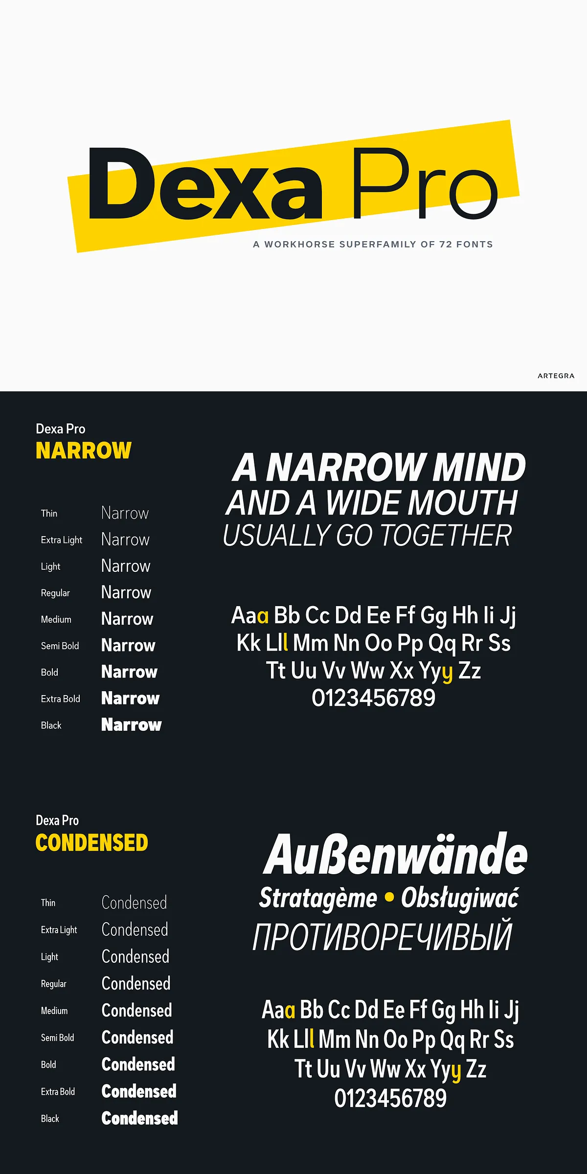
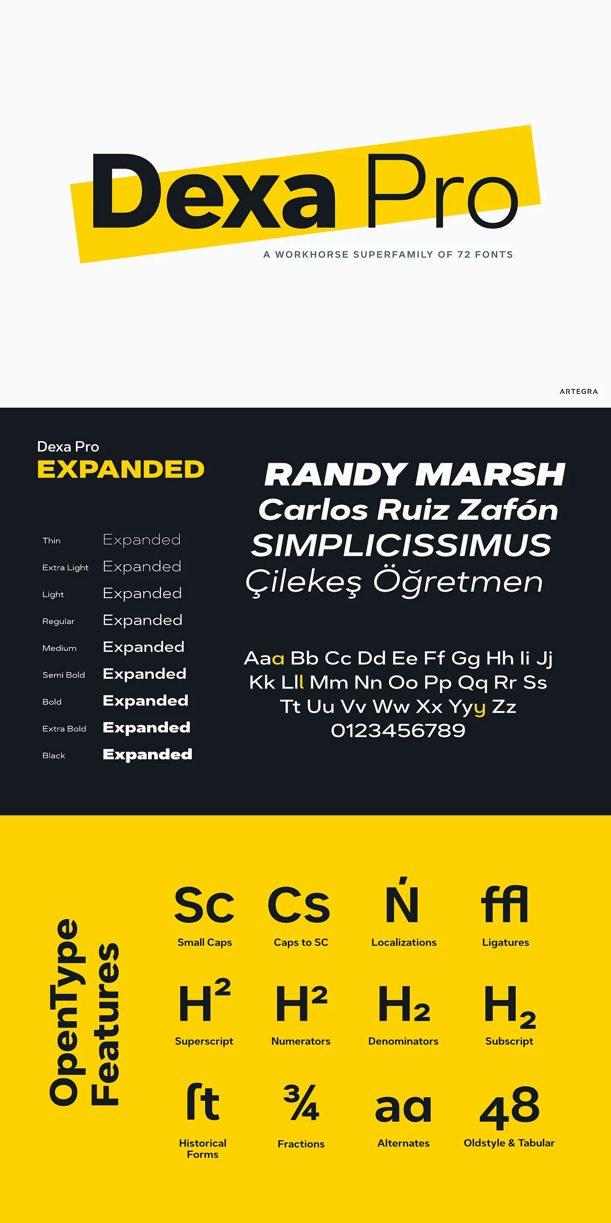
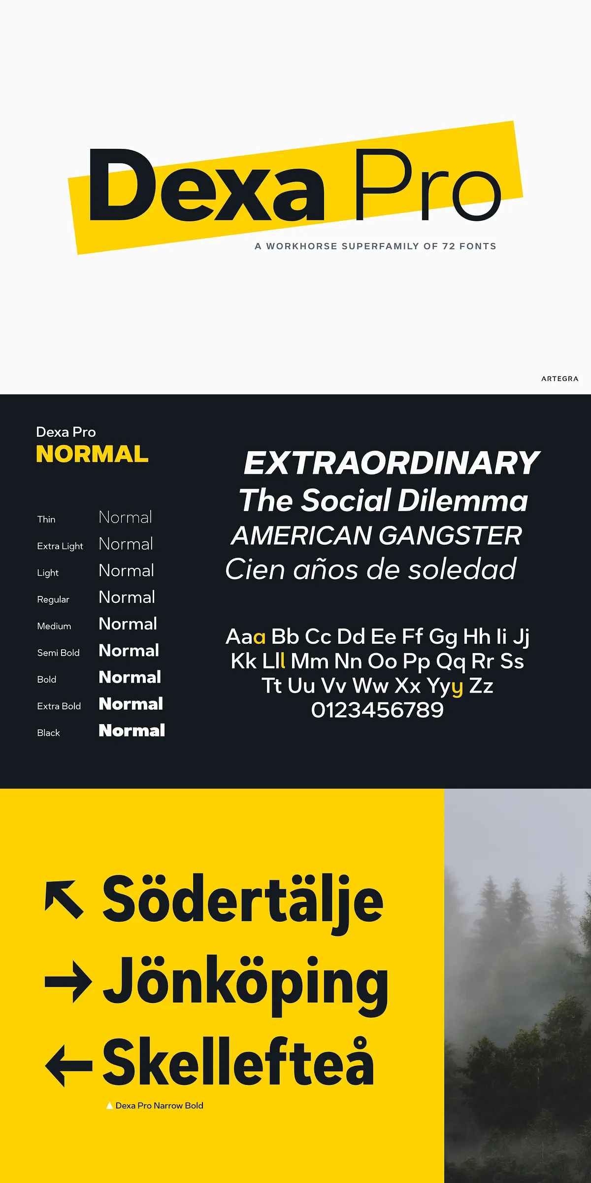
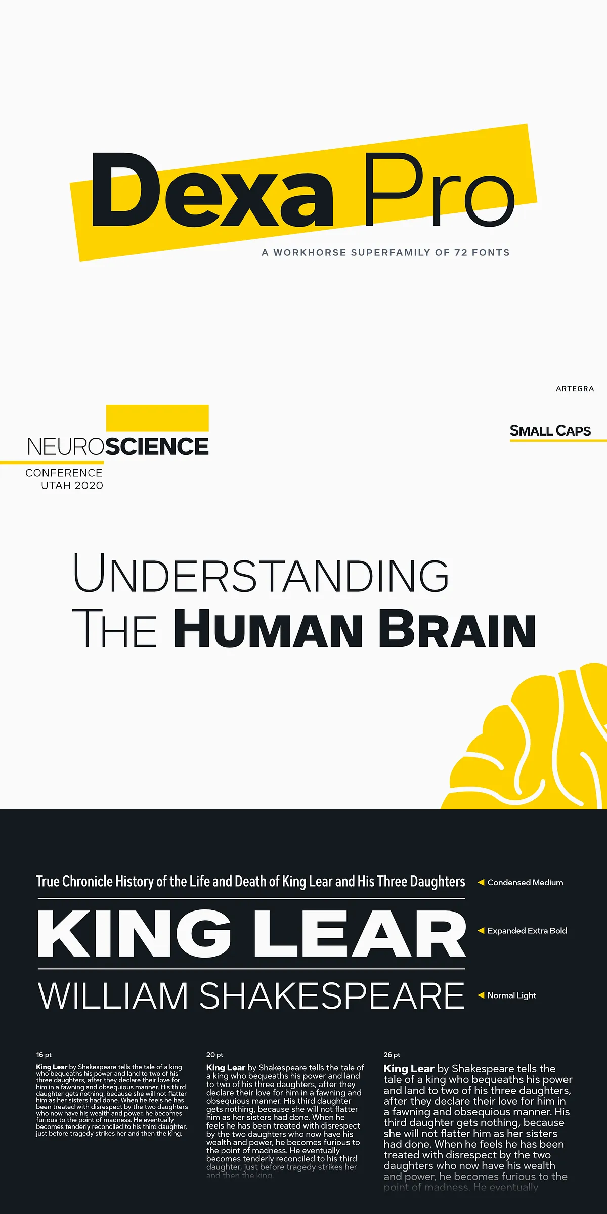
Every width offers eighteen fonts for complete control
Each width in the Dexa Pro family spans a wide range of weights from thin to black, with finely tuned intermediate weights and matching true italics. Designers can establish nuanced hierarchies without introducing multiple typefaces, maintaining visual coherence across headings, subheads, captions, and long-form copy. The availability of condensed and expanded widths simplifies responsive layout work: tight columns, spacious hero headlines, and flexible modular systems all remain consistent in voice and proportion.
Extensive glyph set and robust language coverage provided
With more than 770 glyphs per font, Dexa Pro includes an expansive set of characters to support diverse languages and typographic needs. The family covers all Latin languages and extends to Cyrillic, enabling cross-market brand continuity. Glyph richness means access to stylistic alternates, diacritics, and specialized symbols that reduce the need for supplementary fonts. Designers benefit from the ability to typeset multilingual documents, localized marketing, and complex editorial projects while preserving a single typographic identity.
OpenType features and practical typographic functionality
Dexa Pro ships with a comprehensive suite of OpenType features that enhance typographic control. Included features are small caps, caps-to-small-caps conversions, alternates, old-style figures, tabular lining figures, old-style tabular lining figures, localized language forms, discretionary and standard ligatures, superscripts, subscripts, numerators, denominators, fractions, and historical forms. These tools allow designers to refine numeric tabulations, maintain rhythm in multi-level text, and apply sophisticated typographic treatments without resorting to manual workarounds.
Recommended usage patterns and production guidance
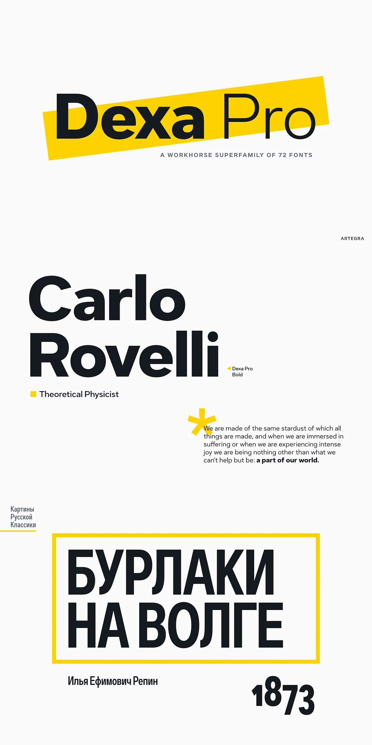
Use Dexa Pro as a single-source family for branding systems, editorial templates, corporate communications, and digital interfaces. For long-form reading, select mid-range weights in the normal width and tune leading for comfortable line length. Reserve condensed weights for narrow spaces like navigation bars and tight column grids. Apply expanded weights to create impactful display headlines and large-format typographic statements. When deploying on the web, include modern WOFF/WOFF2 formats and test font-display strategies to prevent layout shifts and improve perceived performance.
Licensing, integration, and workflow considerations
Before production use, verify license terms with the foundry or distributor to confirm embedding, app, and web licenses as required. Dexa Pro’s technical construction supports common production workflows and integrates cleanly with design systems, CMS templates, and asset pipelines. Because each weight and width is carefully spaced and kerned, designers will find fewer adjustments necessary when scaling across sizes and formats.
Dexa Pro is a workhorse super family that actively addresses modern typographic demands: wide stylistic range, deep language support, and production-ready features. When a project demands a single, confident voice that can adapt to many roles, Dexa Pro provides the tools designers need to execute with precision and speed.