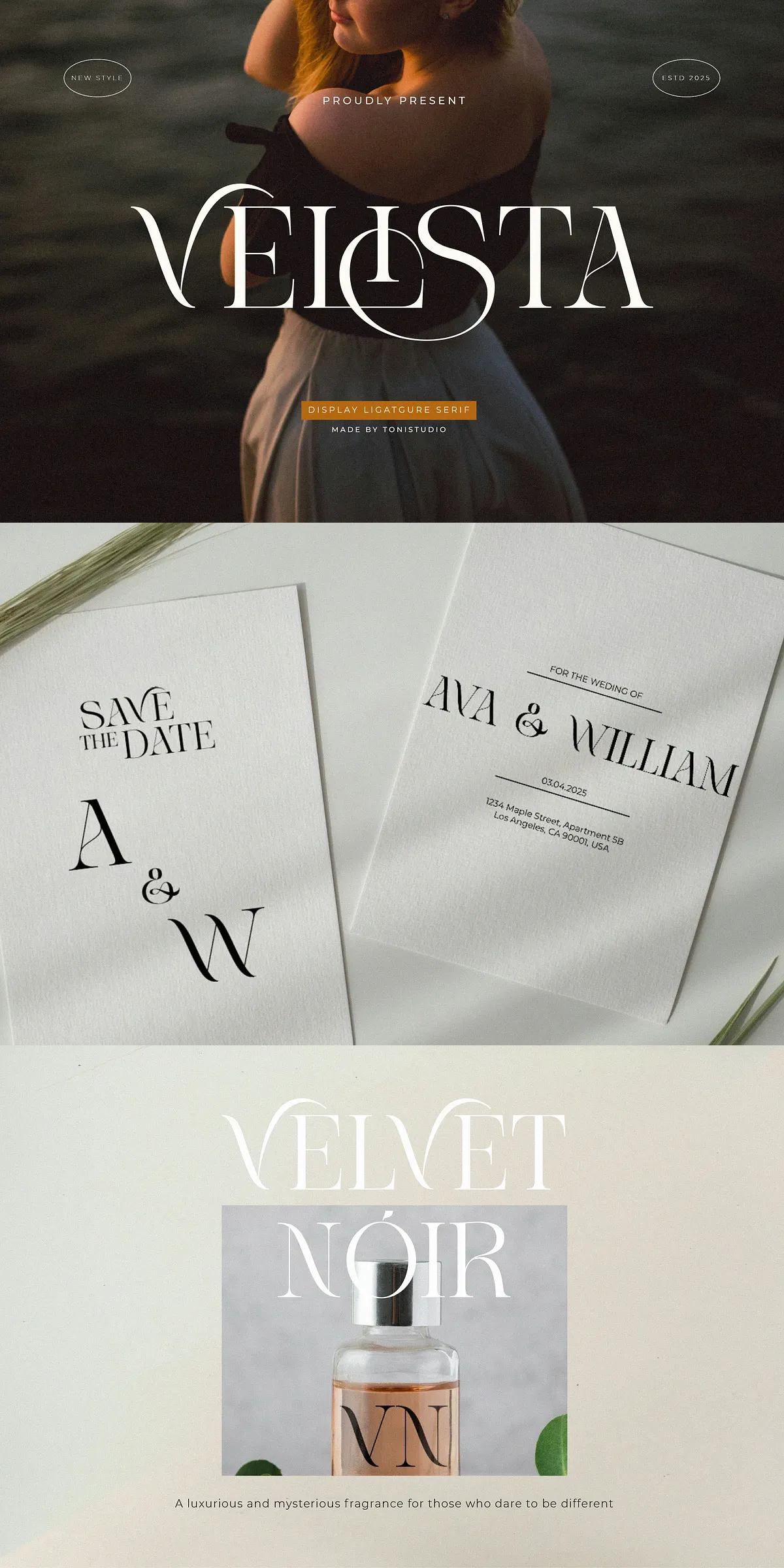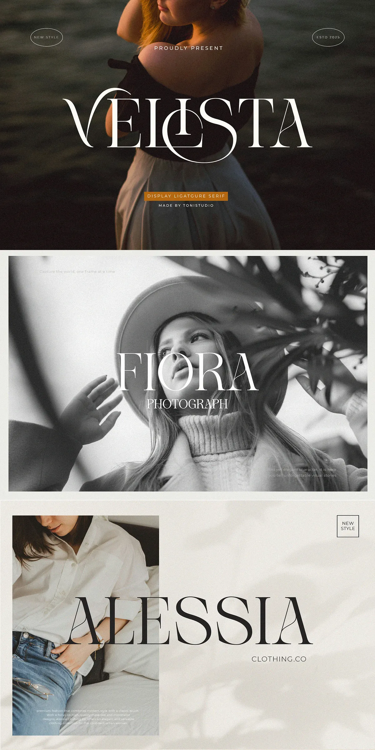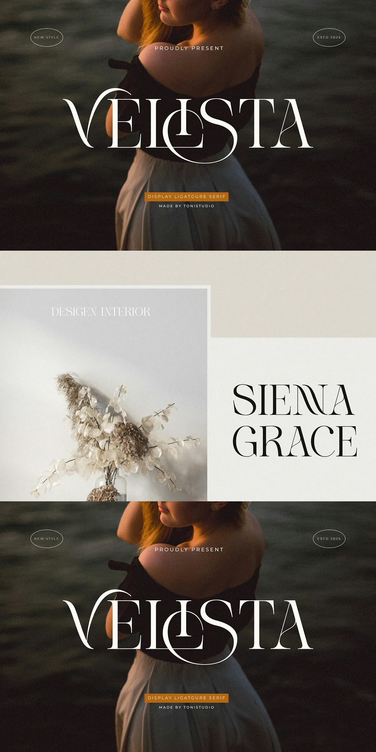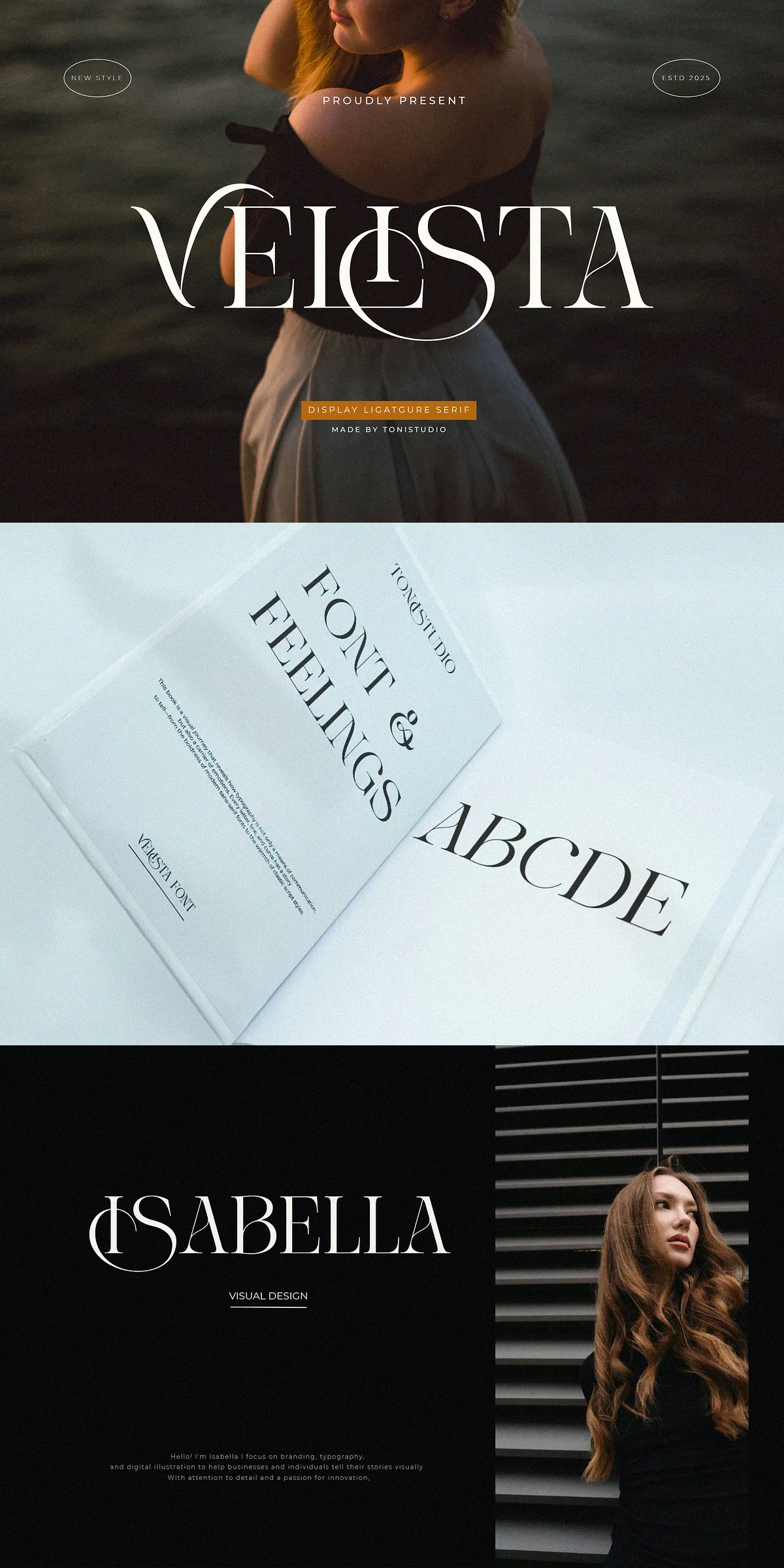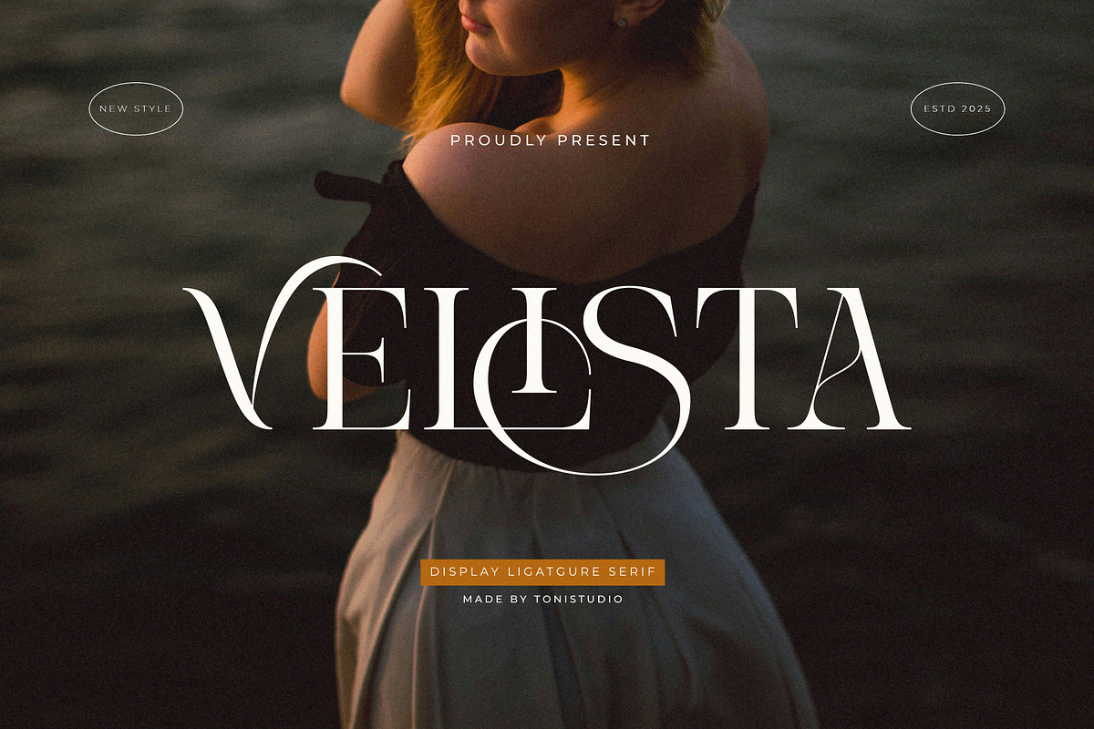
VELISTA delivers a refined, high-fashion voice for visual identities that demand poise and clarity. Designed with meticulously crafted thin strokes and purposeful contrast, VELISTA balances delicate grace with outstanding legibility. The typeface reads clearly at display sizes while retaining a light, airy presence that elevates premium branding, editorial layouts, and luxury packaging. Use VELISTA when you want typography to communicate elegance, authority, and thoughtful refinement.
🎯 Key Features That Define VELISTA
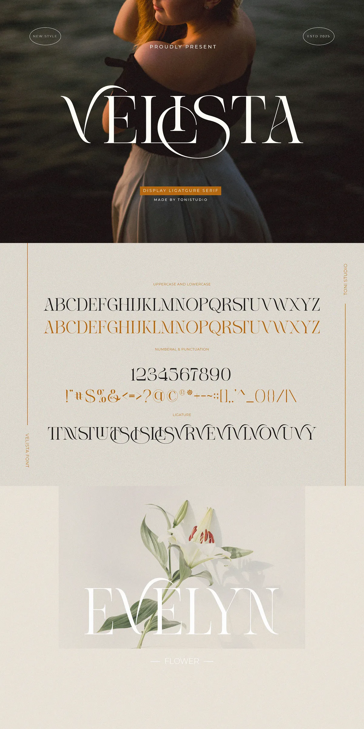
Distinctive Letterforms And Refined Details
Every character in VELISTA shows careful shaping: tapered serifs, subtle terminals, and elongated stems create a consistent rhythm across headlines and logos. The thin yet striking construction gives the family a couture-like silhouette that suits fashion, beauty, hospitality, and editorial projects.
Elegant Ligatures And Alternate Characters
VELISTA includes a curated set of ligatures and alternates that let you introduce bespoke typographic accents without manual editing. Toggle stylistic alternates to add understated flourish to logotypes, invitations, or signature marks and craft one-of-a-kind wordmarks quickly and confidently.
Technical Compatibility And Format Support
VELISTA ships in standard, widely supported formats so you can deploy it across print, web, and app projects. Deliverables include OTF and TTF for desktop workflows, and WOFF/WOFF2 for optimized web use. The font integrates smoothly with professional design applications and most content management systems that support webfonts.
📦 What You Get With VELISTA
- VELISTA in OTF format
- VELISTA in TTF format
- VELISTA in WOFF format
- VELISTA in WOFF2 format
- Access to stylistic alternates, ligatures, and standard OpenType features
💡 Recommended Uses And Practical Applications
Designers will find VELISTA actively improves the perceived value of a product or brand. Apply it to:
- High-end branding and logotypes where refined letterforms distinguish your identity
- Fashion and beauty editorials that require graceful headlines and elegant mastheads
- Invitations, stationery, and wedding suites that benefit from sophisticated typographic detail
- Packaging and labels where a delicate serif communicates craftsmanship and luxury
- Web hero banners and promotional imagery that need a polished, editorial tone
Design Examples And Implementation Tips
Create bold, recognizable logotypes by pairing uppercase alternates with refined lowercase forms. Use generous tracking and larger sizes to let the thin strokes breathe on printed materials. For web use, load WOFF2 for best performance and include a fallback system font that preserves contrast when webfonts are delayed.
🔧 Installation, Licensing, And Compatibility Notes
Install desktop fonts via your OS font manager or design application. Confirm license terms for commercial use, web embedding, and product or merchandise reproduction before distribution. VELISTA performs well in Adobe Illustrator, Photoshop, InDesign, Affinity apps, and modern web environments that support @font-face embedding.
Pairing Strategies And Visual Direction
Pair VELISTA with a neutral sans-serif for body copy to maintain readability while highlighting the serif’s elegance in headings. Select minimal color palettes—black, warm neutrals, and muted metallics—to emphasize the typeface’s refined character. Keep supporting graphics simple: the type should remain the focal point.
✅ Final Recommendations And Designer Workflow
Adopt VELISTA when you want typography to elevate brand perception. Favor large display settings to showcase alternates and ligatures, and use stylistic sets sparingly to preserve legibility. For packaging or print collateral, test ink coverage and paper texture to ensure the thin strokes reproduce cleanly. With careful pairing and considered sizing, VELISTA brings an aura of prestige and measured luxury to every project.