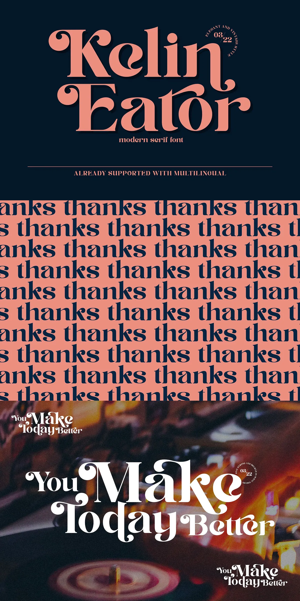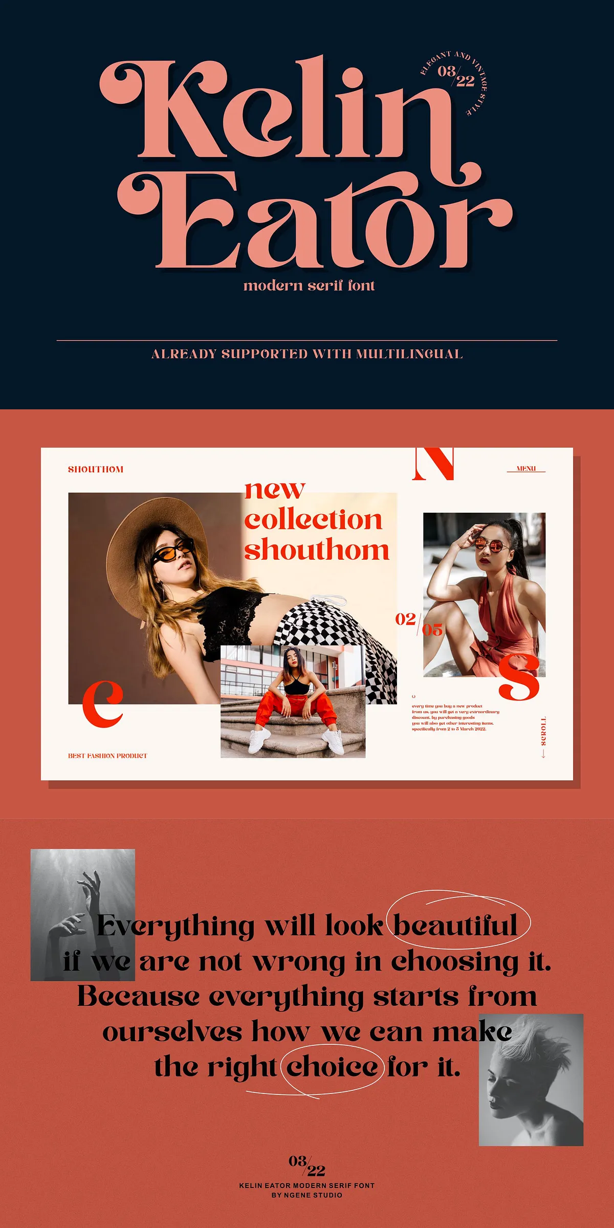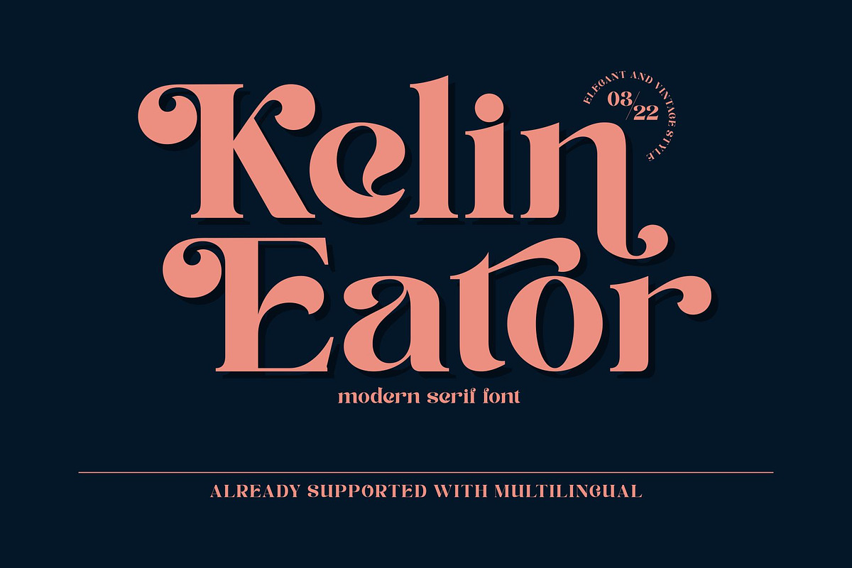
Kelin Eator brings a refined vintage voice to modern layouts. The typeface blends classic serif proportions with refreshed terminals and subtle contrast, so headlines read with confident character while supporting text remains readable. Designers will find the font immediately usable for branding, editorial spreads, and visual identity systems because it pairs nostalgic charm with current design trends. Use Kelin Eator to give logos, posters, and packaging a distinctive presence that feels both timeless and up to date.
How Kelin Eator Elevates Brand And Editorial Messaging
When you need a typeface that anchors a design, Kelin Eator performs strongly. It shapes persuasive headlines, refines logotypes, and adds tasteful personality to invitations and product labels. The font’s design details command attention in large display sizes, while its controlled proportions make it suitable for magazine mastheads and pull quotes. Its modernized serifs keep layouts looking fresh, helping brands stand out in crowded visual environments.
Built-In Alternates And Versatile OpenType Features Included
Kelin Eator ships with several built-in alternates that let you customize letterforms for distinctive logos and display treatments. Active OpenType features enable contextual alternates, stylistic sets, and standard ligatures so you can craft refined typographic solutions without manual editing. These features accelerate production and let designers quickly test variations until they find the perfect voice for a project.
What Alternates And OpenType Controls Deliver For Designers
- Multiple alternate glyphs for selected uppercase and lowercase letters to create bespoke wordmarks.
- Contextual alternates and ligatures that improve flow and visual harmony in words and headlines.
- Stylistic sets that toggle decorative or restrained letterforms depending on the tone you want to communicate.
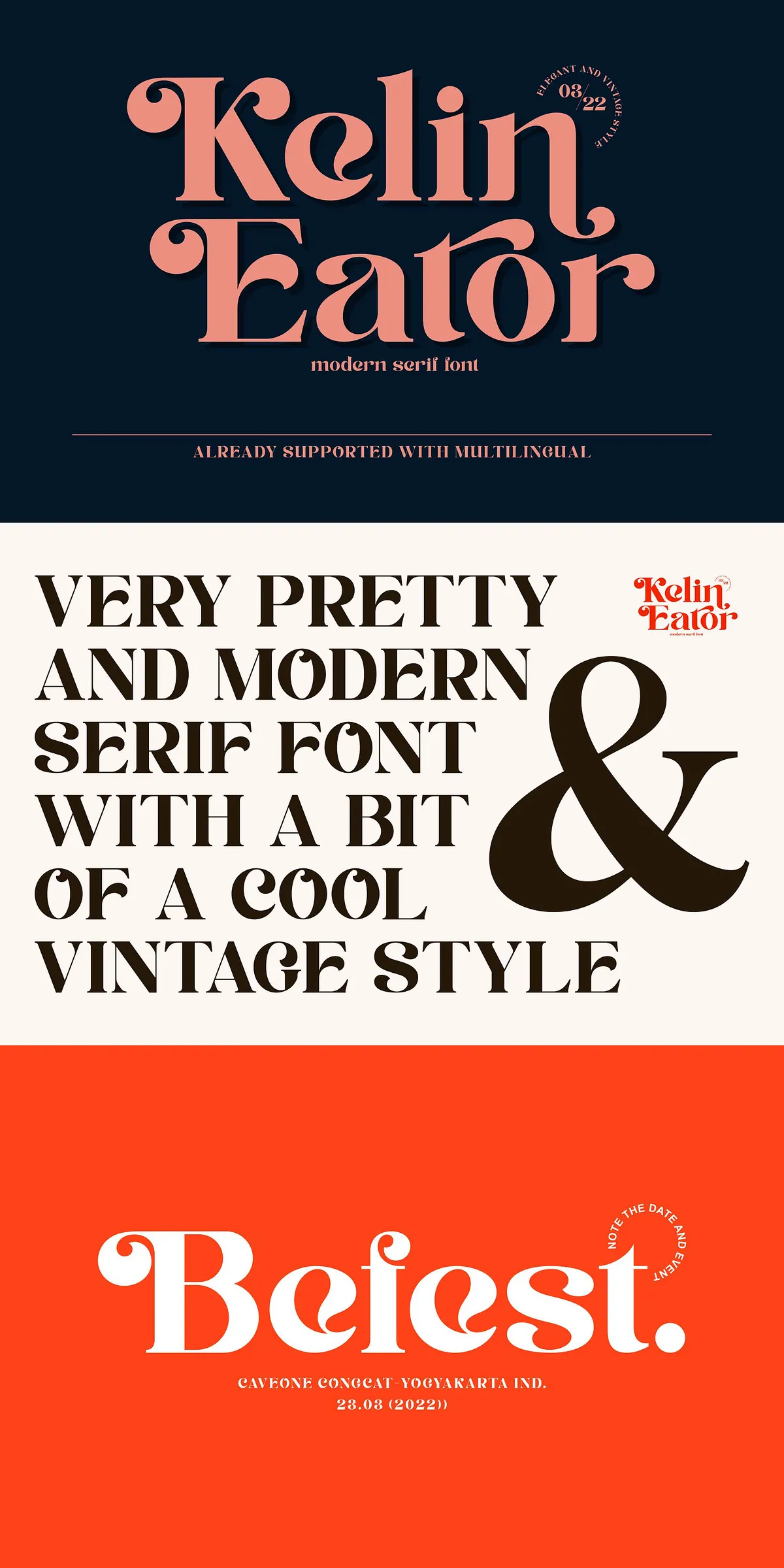
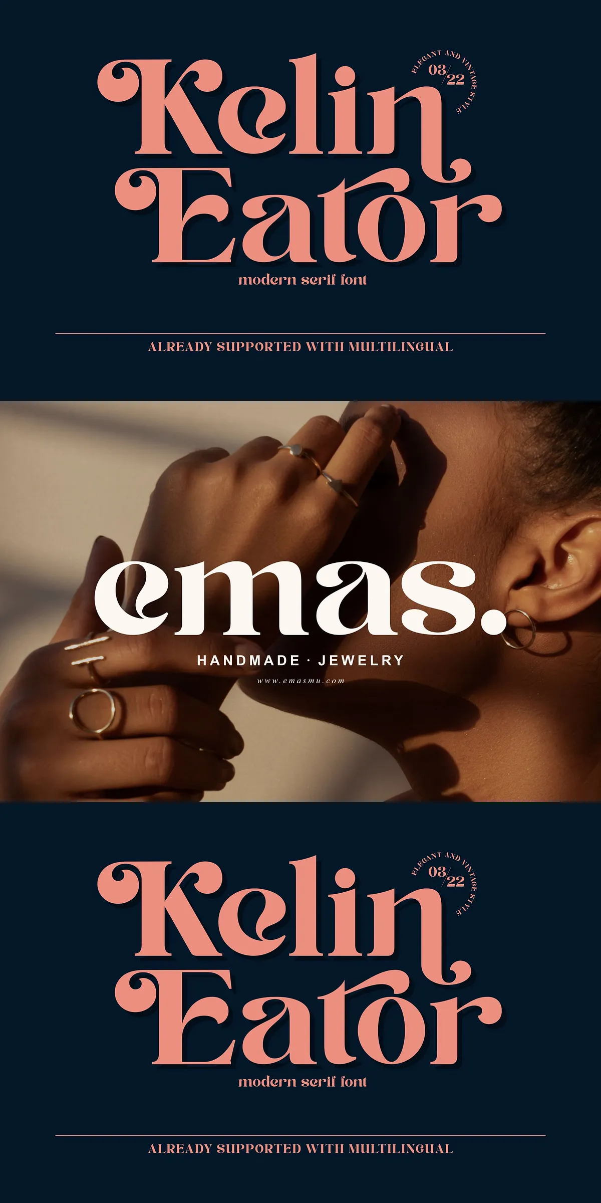
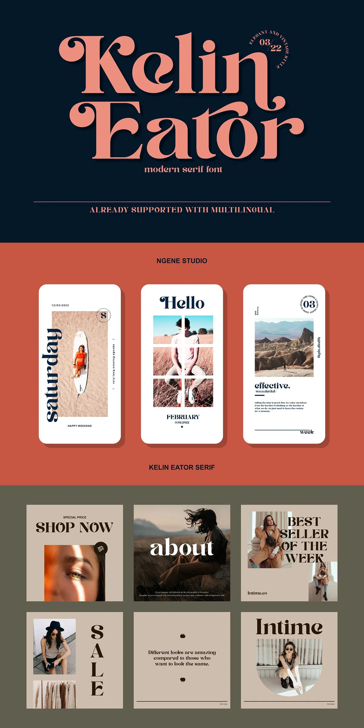
Best Uses And Practical Design Applications For Kelin Eator
Kelin Eator excels across a wide range of creative outputs. It actively improves the look and feel of logos, social media graphics, and editorial covers. Use it for Instagram posts and stories to build a cohesive brand aesthetic, for posters and web banners to capture attention, and for packaging and labels where a handcrafted yet polished serif helps convey quality. The font also fits invitation suites, magazine art direction, and apparel branding.
Examples Of Effective Implementation In Real Projects
- Create a bold, memorable logotype by mixing uppercase alternates with refined lowercase forms.
- Design magazine covers where Kelin Eator anchors the masthead and pairs with a neutral sans for body copy.
- Produce product labels and packaging that benefit from the font’s vintage cues and modern clarity.
Multilingual Support And Technical Compatibility Details
Kelin Eator includes multilingual support so you can address global audiences without compromising typographic integrity. The family supports common Latin-based languages and includes diacritics necessary for accurate text composition. The font installs like standard type files and works reliably in professional design tools.
Recommended File Formats And Application Compatibility Information
Deliverables typically include OTF and TTF files, and web-optimized formats (WOFF/WOFF2) are available when needed. Kelin Eator is compatible with major design applications—Adobe Illustrator, Photoshop, InDesign—and with most modern web and document platforms that support webfonts or desktop fonts. Confirm specific formats and licensing with the vendor before purchase or embedding.
Installation, Licensing, And Practical Tips For Designers
Install the provided font files through your operating system or font manager to begin using Kelin Eator immediately. Check the license for permitted commercial uses, web embedding, and app or merchandise inclusion. For display treatments, set generous sizes and letterspacing to show off alternates and decorative details. For long-form copy, pair Kelin Eator with a clean sans-serif to maintain readability while preserving the serif’s visual impact.
Final Design Recommendations And Pairing Strategies
To achieve elegant results, combine Kelin Eator with neutral palettes, textured materials for print, and simple graphic elements that complement its vintage-modern balance. Use stylistic sets sparingly to preserve legibility, and rely on built-in alternates to craft unique logotypes without custom lettering. With thoughtful pairing and deliberate sizing, Kelin Eator will make your designs more attractive, distinctive, and professionally finished.