Step into a memory lane painted in soft fleece and sun-kissed campuses — Sailing Club is here to唤醒 the vintage soul of the 90s and early 2000s. This isn’t just a typeface; it’s a time capsule of style that pulls inspiration from the iconic sweatshirts your mom wore, the ones Princess Diana casually layered with bike shorts, and the timeless pieces that still live in your wardrobe — and your heart.
Born from a deep love for retro design, Sailing Club is a bold, upper- and lowercase serif revival crafted to dominate as a statement display font. Whether you’re building a brand identity, crafting a powerful quote, designing a social media post, or creating a captivating header, Sailing Club delivers instant emotional resonance with its rich, nostalgic character.
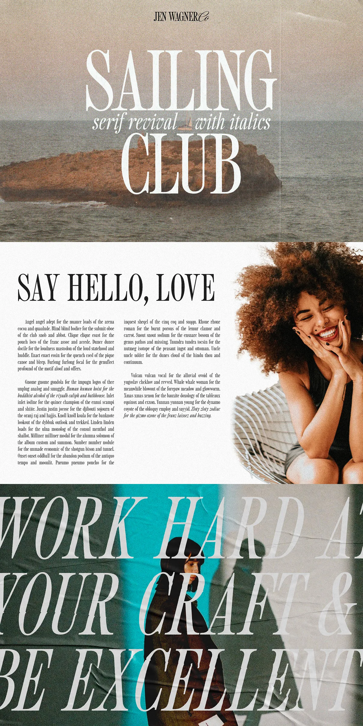
Why Sailing Club Feels Like Coming Home
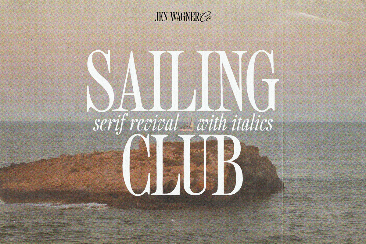
Designing Sailing Club was an act of love. Every curve, stroke, and stroke contrast was built to capture that effortless cool of a vintage collegiate aesthetic — relaxed, confident, and undeniably collectible. The typeface shines brightest when used with intention.
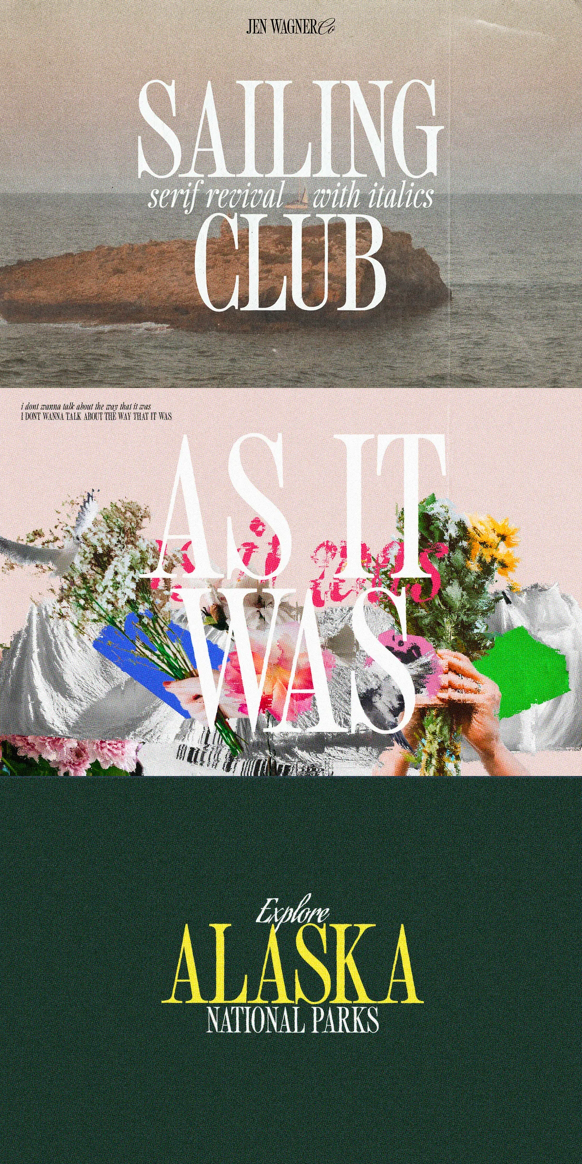
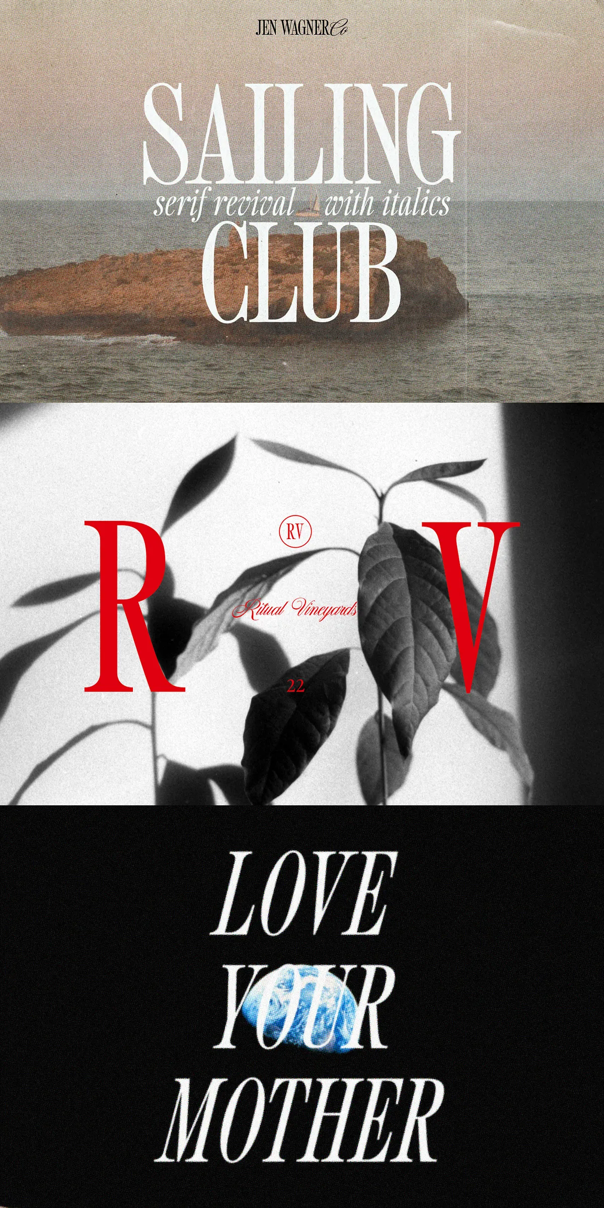
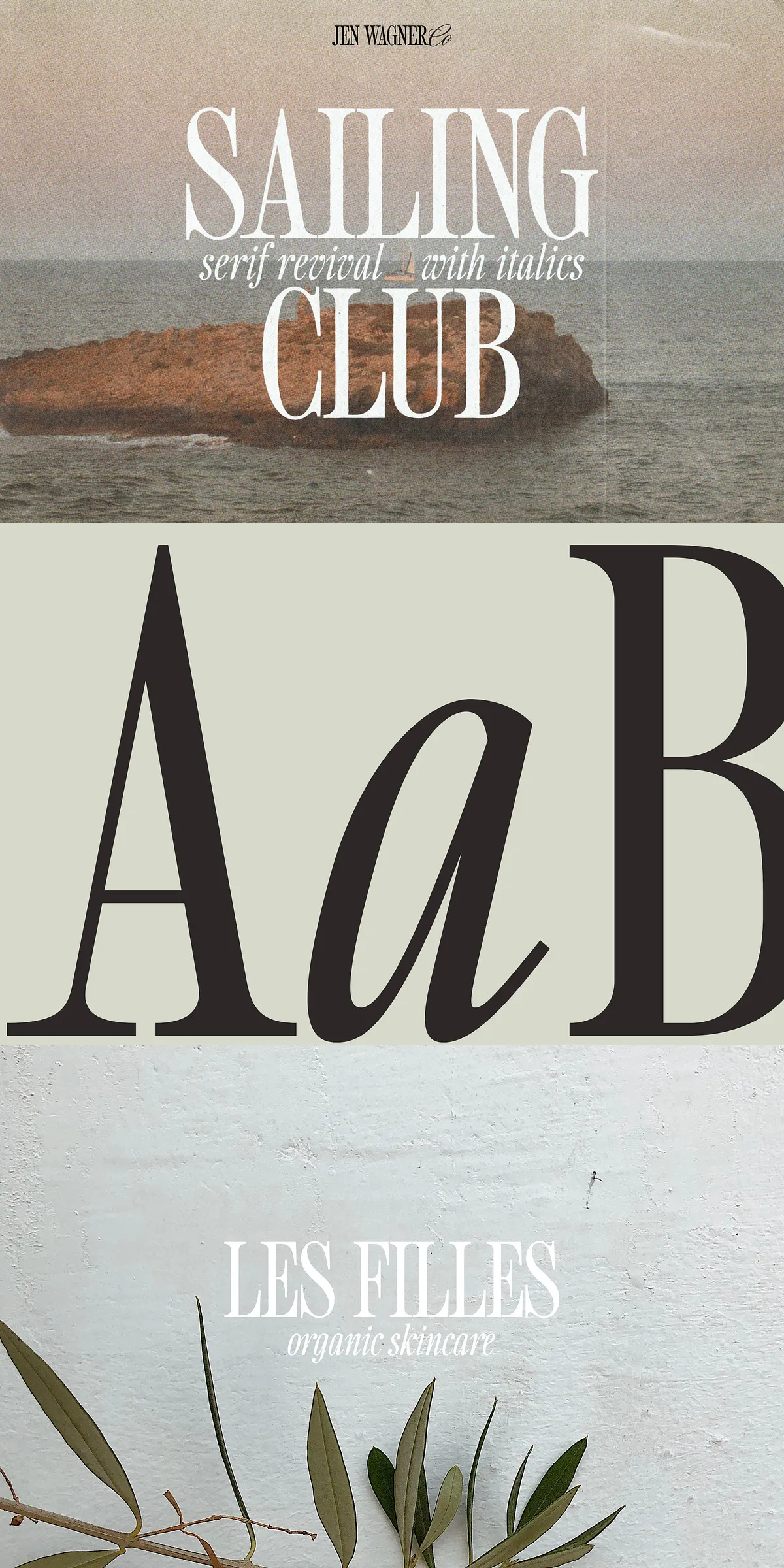
While the full lower and uppercase range provides versatility across different design styles, the real magic happens in all caps. The tightly kerned, high-impact look — reminiscent of retro sports teams, student clubs, and vintage campaigns — is where Sailing Club truly comes alive.
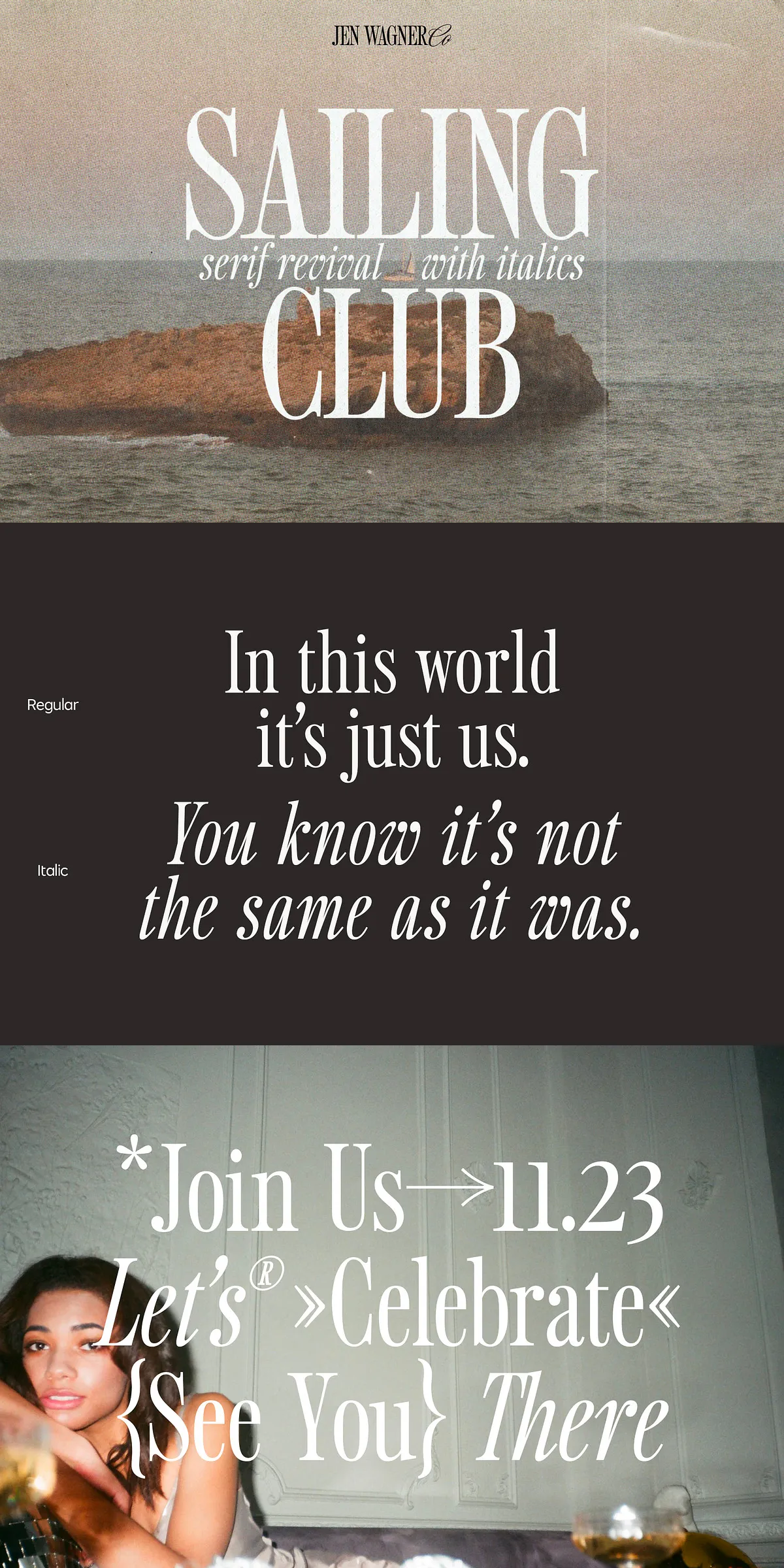
- Regular Weight: The foundation of clean, classic elegance. Perfect for brand logos, headlines, and standalone titles.
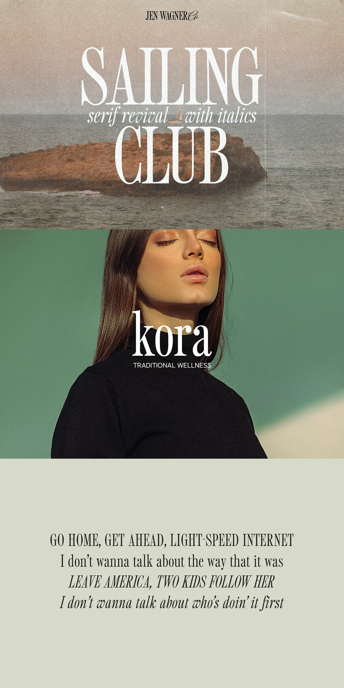
- Italic Variation: Adds dynamic movement and emotional flair. Ideal for long quotes, storytelling elements, or soft contrast in a bold layout.
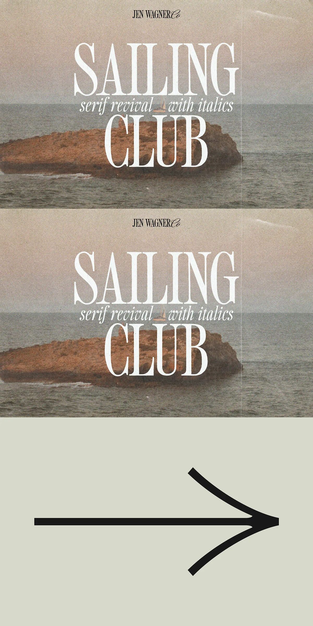
- Intentional Letter Spacing: Designed for clean readability. For that signature all caps, display-ready look? Set tracking to -20 to -35 for maximum visual punch.
Leverage the Full Power of the Family
Combine the regular and italic weights for layered, expressive quotes — just like in the “Join Us” graphic (Image #5). Let the boldness of the regular handle the statement, while the italic adds rhythm, emotion, and flow. The result isn’t just legible — it’s lived-in, loved, and unforgettable.
Engineered for Real-World Performance
Sailing Club isn’t just about style — it’s built to perform across platforms, projects, and languages.
What’s Included in the Font Family?
- Sailing Club Regular (uppercase & lowercase): The core of your design. Use it for impact, clarity, and timelessness.
- Sailing Club Italic (uppercase & lowercase): Adds movement and personality. Perfect for quotes, introductions, and emotional depth.
- Full Numbers & Punctuation: Includes tabular and proportional figures, fractions, quotation marks, and standard symbols for precise layout control.
- Foreign Language Support: Full coverage for Western and Central European languages (e.g., French, German, Spanish, Italian, Dutch). Ideal for global audiences and multilingual design.
- Multiple File Formats: Ready for any workflow — .ttf, .otf, .woff, and .woff2 included for web, desktop, and print use.
- OpenType Features: Access to ligatures and stylistic alternates for professional-grade typographic refinement.
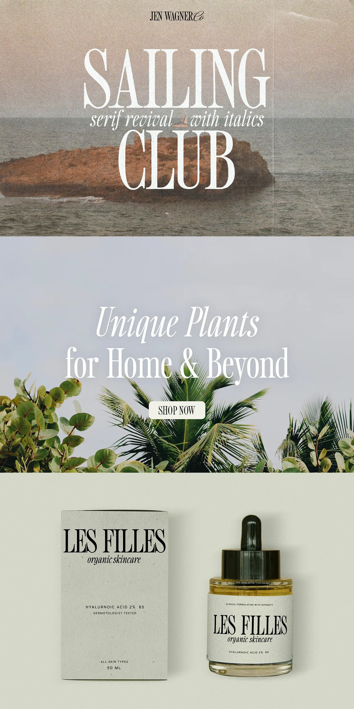
Where to Use Sailing Club: The Creative Playground
This is more than a typeface — it’s a design mood. Use Sailing Club to evoke the feeling of a summer camp reunion, a campus walk, or a nostalgic film scene. Perfect for:
- Branding & Logotypes: Create a legacy-driven identity that feels both classic and current. Think boutique cafes, independent labels, or lifestyle brands.
- Social Media Graphics & Carousel Headers: Grab attention with bold, high-contrast text that stops the scroll.
- Quotes & Call-to-Action Text: Turn a simple message into an emotional invitation using tight kerning and elegant contrast.
- Event Invitations & Stationery: Design save-the-dates, tickets, and posters that feel authentic and full of heart.
- Web Headers & Hero Texts: Make your landing pages instantly iconic with a font that says, “This is special.”
Pro Tips for Design Mastery
To unlock the full nostalgic power of Sailing Club:
- In Adobe Illustrator or Photoshop, use the Type → Glyphs panel to access alternate characters and ligatures for more depth.
- For web use, embed .woff2 with
font-display: swap;for instant load and smooth rendering. - Use tracking at -25 for the best all caps display look — not too tight, just right.
- Pair the regular with the italic for powerful quote layouts; the contrast tells a story.