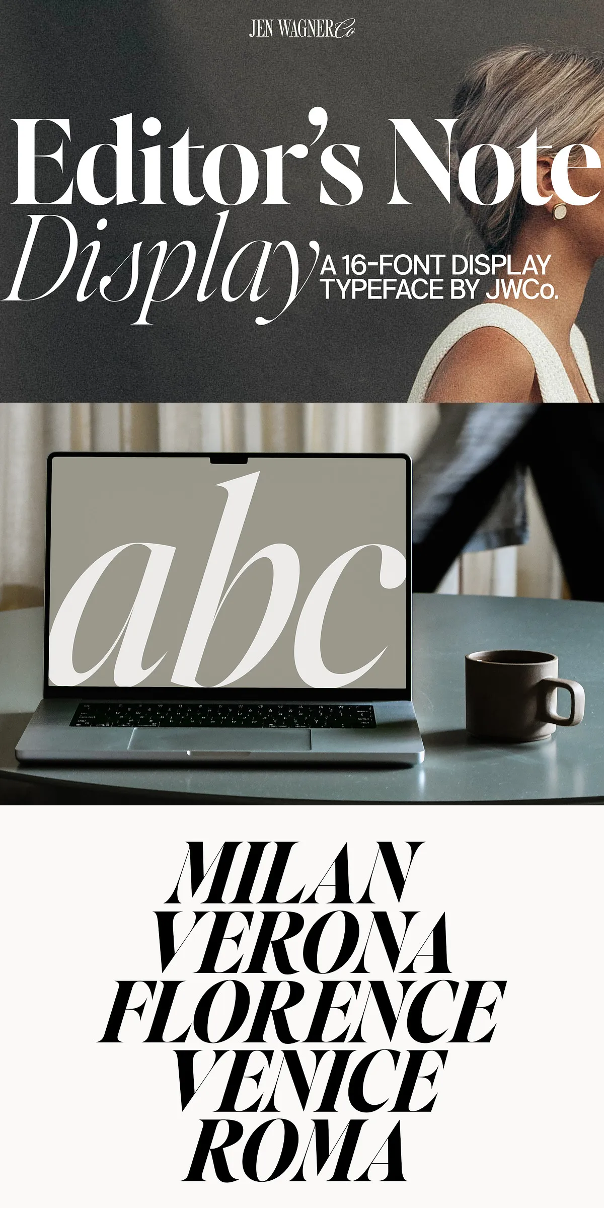
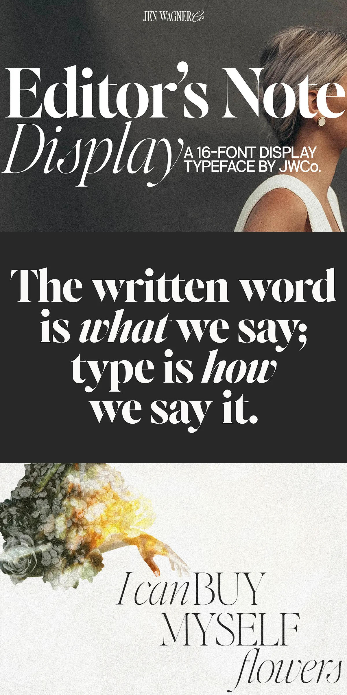
When silence speaks volumes and every line carries weight, Editor’s Note Display steps forward — not to blend in, but to take control. Designed as the bold, high-contrast counterpart to its elegant sibling Editor’s Note, this display typeface turns typography into an experience: sharp, fearless, and built to dominate the visual landscape.
Engineered for Impact at Any Scale
Editor’s Note Display thrives when it’s big — really big. With razor-sharp points, super-thin lines, and extreme stroke contrast, it’s crafted to retain its integrity and edge even at massive sizes. You can stretch it to 150px, 300px, or 500px — and it won’t blur, soften, or lose its soul. This isn’t a font that scales down gracefully; it’s one that evolves upward.
Forget subtlety. Editor’s Note Display wants to be seen.
Why This Typeface Demands to Be Front and Center
- Precise Geometric Refinement: Every curve has been obsessively tested and adjusted. No wobbles. No inconsistencies. Just flawless execution.
- High-Contrast Aesthetic: Sharp serifs meet hairline strokes for a look that’s modern, dramatic, and instantly recognizable.
- Web & Print Ready: Fully compatible with modern CSS, web-safe formats (WOFF2 included), and high-resolution print output.
- Responsive Flexibility: Works stunningly across digital platforms — from mobile web headers to full-screen video intros.
Perfect for the Projects That Need to Shout
Editor’s Note Display was not designed for small text. It was made for moments that matter. Use it where attention is the currency.
- Website Headers & Hero Sections: Command the scroll with headers that instantly capture focus and set the tone.
- Social Media Carousels & Reel Covers: Make your content stand out in a crowded feed with headlines that demand a tap.
- Event Promotions & Launch Campaigns: Convey urgency and sophistication in one bold stroke.
- Book Covers & Magazine Titles: Elevate editorial design with typographic power that matches the content’s depth.
- Product Launch Tags & Taglines: Add a premium feel to branding with high-contrast, eye-grabbing text.
Advanced Features Built for Professionals
Editor’s Note Display is more than just visuals. It’s a toolkit for creators who value control, precision, and depth.
What’s in the Box?
- 8 Weights: Regular, Medium, Semibold, Bold, Extrabold, and their corresponding italic variants — giving you full control over tone and emphasis.
- Numbers & Punctuation: Includes tabular and proportional figures, fractions, ordinals, and decorative punctuation.
- Comprehensive Language Support: Full Western and Central European language coverage including French, German, Spanish, Italian, Dutch, and Scandinavian languages.
- OpenType Features: Access to stylistic alternates, ligatures, and contextual forms for advanced typographic control.
- Multiple Formats: Available in .ttf, .otf, .woff, and .woff2 — ensuring compatibility across platforms and design tools like Adobe Illustrator, InDesign, Photoshop, Figma, and Sketch.
Pro Tip: Maximize Impact in Design Software
To unlock the full expressive range of Editor’s Note Display, use it in Adobe Illustrator or Adobe InDesign. Go to Type → Glyphs to access specialty characters, ligatures, and stylistic alternates. For web applications, use the WOFF2 file with CSS font-display: swap; to ensure fast, seamless rendering.
Final Call: Step Into the Spotlight
Design isn’t about filling space. It’s about owning it. With Editor’s Note Display, you don’t just fill the space — you redefine it.
Whether you’re launching a brand, creating a campaign, or crafting a piece of editorial art, let this font be your voice — bold, unapologetic, and unforgettable.
Download Editor’s Note Display today and turn every moment into a standout statement.