TC Jimmy Pro Sans answers a common designer challenge: preserving a handcrafted, handwritten voice in tight, small-scale environments. Built as a complementary sans-serif for handmade font collections, this typeface maintains warmth and personality while remaining highly legible at sizes where most handwritten fonts fail. The Pro release enhances usability by introducing lowercase glyphs and extended multilingual support, so you can confidently use the family across global projects and varied placements.
Why TC Jimmy Pro Sans Excels In Compact Typographic Use
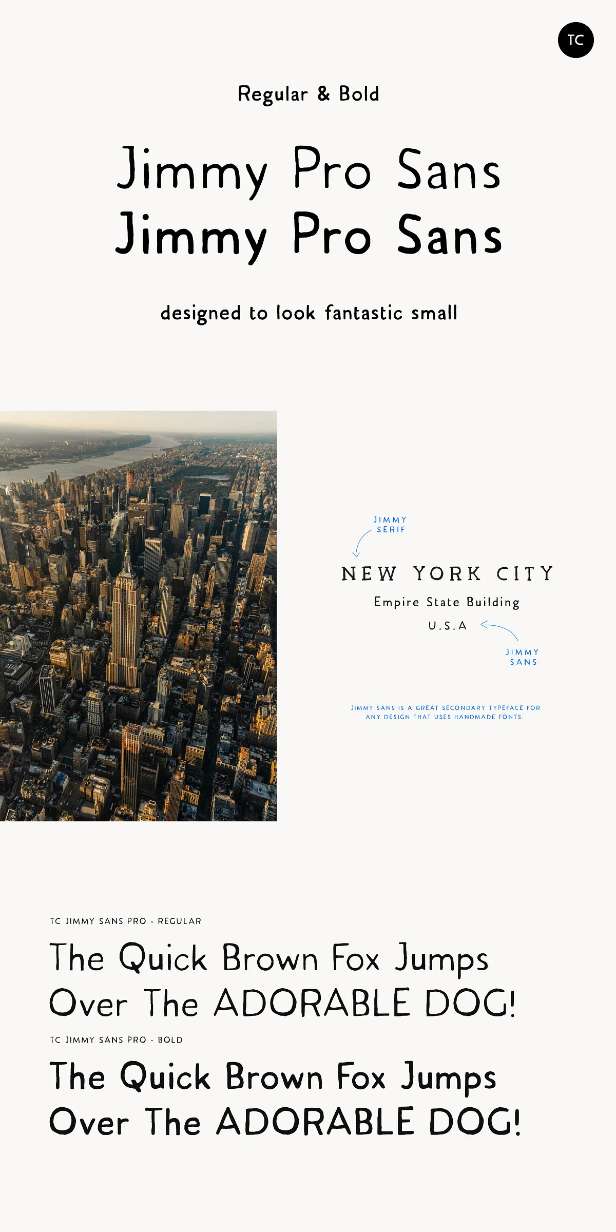
Retention Of Handcrafted Character At Small Sizes
Many handwritten fonts lose their charm or collapse into illegibility when reduced. TC Jimmy Pro Sans intentionally balances organic stroke endings and open counters with restrained proportions and carefully tuned spacing. The result: letterforms that preserve the authentic, hand-drawn expression while staying readable in captions, presentation mockups, and product labels.
Designed Out Of Practical Necessity For Designers
The designer behind Jimmy Sans created this sans specifically to solve a recurring problem in composition and promotional imagery. When working with handcrafted headline fonts, designers often need a neutral, yet human companion typeface for smaller UI text or explanatory copy. TC Jimmy Pro Sans fills that role by providing a friendly sans that harmonizes with textured or decorative display faces without competing visually.
What The PRO Release Adds And Why It Matters
Lowercase Glyphs Expand Typographic Flexibility
Previously a single-case display tool, the PRO update delivers fully designed lowercase letters that broaden the font’s practical roles. With lowercase support you can use TC Jimmy Pro Sans for short paragraphs, captions, and body-level UI components while preserving the brand’s handmade aesthetic across all text hierarchies.
Extended Multilingual Support For Broader Reach
The PRO release introduces extra multilingual glyphs so you can deploy the font in international work without sacrificing tone or legibility. Adding accented characters and language alternates makes TC Jimmy Pro Sans viable for packaging, editorial products, and online stores that target multiple language markets.
Practical Uses And Pairing Recommendations
Ideal Applications For TC Jimmy Pro Sans
Use TC Jimmy Pro Sans as a supporting sans in branding lockups, product mockups, social media templates, and presentation slides. It works especially well as UI labels, callouts, and short paragraph copy where you want a human touch without clutter. Because it reads clearly at small sizes, it proves useful in footers, captions, and on-screen annotations.
Pairing Strategies To Amplify Your Design
Pair the font with a strong handmade display for headline energy, then deploy TC Jimmy Pro Sans for captions and body-level microcopy to maintain visual cohesion. It also pairs effectively with neutral geometric sans-serifs to create contrast while keeping the overall design approachable. For editorial layouts, combine it with a refined serif to balance warmth with structure.
Implementation Tips And Workflow Advice
Spacing, Tracking, And Readability Tweaks
To maximize clarity at small sizes, slightly increase tracking and line-height compared with your headline settings. Test at the smallest intended display size and adjust letter-spacing to avoid crowded counters. For digital projects, preview on the target device to confirm rendering and legibility under typical display conditions.
Using The PRO Features Across Tools
Explore alternates and lowercase forms in your design software to create natural variation and improve rhythm. If you work in presentation apps or online design tools, map the lowercase and diacritic glyphs into your templates so teams can apply consistent typography without manual adjustments.