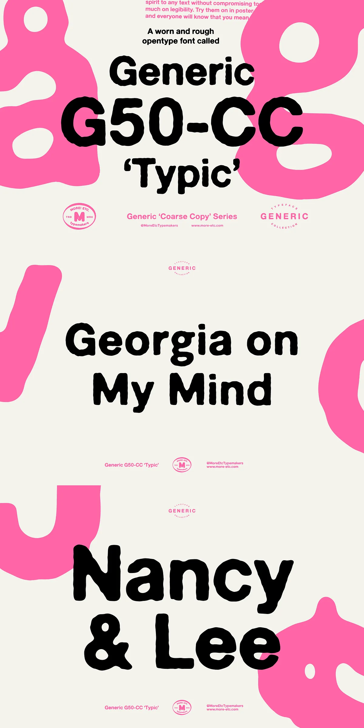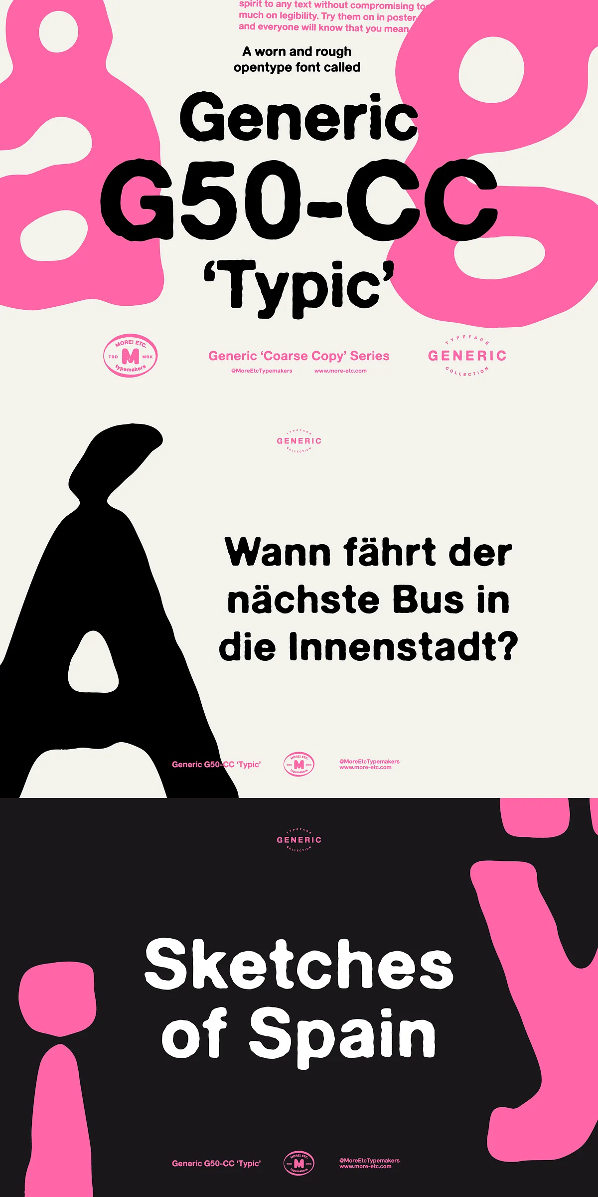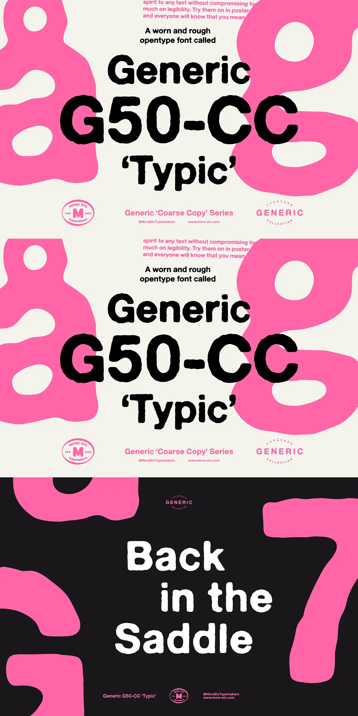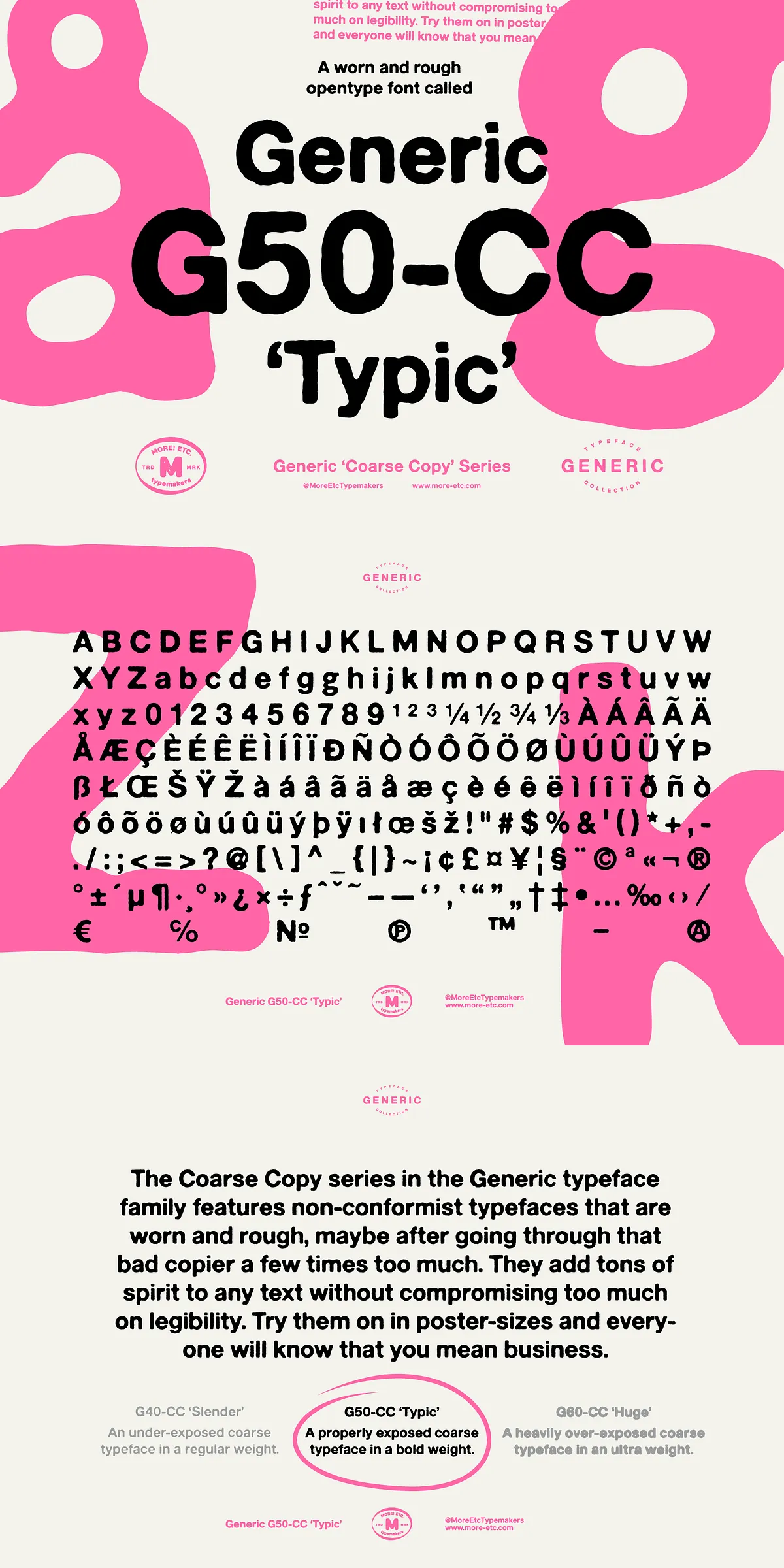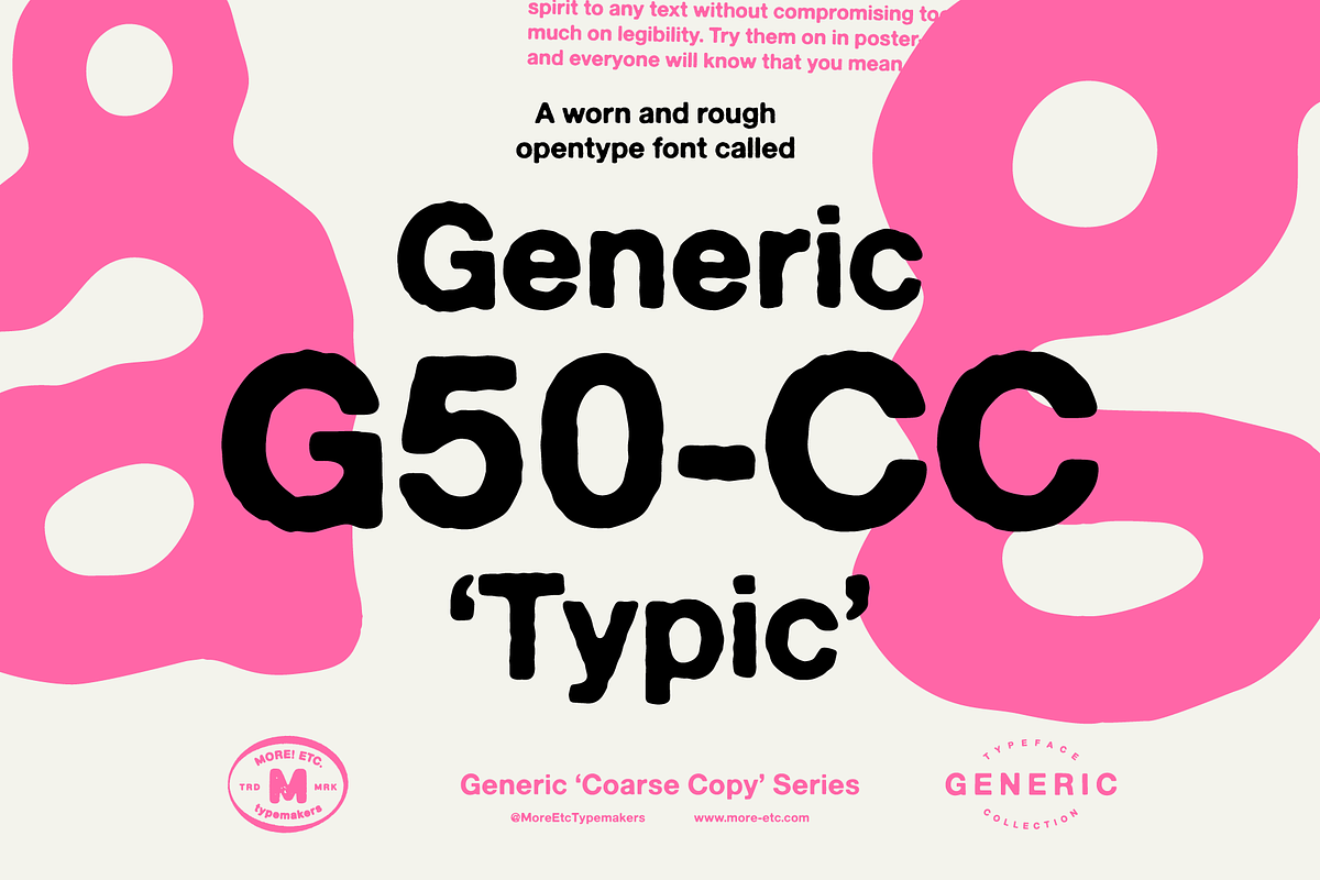

Say hello to Generic G50-CC “Typic,” a bold, coarse display typeface built to deliver attitude and clarity in equal measure. Typic’s rough, photocopied texture and worn edges give it distinct personality while preserving the legibility that designers rely on at display sizes. Whether you need an arresting poster headline, a gritty editorial masthead, or a brand identity that feels human and tactile, Typic brings spirit and presence to every layout. This description outlines Typic’s features, practical applications, technical details, and tips for using the font effectively across print, web, and branding work.
Why Typic Commands Visual Attention With Confidence
Typic emphasizes raw personality. The intentionally rough, imperfect strokes suggest a typeface that’s been handled and repurposed—like a voice that has been around the block and still speaks loud and clear. This worn aesthetic reads as authentic and energetic, immediately signaling that the design has a story to tell. The typeface’s bold weight and sturdy letterforms ensure strong readability in large formats while the coarse texture keeps designs visually interesting and tactile.
Core Qualities That Define Typic’s Characterful Appeal
- Worn and rough texture that conveys handmade authenticity.
- Tons of personality and a warm human appeal.
- Primarily a display font but usable in longer text settings where character is desired.
- Comprehensive character set: 228 glyphs for broad typographic flexibility.
- Includes one alternate character for subtle variation and typographic refinement.
- Provided in OTF (OpenType) for desktop use and WOFF for web embedding.
Design Applications Where Typic Excels And Delivers Impact
Typic works anywhere you want bold messaging with a handcrafted edge. Use it to:
- Create posters and event signage that need to cut through visual noise.
- Design editorial covers and feature spreads that benefit from a raw, human tone.
- Craft brand identities that emphasize authenticity, grit, and personality.
- Produce packaging and labels that require instant shelf presence and character.
- Build social graphics and hero images where bold lettering stops the scroll.
Practical Tips For Effective Use In Layouts
Apply Typic at display sizes to maximize its impact; large point sizes reveal the worn texture and strengthen legibility. Pair Typic with clean, neutral body fonts—such as a geometric sans or a minimal serif—to retain hierarchy and prevent visual competition. For headlines, use tight tracking and controlled kerning to bolster typographic rhythm; for full-bleed imagery, place Typic against solid or gently blurred backgrounds so its textured edges remain distinct.
Technical Details And Cross-Platform Compatibility Advice
Typic ships as an OpenType (.otf) file for desktop workflows and a WOFF file for web deployment. OTF ensures broad compatibility with professional design software (Adobe Illustrator, Photoshop, InDesign, Affinity, Figma, Sketch), while WOFF provides compressed, web-friendly performance. When embedding Typic on websites, include the WOFF file via @font-face and use font-display: swap to maintain perceived performance. If you need tighter file sizes, subset glyphs to only the languages and characters you require.
Alternates, Glyph Coverage, And Workflow Suggestions
Typic includes one alternate character to help break visual repetition—use it selectively in logos and headlines for subtle differentiation. Access alternates and advanced OpenType features via your application’s glyphs panel or OpenType menu. For outputs where font embedding is impractical (some printers, legacy systems), convert headlines to outlines to preserve appearance. Always proof fonts at final output sizes to check texture and edge clarity, especially for halftone or screen-printed production.