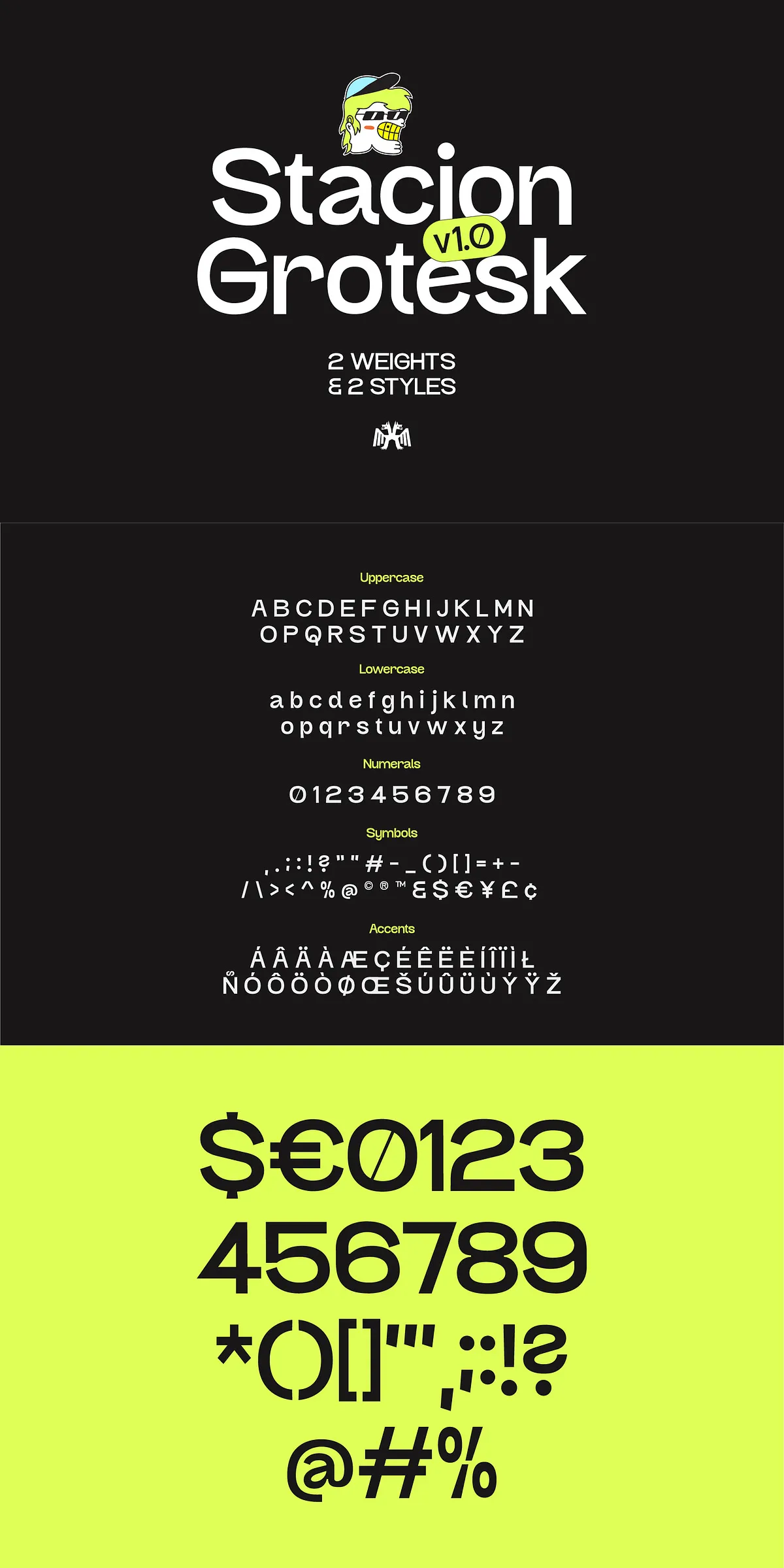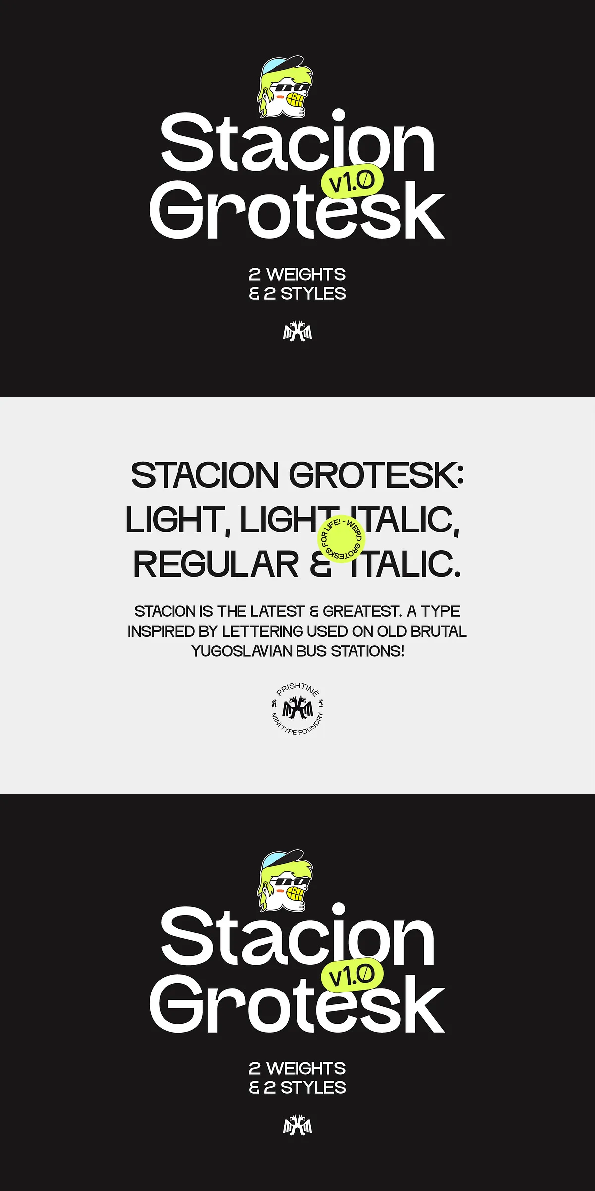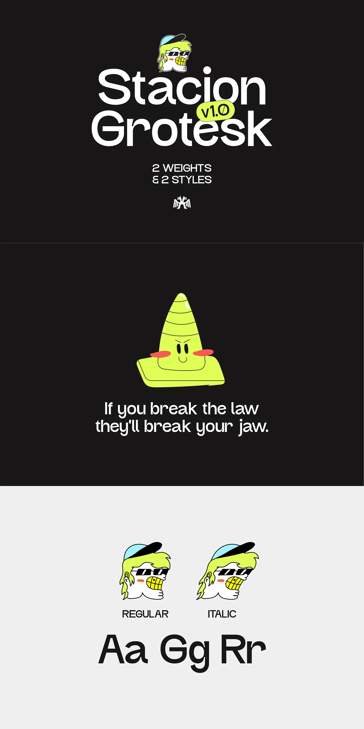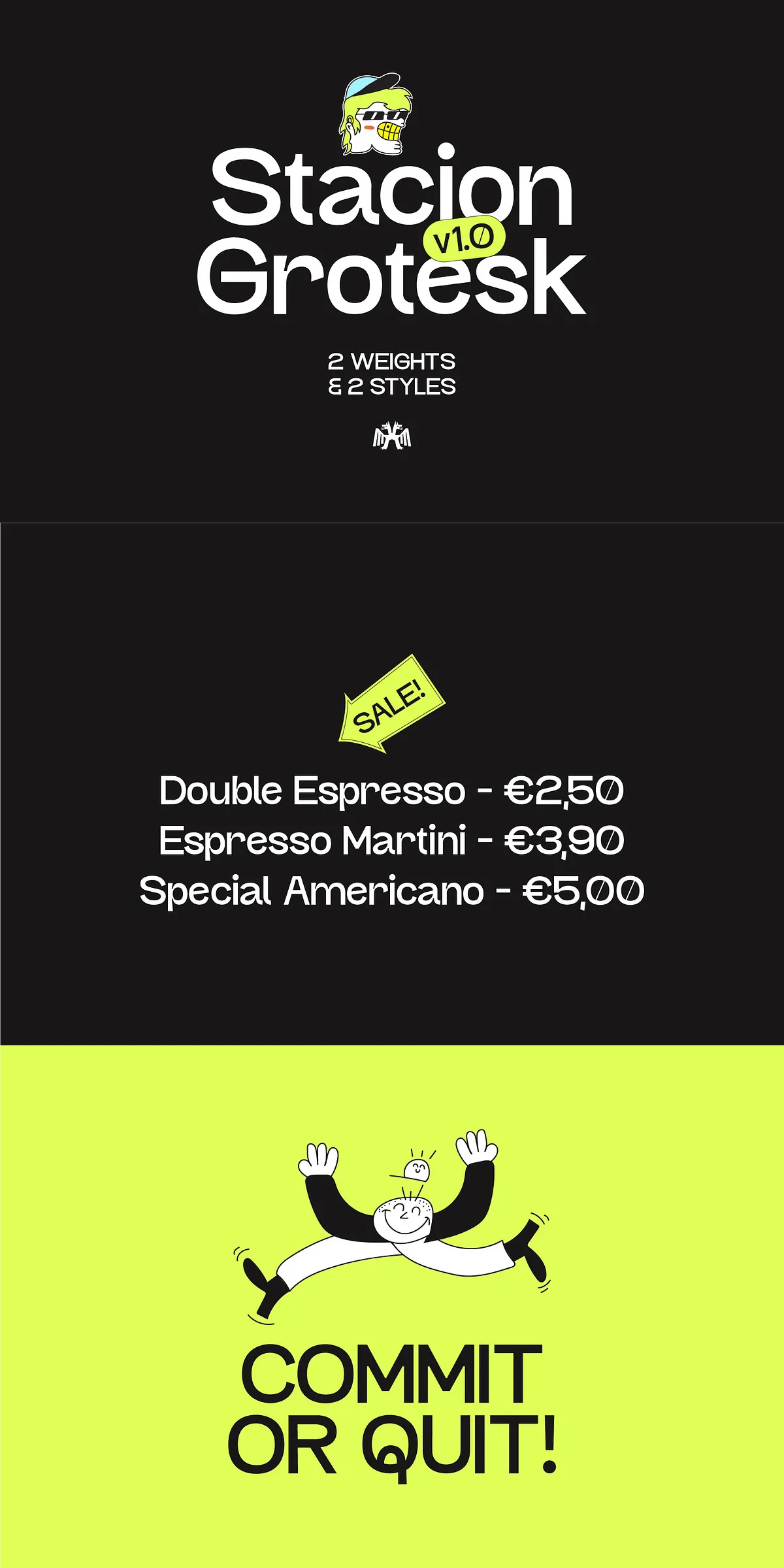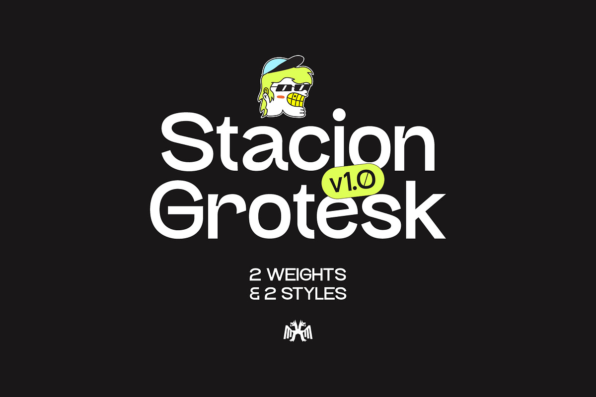

Stacion Grotesk delivers a fresh, eccentric voice for designers who want to push boundaries. Inspired by Yugoslav-era brutalist bus stations, this typeface fuses structural boldness with playful, unexpected details. Each glyph carries a little character: slightly exaggerated terminals, subtle quirks, and a visual rhythm that reads as both contemporary and nostalgically industrial. Stacion Grotesk invites experimentation while remaining clear and effective across display and short copy settings.
Design Inspiration And Core Character That Commands Attention
Stacion Grotesk draws its personality from concrete architecture—strong lines, practical geometry, and the human marks that accumulate over time. The result is a grotesk that feels engineered yet alive. Designers will notice the font’s purposeful irregularities: whimsical counters, lively stroke endings, and a friendly tension between uniform proportions and playful detailing. These choices give layouts energy and distinctiveness without sacrificing readability at headline sizes.
Key Visual Traits And What They Mean
- Brutalist influence: sturdy stems and clear forms for bold visual presence.
- Playful glyphs: unique details that add personality to headlines and logos.
- Readable structure: balanced spacing and weight distribution for strong legibility.
- Versatile styles: available in Light, Regular, and Italic to support varied hierarchies.
Where Stacion Grotesk Excels In Real Projects
Put Stacion Grotesk to work wherever you need striking personality and confident tone. Use it to create posters that stop traffic, editorial headlines that demand a second look, and brand marks that feel unmistakable. The typeface also performs well on packaging, environmental signage, magazine covers, and digital hero headers. Its expressive details give brands an identifiable voice, while the structural skeleton supports clean, modern layouts.
Practical Applications Designers Will Love
- Brand identities that require a bold, memorable headline typeface.
- Editorial spreads and covers where character drives interest.
- Event posters and promotional materials that need visual impact.
- Packaging and labels seeking a tactile, human edge.
- Web hero banners and social graphics that aim to stand out in feeds.
Features, Formats, And Technical Details
Stacion Grotesk ships with the essentials designers expect and the expressive traits they crave. The family includes Light, Regular, and Italic styles to build typographic hierarchy across layouts. Glyph coverage supports core Latin character sets, and spacing performs reliably in major design apps. Deliverables typically include OTF files for desktop use and web-friendly formats available upon request or via the license package.
File Types And Workflow Tips
- OpenType (OTF) for robust desktop and print workflows.
- Use webfont formats (WOFF/WOFF2) for fast, reliable web deployment.
- Apply the Italic for emphasis and expressive subheads; use Light for subtle, modern captions and supporting text.
- Pair Stacion Grotesk with a neutral sans or a soft serif to balance its quirky personality.
Practical Usage Tips And Pairing Recommendations
To maximize Stacion Grotesk’s impact, set it large for headlines where its quirks read clearly. Tighten tracking slightly for headline use to strengthen rhythm; increase line-height for multi-line headers to preserve clarity. Pair the typeface with a clean, low-contrast body face—geometric sans or humanist serif works well—so the page retains hierarchy without visual conflict. For brand work, create logotypes with all-caps or mixed-case experiments to highlight the glyphs’ personality.
Accessibility And Legibility Best Practices
- Maintain strong contrast between text and background to preserve legibility.
- Use sufficient size for body copy if you choose Stacion Grotesk outside of headlines.
- Proof at final output sizes for print and screens to ensure texture and detail render correctly.