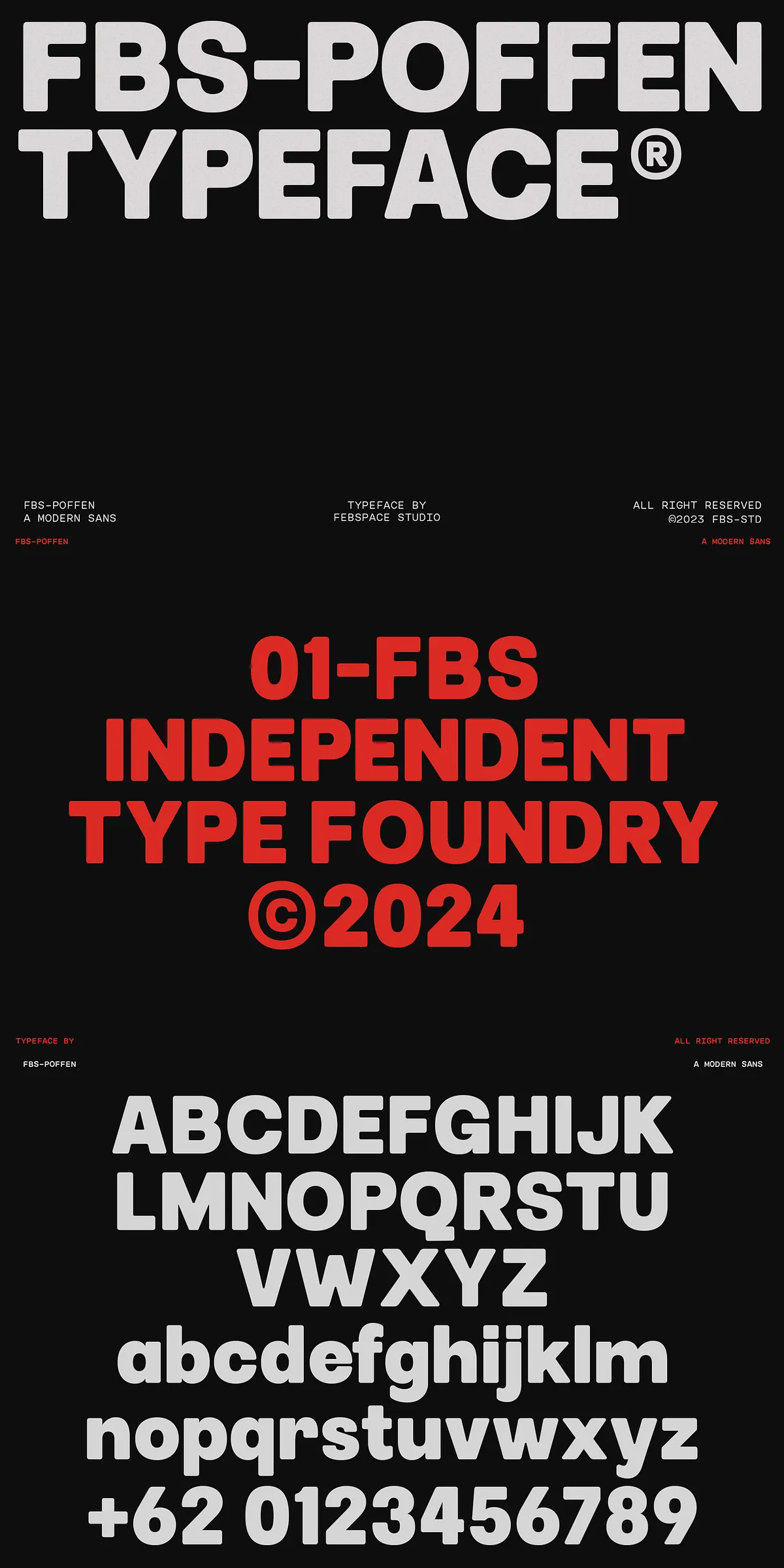
FBS Poffen delivers a practical, modern sans-serif system that empowers designers to refine visual language quickly and confidently. Built with four distinct styles and flexible corner treatments—rounded and pointed—plus a slanted variant, FBS Poffen adapts to diverse creative needs. The family balances clarity and personality: it reads cleanly at small sizes and commands presence at large scales, making it an excellent choice for branding, user interfaces, editorial layouts, packaging, and more.
Four Flexible Styles Designed To Meet Real Design Needs
Multiple Weights And Corner Options For Maximum Control
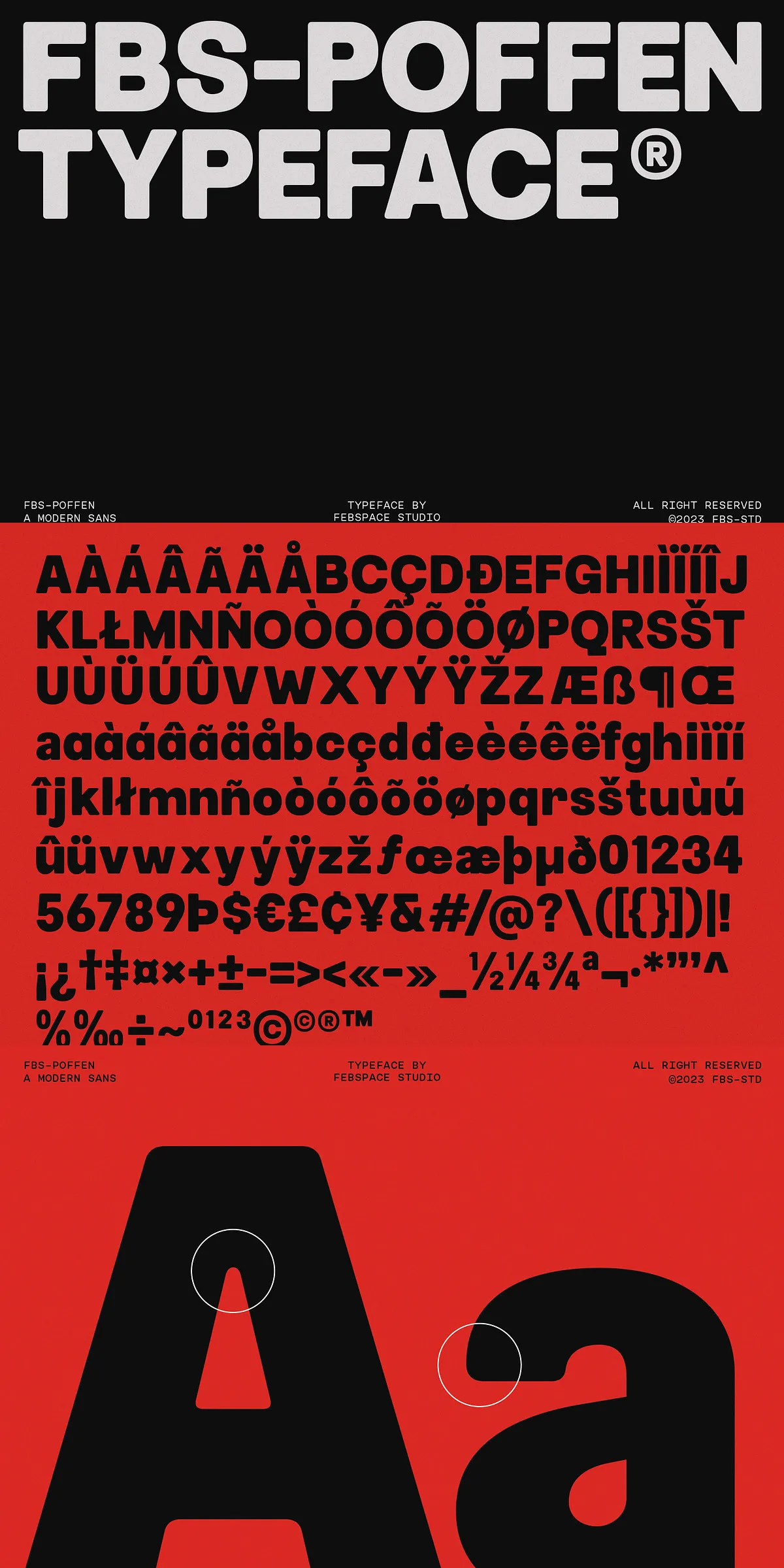
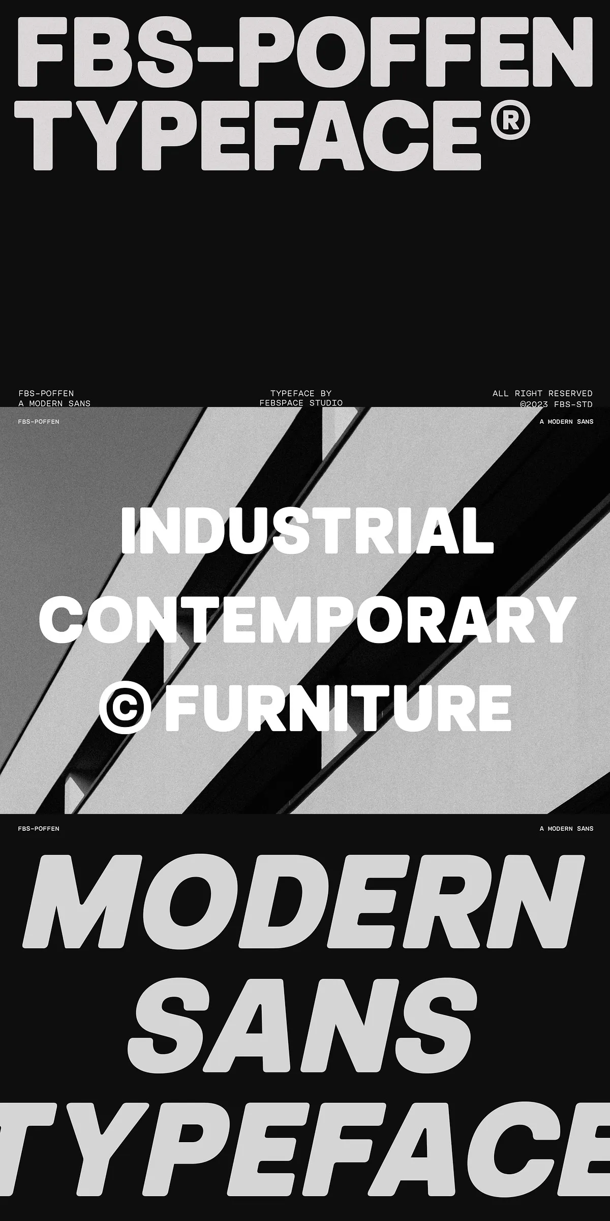
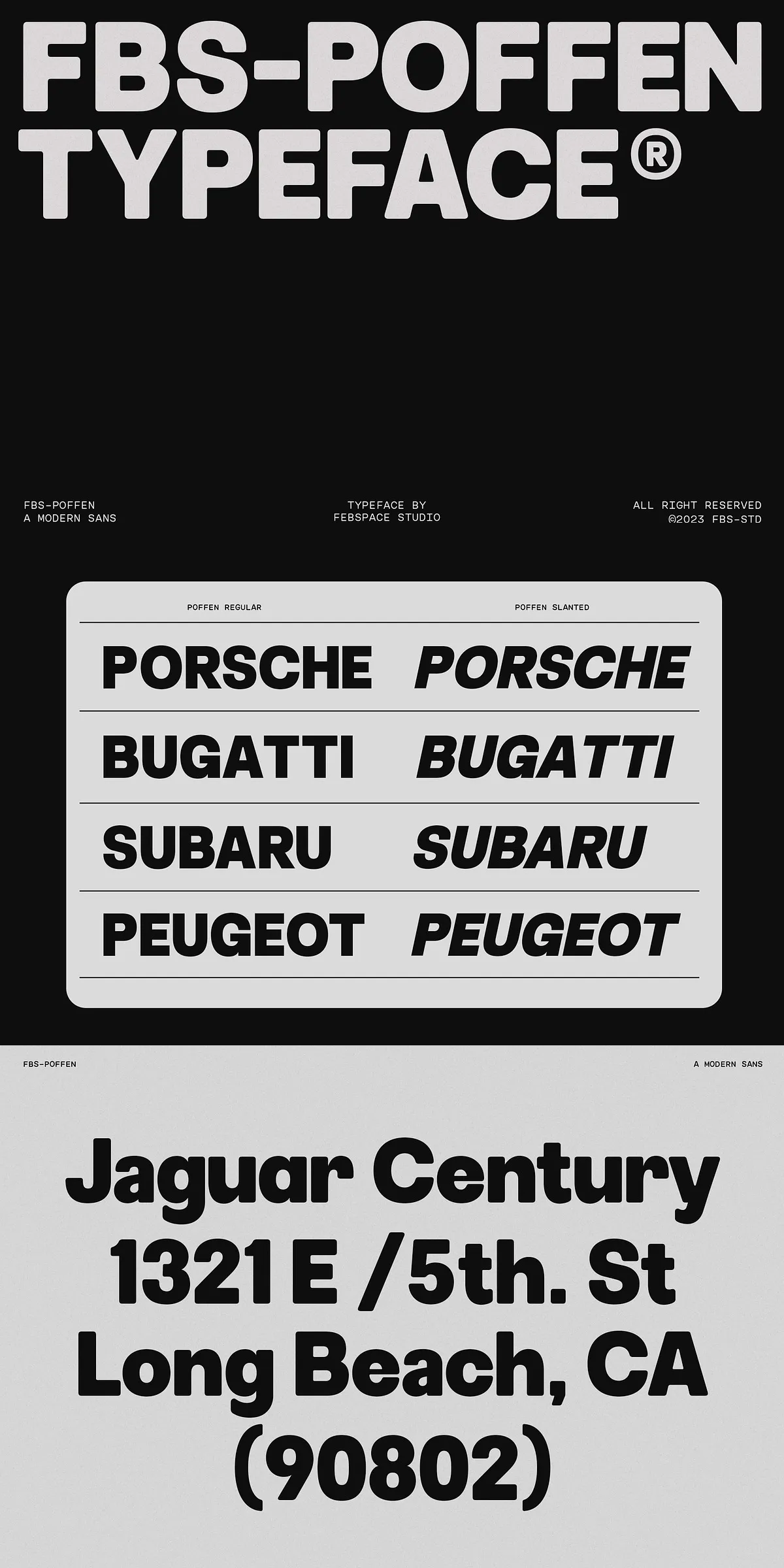
FBS Poffen offers four core styles that designers can mix and match to build consistent typographic hierarchies. Each style includes rounded and pointed corner alternatives so you can tune tone and atmosphere without changing the base proportions. Rounded corners soften the voice and work beautifully for lifestyle brands, friendly interfaces, and approachable packaging. Pointed corners sharpen the voice and suit tech-forward brands, editorial headlines, and confident logos. The slanted variant introduces kinetic energy and emphasis for callouts, subbrands, and promotional materials.
Workflows Streamlined With Practical Versatility
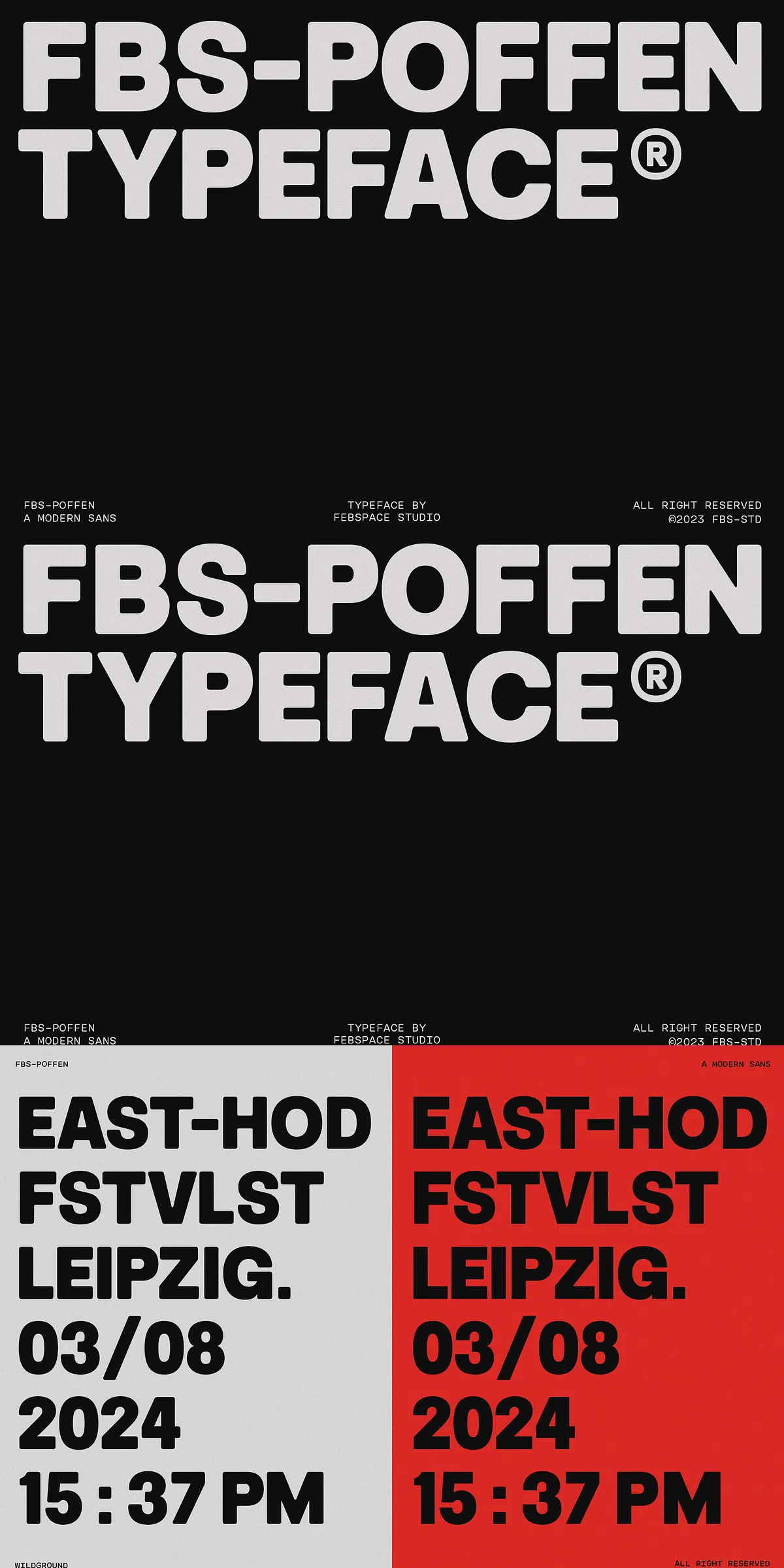
Because the styles share a unified skeleton, switching between rounded, pointed, or slanted versions preserves rhythm and spacing across layouts. Use the same family to maintain visual coherence across web pages, print collateral, and motion graphics. The consistent metrics reduce layout rework: swap a rounded headline for a pointed subhead or add the slanted style for emphasis while keeping baseline grids intact. This efficiency accelerates production and keeps brand systems tight.
Strong Applications Across Branding, Web, And Print
Standout Logos And Brand Identities Created With Precision
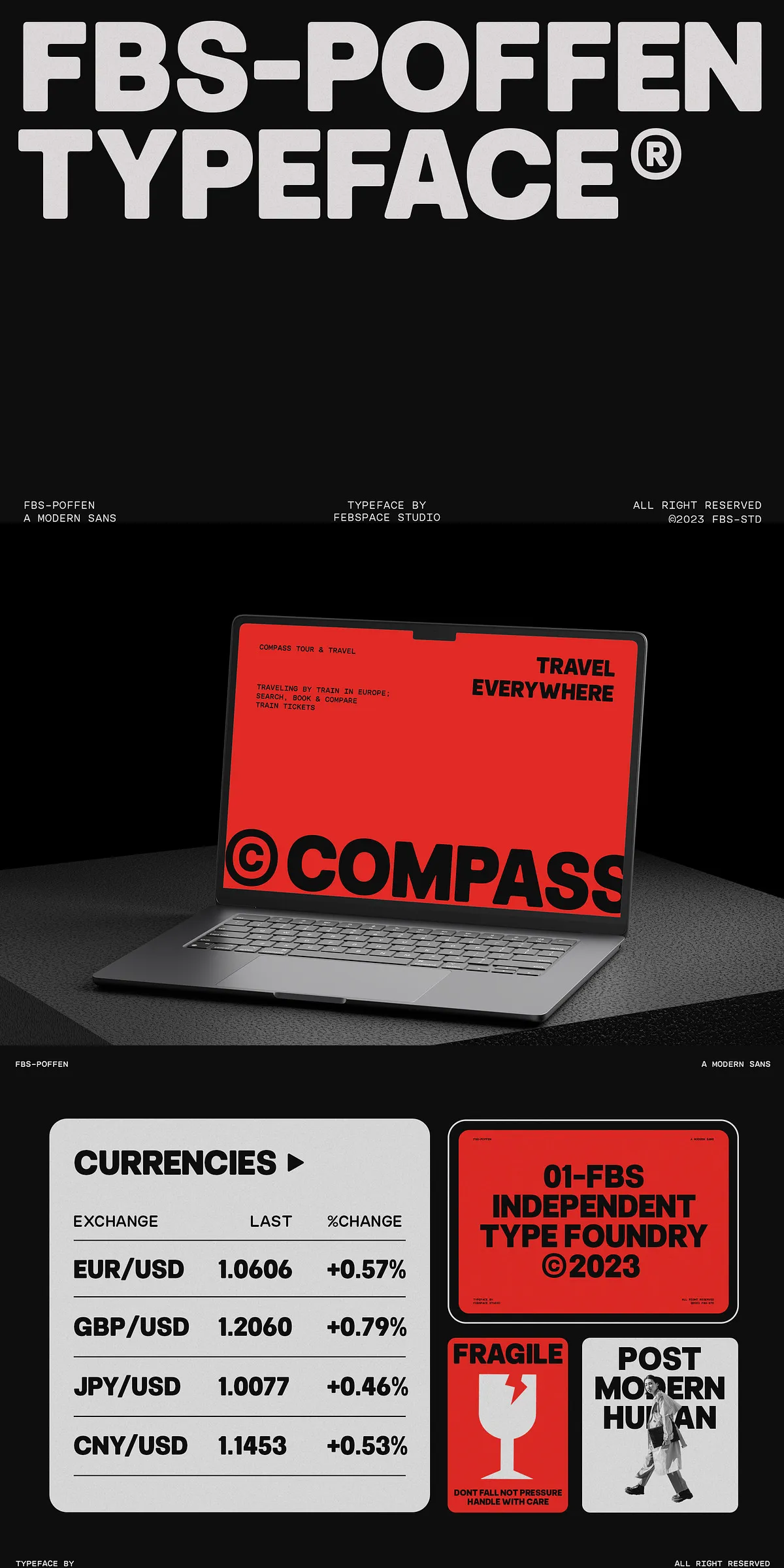
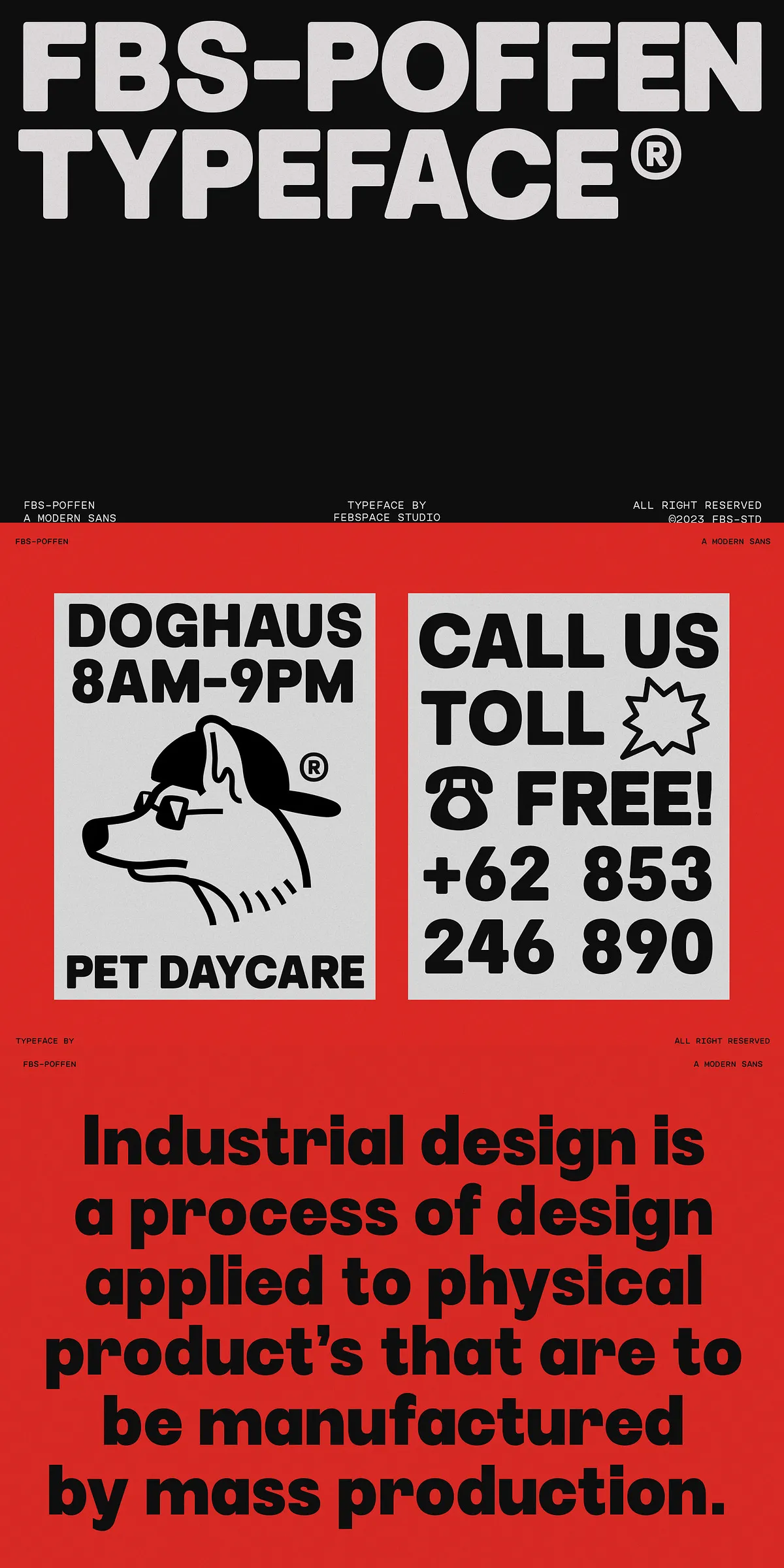
FBS Poffen’s balanced proportions and flexible corners make it a reliable logo workhorse. The pointed variant projects authority for corporate and technical brands, while the rounded variant softens identity for lifestyle and consumer-facing projects. The slanted style offers an energetic alternative that brings motion to monograms and lockups. Use alternates to craft distinctive wordmarks without sacrificing legibility.
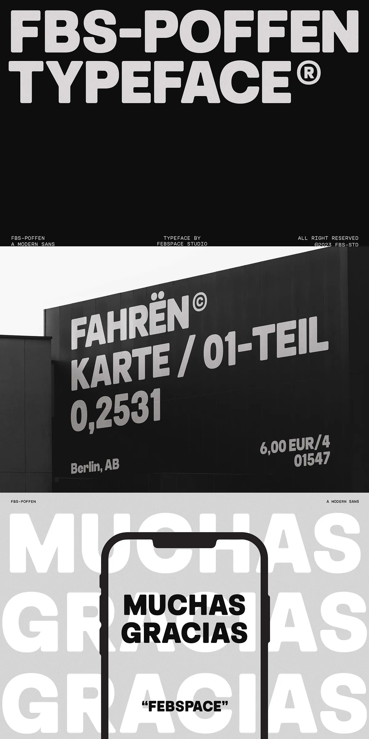
Clear Interfaces And Readable Editorial Systems
On-screen, FBS Poffen maintains excellent legibility at interface text sizes and scales crisply for headlines and banners. In editorial layouts, the family establishes strong visual hierarchy: pair heavier weights for attention-grabbing titles with lighter weights for captions and metadata. The slanted variant serves as a tasteful accent for pull quotes, bylines, and promotional strips. Overall, FBS Poffen adapts to long-form reading as well as high-impact display use.
Practical Features That Support Real Projects
Designed To Integrate Seamlessly Into Your Toolkit
FBS Poffen integrates into modern design toolchains and supports efficient typographic workflows. Use it to create consistent UI components, polished marketing materials, social graphics, and identity systems. Its interchangeable corner styles reduce the need to source multiple families—letting you maintain a coherent voice while exploring tonal variations.
Why Choose FBS Poffen For Your Next Project
- Adaptable: Four styles with rounded, pointed, and slanted options cover a wide range of tones.
- Coherent: Shared metrics preserve spacing and rhythm across variations.
- Practical: Suited for branding, web UIs, editorial, packaging, and motion design.
- Efficient: Reduces the need for multiple font families, streamlining production.
How To Use FBS Poffen Effectively In Production
Establish Hierarchy With Consistent Weight Choices
Start by selecting a primary weight for body copy and reserve heavier weights for primary headlines. Use rounded corners to communicate friendliness and pointed corners to convey precision. Apply the slanted variant sparingly for emphasis so emphasis retains impact without visual noise.
Pairing Recommendations To Elevate Your Designs
Pair FBS Poffen with neutral serif or geometric sans companions for contrast. A delicate serif provides elegance for editorial contexts, while a geometric sans promotes a modern, minimalist aesthetic for product interfaces. Keep spacing and baseline grids aligned to preserve rhythm between families.
FBS Poffen is a dependable, creative tool that helps designers move from concept to polished execution faster. Its practical flexibility and considered design make it an excellent addition to any font library—especially when you need one family to handle many roles with clarity and style.