Step into a world where typography is not just readable — it’s a statement. Welcome to Colosso, a revolutionary all-caps display font collection that redefines the boundaries of visual expression. Born from the raw energy of transfer lettering, the tactile history of vintage printing, and the rebellious spirit of mid-century fanzines and punk flyers, Colosso doesn’t just convey words — it commands attention, evokes emotion, and transforms every design into an artistic experience.
This isn’t digital perfection. It’s purposeful imperfection. A deliberate rebellion against sterile, over-polished computer fonts. Each character in the Colosso collection carries the soul of handcrafted print — subtle inconsistencies, faint ink bleeds, uneven strokes, and the ghost of human touch. These imperfections aren’t flaws — they’re features. They’re what make Colosso feel alive, authentic, and powerfully human in the age of algorithmic design.
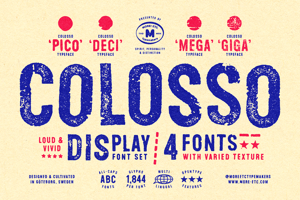
Four Distinct Personalities, One Unmistakable Identity
Colosso is more than a single font — it’s a collection of four uniquely textured typefaces, each designed to suit a different mood, style, and creative need. Whether you’re crafting a minimalist poster or a maximalist manifesto, there’s a Colosso font that speaks directly to your vision.
1. Colosso Smooth – Sleek, Slick, and Sophisticated
Perfect for high-end branding, modern logos, and clean poster layouts, Colosso Smooth delivers a sleek, polished aesthetic with a hidden edge. Its refined curves and consistent weight give it a luxurious, controlled feel — ideal for luxury, fashion, or premium lifestyle brands. Despite its smooth finish, it still carries faint traces of hand-crafted authenticity, proving that elegance and character can coexist.
2. Colosso Rough – Textured & Urban Edge
Embrace the grit. Colosso Rough brings the street into your design. With visible ink smudges, rough edges, and uneven stroke thickness, this font screams urban authenticity. It’s the perfect match for underground music scenes, skateboarding campaigns, indie brand identities, and anything with a rebellious, DIY energy. Use it to add tension, dynamism, and raw emotional impact.
3. Colosso Weathered – Time-Worn & Authentic
Like a forgotten billboard from the 1970s, Colosso Weathered captures the essence of time and exposure. Layers of fading ink, eroded edges, and subtle scratches give it a deeply nostalgic, vintage feel. Use this font for historical projects, retro-themed branding, film posters, or designs that evoke memory, loss, or legacy.
4. Colosso Eroded – Experimental & Artistic
Push the limits. Colosso Eroded is where typography becomes sculpture. With exaggerated wear, fragmented letters, and deliberate damage, it’s built for artists and creators who want to make a visual statement. This font thrives at large sizes — banners, murals, art installations — where its decayed form can be fully appreciated. It’s not just for reading; it’s for experiencing.
Designing with Purpose: How to Use Colosso in Real-World Projects
The true power of Colosso lies in its versatility. But to unlock its full potential, you need to understand how each typeface performs across different scales and applications.
Size Matters: Match the Font to the Scale
- Colosso Smooth – Best at medium to small sizes (12–48pt). Its clean lines remain sharp and readable without losing character.
- Colosso Rough – Shine at medium to large sizes (18–72pt). The texture becomes more apparent and expressive.
- Colosso Weathered – Most impactful at large to extra-large sizes (48–120pt). The wear and tear tell their story best when given space to breathe.
- Colosso Eroded – Designed for large-scale applications (72pt and above). At smaller sizes, it becomes illegible — but in billboards or art pieces, it’s unforgettable.
Where Colosso Makes the Most Impact
Colosso isn’t built for body text. It’s built for moments that demand presence. Here are the top six design applications where Colosso dominates:
Top 6 Creative Use Cases for Colosso Typefaces
- Brand Logos & Identity Systems – Instantly communicate attitude, heritage, and boldness. Ideal for music labels, fashion startups, and creative studios.
- Poster & Billboard Design – Turn any public space into a gallery. The high visual weight and texture draw eyes from afar.
- Album Covers & Music Release Art – Pair with raw textures and high contrast to evoke the energy of punk, rock, or experimental music.
- Festival & Event Branding – Create immersive experiences with fonts that match the event’s energy — whether it’s wild, nostalgic, or rebellious.
- Art Prints & NFTs – Transform your favorite quotes or phrases into collectible visual art pieces with a tangible, analog soul.
- Website Headers & Landing Pages – Use a single Colosso line to make a statement. It’s perfect for hero sections where first impressions matter.
Pro Tips for Maximum Visual Impact
To get the most out of Colosso, think beyond the font itself — consider context, texture, and contrast.
Expert Design Strategies
- Pair Colosso Smooth with a minimal, neutral background to let the sophistication shine.
- Use Colosso Rough on textured paper or with grain overlays to deepen the urban feel.
- Combine Colosso Weathered with muted tones (khaki, slate, cream) for a vintage, nostalgic mood.
- Let Colosso Eroded dominate a dark background — the damage becomes a feature, not a flaw.
- Avoid using more than one Colosso font in the same design — each deserves the spotlight.
Claim Your Space in the World of Bold Typography
Colosso isn’t just a collection of fonts. It’s a movement. A declaration that typography should feel human, that design should carry weight, and that every letter can be a work of art.
Whether you’re a designer, artist, marketer, or creative thinker, Colosso gives you the power to speak loud, speak proud, and speak with authenticity. Stop blending in — start standing out.
Download the full Colosso Typeface Collection today and transform your next project into a bold, unforgettable statement.