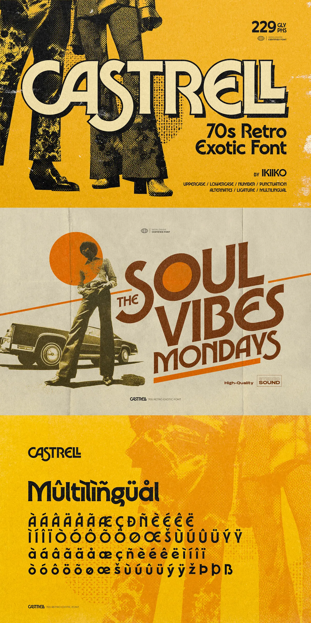
Castrell revives the golden era of 1970s design with bold curves, warm proportions, and unmistakable vintage swagger. This exotic retro display typeface captures afro-funk energy and disco-era charm, making it an excellent choice for designers who want to inject personality, movement, and nostalgia into titles, logos, apparel, and poster work. Each character in Castrell reads with life and rhythm, delivering a tactile presence that elevates visual storytelling.
Key Features And Design Characteristics That Stand Out
Smooth Curves And Bold Retro Proportions That Command Attention
Castrell’s letterforms combine soft, rounded terminals with confident stems to create a voice that reads as both playful and powerful. The typeface balances wide counters and rhythmic strokes so headlines pop from a distance while retaining detail at closer inspection. Its shapes reference vintage cinema posters and disco graphics, giving designs a distinctive period-accurate flavor without feeling dated.
Exotic Flair And Funky Alternates For Expressive Typography
Beyond standard glyphs, Castrell includes alternates and ligatures that let you dial in extra personality. Use alternates to add exotic flourishes to display lines or mix ligatures to create seamless wordmarks that feel handcrafted. These expressive options encourage experimentation and help you craft memorable typographic identities.
What’s Included And File Formats Delivered
Complete Deliverables For Cross-Platform Use
The Castrell package includes everything you need to start designing immediately: uppercase and lowercase alphabets, full punctuation, numerals, alternates, and ligatures. The family supports multiple languages and ships in common desktop formats (TTF and OTF), ensuring compatibility across Mac and PC workflows. The included file types make Castrell straightforward to install and use in graphic, layout, and web preparation tools.
Practical Applications And Usage Recommendations
Perfect For Posters, Titles, And Branding With Vintage Vibes
Castrell works exceptionally well in large-format uses where its personality can lead the layout. Use it for movie titles, retro packaging, festival branding, editorial spreads, and fashion identity systems that lean into nostalgia. For apparel and merchandise, Castrell reads strong on both screen-printed and embroidered surfaces when tested at production scale.
Combining Castrell With Supporting Typefaces
To craft balanced systems, pair Castrell with neutral sans-serifs or understated modern serifs for body copy. A clean geometric sans keeps readability high while allowing Castrell to dominate headlines. For layered branding, reserve Castrell for display elements and use a low-contrast serif or humanist sans for extended text to preserve hierarchy and legibility.
Technical Notes, Installation, And Licensing
Install And Test Across Platforms Before Final Output
Install the supplied TTF or OTF file on PC or Mac and test in your target applications. For print, verify how wide counters and heavy curves reproduce at the intended production size. For digital use, confirm hinting and rendering in target browsers or design tools. If you use alternates, check the OpenType panel in your application to access stylistic sets and ligatures.
Included Files Summary:
- Uppercase & Lowercase alphabets
- Numbers & Punctuation
- Alternates & Ligatures
- Multilingual support
- Formats: TTF & OTF (PC & Mac compatible)