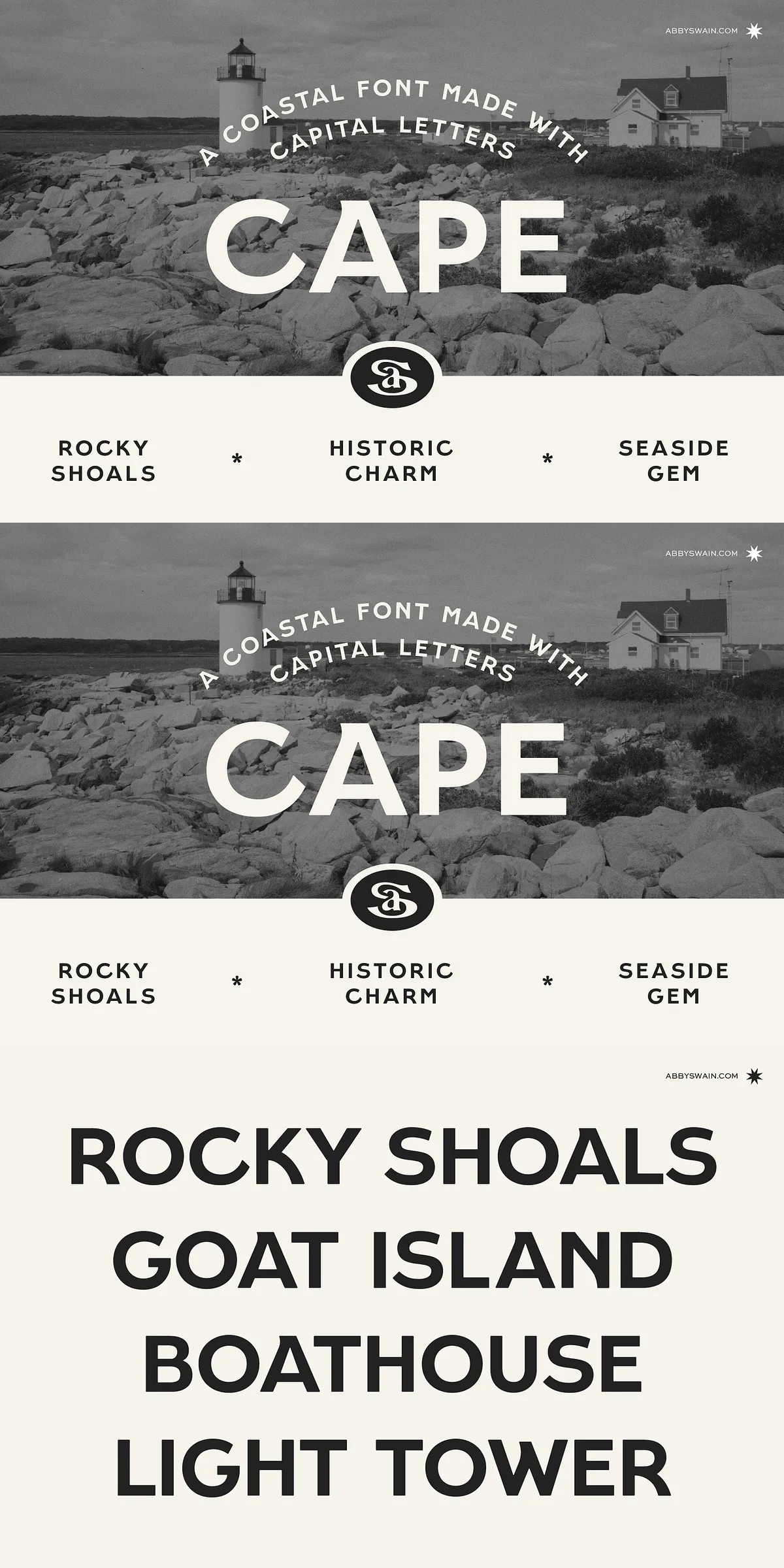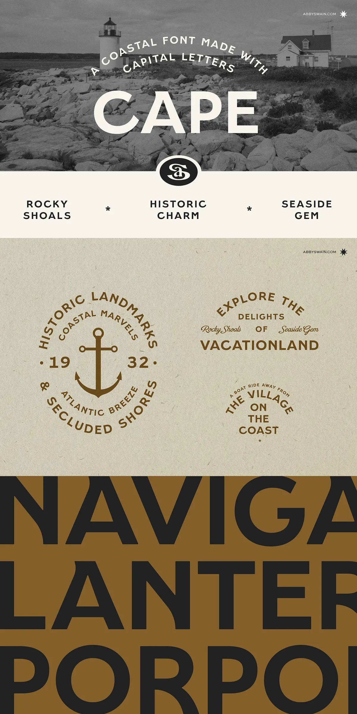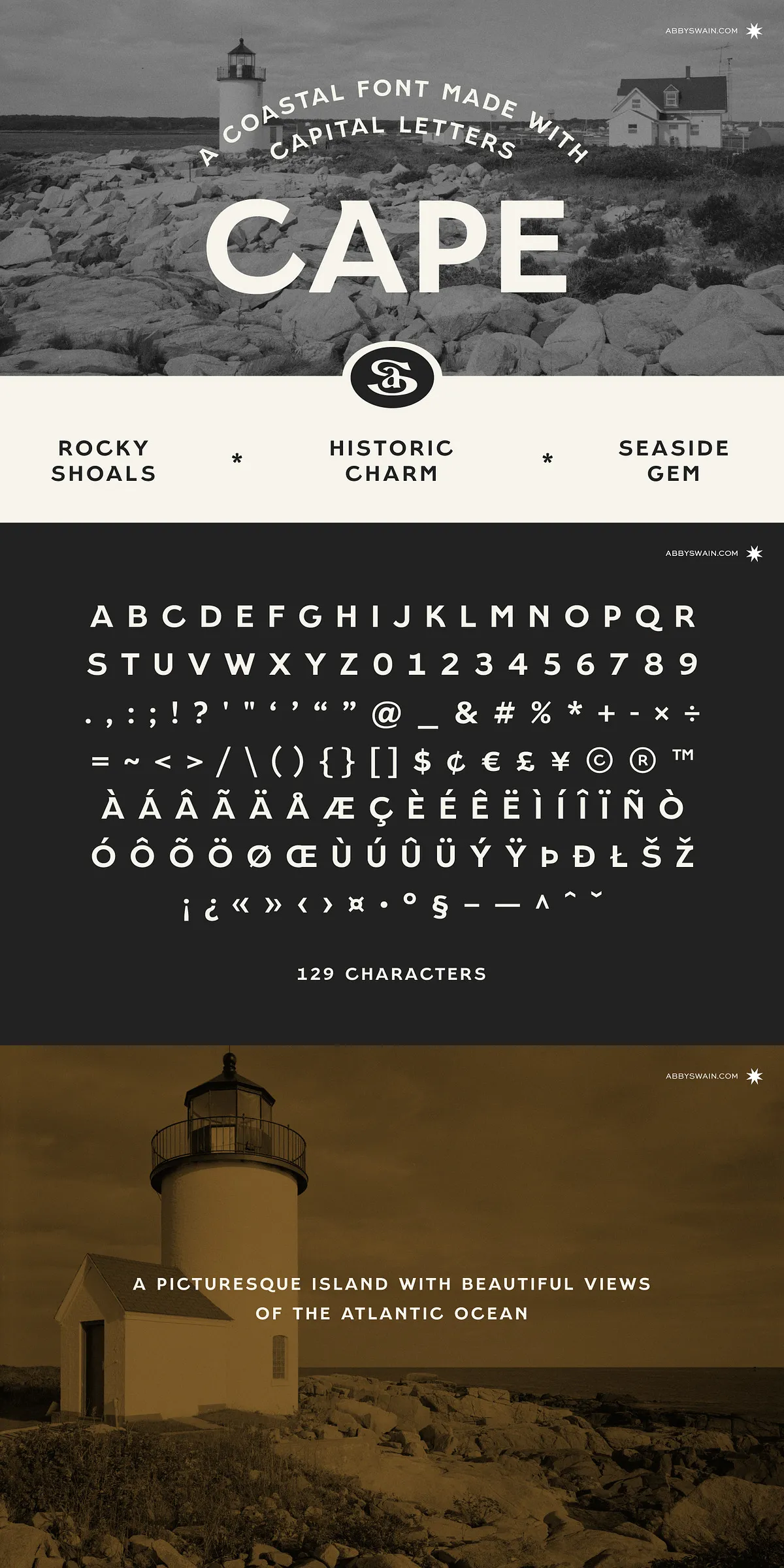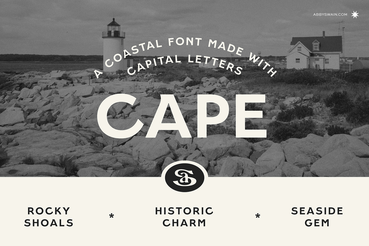
Cape is a distinctive sans serif display font that captures coastal charm and vintage hand-painted character while remaining clean and modern. Designed as an all-caps Latin-based typeface, Cape emphasizes bold, readable forms and handcrafted personality. The font brings nostalgic signage warmth to contemporary projects and adapts easily to both digital and print uses. It includes full uppercase letters, numerals, punctuation, and currency symbols, plus both straight and curly quotation marks for typographic flexibility.
Why Cape Works For Branding, Packaging, And Editorial Use
Delivering Handcrafted Personality With Modern Readability
Cape channels the energy of vintage hand-painted signs but strips away excess ornament so letterforms read sharply at a distance and remain clear in small sizes. Designers can deploy Cape to anchor logos, create memorable headlines, and infuse packaging with artisanal feeling. Because the font uses uppercase-only forms, it excels where bold, confident messaging matters: product labels, storefront signage, poster headlines, and splash pages.
Perfect For Coastal And Lifestyle Brands Seeking Authenticity
Use Cape to evoke beaches, boardwalks, cafés, and seasonal collections. Its soft, modern approach to retro lettering brings an approachable tone that appeals to lifestyle and hospitality brands. Cape complements visual systems that prioritize texture, photography, and tactile materials—pair it with natural palettes, grainy photo overlays, and hand-drawn graphic elements to maximize its coastal effect.
Technical Features And Typographic Details
Comprehensive Latin Support And Essential Glyphs
Cape supports Latin-based languages and delivers the essential glyph set most brands require: uppercase letters, numerals, punctuation marks, and currency symbols. The font provides both straight and curly quotation marks so you can maintain typographic consistency across editorial and marketing materials. Designers will appreciate the balanced proportions and open counters that keep text legible in both print and on-screen contexts.
Simplicity That Encourages Creative Pairing
Because Cape presents itself in all caps, it pairs exceptionally well with complementary typefaces. Combine Cape with a neutral sans serif for body copy to maintain a modern, minimal layout, or pair it with a refined serif to add contrast and editorial elegance. In packaging systems, use Cape for dominant display text while reserving a legible text face for ingredient lists, disclaimers, and long descriptions.
Practical Applications And Production Tips
How To Use Cape Effectively In Real Projects
Start by assigning Cape to primary display roles—logos, hero headlines, product names, and call-to-action banners. Because it reads strongly in uppercase, avoid setting long passages of body text in Cape; instead, use it for short, punchy messaging. Adjust tracking and kerning for tight headlines to preserve the handcrafted look without compromising legibility. For branded assets, create variations in scale and weight to maintain hierarchy while using a single, cohesive voice.
Design Workflows And Output Considerations
Export assets with outlined text when preparing files for print production to preserve letterforms exactly. On the web, use Cape selectively for headings or hero sections and include fallback fonts to ensure graceful degradation. When animating Cape in motion design, emphasize its bold silhouettes—simple fades, slides, and reveal effects will enhance personality without competing with the letterforms.
Summary: Cape As A Reliable Display Choice
Blend Of Nostalgia And Contemporary Usefulness
Cape delivers a confident, modern take on retro hand-painted signage. It offers designers a focused tool for display typography that reads clearly, pairs well with supporting faces, and brings coastal, vintage-inspired warmth to brand systems. Whether you craft logos, badges, packaging, or bold editorial headers, Cape empowers you to create memorable, authentic visuals with efficiency and style.