Step into the world of refined, contemporary typography with Alta Typeface, a bold and sophisticated sans-serif all-caps display typeface that captures the timeless grace of Hermann Zapf’s iconic Optima, while pushing forward into modern design excellence. Crafted with intention and precision, Alta is more than a font—it’s a design philosophy: clean, balanced, and deeply humanist in form. Whether you’re building a high-end brand, designing for editorial excellence, or creating digital experiences, Alta delivers clarity, character, and architectural harmony.
The Essence of Humanist Modernism: Inspired by a Legend
Alta draws deep inspiration from the visual language of Optima, one of the most revered typefaces of the 20th century. But it doesn’t merely replicate the past—it reinterprets it for today’s design challenges. The humanist touch of Alta is evident in its open counters, delicate serifs (or subtle transitional edges), and variable stroke contrast that mimics the natural rhythm of handwritten forms. The result? A typeface that feels both modern and warm, mechanical yet inviting.
With its all-caps design, Alta prioritizes visual impact and uniformity, allowing for powerful, memorable headlines and brand signatures. It’s ideal for projects where presence matters most—logos, title treatments, product labels, and premium editorial layouts—where every letter must command attention without sacrificing elegance.
Three Distinct Weights: Strength, Lightness, and Versatility
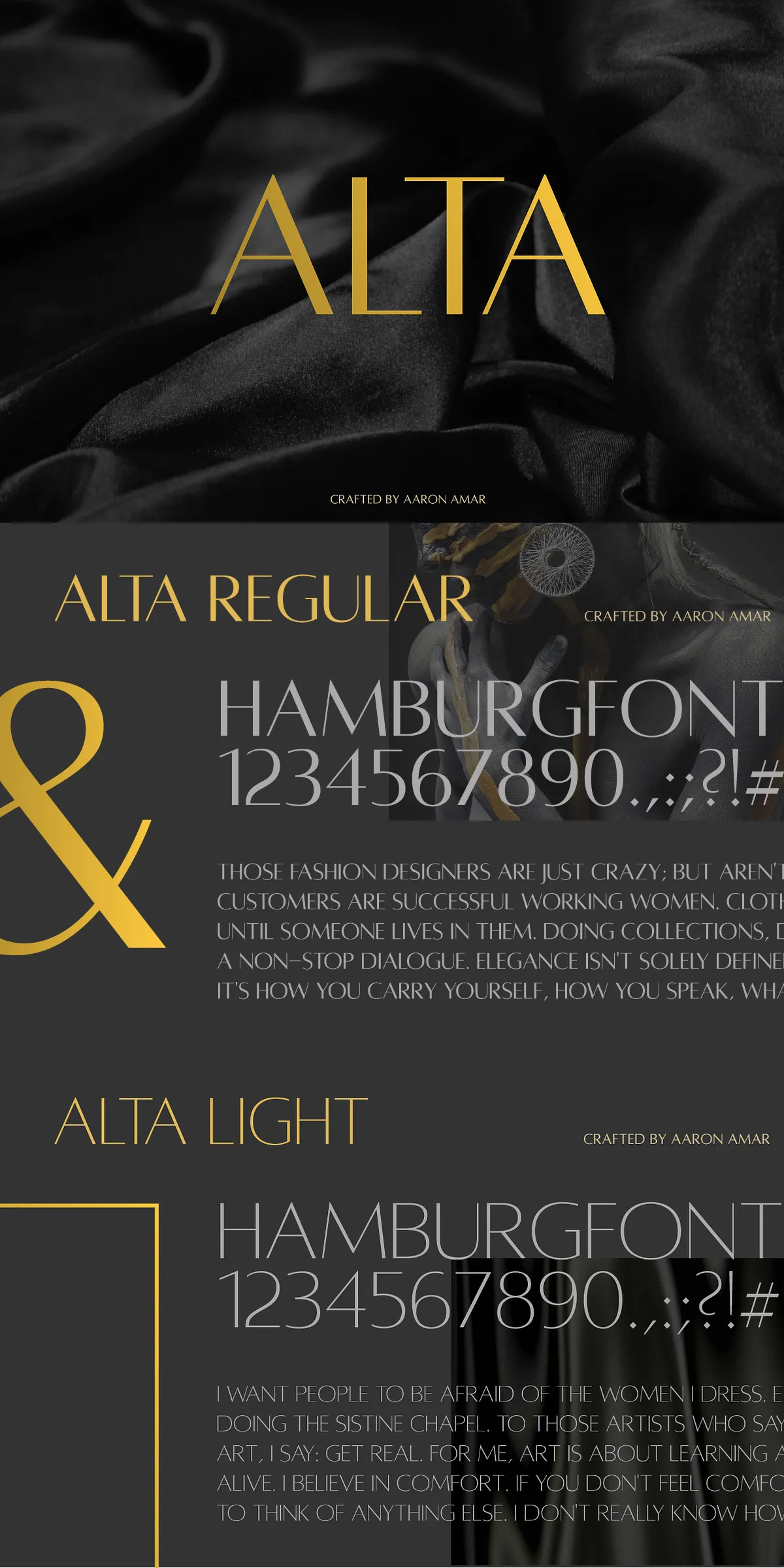
Alta Typeface empowers you with three carefully curated weights, each designed for a different visual role in your design hierarchy:
- Regular: The cornerstone of the family. Offers a balanced, confident presence perfect for primary headlines, brand names, and dominant display text. Its clarity ensures readability without compromising elegance.
- Light: A graceful and understated option for sophisticated accents. Ideal for subheadings, taglines, or minimalist design elements where subtlety enhances meaning. The delicate weight adds depth and contrast when paired with Regular or Caption.
- Caption: The smallest and lightest variant, built for contextual clarity. Designed specifically for tight spaces like footers, image captions, or secondary information, without losing legibility or personality.
These weights work not just independently, but together. Use them to create powerful visual contrasts—pair the bold Regular with the soft Light, or layer Caption text beneath a headline for layered storytelling in a single frame.
Masterful Applications: Where Alta Defines Excellence
Alta isn’t just for show—it’s built for real-world creativity across industries and mediums:
- Branding & Identity Systems: Create memorable, premium brand identities for fashion, lifestyle, architecture, and luxury goods. Alta’s refined simplicity speaks to sophistication and modernity.
- Editorial & Magazine Design: Use it for title pages, feature headlines, section dividers, and pull quotes. The all-caps format ensures strong visual breaks and a premium layout feel.
- Web & UI Design: Integrate Alta into navigation headers, hero sections, and CTAs. Its clean structure renders beautifully on screens, maintaining legibility even at small sizes.
- Print & Packaging: Elevate product labels, packaging inserts, postcards, and business cards. The typeface’s clarity and balance ensure your message stands out in print environments.
- Event & Poster Design: Turn attention with striking title treatments for concerts, art exhibitions, festivals, and conferences. Alta’s humanist soul connects emotionally while its geometric precision commands respect.
Universal Compatibility: Seamless Workflow Integration
Alta Typeface is engineered for maximum flexibility across platforms and tools. It’s fully compatible with:
- Adobe Creative Suite (Illustrator, InDesign, Photoshop, After Effects)
- CorelDRAW, Sketch, Figma, and other leading design applications
- Microsoft Office, Google Docs, and web publishing environments
- Web applications using WOFF and WOFF2 web font formats for fast, responsive loading
Install once, use everywhere. Alta maintains consistent proportions, spacing, and character behavior across projects, ensuring your vision stays flawless from concept to publication.
Bring Your Vision to Life with Alta Typeface
Don’t settle for generic displays. Choose Alta Typeface—where the legacy of Optima meets modern precision, where humanist warmth meets geometric clarity. This is typography that doesn’t just communicate, it connects. It doesn’t just inform—it inspires.
Choose Alta for projects that demand more than just a font. Choose it for design that speaks with confidence, elegance, and lasting impact. Whether it’s for your brand, your portfolio, or your next creative breakthrough—Alta is ready to make your vision unmistakable.