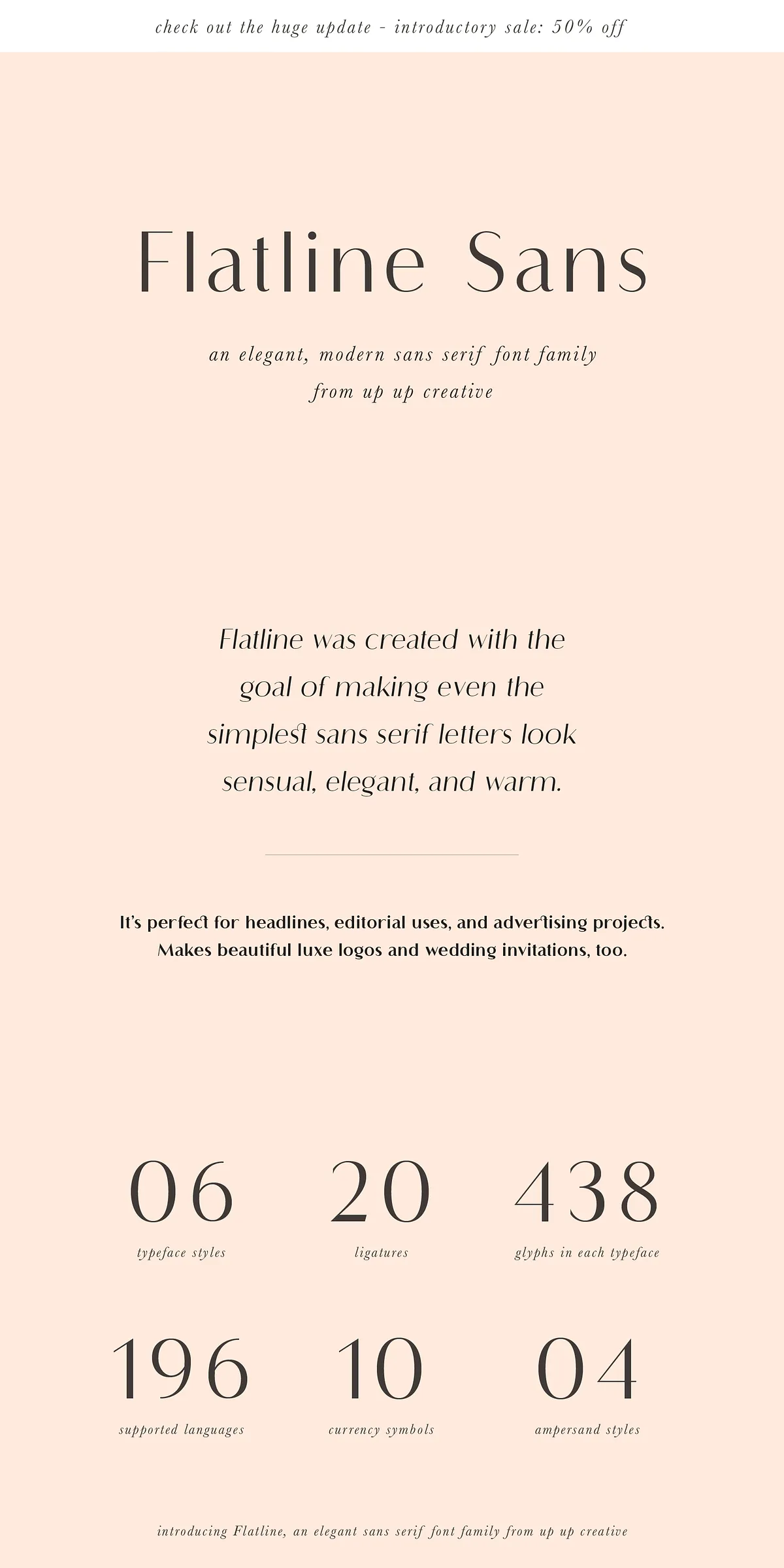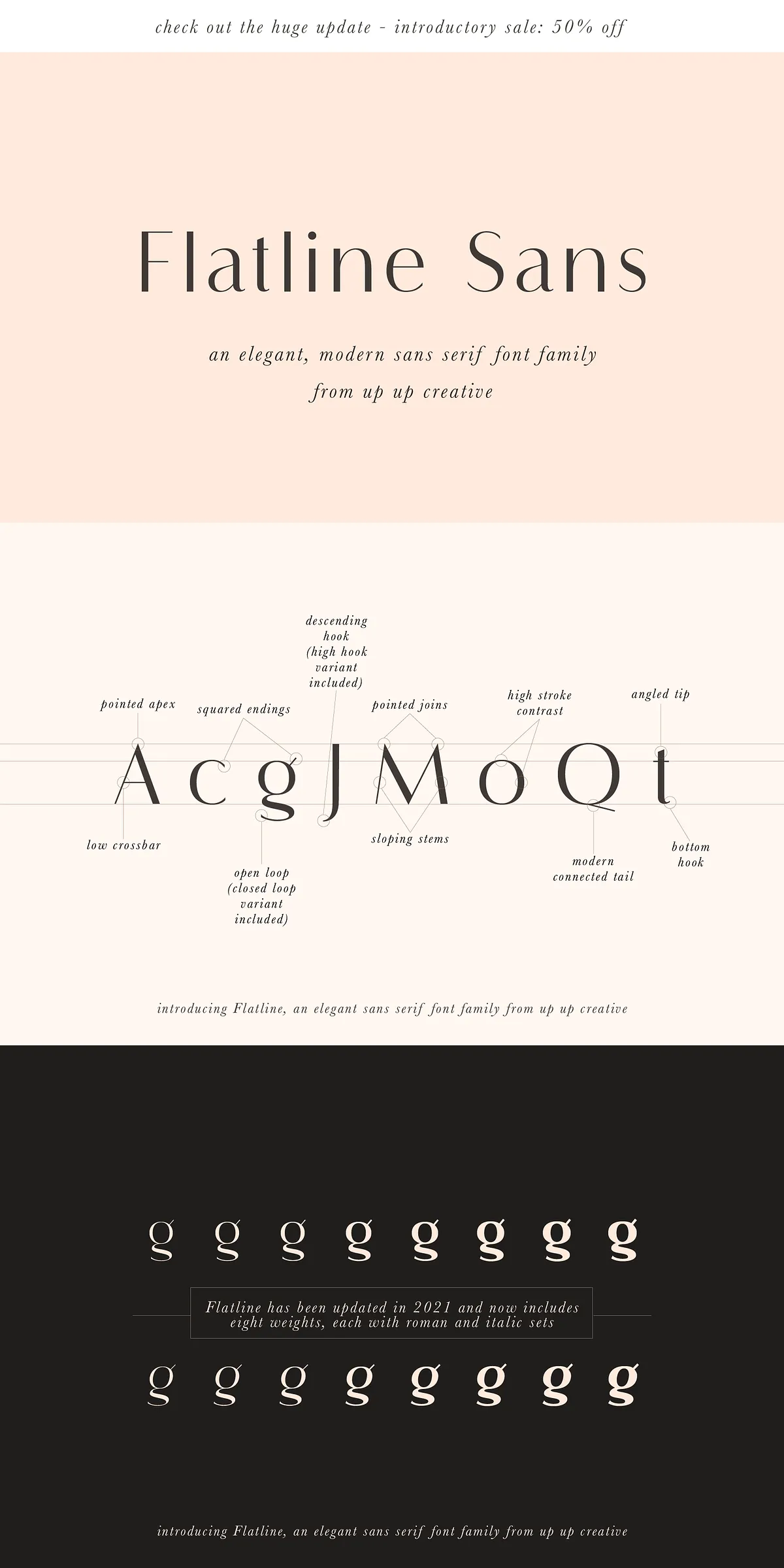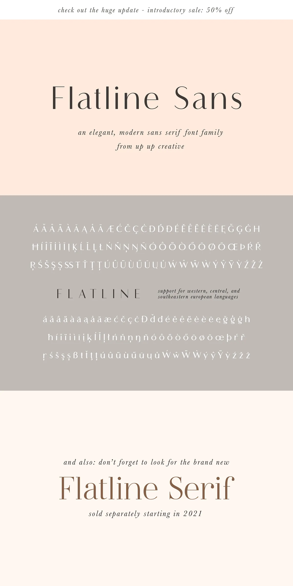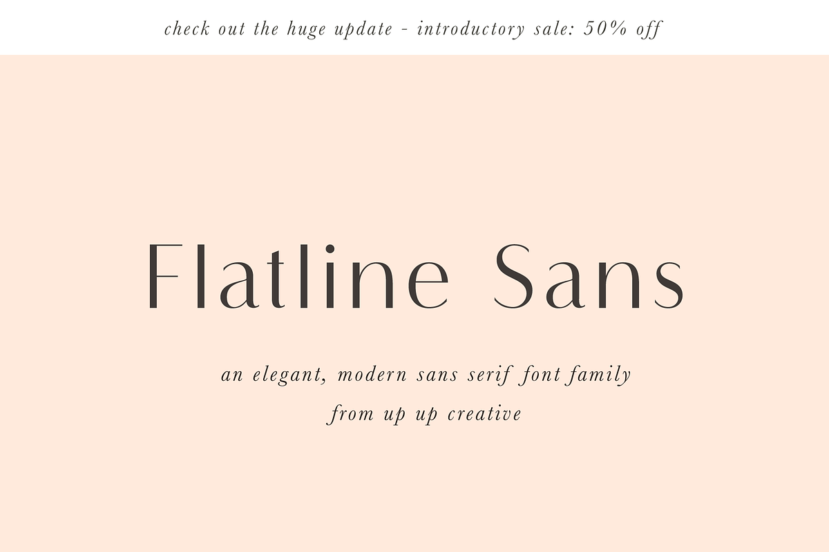

Flatline stands as one of our most beloved and widely used font families. We actively refined and expanded Flatline in 2021 with a major update that introduces five new weights to the family. The update brings the family to a total of eight distinct weights, and because each weight ships in both Roman and Italic, the full family contains sixteen complete fonts. Designers rely on Flatline for its sensual, warm tone and its ability to elevate headlines, editorial layouts, advertising campaigns, and luxury identities.
What Makes Flatline Stand Out In Modern Design
Flatline delivers an elegant, modern sans serif voice characterized by a deliberate contrast between thick and thin strokes. The high-contrast letterforms create an inviting rhythm across words and paragraphs, making even the simplest sans serif characters feel refined and expressive. Use Flatline to craft luxe logos, wedding invitations, editorial mastheads, and high-impact headlines. The family’s balanced proportions maintain legibility at display sizes while preserving personality for brand identity work.
Why You Will Choose Flatline For Branding Projects
Designers choose Flatline because it activates visual elegance without sacrificing clarity. The font’s structure reinforces upscale aesthetics and lends credibility to fashion, editorial, and lifestyle brands. Flatline’s range of weights lets you build typographic hierarchies: set bold, high-contrast headlines in heavier weights and support them with lighter weights for captions and pull quotes. The italic styles add motion and emphasis when you want to direct the reader’s eye.
Technical Features And OpenType Capabilities Explained
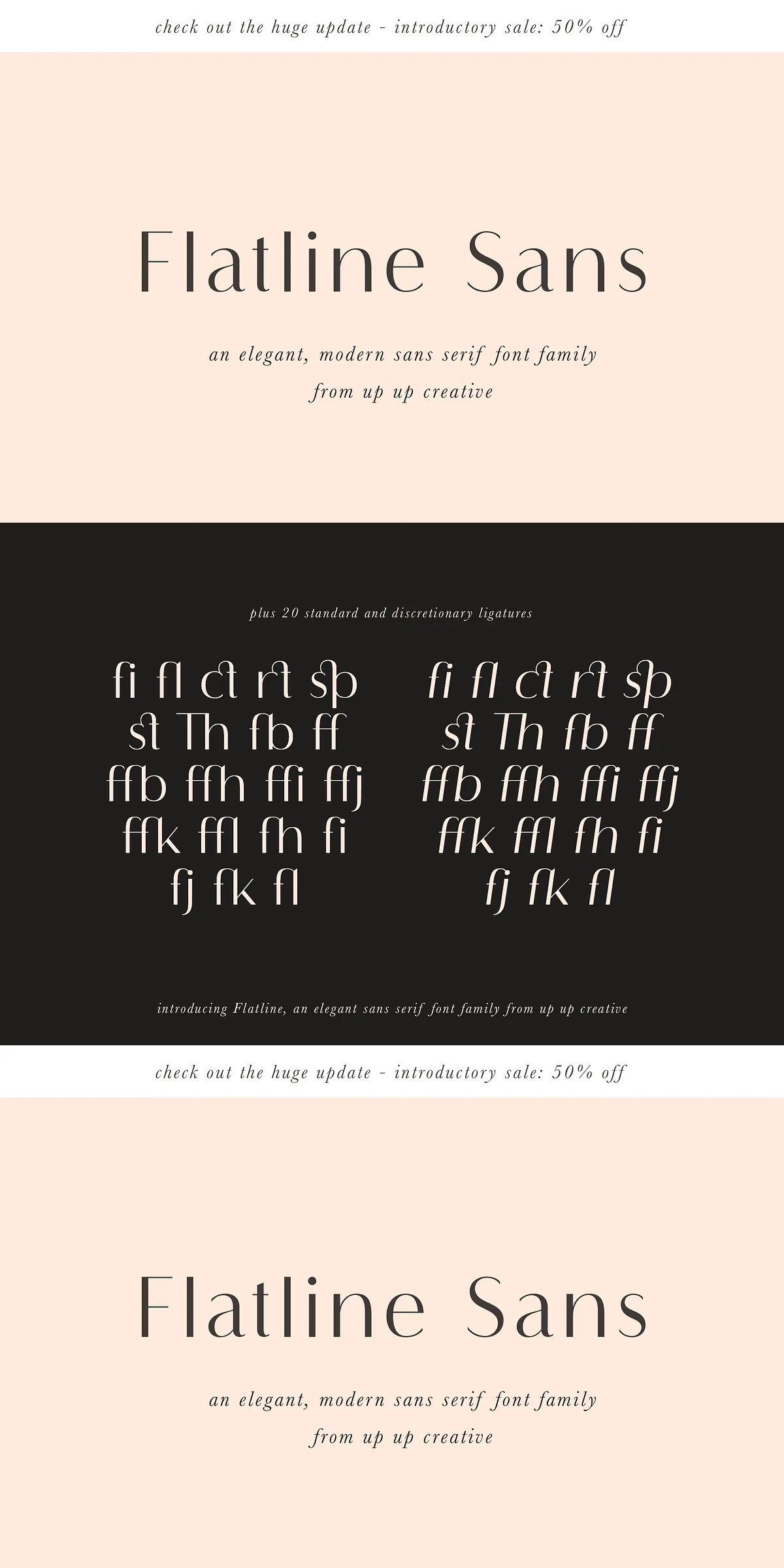
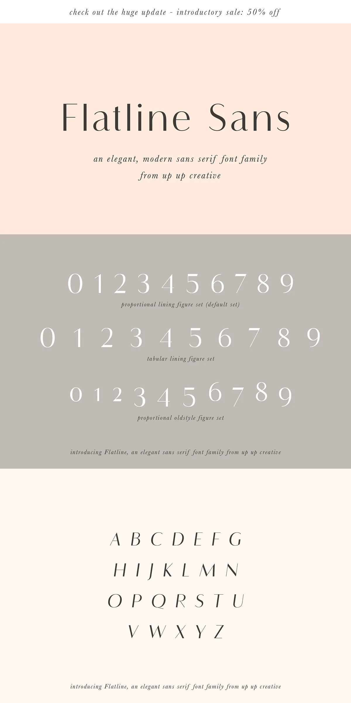
Each Flatline style contains nearly 500 glyphs, offering comprehensive character coverage for robust typographic work. OpenType features include standard and discretionary ligatures, a selection of character variants, three figure sets (lining, oldstyle, and tabular), four ampersand styles, and multilingual support including common currency symbols. These features enable precise typographic control in professional applications.
How To Access OpenType Features And Glyphs
Access OpenType features easily in programs like Adobe Illustrator and Adobe InDesign; these apps expose ligatures, stylistic sets, and alternate glyphs directly from the type panel. Microsoft Word and other mainstream editors provide access to many features through the advanced font settings, though the workflow differs from Adobe apps. If you need a full character map or a special glyph file, contact us after purchase and we will provide the necessary resources.
Included Files, Formats, And Installation Guidance
The Flatline package ships with a clear installation guide and an FAQ to streamline setup across macOS and Windows. The family files include individual OpenType font files for every weight and style listed below. The fonts install into standard font folders and work in all major design tools and web editors when converted to webfont formats by the user.
- FlatlineSans-ExtraLight.otf
- FlatlineSans-Light.otf
- FlatlineSans-Medium.otf
- FlatlineSans-Regular.otf
- FlatlineSans-Bold.otf
- FlatlineSans-ExtraBold.otf
- FlatlineSans-Heavy.otf
- FlatlineSans-SemiBold.otf
- FlatlineSans-ExtraLightItalic.otf
- FlatlineSans-LightItalic.otf
- FlatlineSans-MediumItalic.otf
- FlatlineSans-RegularItalic.otf
- FlatlineSans-BoldItalic.otf
- FlatlineSans-ExtraBoldItalic.otf
- FlatlineSans-HeavyItalic.otf
- FlatlineSans-SemiBoldItalic.otf
- Installation guide and FAQs (included)
File Compatibility And Recommended Workflows
Flatline’s OTF files ensure broad compatibility with macOS, Windows, Adobe Creative Cloud, and Figma. For production output, export vector logos as EPS or SVG and deliver print-ready files as PDF with embedded fonts or outlined text where required. When building web projects, generate WOFF and WOFF2 formats from the provided OTFs and implement fallbacks in CSS to preserve typographic intent across browsers.
Pairing Advice And Practical Use Cases For Flatline
Pair Flatline with simple, neutral serif or sans companions for editorial systems that read well in long format. Use heavier Flatline weights for attention-grabbing headlines and reserve lighter weights for subheads and metadata. The italic variants work beautifully for captions, bylines, and brief emphasis. Flatline also pairs well with script or ornamental display fonts when you need contrast for wedding invitations, packaging, and boutique branding.
Complementary Families And Where To Find Them
We also offer a complementary Flatline Serif family sold separately; explore that collection and see examples at the designer’s Creative Market page: https://creativemarket.com/upupcreative. Combining Flatline Sans with the serif family expands your typographic toolkit and streamlines multi-channel brand systems.