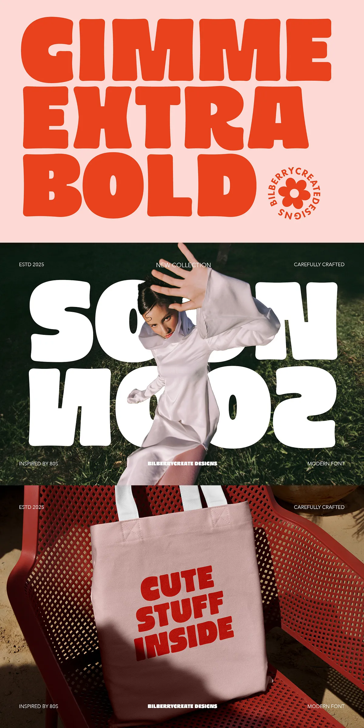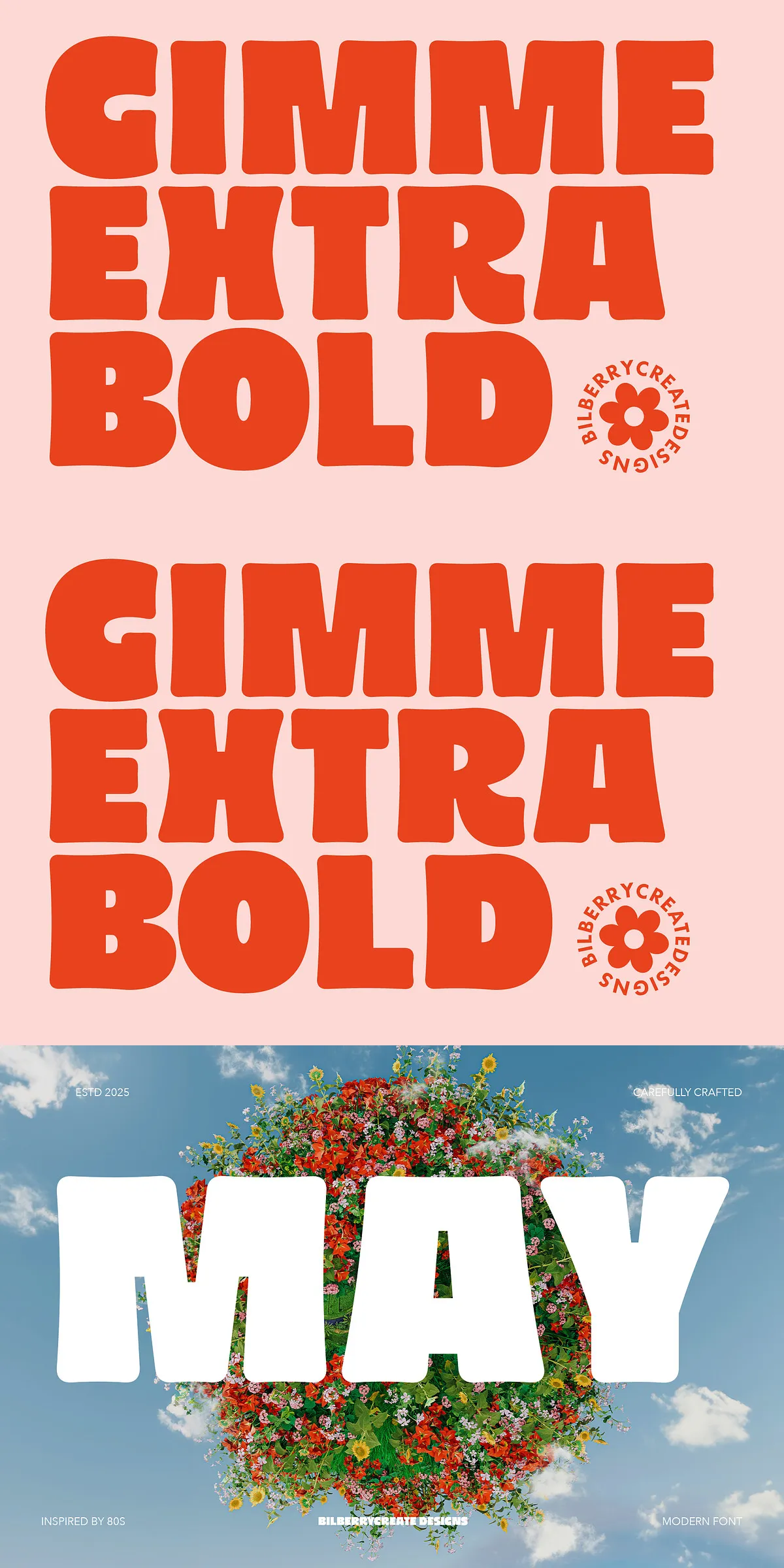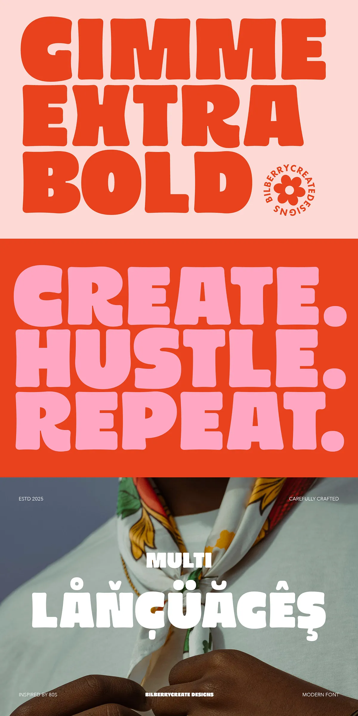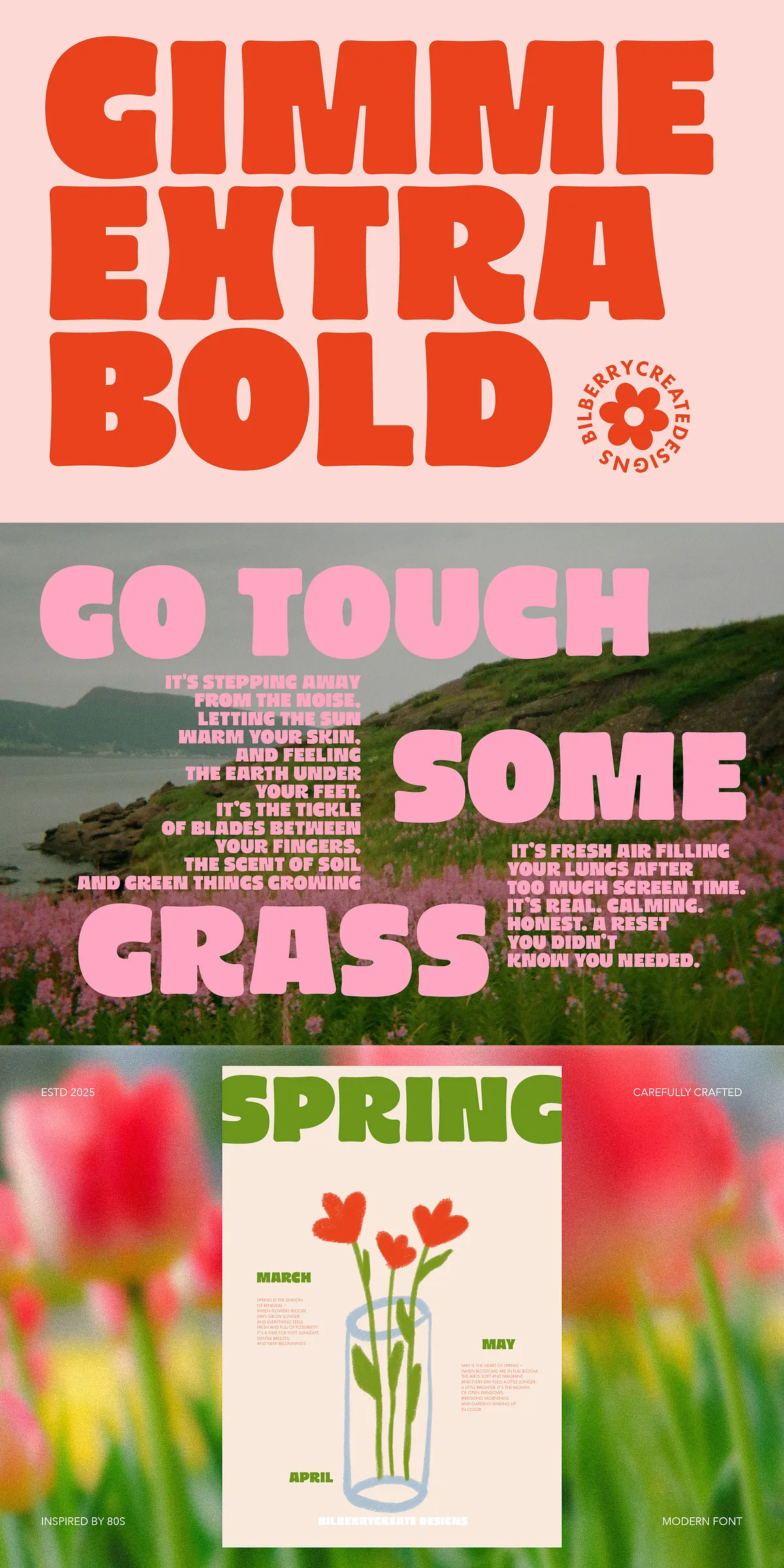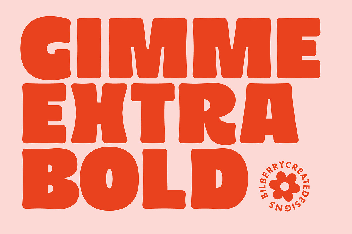
Gimme Extra Bold delivers a confident, high-impact voice that channels the bold spirit of 1980s design. Built for display use, it brings strong presence to headlines, logos, and identity systems. The font’s heavy weight and tight letterforms create an unmistakable silhouette that reads clearly at large sizes and holds character in condensed compositions. Use Gimme Extra Bold whenever you need a headline that commands attention and communicates playful nostalgia without sacrificing modern legibility.
Distinctive Groovy Eighties Aesthetic And Energy
Inspired by retro aesthetics, Gimme Extra Bold fuses funk-driven shapes with contemporary construction. Its rounded terminals and slightly exaggerated strokes echo the era’s energetic signage and poster type while maintaining crisp proportions suitable for today’s screens and print. The design reads as both nostalgic and fresh, making it ideal for projects that want to evoke vintage charm while staying relevant to modern audiences.
What Is Included In The Package
The font package equips you with the essential formats to deploy across devices and platforms. Files come ready for immediate installation so you can begin designing without delay. The package includes the core styles and multilingual support that broaden the font’s usefulness across markets and applications.
File Formats Provided For Immediate Use
- Gimme Extra Bold (OTF)
- Gimme Extra Bold (TTF)
- Gimme Extra Bold (WOFF)
- Multilingual character support included
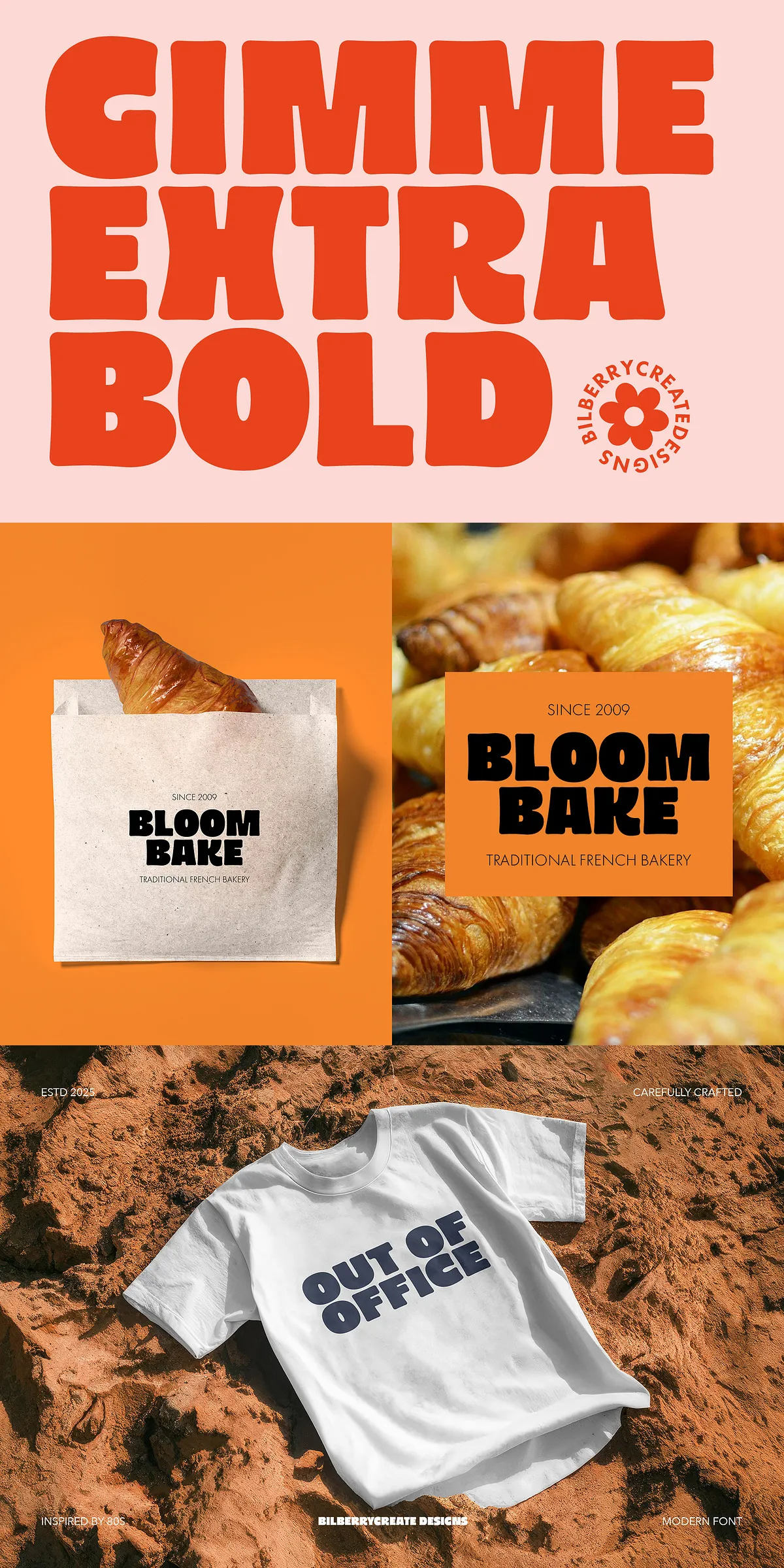
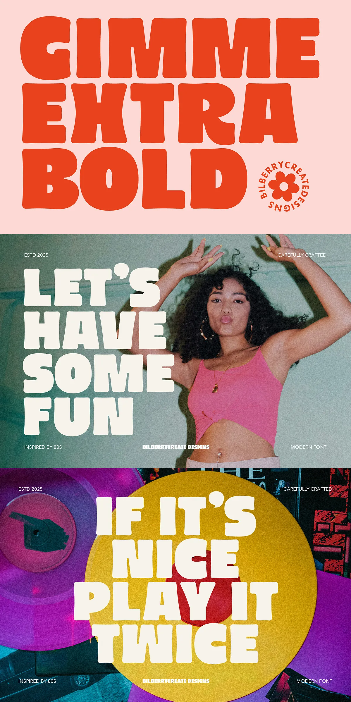
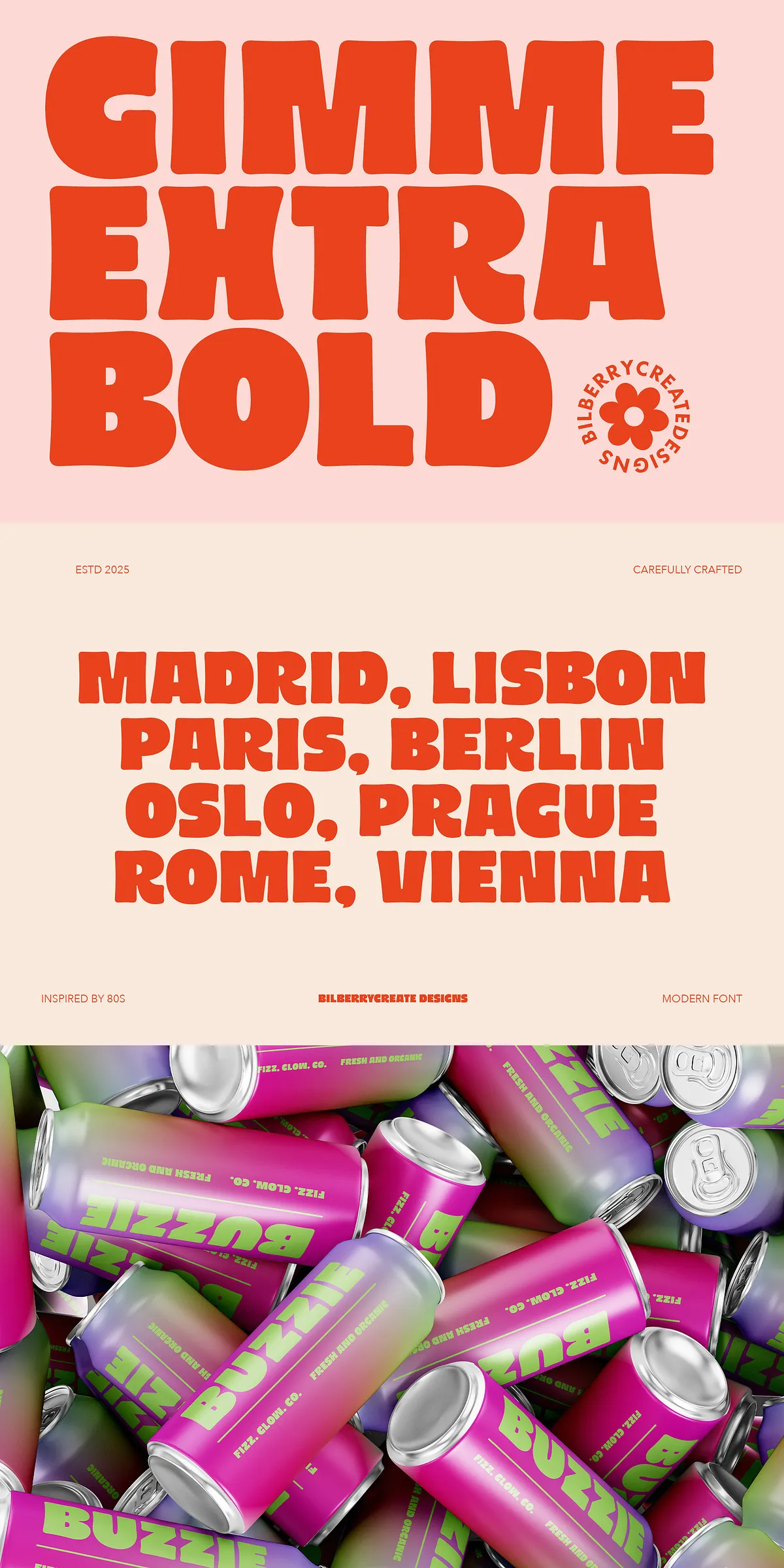
Practical Applications Across Media And Projects
Gimme Extra Bold adapts to a wide range of creative scenarios. Designers and makers will find it especially effective for:
- Logo design and wordmarks that require bold, memorable forms
- Posters and promotional artwork where headline impact is essential
- Packaging and labels that benefit from strong typographic presence
- Apparel and merchandise prints that favor chunky, legible display type
- Invitation and greeting card headlines with a retro atmosphere
- Social media graphics and banners that need to stand out in feeds
How To Use The Font Effectively Today
Apply Gimme Extra Bold as the primary display face. Keep supporting text in a neutral sans or a humanist serif to balance the heavy weight. For maximum legibility, reserve Gimme Extra Bold for short lines and large sizes—headlines, badges, and short taglines. When the design calls for more breathing room, increase letter-spacing slightly to avoid crowding in denser layouts.
Design Pairing Tips And Production Guidance
Pair Gimme Extra Bold with clean, unobtrusive body fonts and minimal color palettes to let the type carry the visual weight. Use contrasting weights or a lighter sans for subheadings to create hierarchy. For print, test halftone and screen-print separations—this font holds up well to bold ink coverage and textured printing methods. For digital use, ensure sufficient color contrast and test on multiple devices to maintain the intended impact across screens.
Optimizing Output For Print And Screen
When preparing assets for print, convert text to outlines only if required by your printer; otherwise keep fonts embedded to preserve editing flexibility. For web use, serve the included WOFF file and pair it with appropriate font-display settings for fast rendering. Check kerning and tracking at display sizes, and adjust tracking for tight headlines to prevent collisions.
Support Licensing And Contact Information
Gimme Extra Bold ships with standard desktop and web use formats. If you need broader licensing, variable font options, or a webfont kit with additional weights, contact the seller for custom licensing and technical support. We respond quickly to installation or compatibility questions and provide guidance for integrating the font into your workflow.