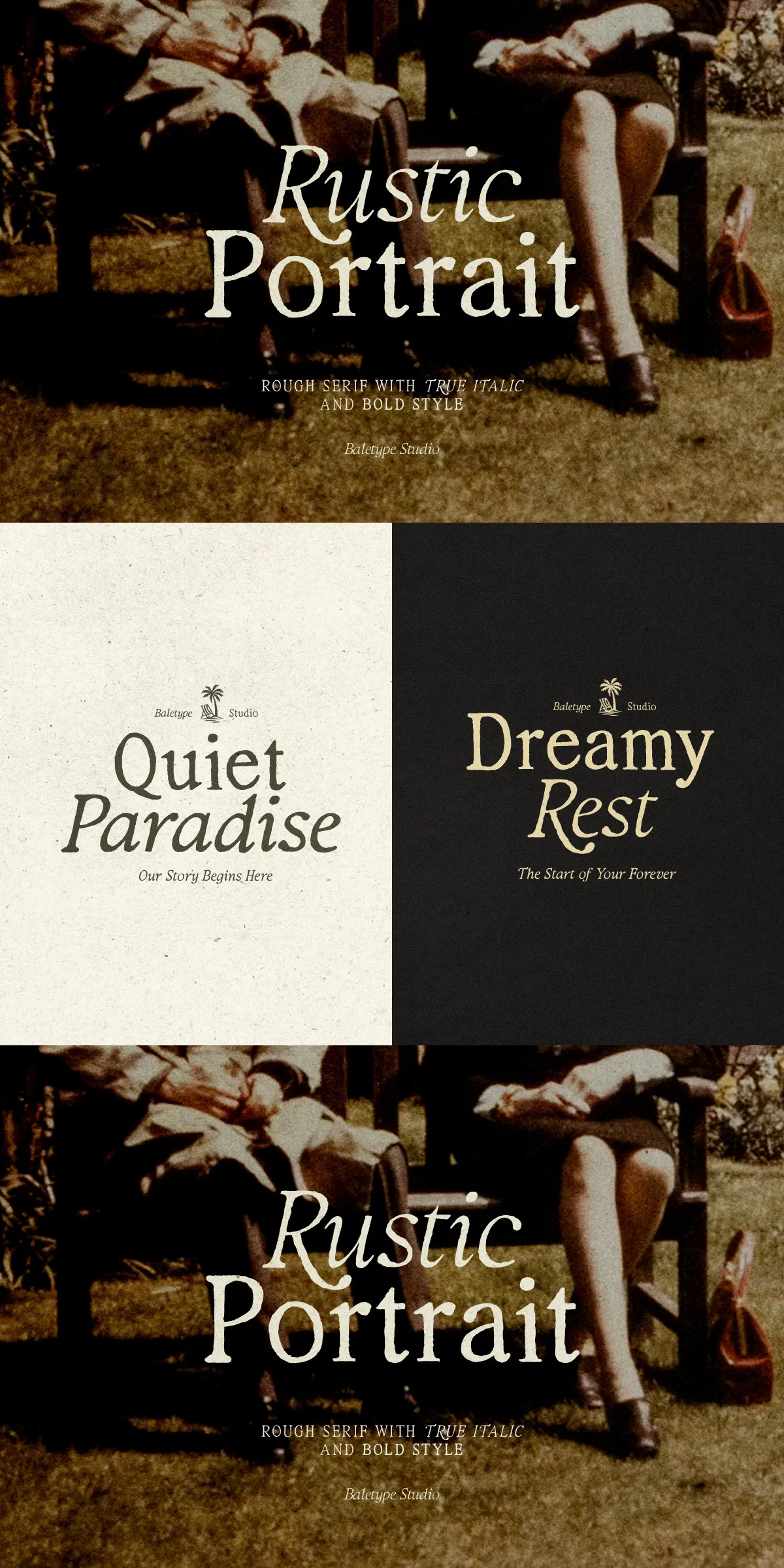
Rustic Portrait captures the warmth and authenticity of handcrafted letterforms. The family reads as deliberately tactile: slightly roughened terminals, subtle texture, and carefully varied stroke endings give each character a human touch. Designed to feel approachable and artisanal, Rustic Portrait drives emotional connection while maintaining production-ready clarity. Use it where sincerity and craft matter—brand identities, packaging lines, editorial spreads, and lifestyle collateral all gain personality and presence.
Authentic Handcrafted Texture And Warm Serif Character
Distinctive Letterforms That Emphasize Natural Imperfection
Rustic Portrait intentionally preserves hand-led nuances that communicate craft. Counters open comfortably, serifs remain readable at display sizes, and slight irregularities suggest a drawn origin rather than a sterile computer construct. This texture reads as deliberate: it signals authenticity and invites tactile association in audiences. The result is type that feels honest, rooted, and memorably human.
Active Details That Boost Visual Storytelling
Designers will notice active details throughout the family: tapered strokes that lead the eye, terminals that conclude with character, and spacing tuned to enhance headline rhythm. These elements work together to lift packaging copy, reinforce artisanal branding, and create headlines that feel hand-crafted but professionally executed.
Versatile Font Family Suited For Diverse Creative Projects
Flexible Styles For Branding And Editorial Systems
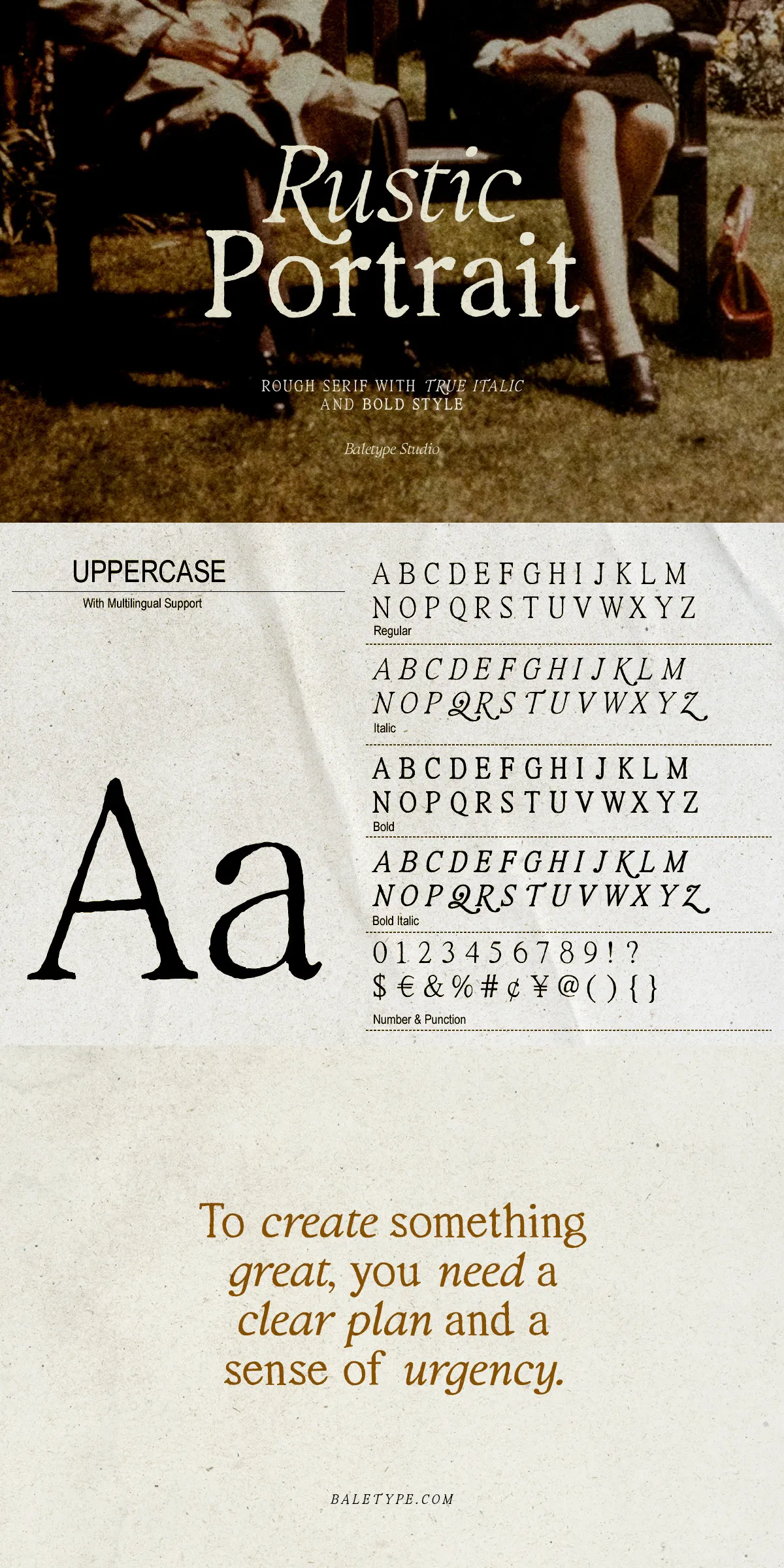
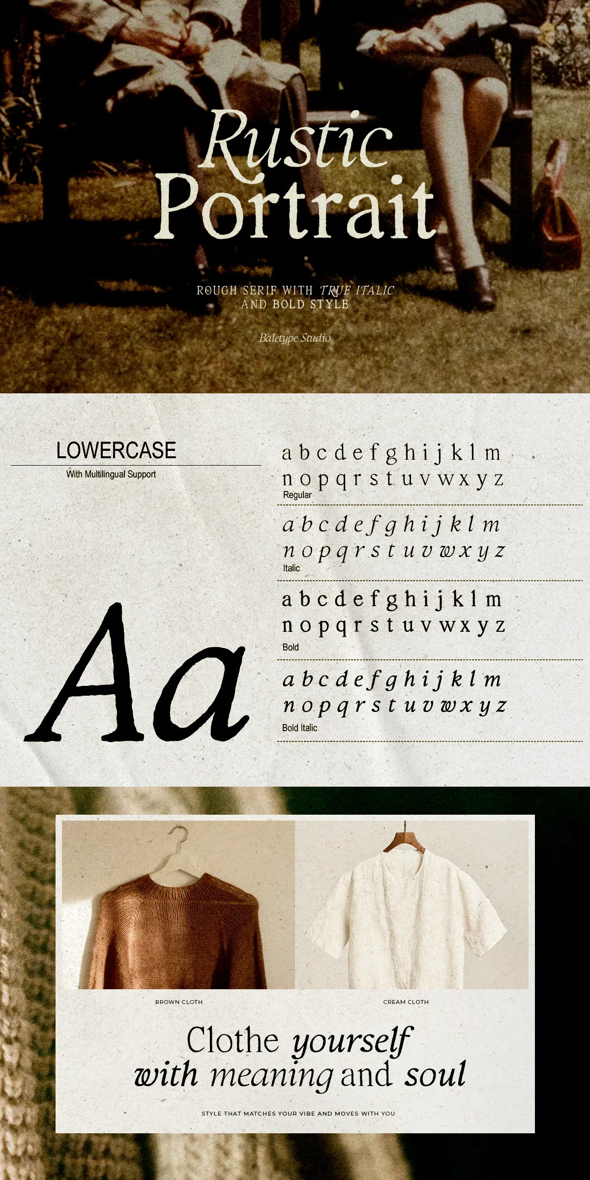
Rustic Portrait ships with four practical styles—Regular, Italic, Bold, and Bold Italic—so you can quickly build typographic hierarchy without switching families. Use Regular for body or supporting copy where texture should remain subtle; use Bold for product names, tags, and display headlines; apply Italic and Bold Italic for emphasis, accents, and expressive pull-quotes. The family adapts seamlessly from product labels to long-form editorial compositions.
Applications That Benefit From Organic, Artisanal Tone
- Brand identity systems for craft beverages, boutique food producers, and handmade goods
- Premium packaging where shelf presence must feel authentic and high-value
- Editorial layouts and magazine features seeking a warm, human counterpoint to photography
- Web banners, hero headlines, and social graphics that require personality at display sizes
Technical Features And Production-Ready File Formats Included
Complete Glyph Set And Multilingual Coverage For Global Use
Rustic Portrait includes full uppercase and lowercase alphabets, numerals, punctuation, and essential diacritics for broad Latin-language support. The family comes with clean kerning, robust spacing, and consistent metrics so designers can deploy text quickly without extensive manual adjustment. These features reduce production friction while preserving the handcrafted aesthetic.
Formats And Workflow Compatibility For Designers
The fonts are provided in OTF, TTF, and WOFF formats to support desktop design, web embedding, and cross-platform workflows. They integrate with major design tools—Adobe Creative Cloud, Affinity, Figma, Sketch—and CMS platforms that accept webfont uploads. Test optical sizes and spacing at intended output scales to maximize legibility and preserve texture on-screen and in print.
Practical Recommendations And Licensing Guidance For Production
Best Practices For Pairing And Hierarchy Decisions
- Pair Rustic Portrait with a neutral sans-serif for long copy to maintain reading comfort while keeping headline warmth.
- Reserve textured weights for display use—logo marks, labels, and hero headings—while using lighter styles for supporting content.
- Leverage Italic styles for captions, product descriptors, and emphasis rather than decorative flourish alone.
Licensing Notes And Implementation Tips For Teams
Confirm licensing for desktop, webfont, app embed, or enterprise use before embedding the family into commercial products. Verify file delivery and hinting for best screen rendering, and export final typographic assets (SVGs or high-resolution images) when exact texture preservation is critical across platforms. Reach out to the foundry or distributor for extended language support, variable font options, or bespoke licensing requirements.