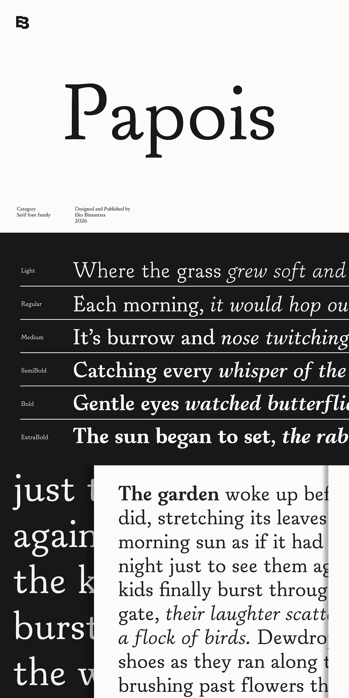
Papois channels the warmth and charm of early 20th-century American old-style serifs while acting with thoroughly modern intent. The typeface adopts soft edges, moderate stroke contrast, and a subtle diagonal stress that echoes its calligraphic roots. Each glyph reads as handcrafted and organic rather than mechanical; designers will notice how the gentle curves and measured terminals invite close reading while imparting a friendly, refined tone. Papois deliberately balances character and restraint so it can stand confidently in both display and extended text roles.
Readability and Versatile Application Across Projects
Papois performs reliably across sizes and media. In headlines it asserts presence through nuanced contrast and charming serifs; in body text it sustains comfortable readability through consistent proportions and open counters. Use Papois to build cohesive editorial systems, where its warm voice complements photography and generous layouts. Activate Papois for branding projects to convey approachability with sophistication: its organic shapes communicate authenticity for lifestyle, hospitality, and boutique product identities. For packaging and invitations, Papois lends a handcrafted, premium feel without compromising legibility.
Technical Features and Language Support Included
Papois ships as a robust family that adapts to global production needs. The family includes 12 styles ranging from Light through ExtraBold, each paired with a matching italic to offer expressive hierarchy and emphasis. It provides full uppercase and lowercase sets, lining and oldstyle numerals, common punctuation, and essential diacritics for extended Latin coverage. Designers will appreciate the careful kerning and thoughtfully tuned metrics that reduce tuning time in layouts. Papois also supports multilingual typesetting and integrates seamlessly into editorial workflows and web deployments.
Practical Tips for Effective Typography with Papois
To maximize Papois’s character, increase tracking slightly for very large display treatments to preserve letterform clarity and emphasize the serif details. Reserve italics for emphasis, captions, and pull quotes to create contrast in editorial spreads. Pair Papois with a neutral sans-serif for body copy in UI contexts or long-form digital reading; a humanist or geometric sans will complement Papois’s warmth while maintaining accessibility. When composing brand lockups, allow generous whitespace around Papois headlines to reinforce their approachable presence.
File Formats, Licensing, and Workflow Integration
Papois arrives ready for production with common desktop and web formats. Expect OTF and TTF packages for print and design applications plus WOFF/WOFF2 for optimized web use. Implement font-display: swap for web embedding to avoid invisible text while preserving the visual identity. Verify licensing terms for commercial projects—confirm whether the trial or demo versions supply commercial rights or if a full license purchase is required. For print collateral, embed OTF/TTF files into PDFs to ensure consistent output across print vendors.
Included Items and What Designers Receive
- Complete family of 12 styles from Light to ExtraBold
- Matching italics for each weight
- Uppercase and lowercase alphabets
- Numbers, punctuation, and diacritic support for extended Latin
- OTF, TTF, and web-friendly WOFF/WOFF2 file formats