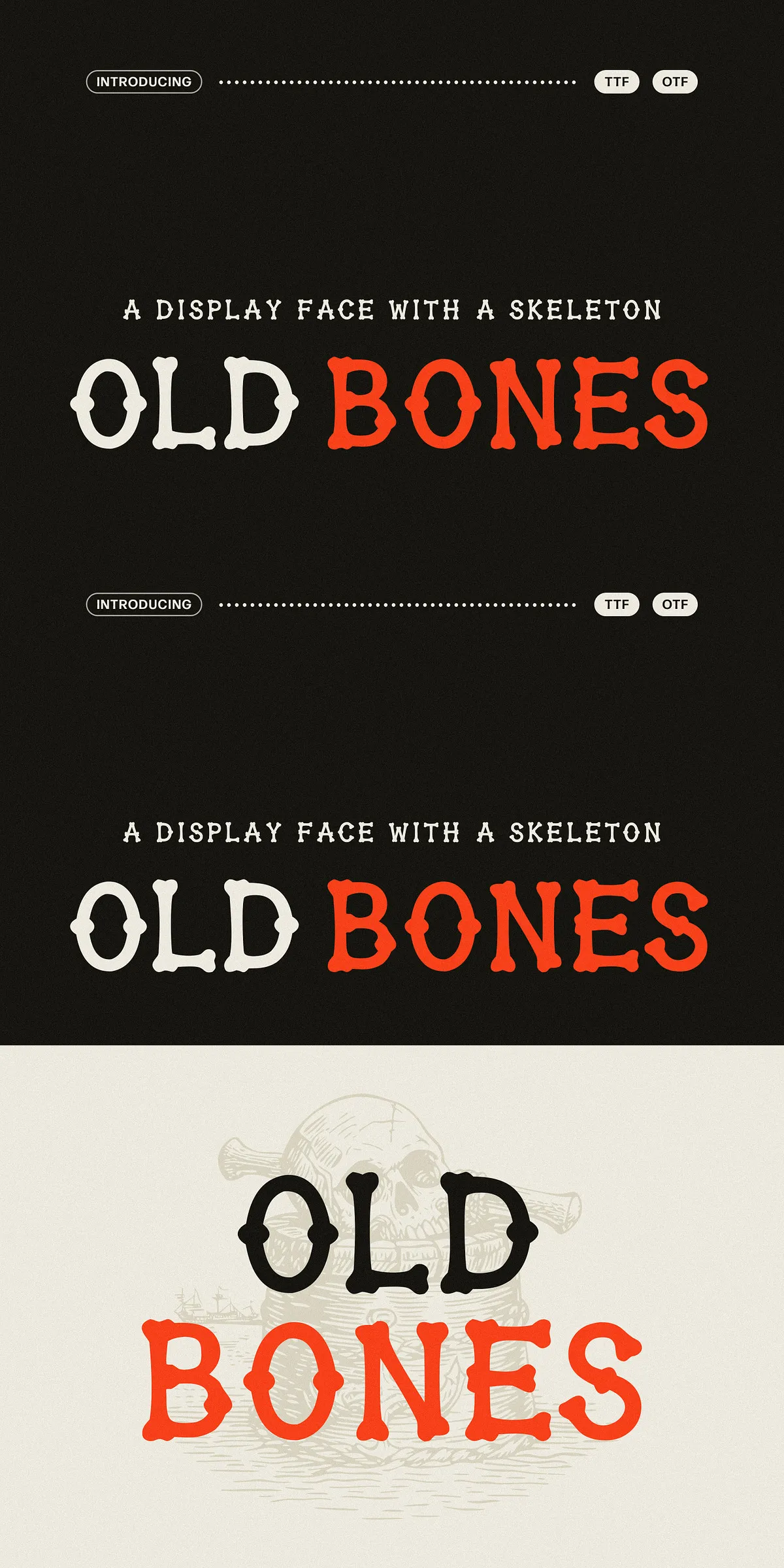
Old Bones grows directly from the visual language of antique engraving, skull-and-crossbones woodcuts, and weathered tavern signage. Each glyph is drawn by hand, so letters retain the pleasing irregularity and tactile texture of old print pulled from a worn block. The terminals swell into knobby, bone-shaped serifs that emphasize silhouette and presence, while intentionally rough edges and staggered rhythm create an immediate, theatrical character at large sizes. Old Bones doesn’t whisper — it announces, commands, and dramatizes.
Where Old Bones performs best in creative projects
Use Old Bones where short, loud typographic statements need personality and attitude. The face holds a strong silhouette even when reproduction turns gritty, making it ideal for maritime, horror, and old-world themed work. It excels across branding and identity for craft venues, concert posters, merchandise, and packaging where a bold, handcrafted voice elevates the visual story.
Distinctive knobby terminals and rough edges
The font’s most striking feature is its knobby, bone-like serifs that give each letter a distinct, unmistakable outline. Roughened strokes and slightly uneven counters emulate the imperfections of historical woodcuts and letterpress. This deliberate texture works to create mood and atmosphere: eerie for horror-themed pieces, robust for maritime and tavern aesthetics, and authentic for heritage-inspired branding.
Practical uses and real-world applications for Old Bones
- Branding and logos — craft breweries, tattoo studios, barbershops, dive bars, motorcycle clubs that need a bold handcrafted seal.
- Poster and flyer design — gig posters, horror screenings, Halloween events, metal shows, and themed parties where headline impact matters.
- Merchandise — band tees, enamel pins, skate decks, patches, and sticker packs that demand a gritty, iconic mark.
- Packaging design — hot sauce labels, spirit bottles, coffee bags, craft soda, and candle tins seeking personality and tactile charm.
- Editorial and titles — book covers, chapter openers, comic titles, and zine headers that benefit from theatrical display type.
Feature set designers rely on
- Uppercase A–Z with lowercase keys repeating capitals for consistent display compositions.
- Complete numerals, punctuation, and core symbols to support headers and short blocks of copy.
- Available in both OTF and TTF formats for broad workflow compatibility across print and digital tools.
Design and production recommendations for best results
Because Old Bones is meant to speak loudly, reserve it for headlines, short headlines, and identity marks rather than long body text. At large sizes, let the knobby serifs and textured edges breathe: increase tracking slightly and allow generous leading when pairing with secondary text. For high-fidelity print finishes such as letterpress, foil, or embossing, test proofs to confirm how the rough edges translate under pressure or metallic ink. For web use, consider rasterizing headline art for pixel-perfect control on small screens, or pair Old Bones with a clean sans for readable body copy.
Pairing suggestions and tonal guidance
Pair Old Bones with neutral, geometric sans-serifs to let the display face dominate while supporting readability for longer passages. Use restrained punctuation and limited alternates in compact lockups to avoid visual clutter. Opt for distilled color palettes and textured paper stocks to complement the font’s weathered personality and historic reference.