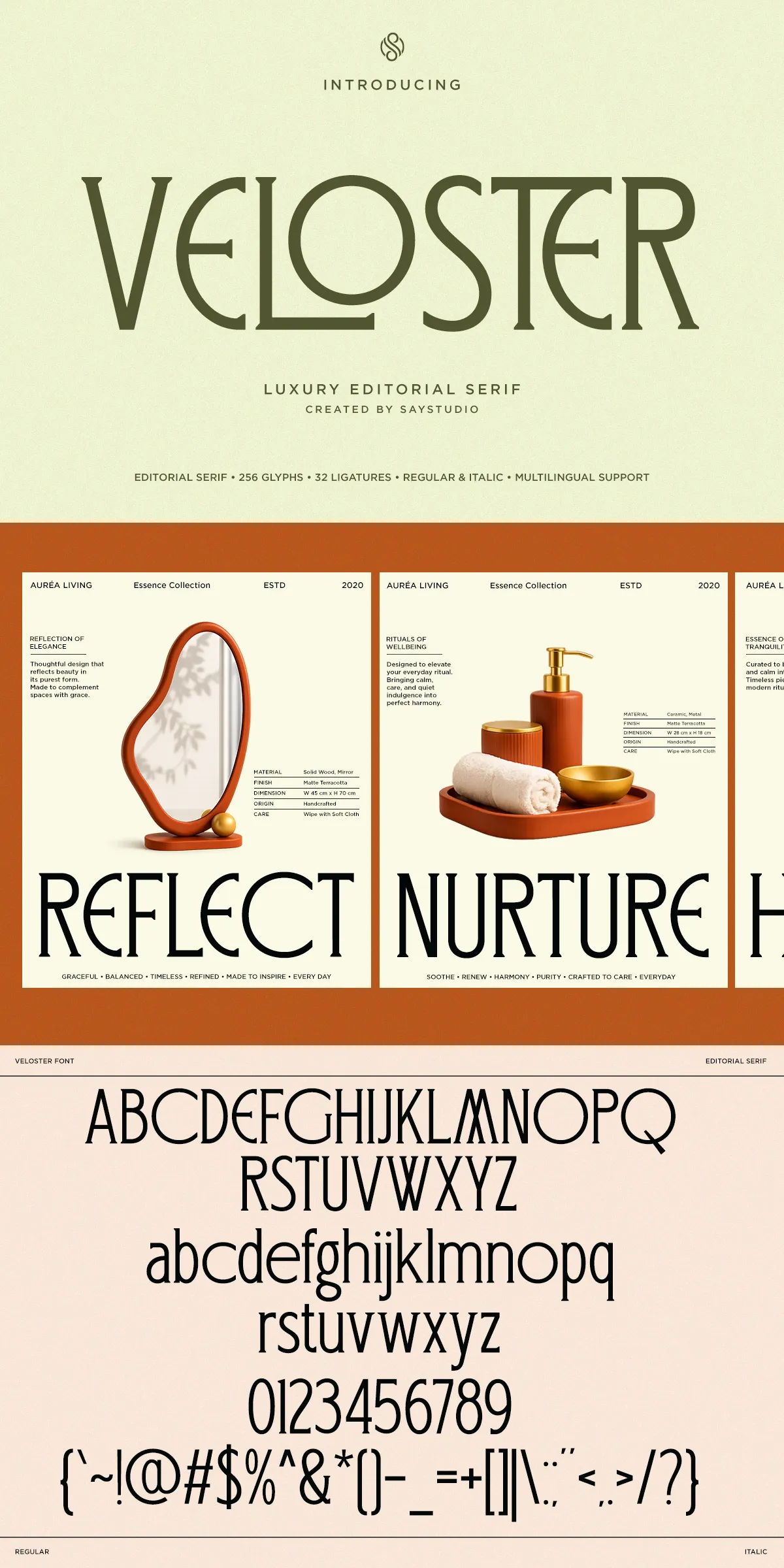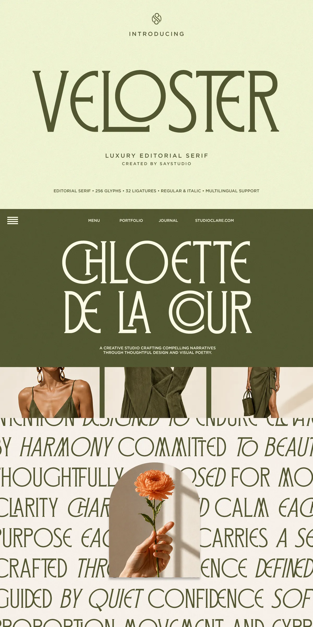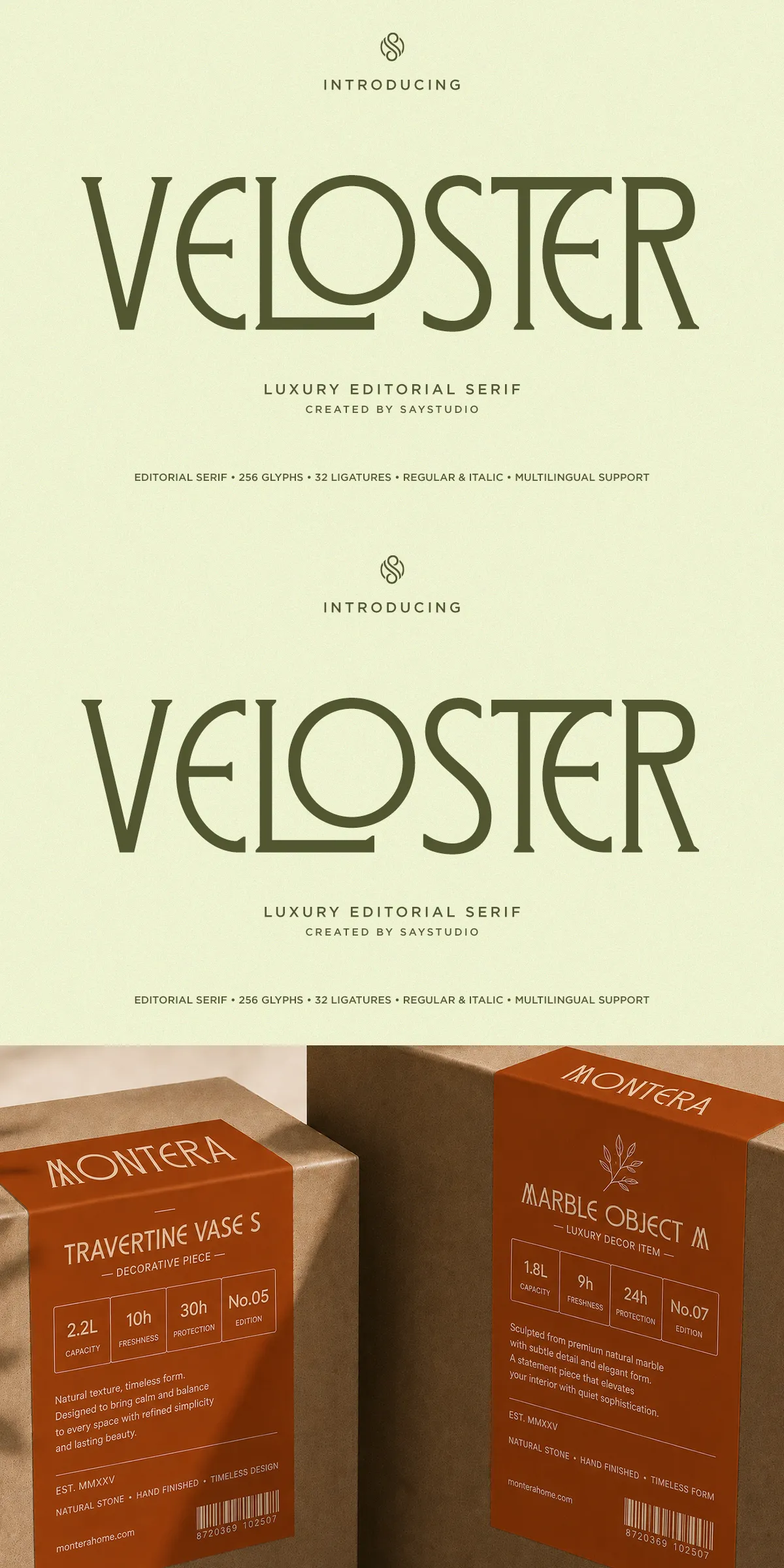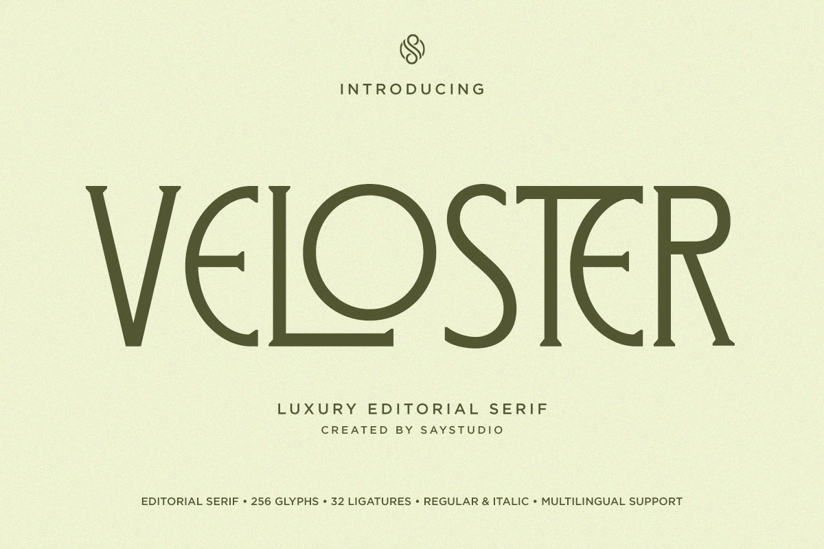

Veloster delivers an immediate sense of luxury and considered craft. Built with graceful contrast, elegant terminals, and purposefully drawn proportions, Veloster elevates headlines and brand marks with a poised, editorial voice. The typeface draws inspiration from premium magazine typography and boutique packaging systems, and it performs where refinement matters most: fashion campaigns, beauty and cosmetic identities, jewelry packaging, hotel and hospitality collateral, wedding stationery, and high-end print advertising. Veloster helps brands assert a polished, modern presence while remaining approachable and readable across touchpoints.
Distinctive Ligatures And Carefully Sculpted Alternates
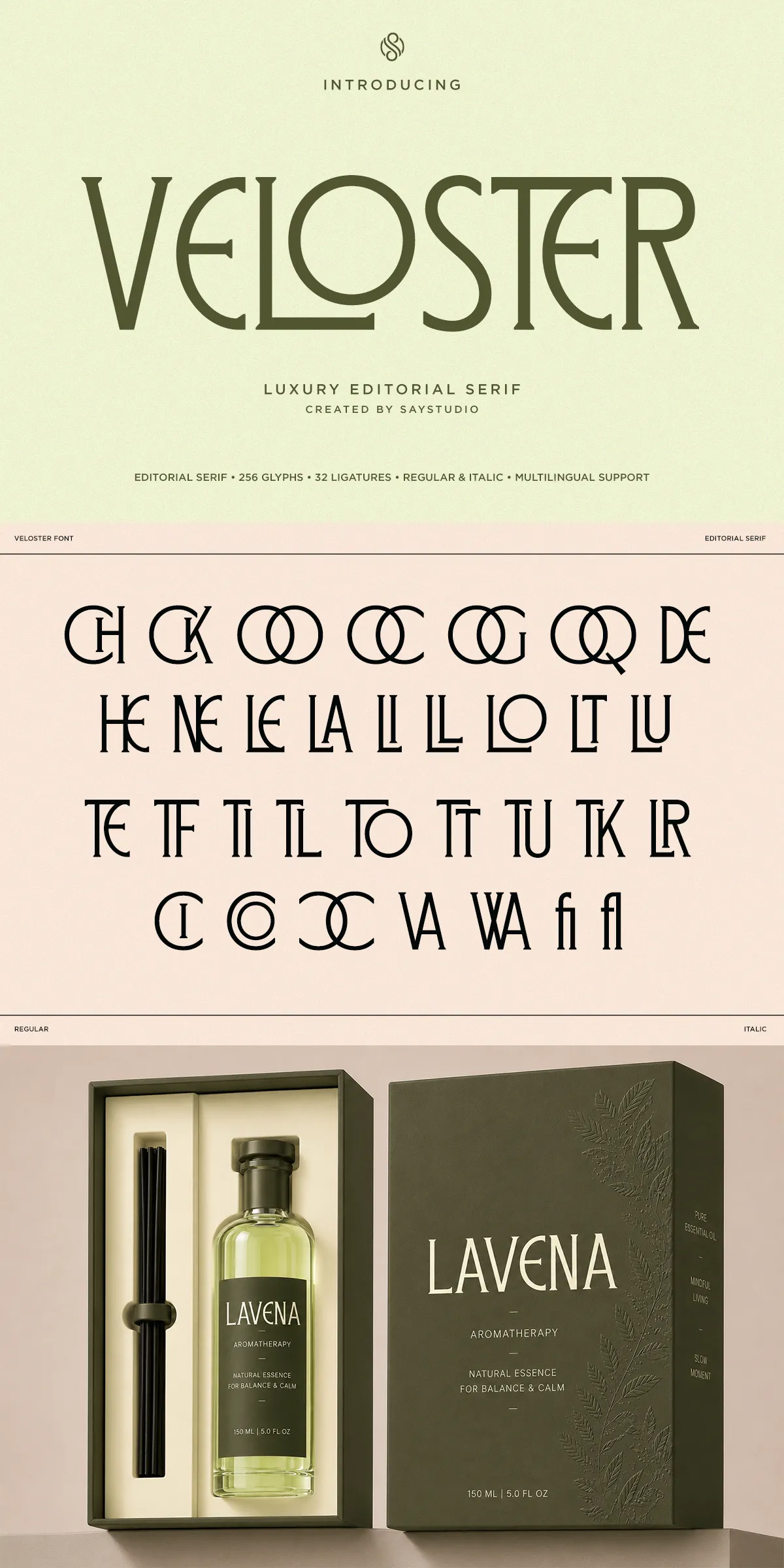
Veloster includes stylistic ligatures and alternates that designers can deploy to craft distinctive wordmarks and expressive headlines. These purposeful glyph options create subtle rhythm and flourish without compromising clarity. Use alternates sparingly to preserve impact; lean on regular letterforms for longer text. The italic complements the regular style with fluid motion and refined cursive details, allowing dynamic typographic hierarchies that move from assertive display headlines to softer, elegant subheads.
Files Included And Technical Format Details
- Veloster Regular and Veloster Italic desktop fonts in OTF/TTF formats for professional layout applications
- Web-optimized WOFF and WOFF2 files for fast, consistent browser rendering
- Complete glyph set including uppercase, lowercase, numerals, punctuation, and currency symbols
- Stylistic ligatures and alternates packaged for immediate use
- Multilingual support for extended Latin languages to serve international branding needs
Practical Use Cases And Active Implementation Advice
Apply Veloster as a headline or logo type to command attention: increase size, tighten tracking slightly, and allow the contrast and ligatures to define the visual tone. For editorial layouts, use Veloster sparingly in display roles and pair it with a neutral sans-serif for longer body copy to preserve readability and visual balance. In packaging, Veloster provides an instant premium cue — combine it with minimal color palettes and generous white space to emphasize quality. For digital hero headers, use the italic for softer messaging and the regular for more declarative statements.
Typography Pairing And Layout Recommendations
Pair Veloster with a clean geometric or humanist sans for body text (for example, a neutral grotesk or humanist sans) to create contrast and legibility. When using Veloster across responsive screens, adjust size and line-height for small viewports and consider toggling alternates to preserve letter spacing. Use webfont formats (WOFF/WOFF2) to optimize load performance, and preload critical font resources to avoid layout shifts.
Licensing, Production Guidance, And Commercial Use
Before deploying Veloster in commercial products, confirm the license tier that matches your project scope — desktop license for print and in-app design, web license for embedding across domains, app license for mobile application distribution, and extended licenses for product resale or large-volume distribution. Keep the original font files in your production archive and provide recommended formats to vendors and printers. The packaged guide outlines how to access ligatures and alternates through OpenType features so you can implement stylistic choices without manual glyph substitution.
Why Choose Veloster For Luxury Brand Experiences
Veloster actively shapes a refined brand narrative: it balances editorial heritage with modern clarity, offers expressive typographic tools through ligatures and alternates, and supports practical production needs via standard file formats and multilingual coverage. If your project seeks to communicate artful sophistication, visual consistency, and memorable typographic character, Veloster supplies the considered details and reliable performance required by premium design systems.