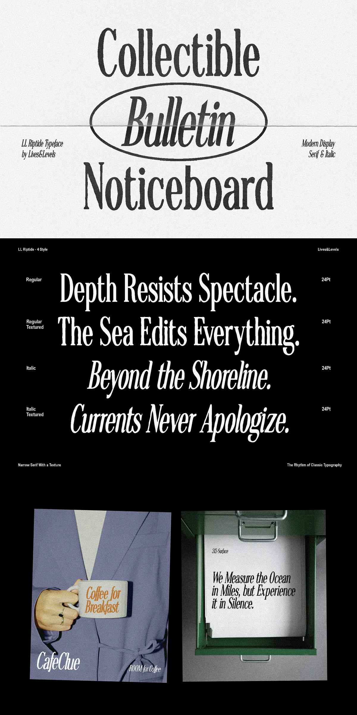
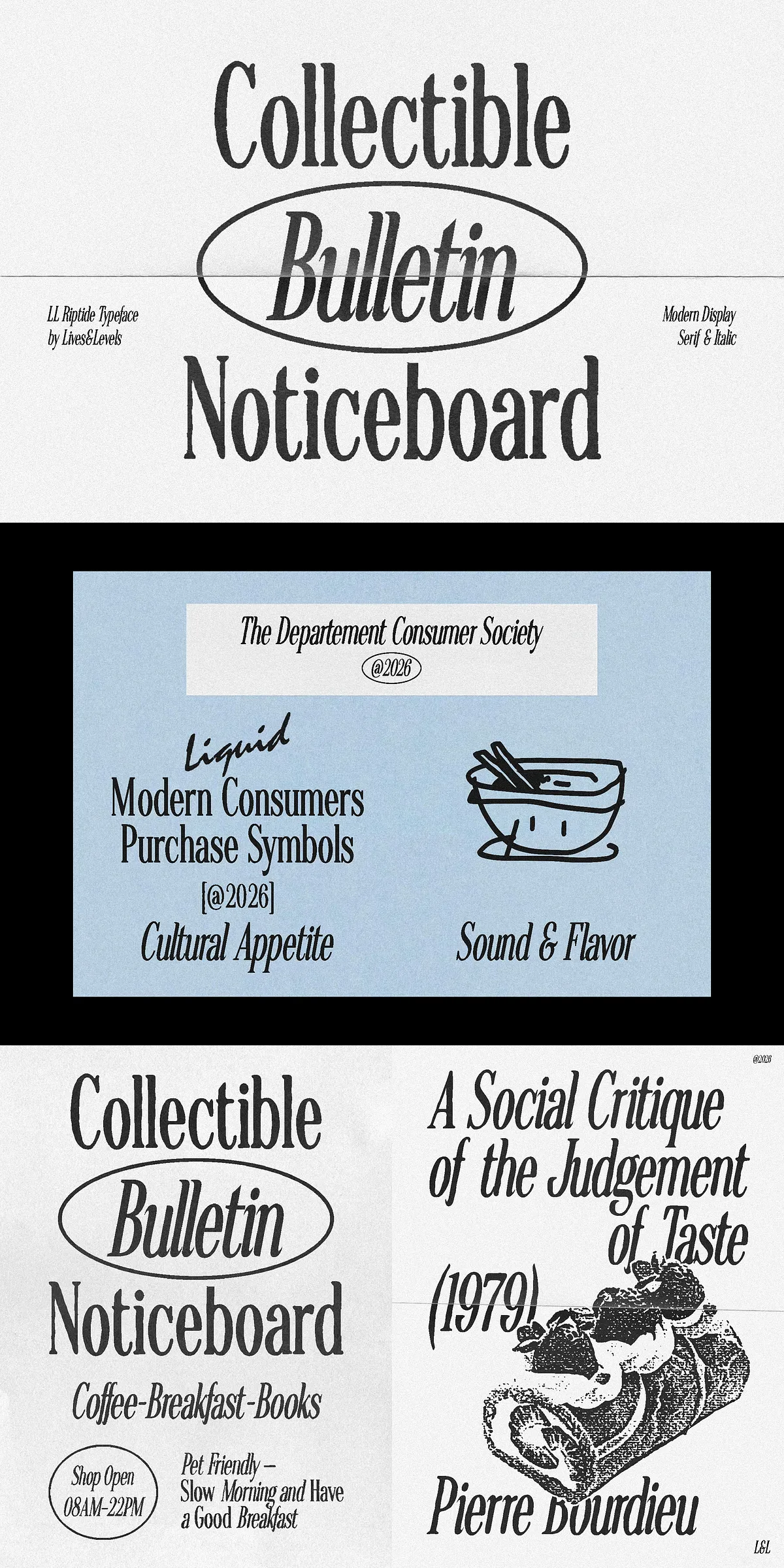
Riptide delivers a contemporary display serif that blends timeless elegance with modern confidence. Designed with deliberate high contrast, sculpted curves, and balanced proportions, Riptide creates distinctive editorial voice while remaining remarkably readable. Each letterform receives meticulous attention so that headlines command attention, brand marks feel authoritative, and visual identities register with memorable clarity. Riptide supports bold, confident statements across fashion campaigns, magazine covers, premium packaging, and creative portfolios.
Design Character That Balances Classic Rhythm And Modern Expression
High-Contrast Letterforms That Command Visual Attention
Riptide emphasizes vertical contrast and refined terminals, producing strong display presence without sacrificing legibility. The serif’s sculpted bowls and tapered strokes provide rhythm and motion in large sizes, while open counters retain clarity on both print and digital surfaces. You will find Riptide excels at mastheads, poster headlines, and logo treatments where a commanding typographic system matters.
Italic Style That Adds Fluidity And Expressive Motion
Riptide’s Italic does more than simply slant the upright forms: it introduces a fluid, expressive character that complements the upright family. The italic articulates emphasis, creates subtle hierarchy, and injects movement into editorial spreads. Use the Italic to highlight pull-quotes, to form elegant pairings with the upright headings, or to add a refined voice to product descriptions and captions.
Practical Applications And Where Riptide Performs Best
Fashion And Beauty Campaigns That Demand Sophisticated Typography
Designers use Riptide to evoke luxury and to anchor visual identity systems. Large-format headlines and product names benefit from the font’s dramatic contrast, while carefully tuned spacing preserves readability on labels and tags. Riptide elevates lookbooks, runway invites, and campaign graphics with a refined typographic foundation.
Editorial Layouts, Magazines, And Cultural Publications That Require Authority
Riptide provides editorial gravitas for magazine covers and section heads. Its structured forms support rigorous typographic grids and create consistent hierarchy across feature spreads. The Italic injects personality for pull-quotes and captions without disrupting editorial rhythm.
Premium Packaging And Identity Systems That Seek Shelf Presence
On luxury packaging and brand identity, Riptide communicates quality and clarity. Use the Regular or Bold weights for product names and the Italic for secondary copy or accent lines to produce layered, premium compositions that translate from print to e-commerce photography.
Technical Features And File Format Details For Production Workflows
Complete Glyph Set And OpenType Capabilities That Support Designers
- Full uppercase and lowercase letterforms
- Numerals, punctuation, and currency glyphs
- Multilingual Latin support to cover common Western languages
- Deliberate kerning pairs and clean spacing tuned for display use
- Italic that offers original shapes and expressive alternatives
Available Styles And Format Compatibility For Web And Desktop
Riptide ships in multiple styles to suit a range of visual weights: Regular and Italic, plus Rough, Bold, and Black for more dramatic display treatments. The family is supplied in OTF, TTF, and WOFF formats to ensure broad compatibility with professional design tools and web deployments. These formats integrate with Adobe Creative Cloud applications, Affinity, Sketch, Figma (as a webfont or through platform font upload), and established CMS workflows.
Workflow Recommendations And Best Practices For Typographic Excellence
Pairing Suggestions And Hierarchy Strategies For Strong Layouts
- Use Riptide at display sizes for primary headlines to showcase its contrast and sculpted shapes.
- Pair with a neutral humanist or geometric sans-serif for extended text to maintain reading comfort.
- Reserve Italic for emphasis, subheads, or pull-quotes to introduce motion and refined contrast.
- Test kerning and optical sizing in your production environment, especially for tight compositions and logotypes.
Licensing Notes And Support Guidance For Production
Confirm the appropriate license for your use—desktop, webfont, app embedding, or enterprise—before integrating Riptide into commercial products or packaging runs. Reach out to the foundry or authorized retailer for license clarification, installation support, and guidance on best practices for OpenType features. When working in web editors that limit OpenType access, prepare final assets in applications that fully support OpenType to preserve ligatures, italics, and spacing nuances.