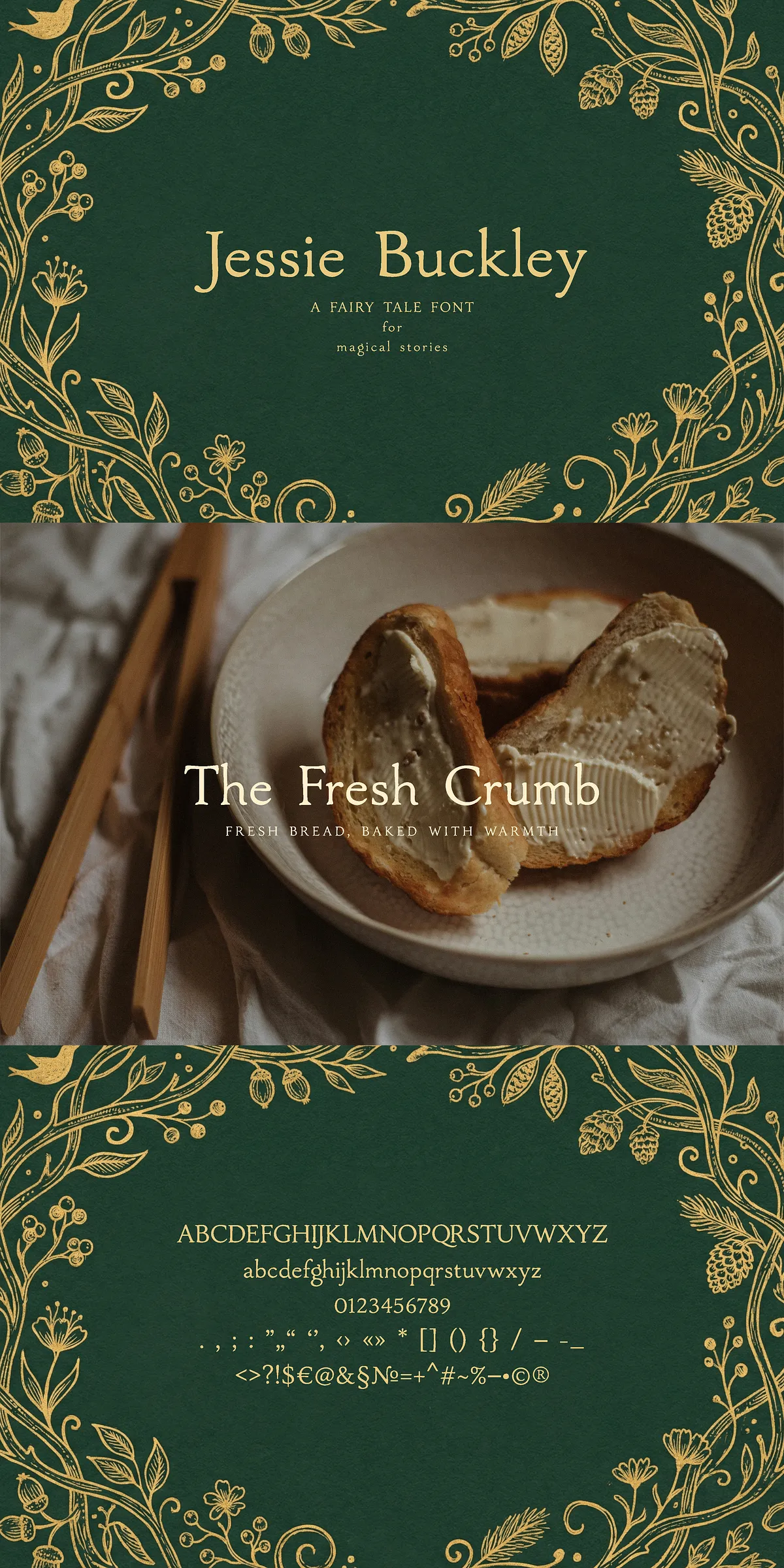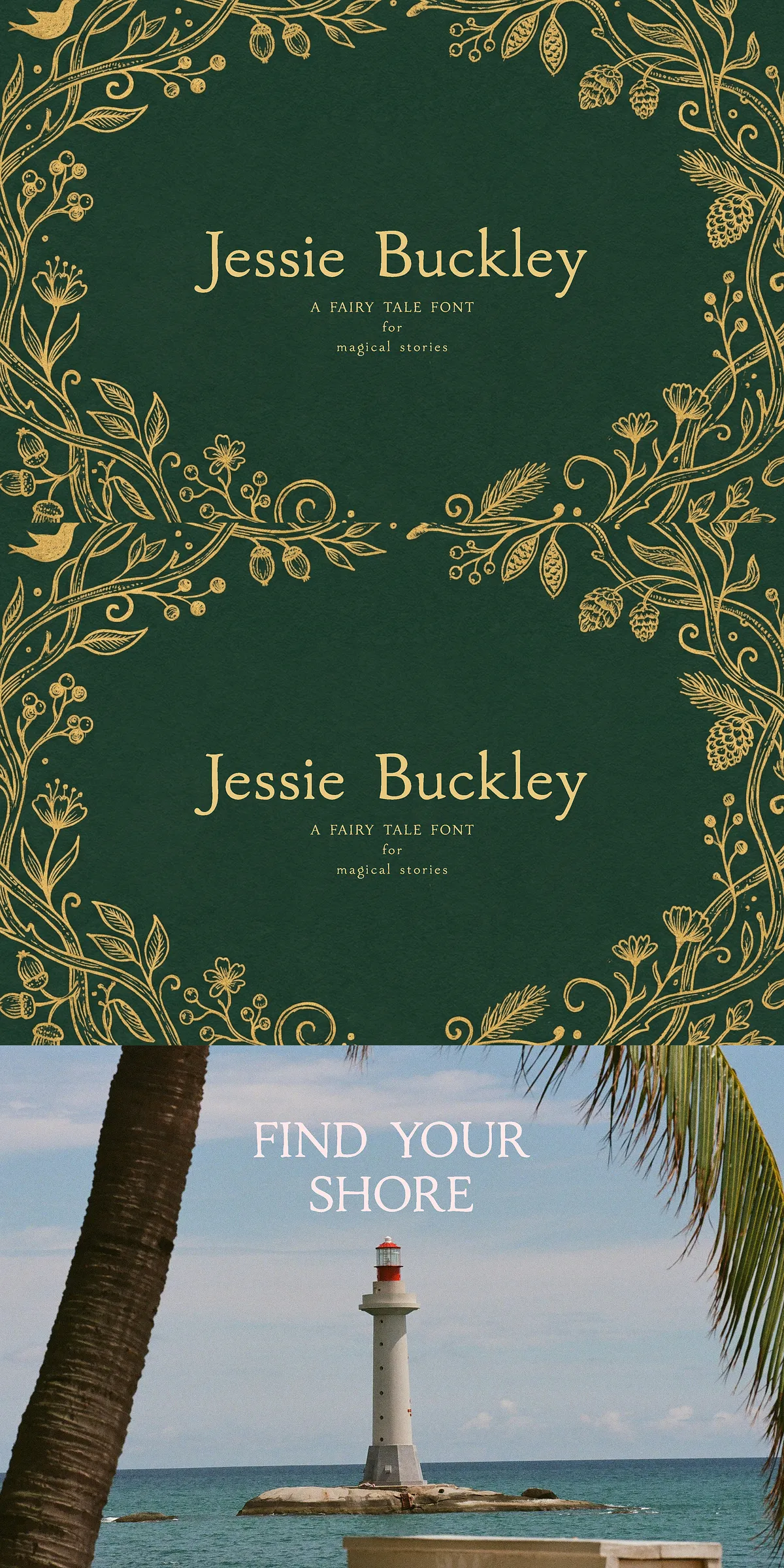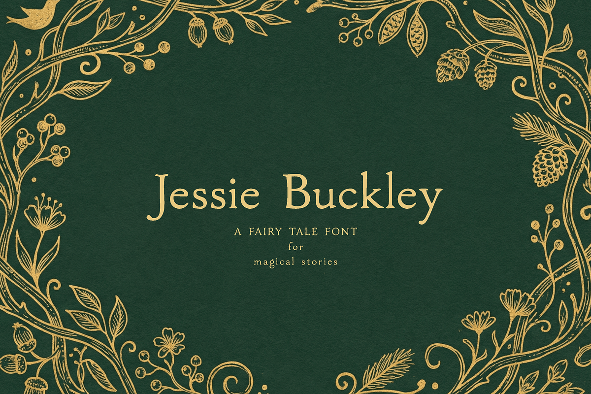

Jessie Buckley channels the charm of old storybooks and folklore through carefully shaped serifs and warm proportions. The typeface reads like a found treasure from a vintage library: its elegant terminals, subtle contrasts, and whimsical details invite readers into imagined forests and candlelit pages. Designed to evoke a soft nostalgic feeling, this serif balances legibility and personality so it performs equally well in display roles and short blocks of copy.
Rooted in classic serif traditions and influenced by the historical forms that defined printed fairytales, Jessie Buckley follows the broader conventions of serif design while adding hand-crafted character. For reference on serif classifications and features, see the Serif overview: [Serif](https://en.wikipedia.org/wiki/Serif)
Creative applications that benefit most from its storybook aesthetic
Use Jessie Buckley to craft covers that immediately communicate warmth and narrative. It excels on book jackets, chapter headings, and inside spreads where a whimsical yet readable voice is essential. Apply the font to children’s storybooks, fairy tale anthologies, poetry collections, and illustrated novels to enrich storytelling with type that feels lovingly made.
Branding, packaging, and collateral that feel handcrafted and sincere
Beyond books, Jessie Buckley enhances logos, small-brand identities, and boutique packaging. It lends a signature look to artisanal goods, stationery, invitations, and greeting cards. Pair the font with muted color palettes, textured papers, or illustrative flourishes to maximize its romantic quality. Designers and small brands will find Jessie Buckley particularly effective when they want packaging to read as an intimate, hand-told story rather than a mass-produced label.
Practical tips for pairing and layout
To preserve the font’s narrative presence, reserve it primarily for headlines, titles, and short display lines. For body copy, pair Jessie Buckley with a neutral sans-serif to maintain readability while keeping the overall composition balanced. When using the font at large sizes—such as cover titles or poster headlines—increase letterspacing subtly to reveal decorative terminals. For digital projects, test on multiple screen sizes and consider slightly heavier weights for small-screen legibility.
Audience and projects that gain the greatest impact
Jessie Buckley is ideal for authors, illustrators, designers, and brand owners who create dreamy, romantic, or storybook-inspired visuals. Use it for publishing projects aimed at children and young readers, indie presses, boutique lifestyle brands, themed events, or any creative venture that benefits from a warm, nostalgic voice. The font helps projects convey authenticity, handcrafted care, and the emotional pull of classic storytelling.
Design workflow and implementation guidance
Implement Jessie Buckley across print and digital workflows by selecting appropriate file formats for your platforms. For print, ensure high-resolution output and consider combining the type with letterpress, embossing, or spot varnish treatments for tactile effect. For web and social media, use optimized web font formats and scale for clarity on mobile devices. Always proof typographic choices in context—cover mockups, packaging dielines, and responsive layouts—so the font sustains its enchanted character in real-world use.
Why choose Jessie Buckley for narrative-driven design
Choose Jessie Buckley when you want type that actively supports storytelling. Its fairy tale sensibility gives visual projects an emotional anchor that connects with readers and customers. The typeface elevates covers, logos, invitations, and branded packaging by providing a voice that feels both familiar and freshly interpreted. In short, Jessie Buckley transforms ordinary text into a small, immersive world—perfect for designers who build meaning through mood, detail, and heart.