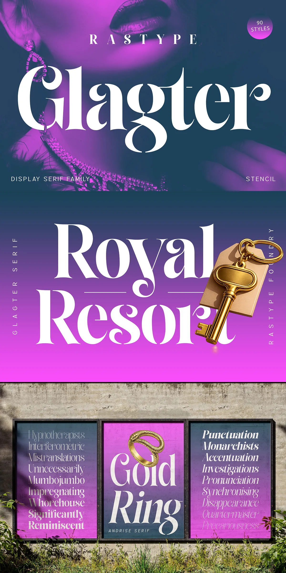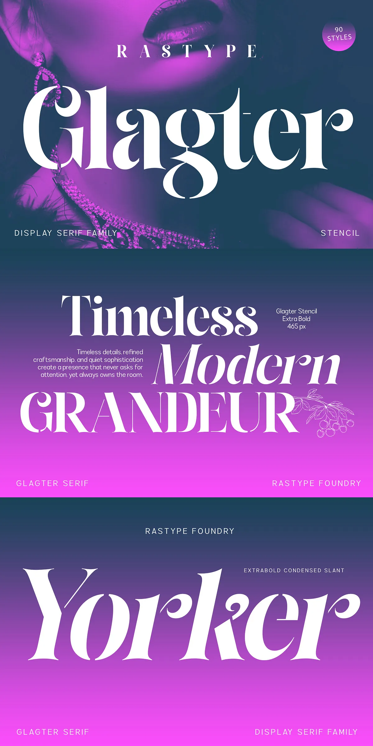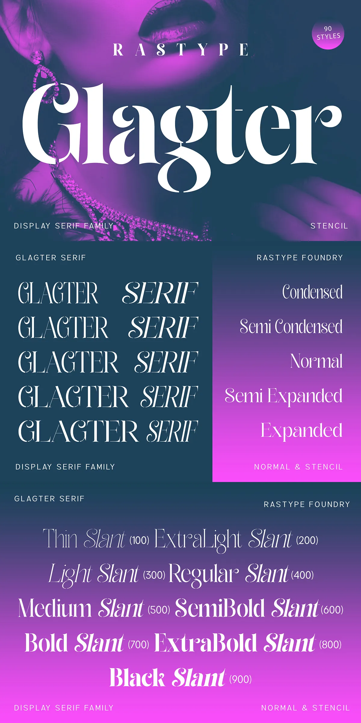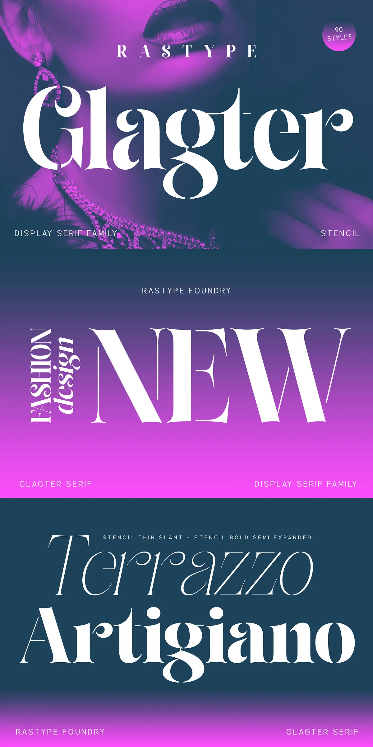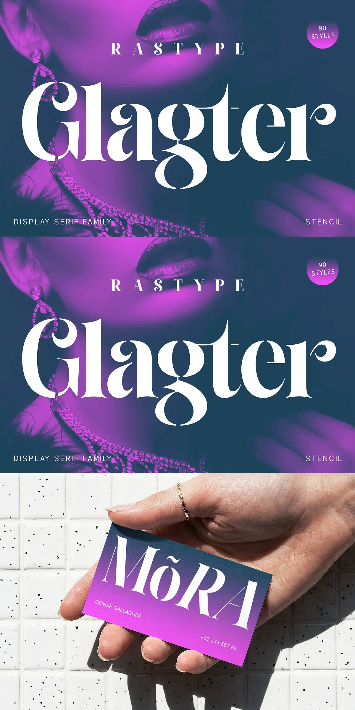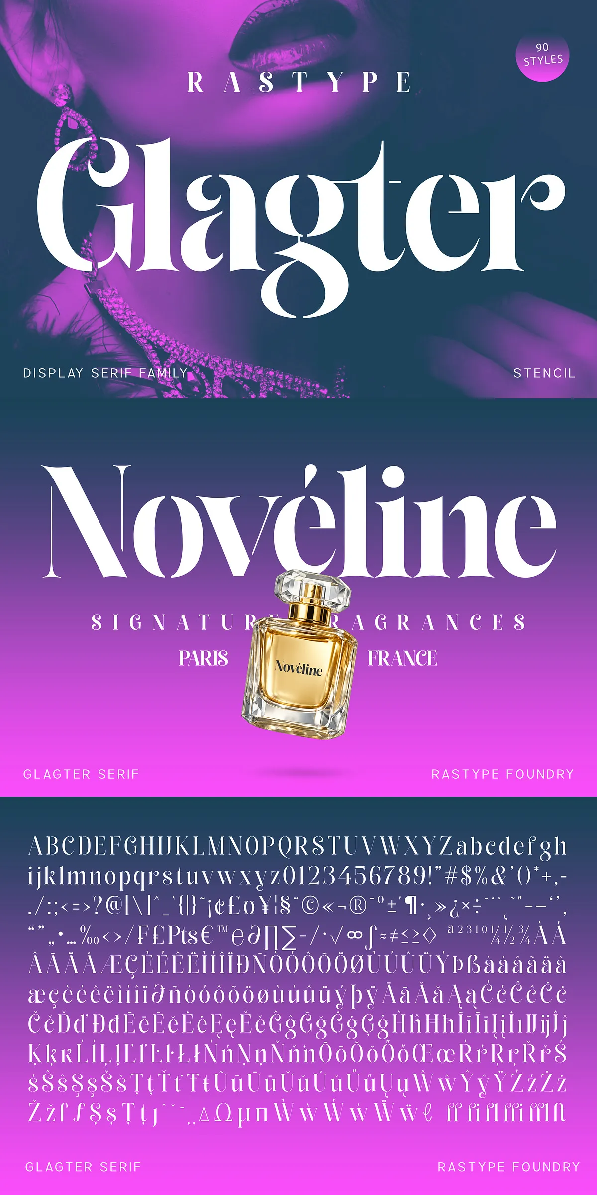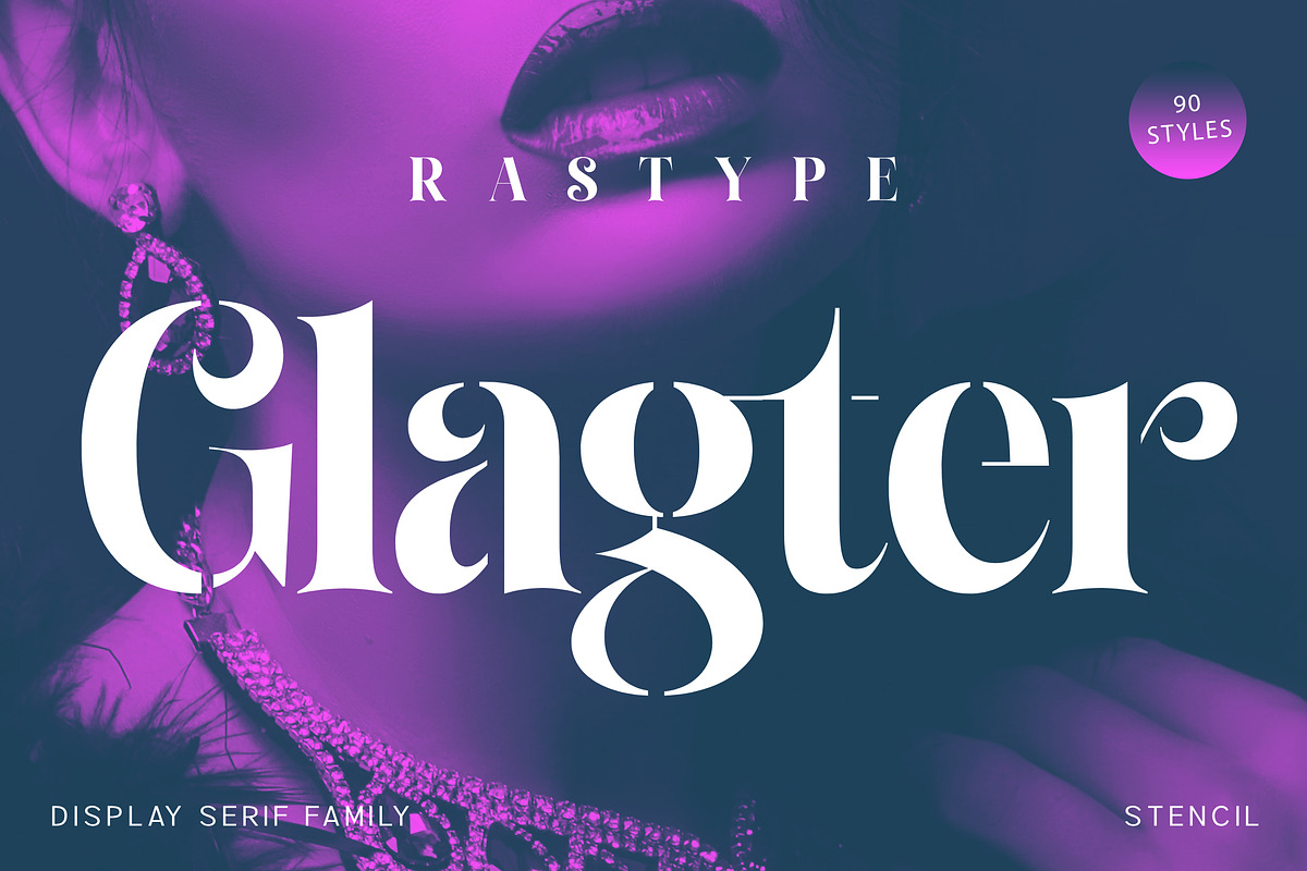

Glagter Stencil commands attention with a confident editorial voice that blends classic serif refinement and modern stencil attitude. The typeface pairs high-contrast strokes with elegantly carved stencil cuts to create letterforms that feel both timeless and intentionally graphic. Each character reads with clarity while delivering a sculptural, luxe presence—ideal when you need a headline that communicates sophistication and bold personality at the same time.
Distinctive stencil cuts and high-contrast details make impact
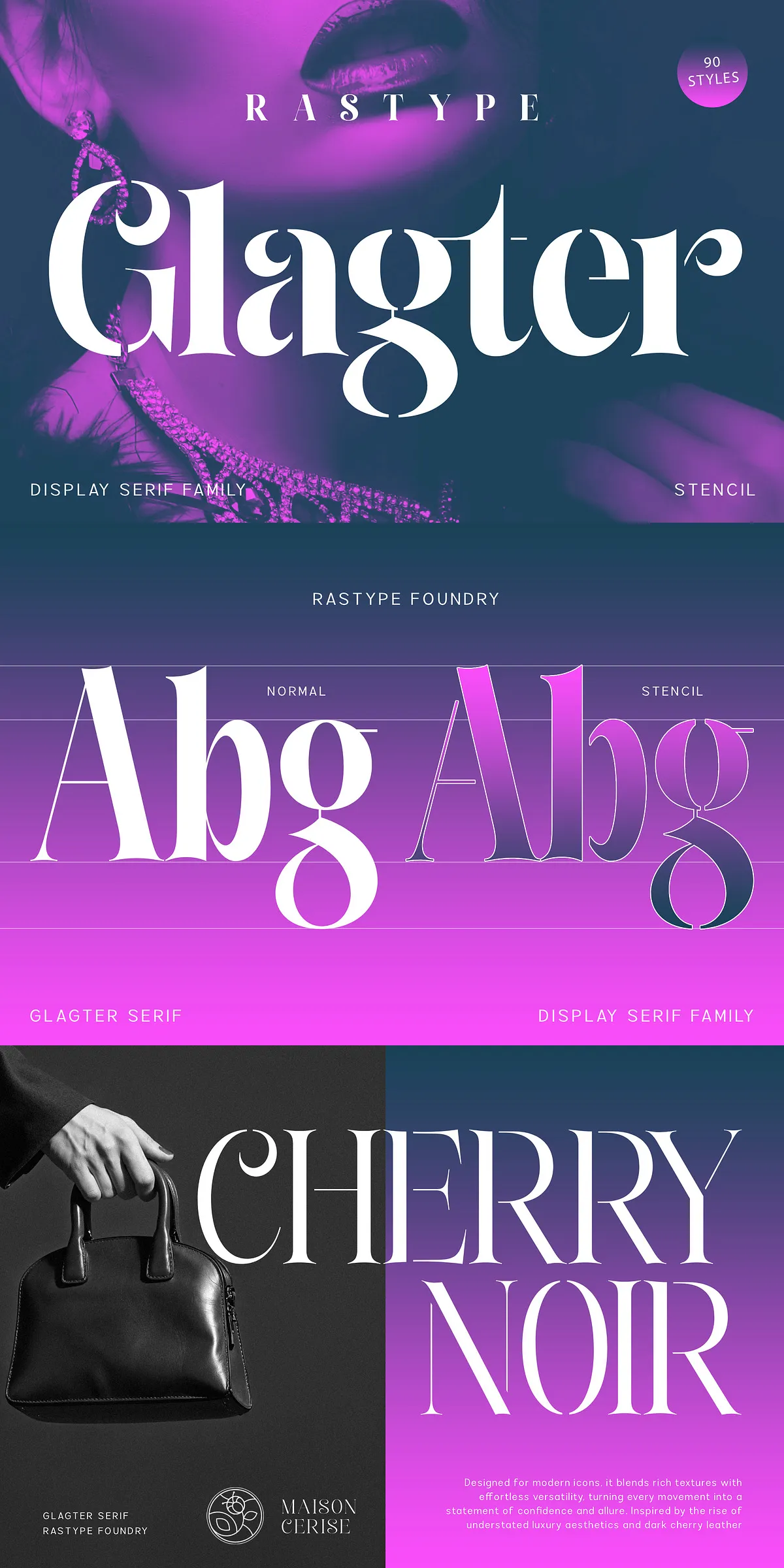
The stencil treatments in Glagter are precisely placed to preserve the integrity of the letterforms while introducing an industrial, modern edge. High-contrast stems and tapered serifs create dramatic silhouettes, and the stencil gaps enhance visibility and recognition at large sizes. These deliberate details allow Glagter Stencil to achieve strong brand recognition, commanding cover treatments, and memorable logotypes without sacrificing legibility.
Applications where Glagter Stencil drives premium perception
Use Glagter Stencil for projects that demand elevated visual voice. It excels in fashion campaigns, luxury packaging, premium product identities, editorial covers, posters, and signage. When you want typography to act as a direct expression of craftsmanship and exclusivity, Glagter delivers. Designers use it to sculpt wordmarks, craft bold magazine mastheads, and frame hero web banners that immediately convey glamour and authority.
Why Glagter Stencil enhances brand storytelling
Glagter’s mix of refined proportions and modern stencil geometry helps brands tell a cohesive premium story. The high-contrast strokes evoke classical print traditions associated with luxury, while the stencil cuts introduce a contemporary, design-forward attitude. This combination raises perceived value and creates versatile typographic assets that translate across print, packaging, and digital touchpoints.
Technical readiness and production-friendly features
Glagter Stencil integrates seamlessly into professional workflows. The family ships with carefully tuned spacing and kerning pairs to speed layout production and reduce manual adjustments. It supports standard production formats for broad compatibility with web and print platforms. Because the font balances decorative character with robust structure, it performs reliably in large display settings as well as controlled editorial use.
Included glyphs, supports, and file formats for flexibility
- Complete uppercase and lowercase alphabets with cohesive proportions
- Numerals, punctuation, and common symbols for editorial and packaging needs
- OpenType features for alternates and stylistic control (where included)
- Multilingual coverage for extended Latin languages
- Available in OTF, TTF, and web-ready WOFF/WOFF2 formats for cross-platform use
Practical pairing recommendations and usage tips
For balanced systems, pair Glagter Stencil with a neutral sans-serif for body copy to maintain hierarchy and readability. Use Glagter at large sizes for maximum impact: hero headlines, embossed packaging marks, and signage. When creating logotypes, selectively apply stencil alternates to achieve uniqueness without overcomplicating letterform recognition. For print, test on both coated and uncoated stocks to ensure stroke contrast and stencil gaps reproduce as intended.
Production advice to preserve aesthetic quality
Treat Glagter Stencil’s stencil cuts as design features rather than defects—allow them breathing room by avoiding overly-tight tracking at display sizes. When setting very large display words, slightly increase letterspacing to maintain visual balance across the stencil gaps. For web use, prefer WOFF2 where possible for crisp rendering and efficient load times.