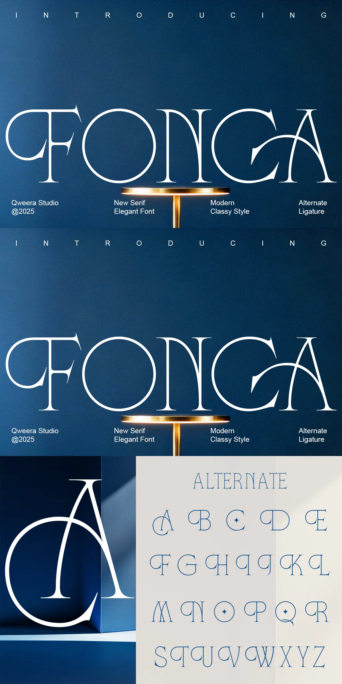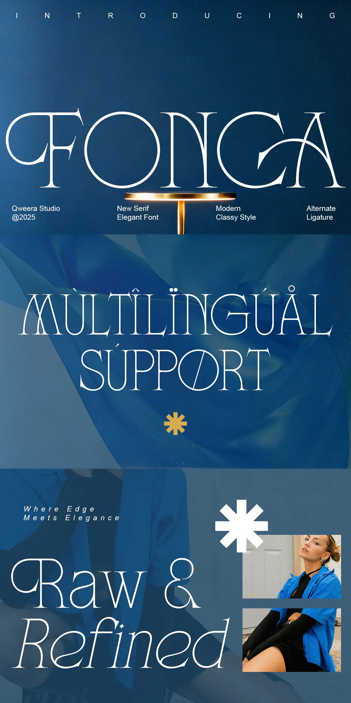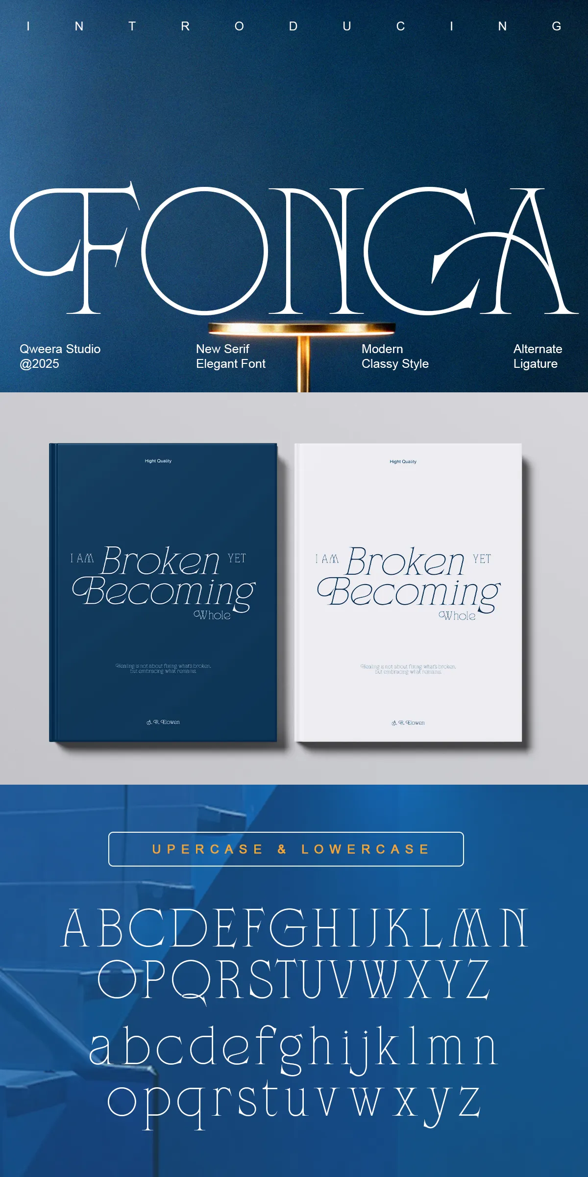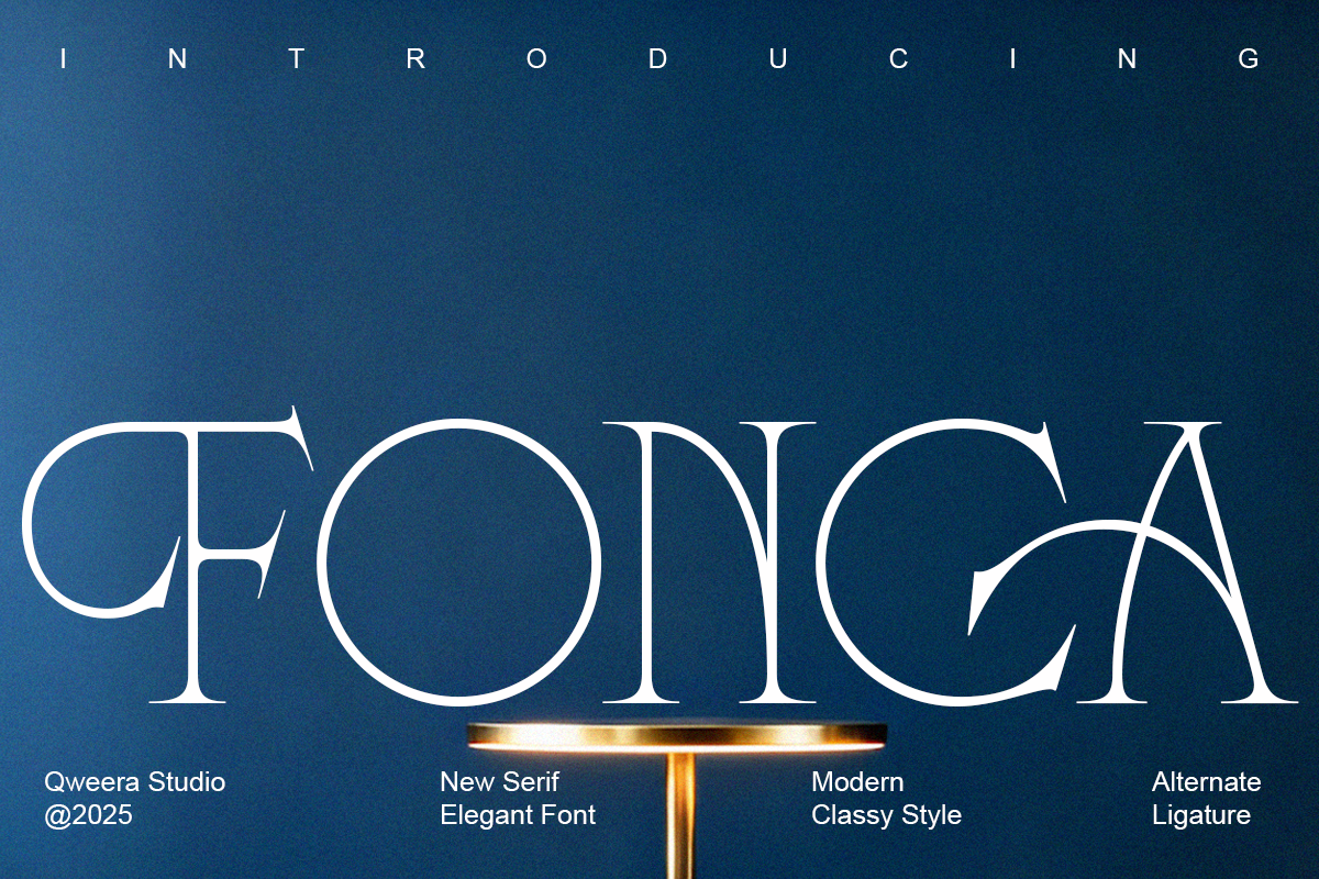

Fonca presents a modern minimal serif voice that actively sharpens brand identity. Built with disciplined proportions, subtle contrast, and crisp terminals, Fonca offers designers clear, elegant typography that reads confidently across print and digital formats. This typeface emphasizes restraint and sophistication, enabling headlines, logos, and editorial layouts to communicate premium quality without ornament. Use Fonca to strengthen visual hierarchy, refine packaging systems, and create distinctive editorial treatments that balance clarity with minimalist character.
Why Fonca Elevates Elegant Brand Systems And Editorial Layouts
Fonca combines minimal serif structure with purposeful design choices to produce letterforms that feel both contemporary and timeless. The reduced stroke contrast and carefully opened counters ensure readability at display sizes while preserving refined details at smaller scales. Fonca’s simplicity enhances legibility, and its composed rhythm supports strong typographic hierarchy. Designers can rely on Fonca to deliver an upscale, modern look that complements fashion brands, boutique packaging, and editorial titles—without distracting from imagery or layout composition.
Technical Features And File Formats Included With Fonca
- Complete uppercase and lowercase character sets for broad typographic flexibility
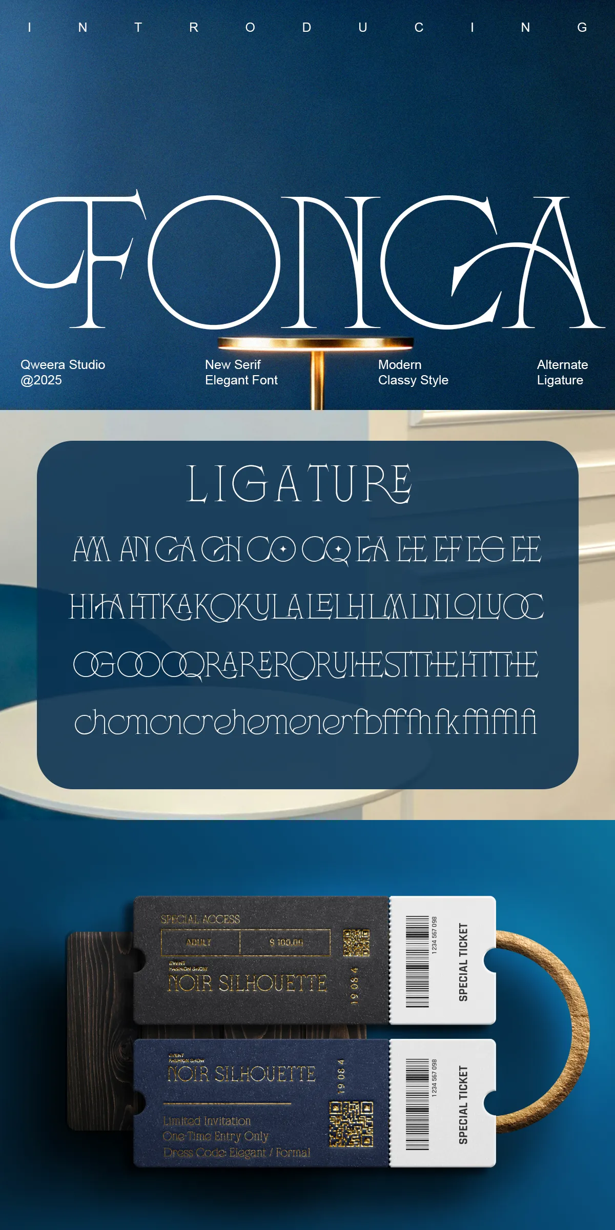
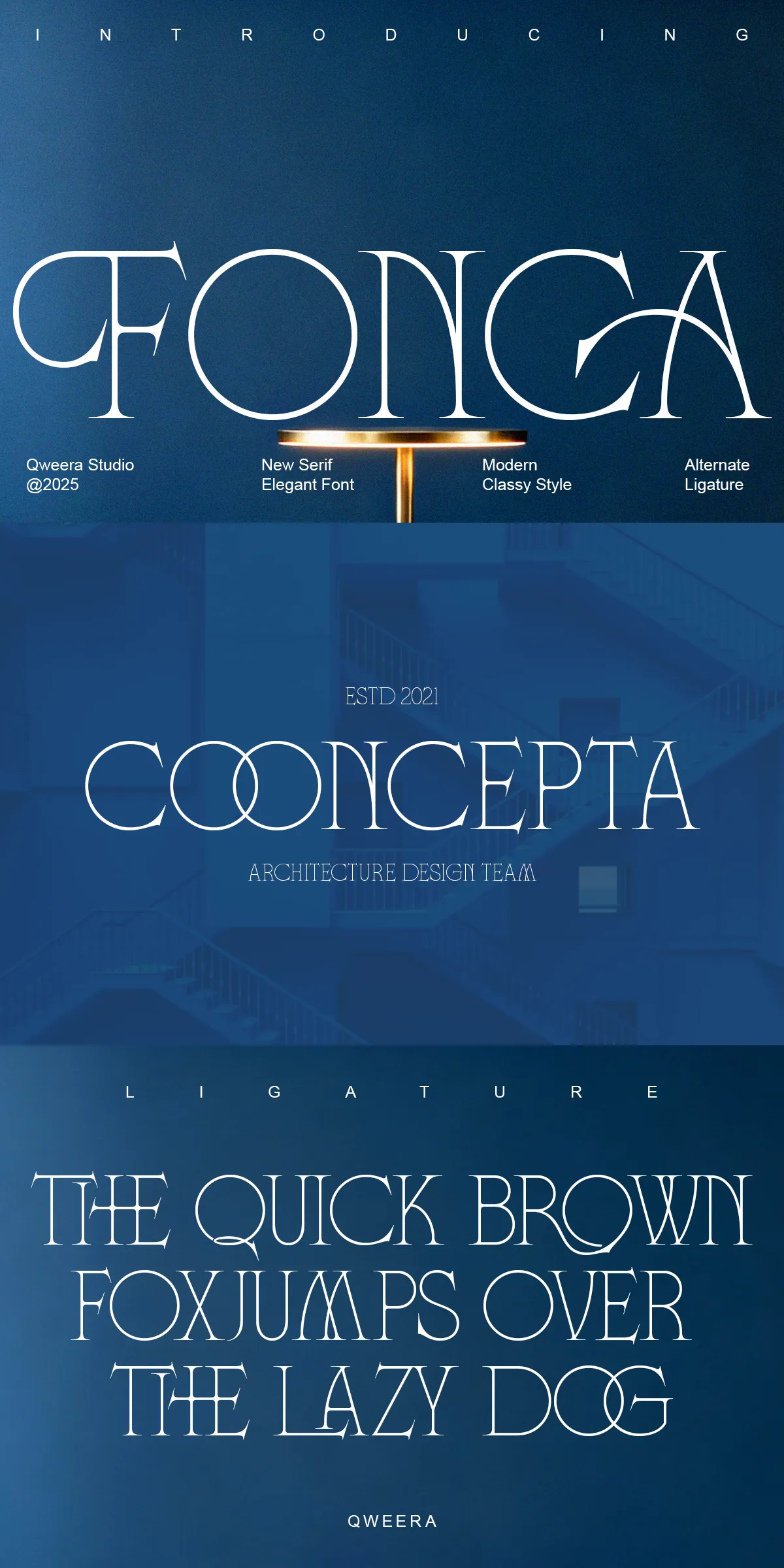
- Alternates and ligatures to customize logotypes and refined headlines
- Multilingual support including extended diacritics for global usage
- Minimal serif structure optimized for clear display typography and branding
- Regular and Italic styles that maintain voice across varied design contexts
- Delivered in OTF, TTF, WOFF, and WOFF2 formats for desktop and web deployment
Primary Use Cases Where Fonca Delivers Immediate Visual Impact
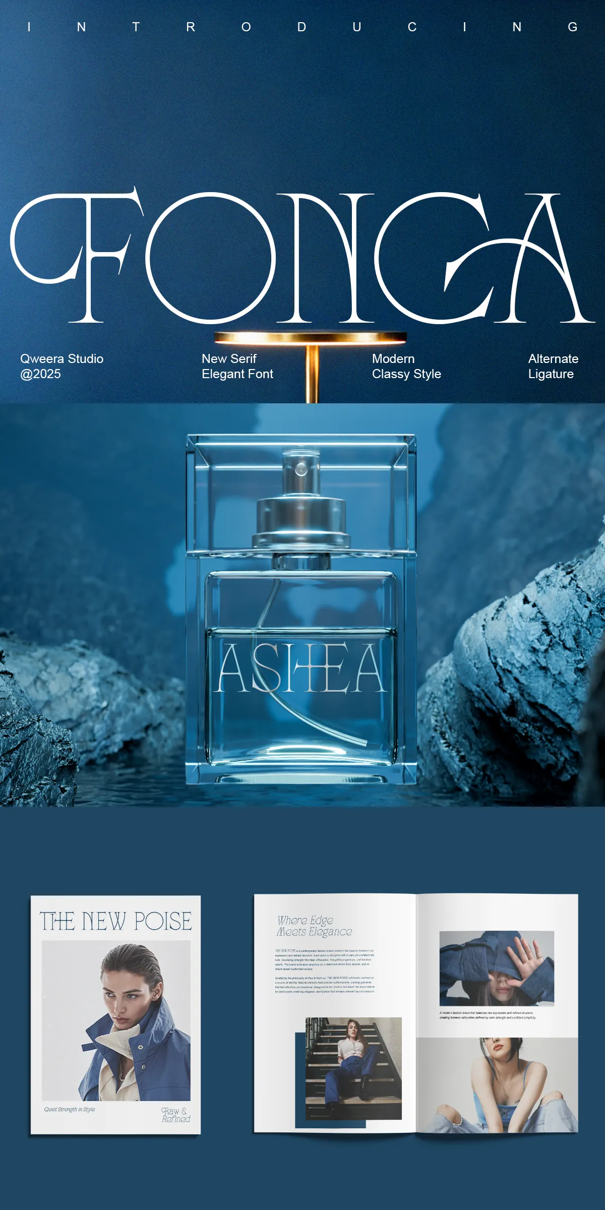
Fonca excels where minimal elegance and clarity matter most. It empowers luxury branding by giving logos and wordmarks a poised yet modern foundation. In editorial design, Fonca creates striking magazine titles and feature headlines that carry authority without excess flourish. Packaging benefits from Fonca’s readable forms and restrained personality, translating well to labels, boxes, and high-end product collateral. Fonca also suits fashion identity systems and minimalist brand environments where typography must communicate refinement at a glance.
Practical Implementation Tips To Maximize Fonca’s Effect
- Pair Fonca with a neutral sans-serif for body copy to maintain readability while showcasing serif display elements.
- Use generous tracking and increased scale for headlines to emphasize letterform proportions and negative space.
- Employ alternates and ligatures sparingly to enhance logos or headlines without compromising legibility in dense text.
- For web use, prioritize WOFF/WOFF2 delivery and consider subsetting to reduce payload and improve load times.
- For print, select quality paper stocks and finishes to highlight the typeface’s minimal elegance and premium intent.
Pairing Strategies And Visual Styling Recommendations For Cohesion
Create balanced systems by pairing Fonca with geometric or humanist sans-serifs to achieve modern contrast. Use restrained color palettes—muted neutrals, monochrome palettes, or a single accent—to keep attention on typographic voice. Introduce subtle rules, simple monograms, and minimal iconography that echo Fonca’s measured terminals. When designing brand marks, experiment with mixed-case treatments and refined alternates to convey sophistication while preserving clarity across applications.