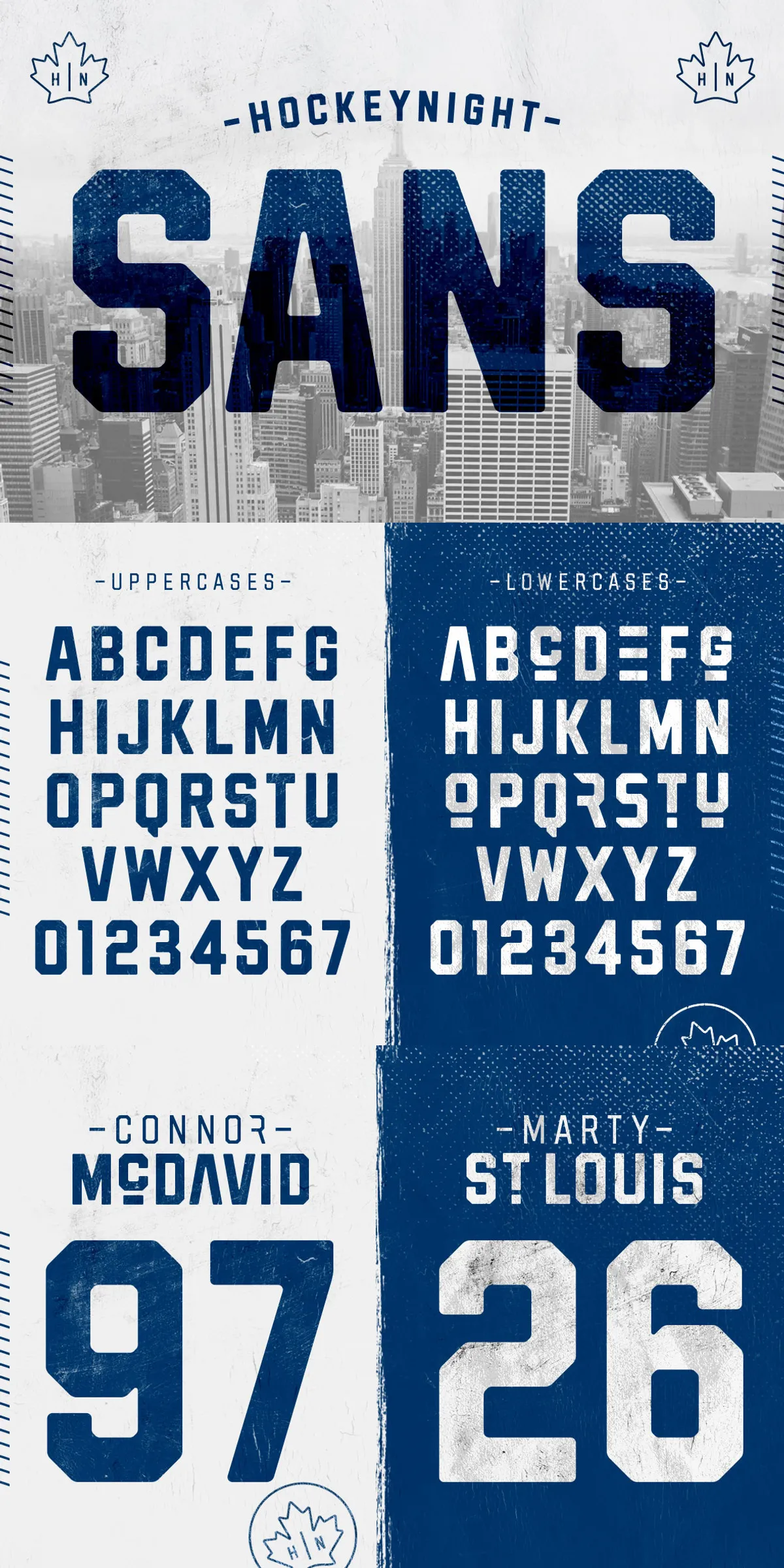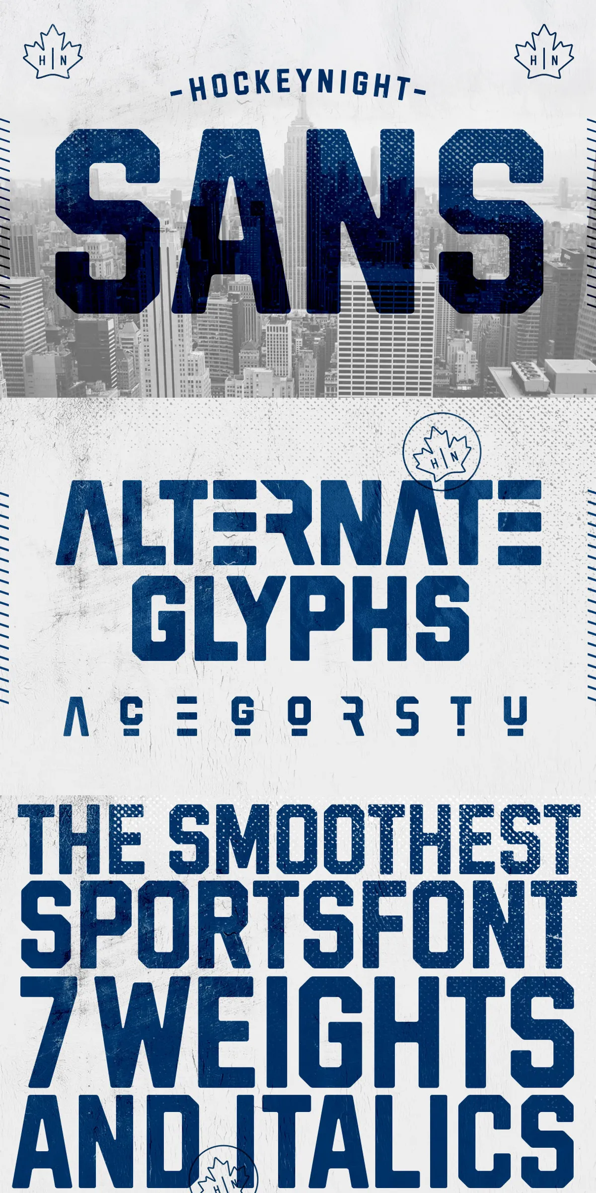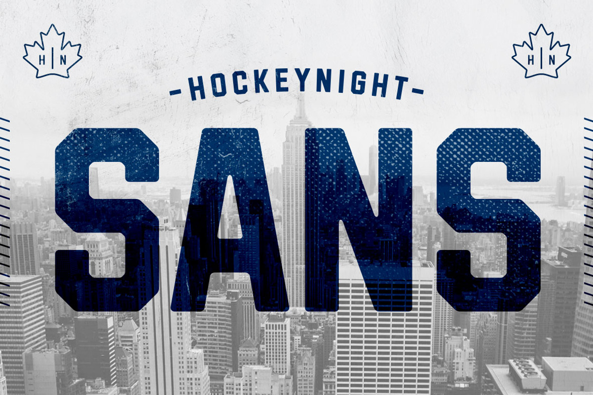

Hockeynight Sans delivers immediate presence. This pack contains two purpose-built display styles — Bold and Bold Italic — engineered to read loud and clear at headline scale. Whether you’re designing posters, team kits, event branding, or apparel, Hockeynight Sans gives text visual authority while remaining extremely straightforward to deploy. Use the Bold style when you need uncompromising weight and clarity. Switch to Bold Italic to introduce motion, emphasis, or a dynamic, forward-leaning attitude without changing weight.
Design Intent And Visual Personality For Impactful Messaging
Hockeynight Sans focuses on high-impact display use. The Bold style anchors compositions with dense strokes and robust counters that maintain legibility across large formats. Bold Italic tilts that same strength into purposeful motion, creating a sense of speed, urgency, or momentum that’s ideal for sports, music, or lifestyle branding. Both styles prioritize strong silhouettes and readable forms so your headlines and logos register instantly, even from a distance.
Recommended High-Impact Use Cases And Applications
Apply Hockeynight Sans wherever strong typographic voice matters. Typical applications include:
- Event posters and concert flyers where headline legibility must be immediate.
- Sports branding, team names, and jersey lettering that require authoritative display type.
- Apparel and merchandise where bold letterforms translate well to printing and embroidery.
- Album covers and promotional graphics that need a decisive, memorable title face.
- Web hero sections and promotional banners that demand quick visual recognition.
Practical Styling Tips For Designers And Developers
Get fast, polished results by following a few active styling guidelines. For single-line headlines, use tight tracking and large sizes to emphasize weight and presence. For multi-line titles, slightly increase line-height to prevent visual crowding and improve readability. Use the Bold Italic sparingly for emphasis inside bold headlines — it creates contrast through angle rather than weight change. When pairing with body text, choose a neutral sans-serif or humanist serif to maintain hierarchy and clarity.
Pairing Suggestions To Build Complete Systems
Hockeynight Sans performs best when it anchors a typographic system. Pair it with a clean, readable body face for longer copy: a neutral sans or a refined serif balances the display strength and reduces visual fatigue. For condensed layouts, consider a narrow humanist sans for secondary headings. When designing for apparel or merch, test the type at production scale to verify stroke fidelity across materials and printing methods.
Production Notes, Licensing, And Delivery Recommendations
This pack includes the two named styles only: Bold and Bold Italic. Before deployment, confirm licensing covers your intended use — commercial merchandise, large print runs, web embedding, or app distribution may require specific permissions. Test the fonts in your production environment and verify kerning and OpenType behavior in your design tools. If you need additional weights, optical sizes, or language extensions, plan for a workflow that supplements this pack with a compatible text family.
Quick Workflow Checklist For Rapid Implementation
- Install both styles and verify they activate correctly in your design app.
- Test large-format compositions (posters, banners) to confirm stroke clarity and spacing.
- Use Bold Italic for emphasis and kinetic headlines only, not as a replacement for a lighter weight.
- Confirm licensing terms for print, web, and merchandise use before production.
- Pair with a neutral body typeface for long copy and UI text to preserve hierarchy.
Start Using Hockeynight Sans Today For Confident Headlines
Hockeynight Sans gives projects decisive typographic personality with only two styles to manage. Its Bold and Bold Italic options keep workflows simple while offering distinct expressive possibilities: static weight for commanding titles and angled motion for energetic emphasis. Download and test the pack in real layouts, and you’ll quickly see how a compact, focused display family can transform headlines, branding, and product graphics into unmistakable visual statements.