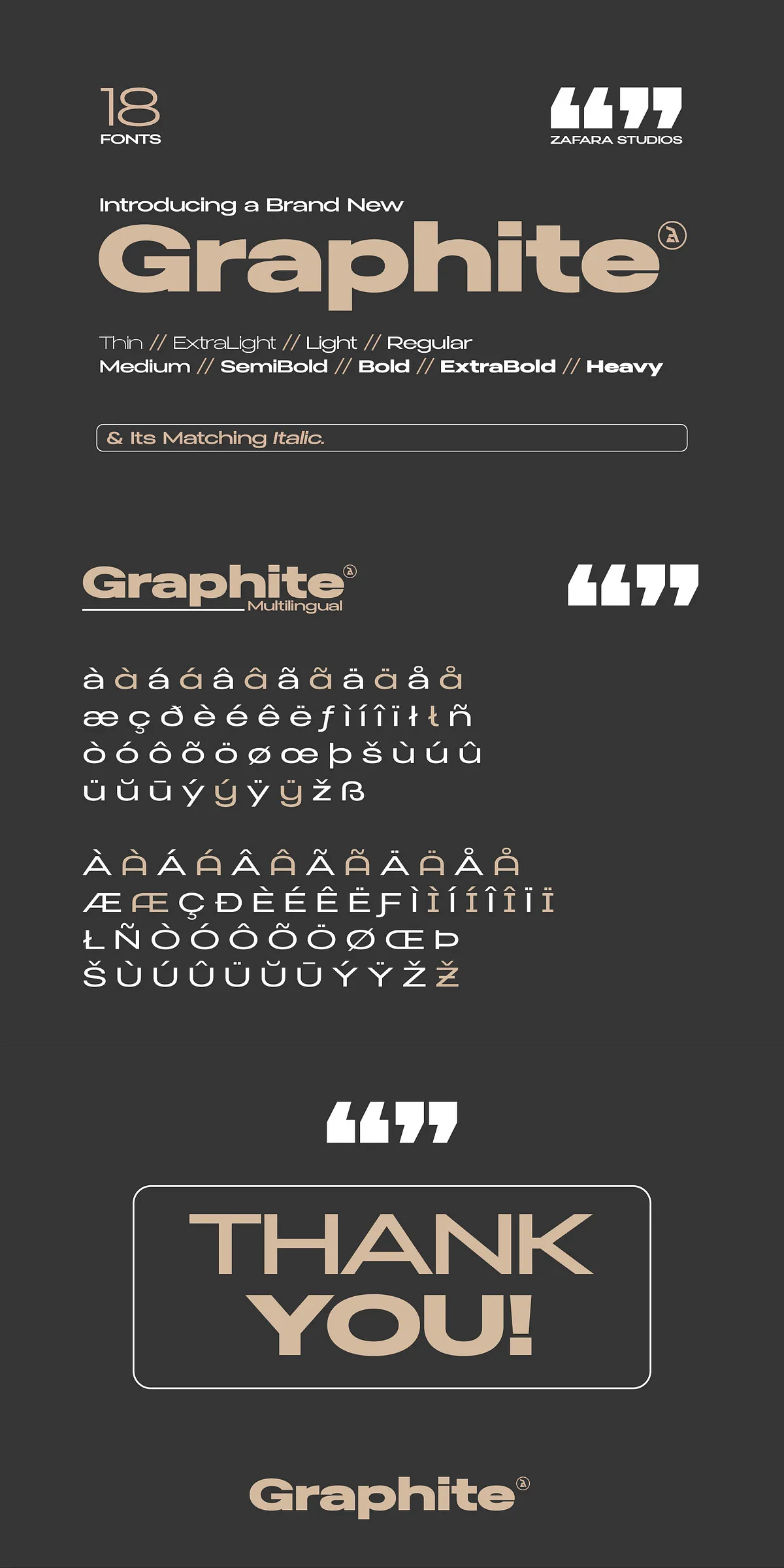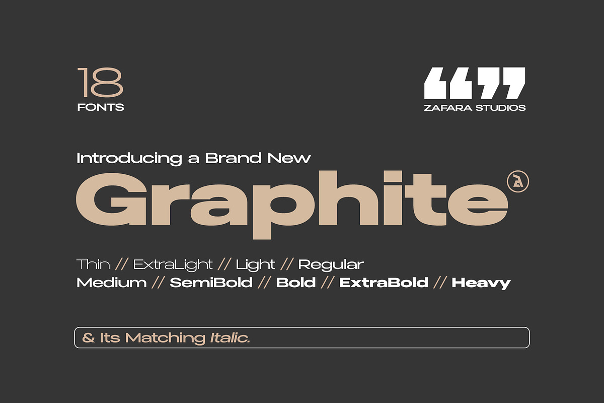

Graphite delivers a bold, deliberate presence that reads clearly at scale. Crafted as a wide sans serif with thoughtful high-contrast strokes, Graphite anchors editorial spreads, logotypes, and headline systems with confident geometry and refined detail. The typeface balances tight, compact letter spacing with generous counter space to produce a sense of intimacy while maintaining excellent legibility. Designers choose Graphite when they need typography that asserts hierarchy, communicates authority, and supports expressive art direction.
What the family communicates and where it shines
Use Graphite to command attention in mastheads, magazine covers, advertising headlines, and brand marks. Its wide proportions and high-contrast forms create strong silhouettes that remain legible from a distance and resolve finely at large print sizes. Because the family intentionally emphasizes clarity and visual rhythm, it also suits packaging copy that must remain readable while appearing modern and elegant.
Included Files, Glyph Coverage, And Technical Specifications
This Graphite package provides everything needed for robust typographic systems. The essential technical details are listed clearly so you can plan production and layout work without surprises.
Glyph set and style breakdown
- Glyphs: 225 glyphs total, including uppercase and lowercase letters, stylistic alternates, multilingual characters where specified, numerals, and punctuation.
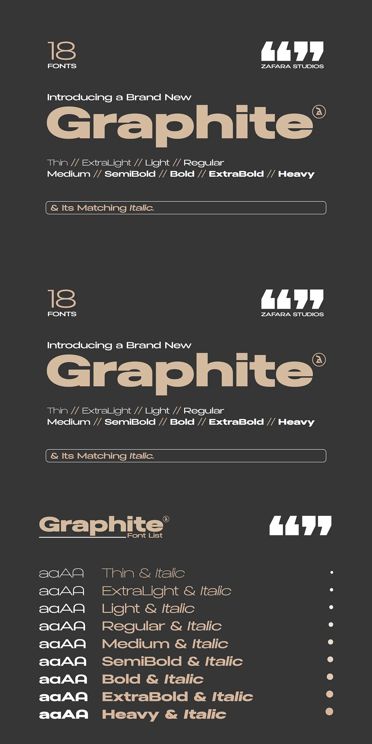
- Weights: 9 distinct weights — Thin, ExtraLight, Light, Regular, Medium, SemiBold, Bold, ExtraBold, Heavy — enabling precise tonal control across designs.
- Italics: 9 matching italics that correspond to each weight, offering emphasis and contrast without breaking the type system.
File formats and production considerations
Graphite is delivered in common font formats suitable for both print and digital workflows. Test the fonts at intended output sizes to confirm optical weight and spacing, especially for heavy display use. When working on web projects, consider webfont optimization (subset glyphs, WOFF2 format) to reduce load times while preserving necessary character coverage.
Recommended Uses, Pairing Strategies, And Editorial Applications
Graphite excels where visibility and personality matter. It performs as a headline face that anchors layouts, and it also scales into logotype work where letterforms need to be identifiable at small and large sizes. Because the family includes multiple weights and italics, you can build clear typographic hierarchies with a single, cohesive voice.
Practical usage examples
- Headlines and subheads for magazines and editorial projects — Graphite commands focal attention while supporting refined page rhythm.
- Logotypes and wordmarks — wide letterforms create memorable, bold marks that adapt to horizontal layouts.
- Posters and large-format signage — high-contrast strokes retain detail at scale and read clearly from a distance.
- Brand systems that require a single family to cover display, subhead, and emphasis needs — Graphite’s nine weights and italics make that possible.
Pairing suggestions
For balanced compositions, pair Graphite with a neutral humanist or geometric sans for body copy, or choose a subtle serif to introduce warmth in longer editorial reads. Keep body text at comfortable sizes and use Graphite selectively for hierarchy to avoid visual fatigue in dense copy blocks.
Implementation Tips, Accessibility, And Licensing Notes
Implement Graphite with precision to maximize its impact. Adjust tracking carefully for display sizes and test italic weights for optical balance. When embedding on the web, subset glyphs to remove unused characters and enable font-display strategies to avoid layout shifts. For accessible typography, ensure contrast ratios meet WCAG when Graphite is used for interface labels or headings.
Licensing and production checklist
- Confirm license scope before using Graphite in commercial goods, merchandise, or app embedding.
- Test typography on final substrates and output devices to validate weight perception and ink spread.
- Export final assets at high resolution for print; use optimized webfonts for digital projects to maintain performance.