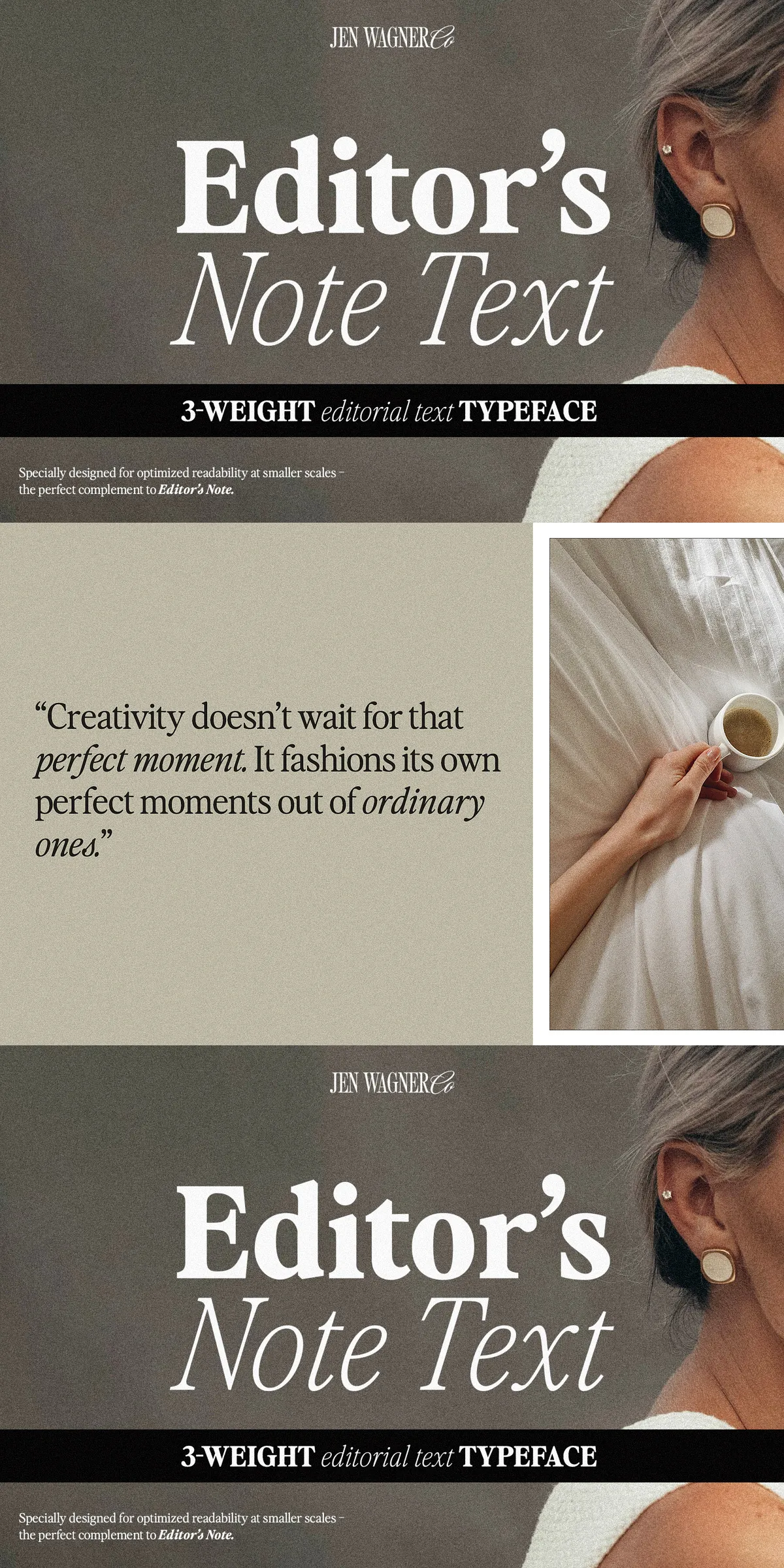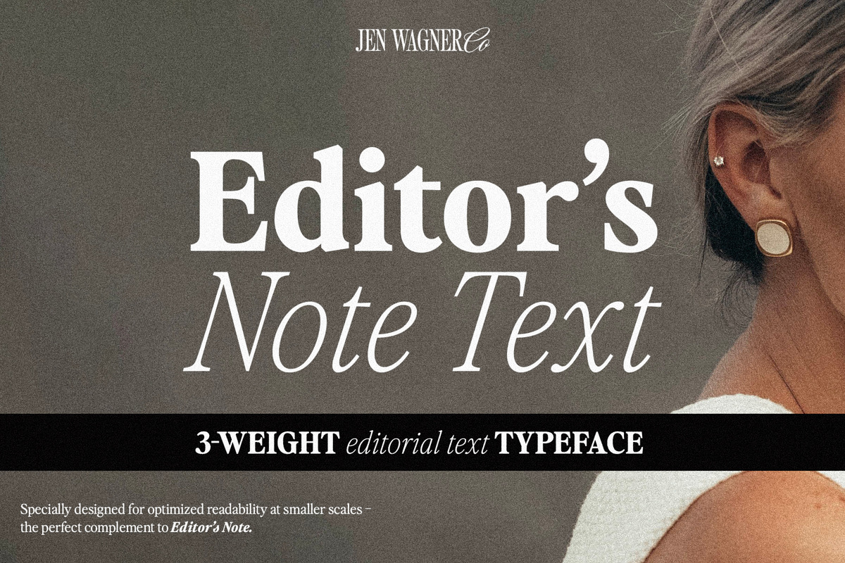
Stop sacrificing legibility for style. Meet Editor’s Note Text—the ultimate text-friendly companion to the bold, high-contrast flagship font Editor’s Note. Designed with precision and purpose, this three-weight typeface is engineered to deliver clarity, comfort, and aesthetic harmony in every paragraph, article, and long-form narrative.
Why Text Needs Its Own Voice: The Problem with High-Contrast Fonts
Using a dramatic, high-contrast display font like Editor’s Note for extended blocks of body text isn’t just unwise—it’s a design faux pas. The thin strokes, sharp serifs, and exaggerated contrast may dazzle at large sizes, but at smaller scales, they struggle to maintain visibility. Thin lines vanish into the background, fatigue sets in, and reading becomes a chore instead of a joy.
That’s where Editor’s Note Text steps in—not to replace the star of the show, but to empower the supporting cast. It’s not a compromise. It’s a strategic upgrade.
Three Weights. One Seamless Vibe. Infinite Applications.
With 6 fonts total across three distinct weights—Light, Regular, and Bold—Editor’s Note Text offers complete typographic control while preserving the core visual identity of its sibling, Editor’s Note.
- Light: Ideal for subtle emphasis, subheadings, or delicate captions where elegance and breathability matter.
- Regular: The workhorse of body text. Clear, consistent, and effortless to read—perfect for blog posts, magazine articles, and digital newsletters.
- Bold: Use for strong headlines within longer content, calls to action, or to create visual hierarchy without distorting the flow.
Each weight maintains the refined proportions and expressive character of the original, ensuring visual continuity across your entire design project.
Text-Optimized for Real-World Legibility
Editor’s Note Text was built from the ground up for small-scale readability. Every curve is smoothed, every stroke is balanced, and every character is calibrated for optimal contrast and clarity. Whether on screen or in print, it delivers unmatched comfort during prolonged reading sessions.
Key features that make it perform:
- Enhanced x-height: Ensures letters remain clear and readable even at small sizes.
- Proper stroke contrast: Balanced between thick and thin lines to avoid visual fatigue.
- Robust kerning & spacing: Prevents awkward gaps or overcrowding, especially in dense text.
- Complete language coverage: Supports numbers, punctuation, and multilingual characters—essential for global content.
No more squinting. No more eye strain. Just clean, elegant reading.
Perfect for Creators Who Value Both Style and Substance
This typeface is your go-to solution when you need:
- Long-form articles, ebooks, or whitepapers with a premium editorial feel
- Newsletters and content websites where readability is king
- Branded publications that maintain consistency across headlines and body text
- Designs where you want the Editor’s Note aesthetic—but without compromising functionality
From editorial layouts to digital branding, Editor’s Note Text ensures your message is heard—clearly, confidently, and beautifully.
Unlock the Full Potential of Your Design System
Think of Editor’s Note as your visual star. Now give it a reliable lead actor for the supporting roles. With Editor’s Note Text, you achieve a complete typographic ecosystem—where bold statements meet smooth storytelling.
Don’t settle for fonts that look good on a poster but fail on a webpage. Choose Editor’s Note Text—the intelligent, readable, and stylistically consistent choice for modern design.
Design with purpose. Read with ease. Write with confidence. Let your words speak clearly, even when the font is bold.