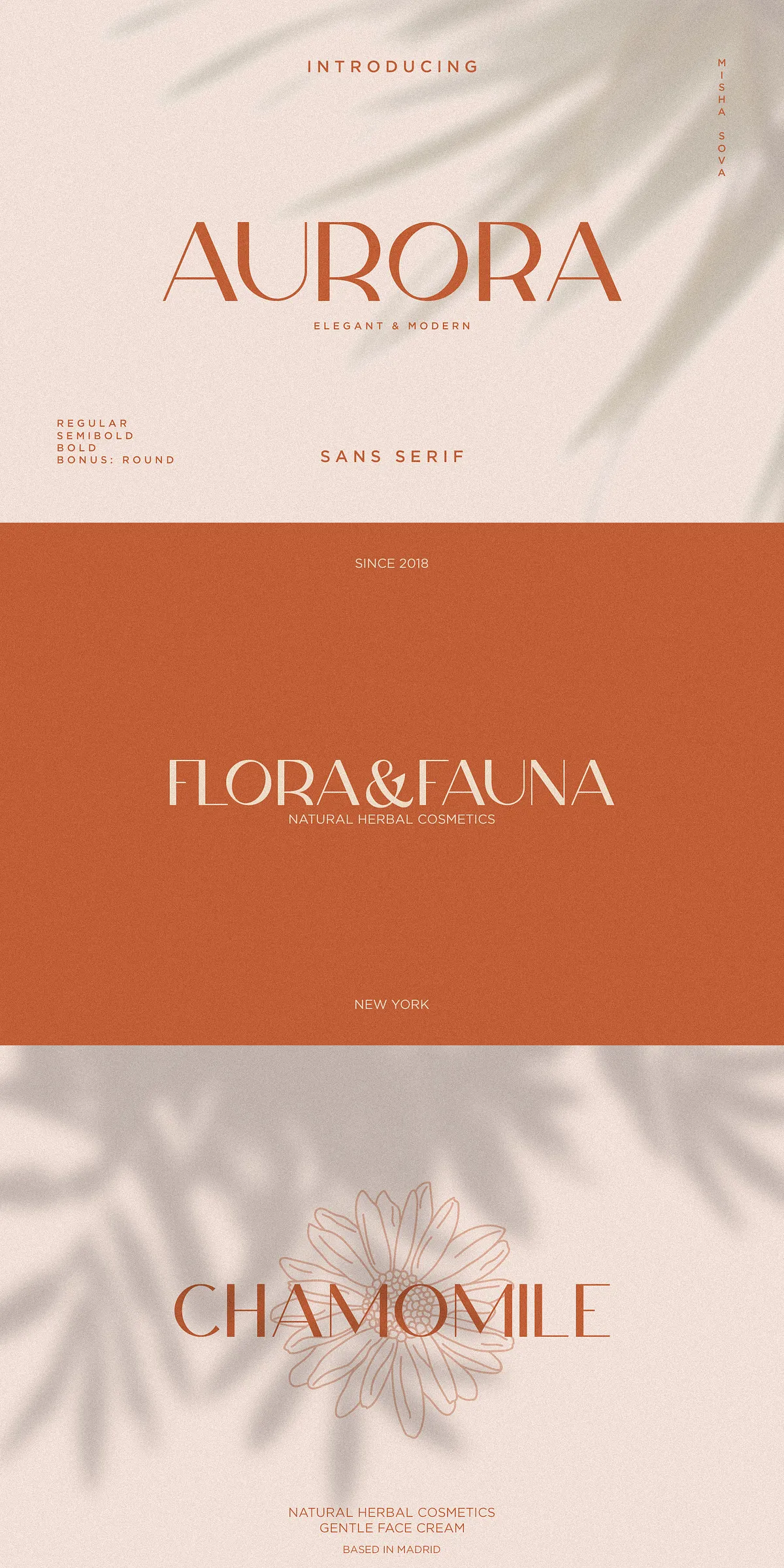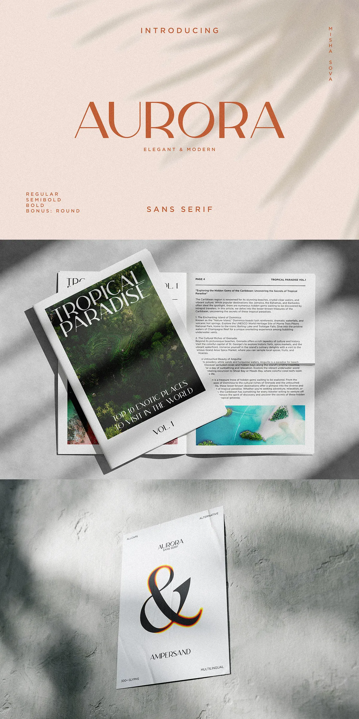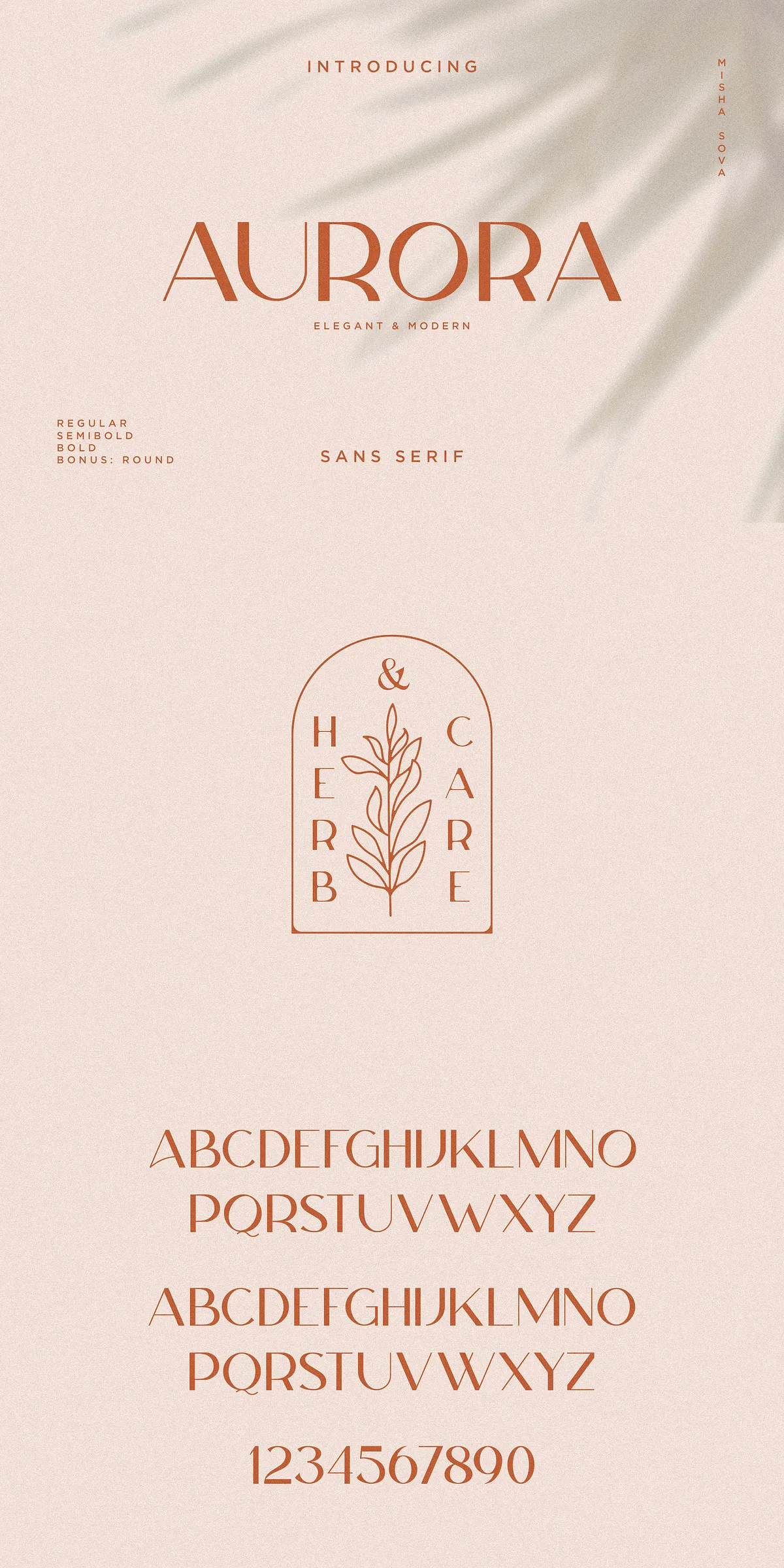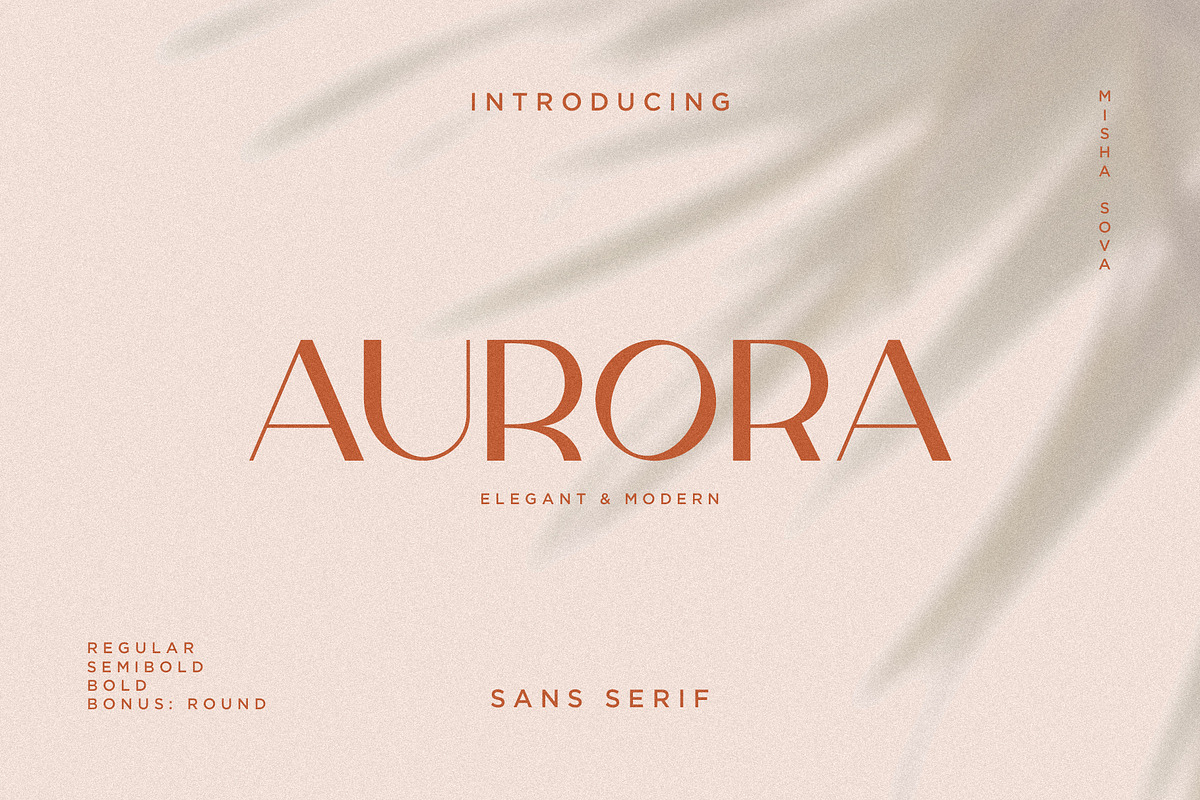

Aurora is a refined and contemporary sans serif that brings clarity, poise, and design flexibility to every project. Carefully drawn with attention to proportion and rhythm, Aurora includes special alternative letters and broad multilingual support. The family performs strongly in identity systems, editorial headers, product packaging, apparel branding, and as a stylish overlay for web and image-based layouts.
Design Essence and Visual Character of Aurora
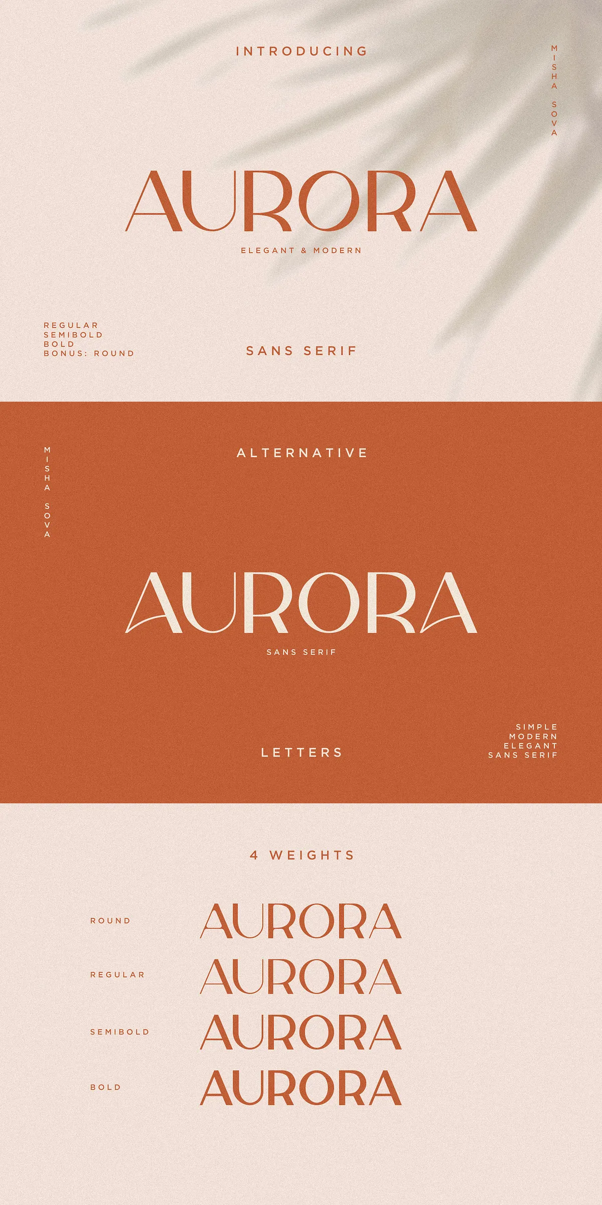
Aurora features clean, modern shapes with subtle humanist touches that create warmth without losing geometric clarity. The typeface balances open counters and well-calibrated stroke contrast to achieve excellent legibility at display sizes while retaining elegance in tighter settings. Its alternative letterforms give designers expressive control—swap characters to refine a logotype or tune headline tone without changing the whole family.
Distinctive Alternatives That Empower Creative Control
Aurora’s alternate glyphs are purposeful: they let you shift voice from formal to friendly, condensed to airy, with a single character change. Use alternates for display headlines, distinct logotypes, or stylized product names. The alternates maintain consistent metrics so substitutions remain layout-safe and predictable.
Practical Uses and Application Areas
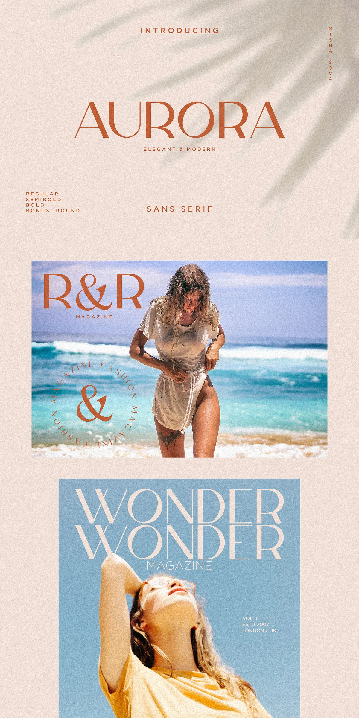
Apply Aurora where refined readability and a contemporary presence are essential. The family thrives in logo creation, magazine headers, product labels, editorial mastheads, fashion branding, and website hero sections. On packaging, Aurora communicates premium quality; on apparel, it reads sharp on woven labels and printed tags. For image overlays, Aurora provides a sophisticated counterpoint to photography without overpowering the composition.
Fast Decisions: Which Weight To Choose
Choose Regular for clean body display and lighter overlays, Semibold for assertive subheads and product names, Bold for headlines and logotypes that need to stand out, and Round when an approachable, softer voice better suits the brand. Each weight adapts to both print and digital workflows.
File Formats, Installation, And Technical Notes
The Aurora package includes both TrueType (.TTF) and OpenType (.OTF) formats to ensure broad compatibility across design and production environments. Install fonts locally for desktop design or compile webfont kits for online use to preserve performance and rendering consistency. The archive contains a simple installation guide to accelerate setup.
- Aurora-Regular.ttf / Aurora-Regular.otf
- Aurora-Semibold.ttf / Aurora-Semibold.otf
- Aurora-Bold.ttf / Aurora-Bold.otf
- Aurora-Round.ttf / Aurora-Round.otf
How To Install And Use Immediately
Unzip the archive, install the TTF/OTF files via your operating system’s font manager, then restart design applications to load the family. For web projects, convert to WOFF/WOFF2 and serve via @font-face with font-display: swap for best performance. Outline text when preparing print-ready files for vendors that cannot embed fonts.
Multilingual Support And Workflow Compatibility
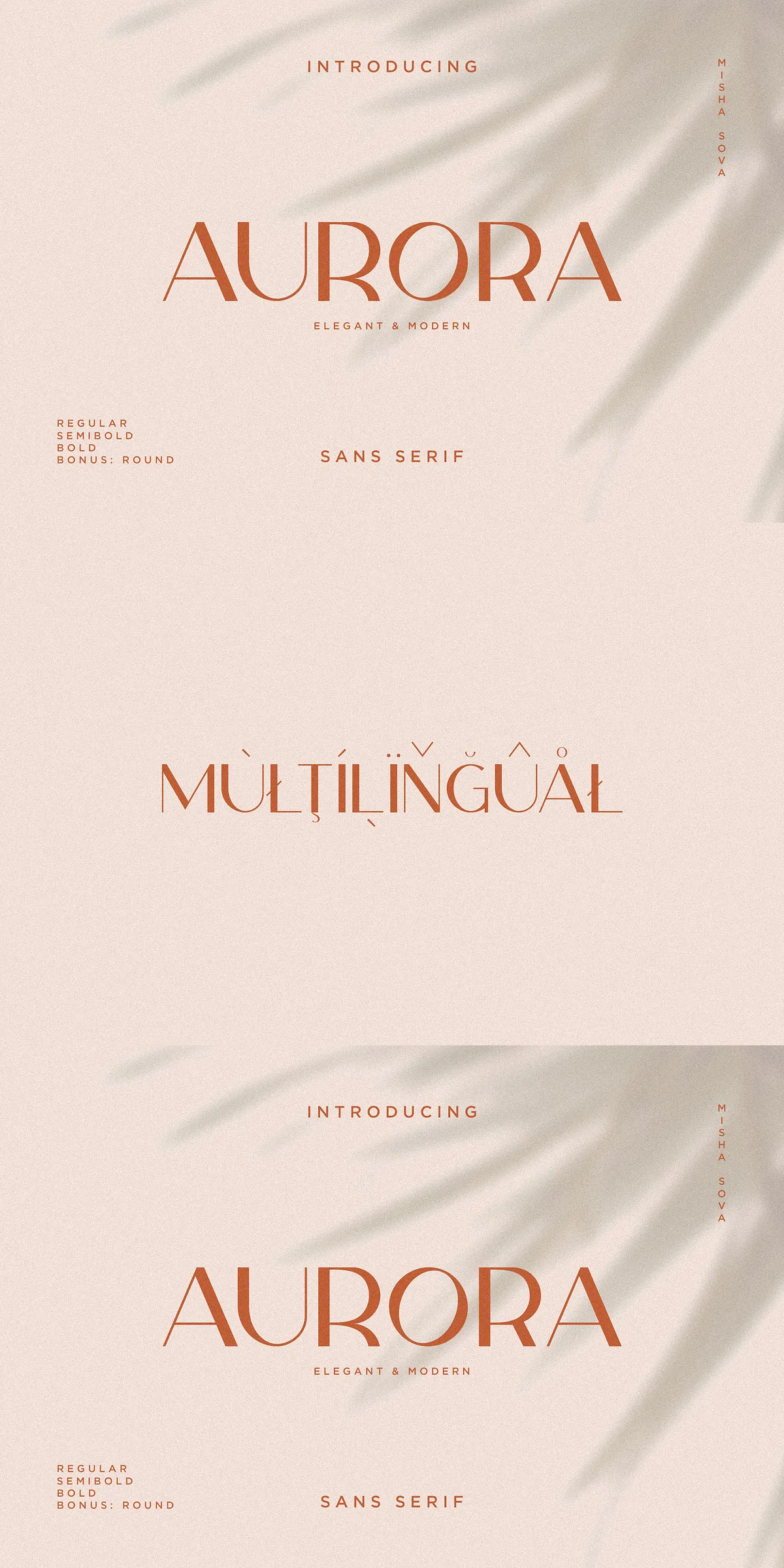
Aurora ships with extended language support to serve Western and Central European languages, enabling designers to deploy consistent branding across diverse markets. The fonts are crafted for compatibility with mainstream design tools—Adobe Illustrator, InDesign, Affinity Suite, Sketch, Figma, and common office programs—so you can access alternates and weight choices across your usual workflow.
Accessing Special Characters And Alternates
OpenType-aware applications expose alternate glyphs, ligatures, and stylistic sets through their font panels. If your editor does not display alternates, use the Glyphs panel or a character map utility to insert specific forms. The included documentation offers quick tips for accessing special characters in popular design software.
Pairing Recommendations And Styling Tips
Pair Aurora with a high-contrast serif for editorial spreads or with a neutral geometric sans for minimalist branding. To achieve upscale packaging, set Aurora headlines in Semibold or Bold, then complement with a light serif for supporting text. Use Round for friendly sub-brands or product lines aimed at lifestyle audiences. Maintain consistent tracking in headlines to preserve the type’s elegant rhythm.
Optimizing For Print And Web
For print, choose OTF outlines for crisp vector output and confirm proper embedding with your printer. For the web, subset fonts to reduce payload and use modern formats to ensure cross-browser rendering. Test on mobile displays to confirm legibility at smaller sizes and adjust weight or letter-spacing as needed.