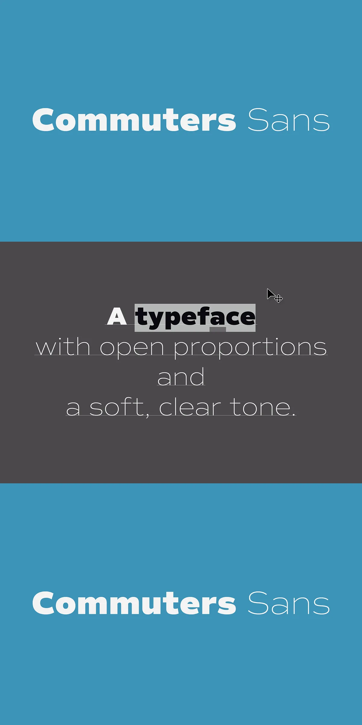
Meet Commuters Sans, the font that doesn’t just keep up with your day — it defines it. This is not just another sans-serif; it’s a daily companion built for clarity, consistency, and effortless performance. With a clean geometric foundation, slightly wide proportions, and a warm, inviting clarity, Commuters Sans cuts through digital noise and stands out with quiet authority. From the morning briefing to the evening pitch, this typeface delivers a sharp, modern presence that feels familiar yet refreshingly new.
Crafted for Real-World Use — Where Form Meets Function
Commuters Sans is engineered with one purpose: to work for you, every single day. Its minimalist letterforms are not empty — they’re intelligently structured, with balanced spacing and subtle curves that enhance readability without sacrificing character. This isn’t cold, sterile design; it’s intelligent minimalism with a pulse. Every stroke is intentional, every counterform calibrated for legibility at every size — whether in small body text or bold headlines.
The beauty of Commuters Sans lies in its versatility. Use it in all caps to create sharp, eye-catching headlines for newsletters, banners, or social media graphics. Switch to mixed-case for long-form articles, reports, or website copy — and watch as the typeface maintains its composure, confidence, and visual harmony throughout. It adapts to your rhythm, not the other way around.
Full Family, Full Power — 8 Weights, Matching Italics, and Global Reach
Commuters Sans offers a comprehensive suite of typographic tools for every design need:
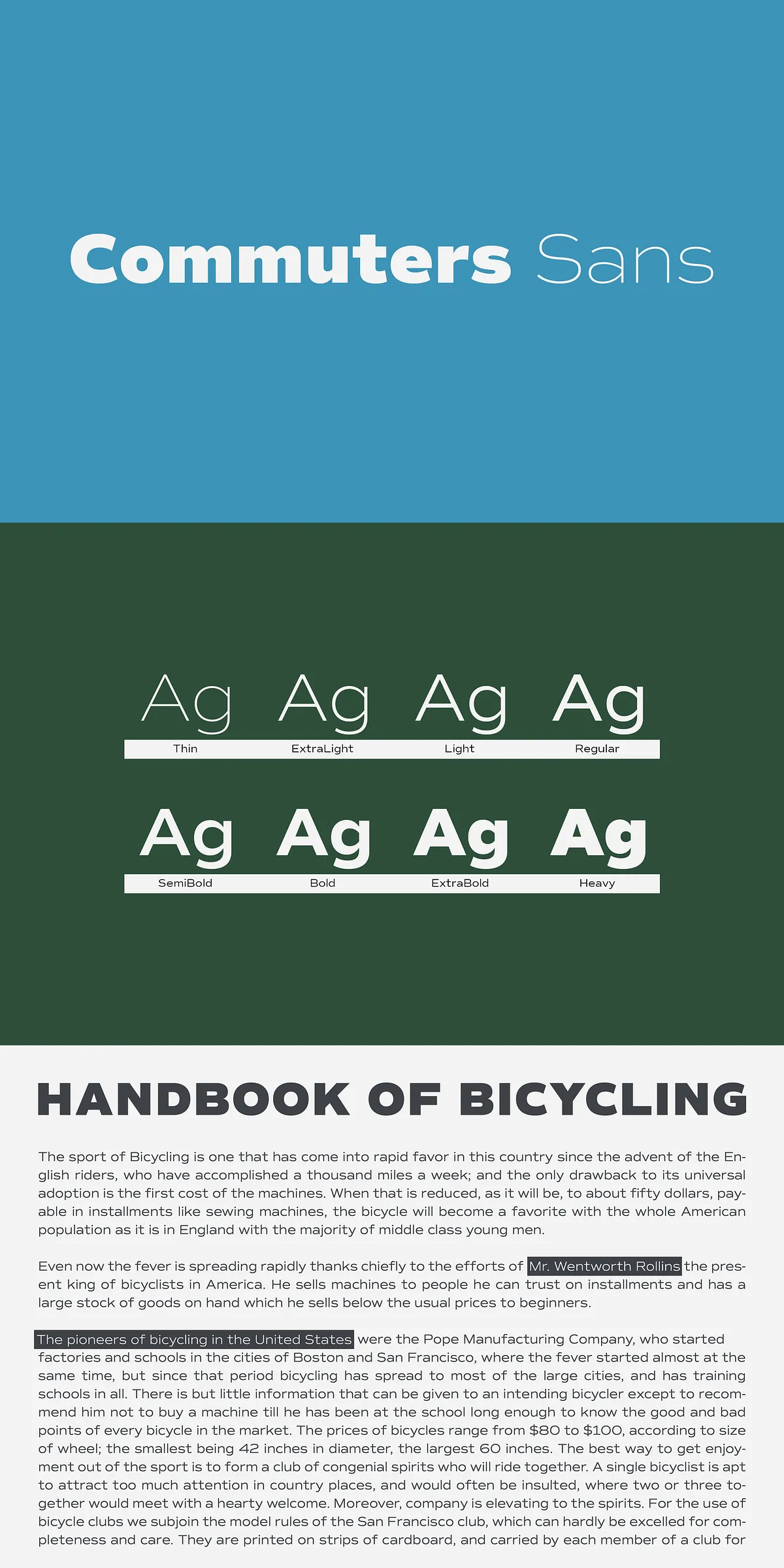
- Eight weights, from delicate Light to powerful Bold — each with its own distinct personality and purpose.
- Matching italics for every weight, allowing you to add emphasis, rhythm, and nuance with confidence.
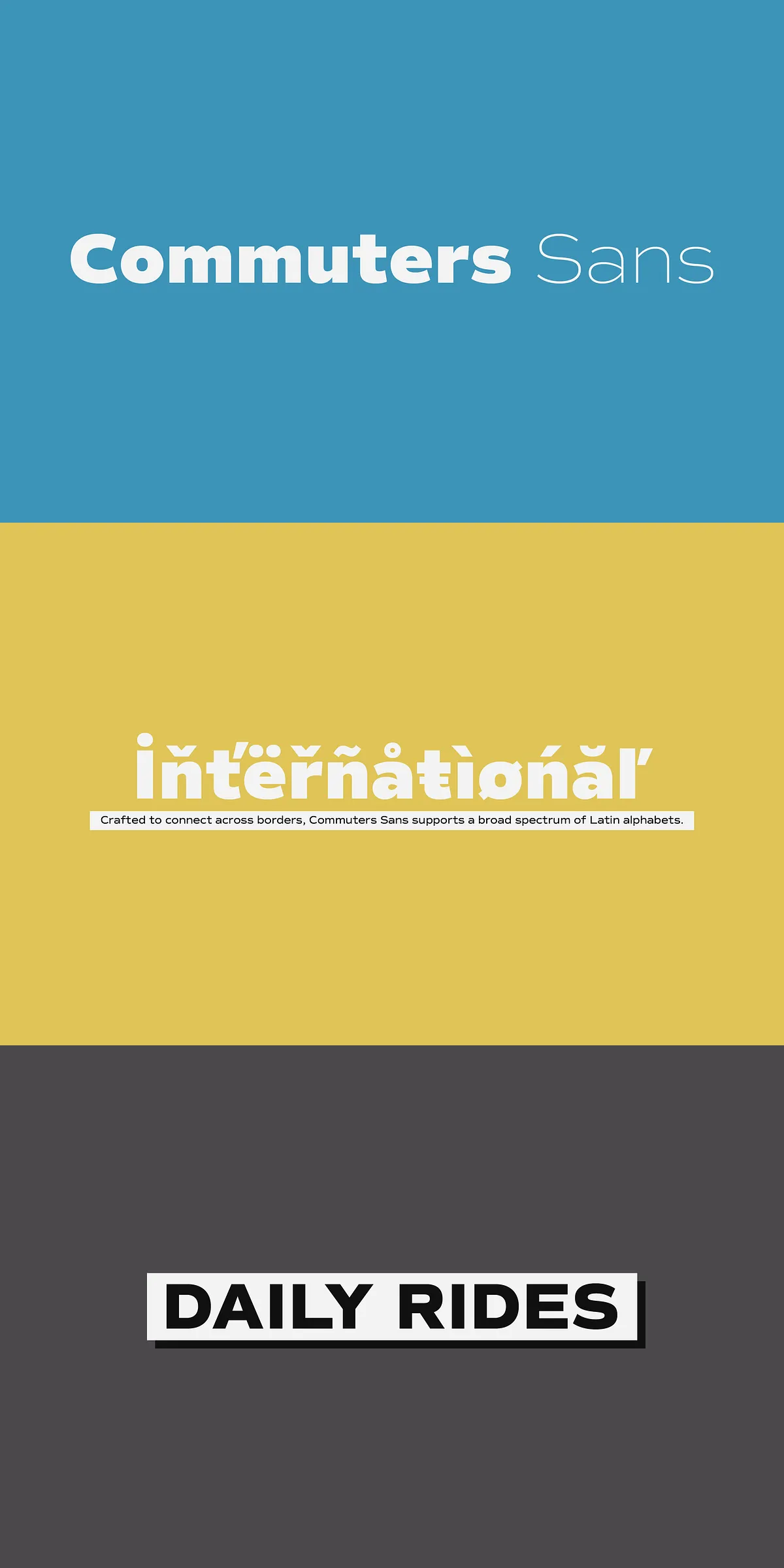
- Extensive multilingual support across almost all Latin-based languages, including complex scripts like French, German, Spanish, Portuguese, and Scandinavian variants — essential for global brands and inclusive communication.
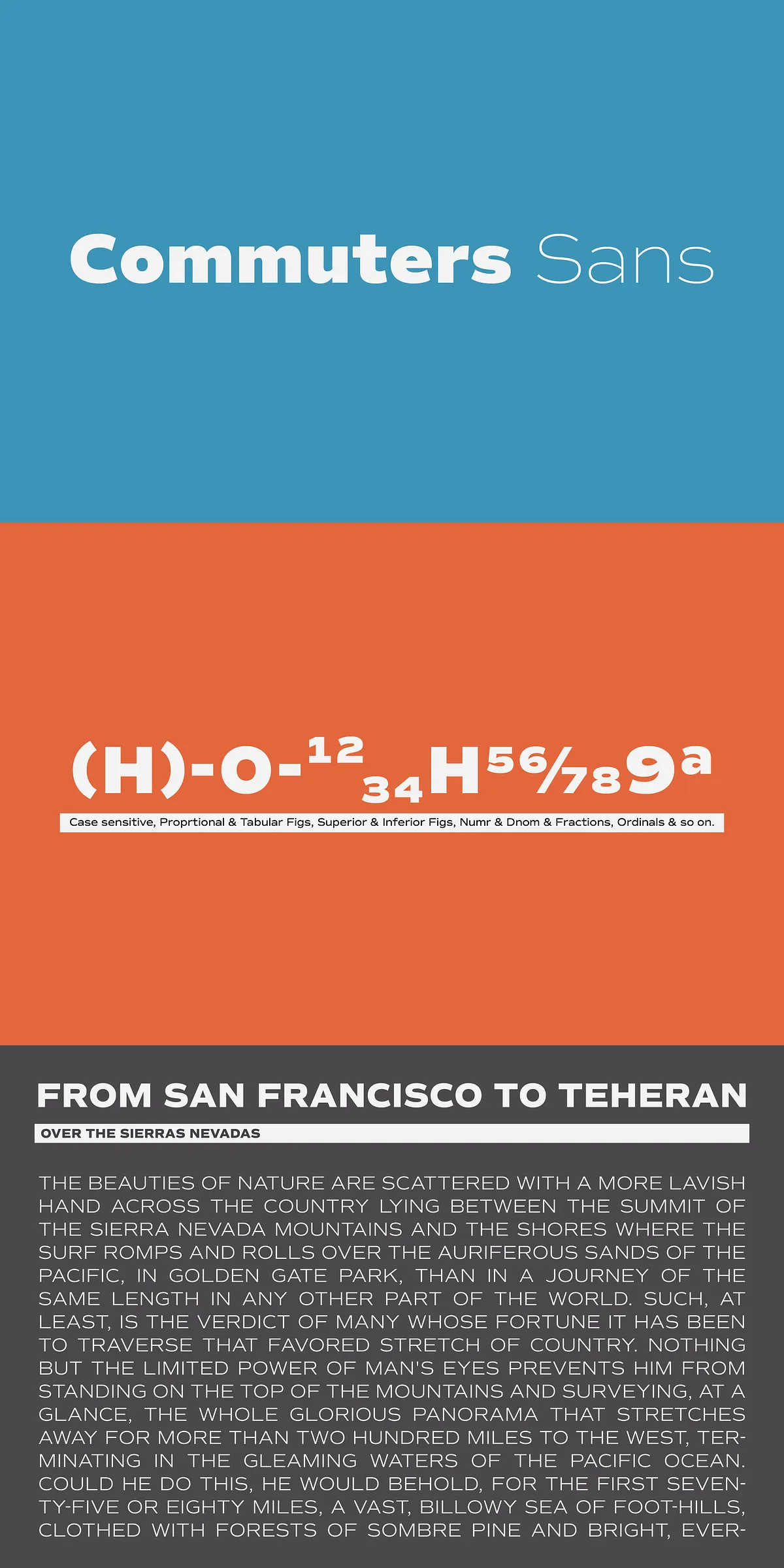
- Optimized spacing and kerning ensures consistent performance across print and digital formats.
Whether you’re designing a corporate identity, launching a new publication, or building a website, Commuters Sans provides the stability and sophistication to anchor your design with precision.
Perfect for Every Domain — From Editorial to Identity
This is a typeface designed for real-world performance across a broad range of applications. Here’s where it truly shines:
Where Commuters Sans Delivers Maximum Impact
- Editorial Design: Enhance magazines, newspapers, or blogs with clean, readable layouts that invite readers in and keep them engaged.
- Branding & Identity Systems: Build professional, scalable brand voices with logotypes that feel contemporary, trustworthy, and timeless.
- Digital Interfaces: Use the WOFF and WOFF2 variants to ensure fast loading, smooth rendering, and crisp display on all devices.
- Business Communication: Elevate reports, proposals, and presentations with a font that communicates authority without arrogance.
- Content Marketing & Social Media: Create visually cohesive campaigns where typography supports message clarity and brand consistency.
- Everyday Applications: From signage and packaging to email templates and internal memos — Commuters Sans handles it all with quiet competence.
Designed to Last — Built for the Future of Typography
Commuters Sans isn’t just about aesthetics — it’s about durability and adaptability. Its geometric core ensures stability across screen sizes and resolutions. The font family is optimized for both print and screen, delivering consistent results whether you’re printing a 100-page report or publishing a microblog post.
With open standards (OTF, TTF, WOFF, WOFF2) and robust OpenType features, Commuters Sans integrates seamlessly into modern design tools like Adobe Creative Suite, Figma, Sketch, and web platforms. No compromises. No limitations.