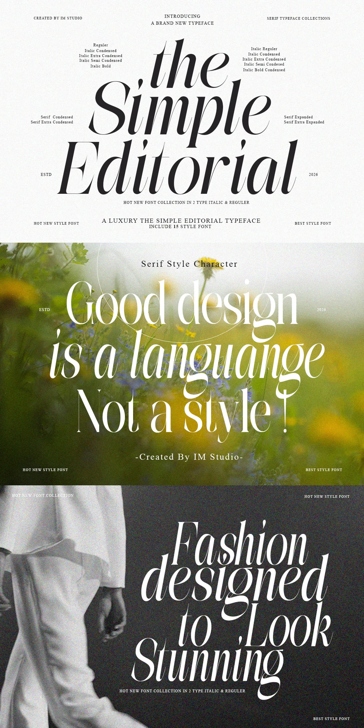
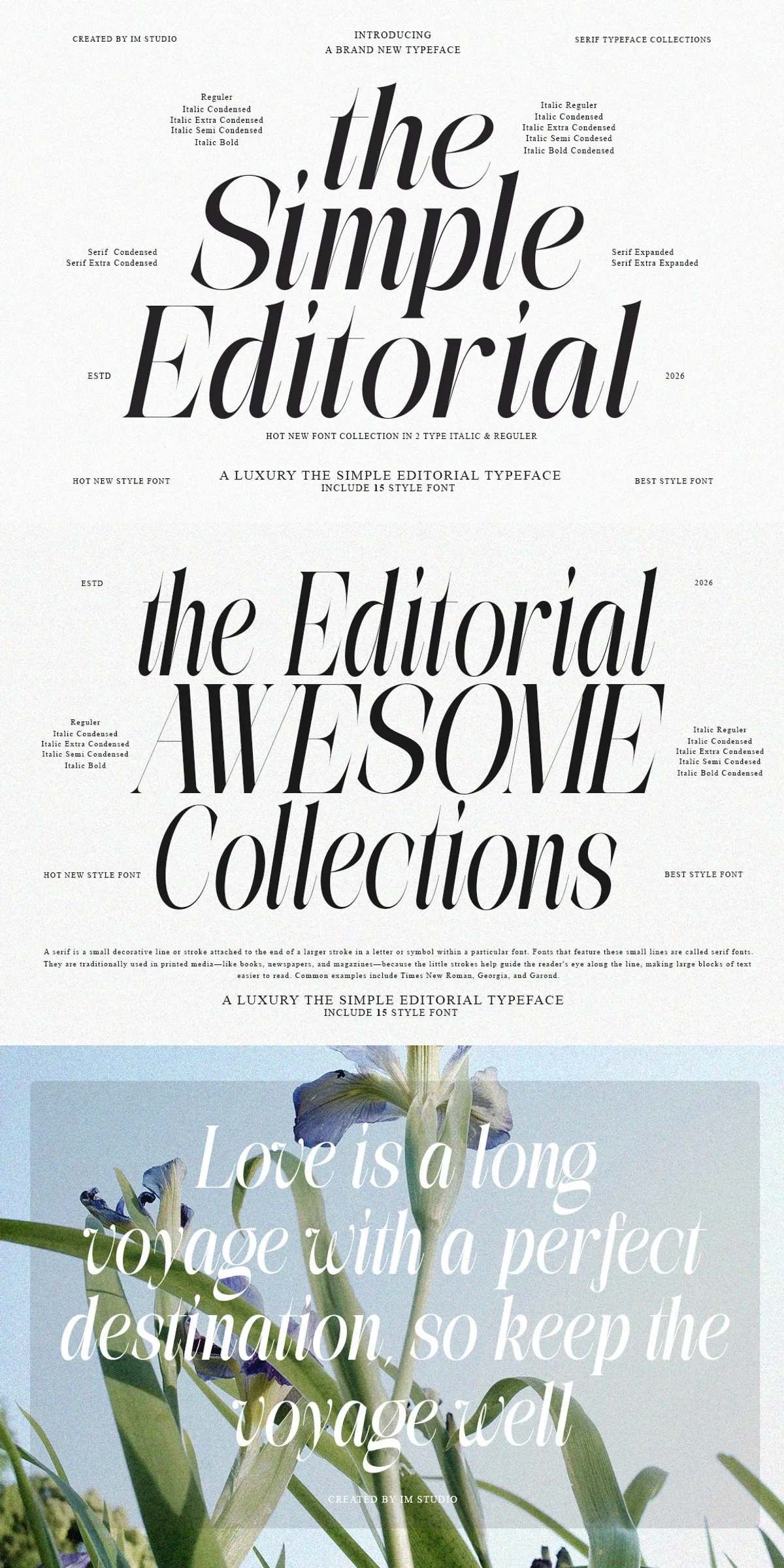
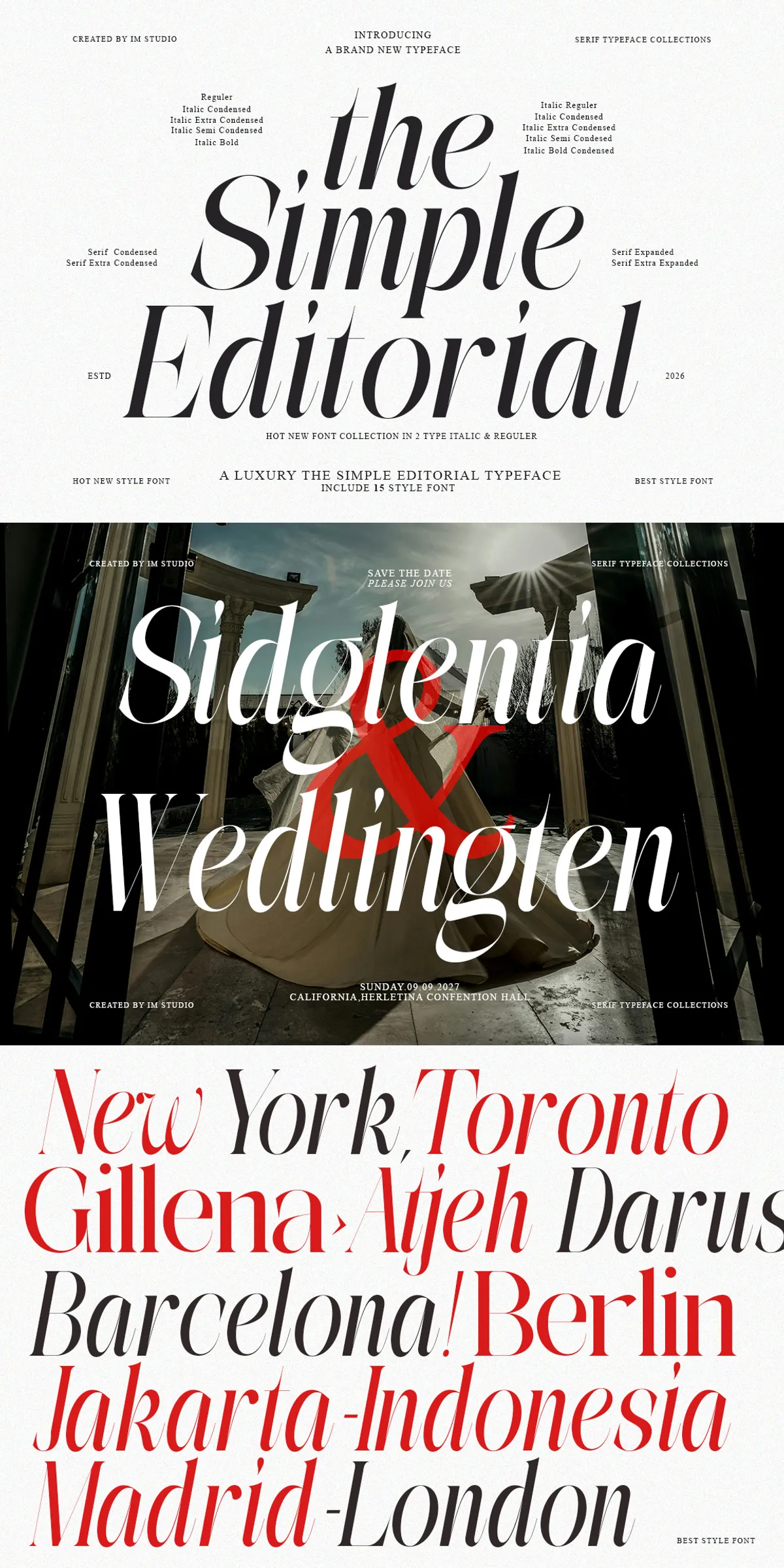
Discover The Simple Editorial, a serif typeface that captures the essence of the golden age of print while seamlessly integrating into contemporary design systems. This font bridges the gap between nostalgic charm and modern functionality, offering designers a sophisticated tool that honors typographic tradition without feeling dated. Rooted in the visual language of vintage publications, iconic mid-century signage, and classic advertising, The Simple Editorial carries an unmistakable retro soul. Yet, it remains perfectly at home in modern brand identities, high-end editorial layouts, and luxury packaging applications.
Comprehensive typographic toolkit with 15 distinct styles
The Simple Editorial provides an extensive range of options to suit diverse creative needs. With a total of 15 carefully crafted styles, this typeface offers unmatched versatility for any design project. The collection includes six regular serif weights and nine corresponding italic variants, allowing you to create nuanced hierarchy and emphasis. From whisper-thin elegance that conveys sophistication and grace, to commanding display weights that demand attention and make bold statements, every style is designed to perform. The inclusion of refined ligatures adds an extra layer of typographic craftsmanship, enhancing readability and visual flow in headlines and body copy alike.
Designed for impact across multiple mediums
Whether you are art-directing a heritage-inspired brand identity, laying out a high-end magazine spread, or crafting product packaging that demands consumer attention, The Simple Editorial delivers consistent excellence. Each weight and every curve is meticulously designed to make an impression. The typeface maintains clarity and legibility at small sizes while exhibiting striking character and presence when used as a display font. This dual capability makes it an invaluable asset for designers who need a single typeface family to handle both body text and headline duties.
Key features that set The Simple Editorial apart
- Complete 15-font family including six regular serifs and nine matching italics for comprehensive typographic coverage.
- Elegant ligatures that provide refined typographic detail and enhance the overall aesthetic of composed text.
- Both OTF and TTF formats included, ensuring compatibility with all major design and publishing software.
- Extensive multilingual support that enables global projects with proper character sets for European and other languages.
- A timeless yet modern aesthetic that feels classic in heritage applications while remaining impossibly fresh in contemporary contexts.
Applications and practical uses
The Simple Editorial excels in a wide variety of professional applications. Brand designers use it to create memorable logotypes and identity systems that convey trust and sophistication. Art directors rely on its range of weights to establish visual hierarchy in complex editorial layouts. Packaging designers appreciate its ability to elevate product presentation through elegant serif styling. The font’s versatility allows it to work equally well in digital interfaces, print campaigns, stationery suites, and environmental graphics.
Why designers choose The Simple Editorial
In a market saturated with generic typefaces, The Simple Editorial stands out for its thoughtful construction and broad applicability. It eliminates the need to juggle multiple font families by providing a complete typographic solution within a single cohesive design. The careful attention to detail in each letterform ensures that the font performs beautifully in any context. From intimate business cards to monumental billboards, The Simple Editorial adapts with grace and precision. For brand designers, art directors, and typographic enthusiasts, this typeface delivers the kind of enduring personality that elevates every project and leaves a lasting impression.