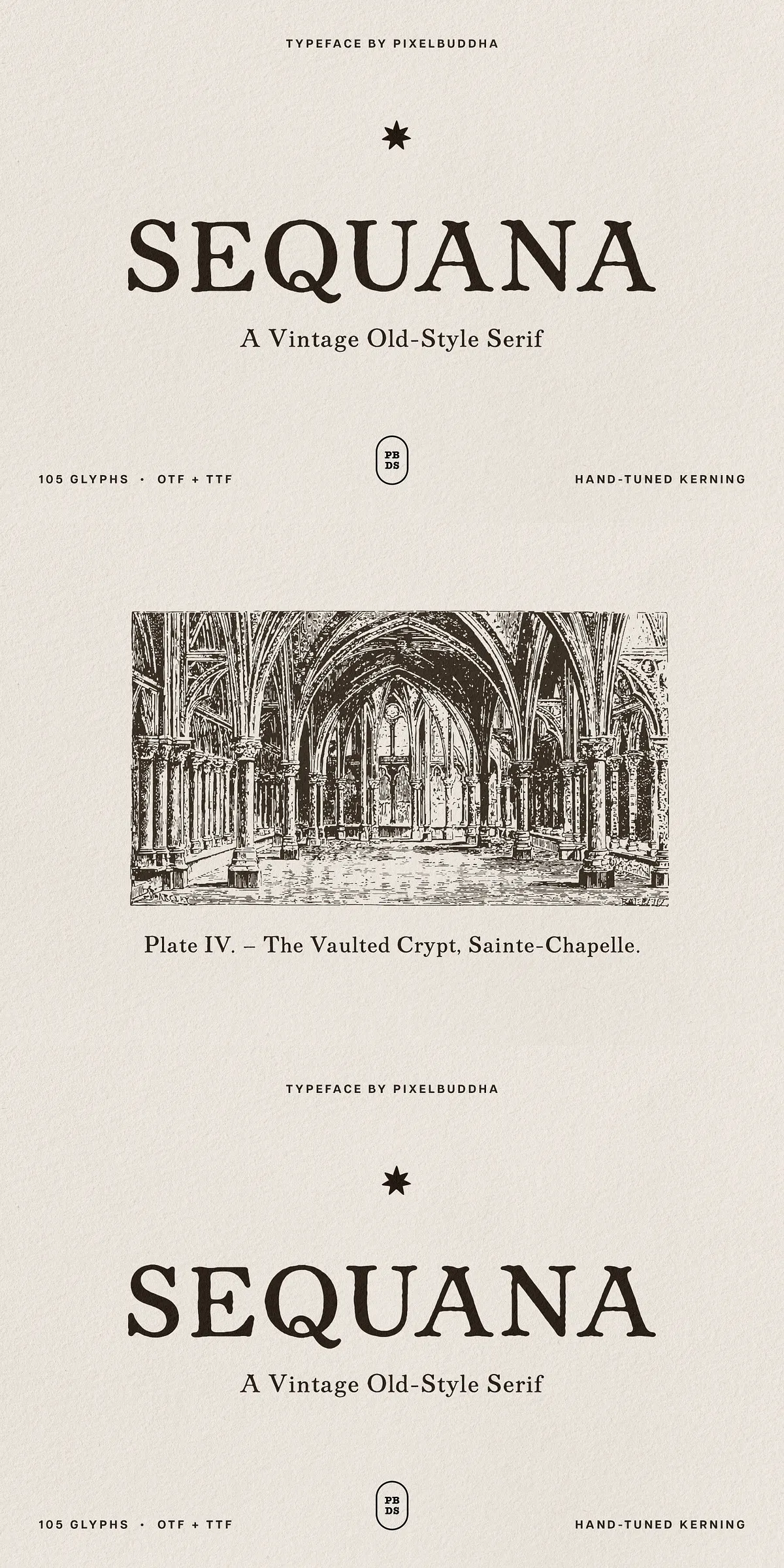
Sequana channels the spirit of early printed books and antiquarian title pages with a deliberately humanist voice. This old-style serif brings together gentle bracketed serifs, moderate contrast, and subtle irregularities that echo letters cut by hand. Sequana actively conveys warmth and character: the looped Q tail, open bowls, and faint ink-bloom texture all introduce tactile personality that reads as both authentic and inviting. Designers will find Sequana immediately useful where historic reference and readable text must coexist with contemporary production demands.
Where Sequana excels in book covers, editorial, and heritage branding
Sequana performs with clarity at small sizes and gains expressive presence at display scales, so a single weight can carry chapter openers as effectively as body text below. Use Sequana for book and journal covers where typographic tone matters, for masthead logotypes that require dignity, and for poetry or editorial layouts that demand refined rhythm. The typeface also suits wine and spirits labels, restaurant menus, certificates and invitations, museum and exhibition graphics, and any heritage branding that benefits from a crafted, historical voice.
Distinctive characteristics and hand-crafted typographic features
Sequana’s design choices emphasize legibility and character. Its humanist proportions maintain comfortable reading across long passages, while the gently bracketed serifs and moderate contrast retain a classical silhouette without becoming rigid. Small, intentional irregularities emulate the slight imperfections of hand-cut type and a faint ink-bloom effect adds organic texture on printed surfaces. These details make Sequana feel lived-in and tactful rather than clinical, adding emotional resonance to editorial and identity work.
Comprehensive feature list designers rely on
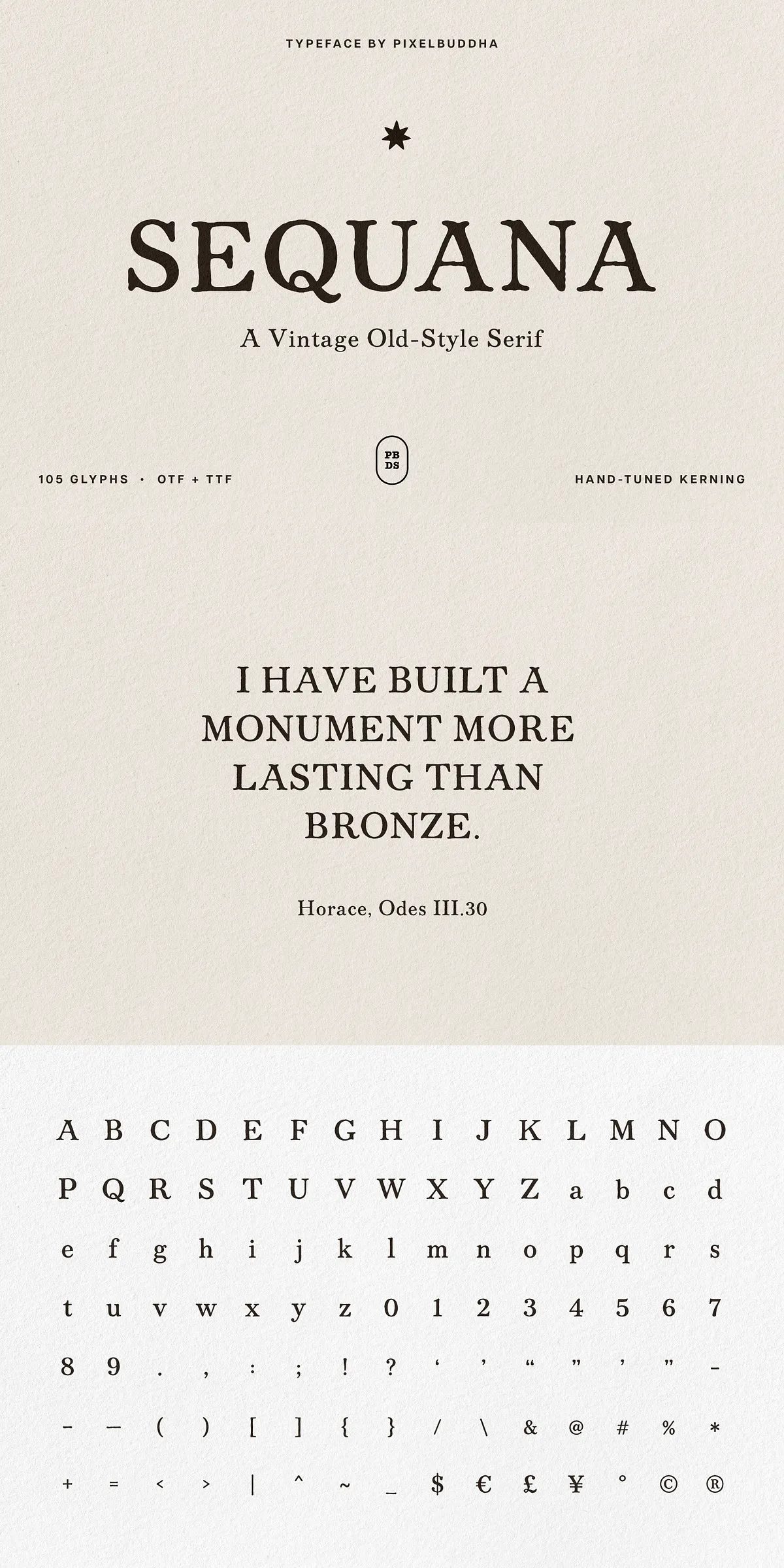
- Uppercase and lowercase alphabets (A–Z, a–z) for full typesetting control
- Numerals, punctuation, and a broad set of symbols for editorial use
- Matched quotation marks for typographic consistency in text
- Currency and reference marks ($, €, £, ¥, ©, ®) included
- Hand-tuned kerning that ensures even spacing across combinations
- 105 glyphs total, covering core language needs and practical symbols
Practical guidance for implementing Sequana across projects
To maximize Sequana’s value, pair it thoughtfully: combine Sequana with a neutral sans-serif for long-form body copy when you want contrast between voice and functional text, or let Sequana lead both headline and supporting copy for a fully consistent editorial expression. For large headings and chapter openers, increase tracking slightly and open leading to showcase the serif terminals and the ink-bloom texture. When setting body text, maintain moderate line lengths and comfortable leading to preserve the font’s humanist rhythm.
Production tips for print and digital workflows
Test Sequana at intended output sizes: the decorative irregularities and ink-like roughness add character in print but may require adjustment for small-screen rendering or low-resolution reproduction. For packaging and labels, proof how decorative elements reproduce under finishes such as foil, emboss, or letterpress. When preparing web use, optimize hinting and test on major browsers to preserve stroke contrast and terminal clarity. Always verify kerning pairs in layouts that include all-caps or dense numeric data to avoid visual collisions.