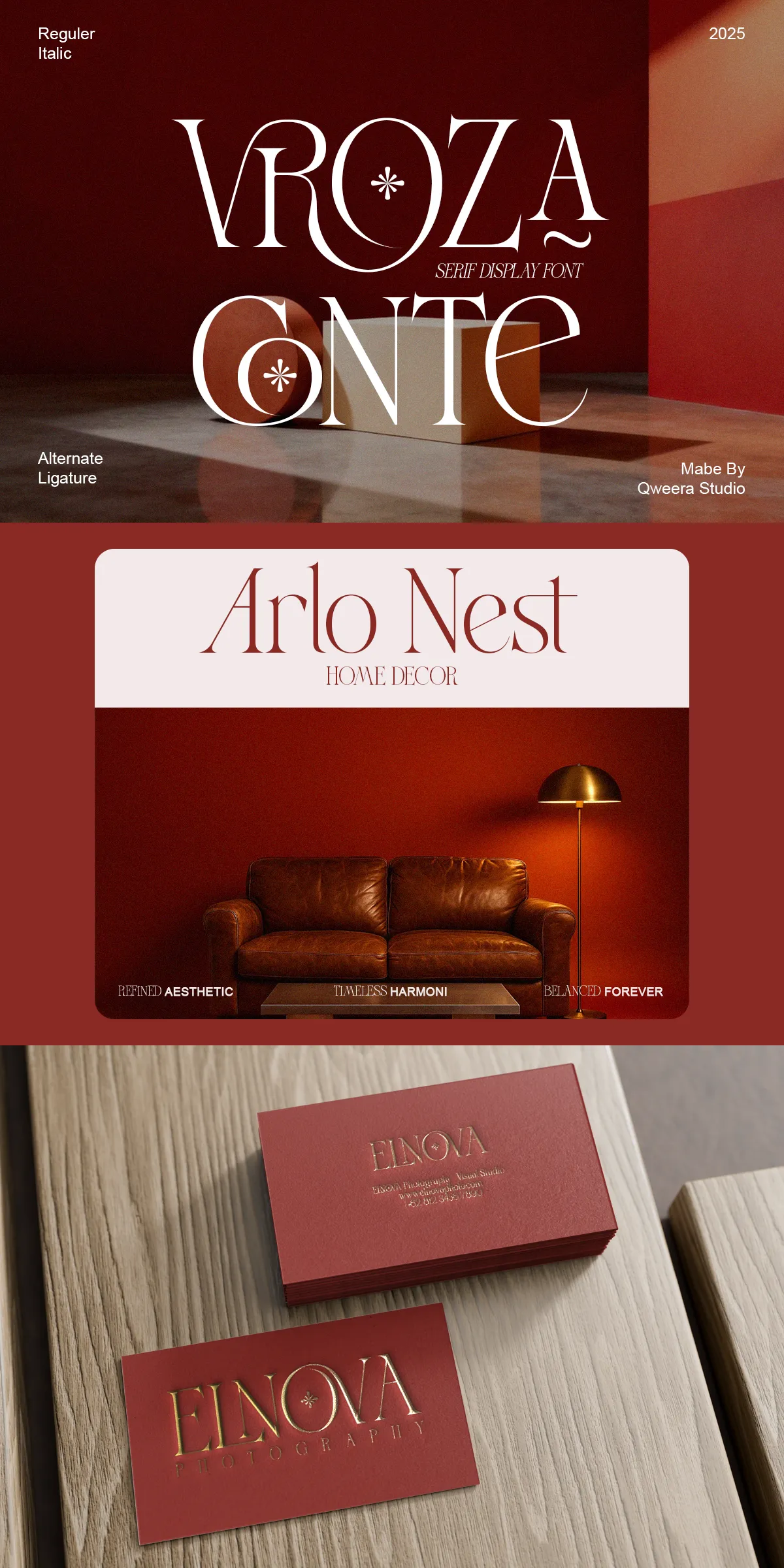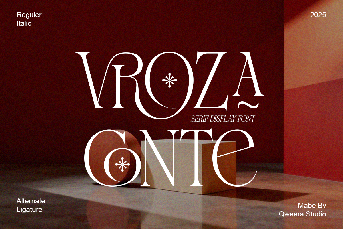

Vroza Conte asserts a refined typographic presence that blends contemporary structure with subtle decorative flourishes. Designed to express modern luxury and artistic refinement, this serif display family empowers creatives to craft identities, headlines, and packaging that convey confidence, sophistication, and timeless style. The typeface balances clean proportions with considered embellishments so that every letter communicates intention and craft. Use Vroza Conte when projects demand a distinctive typographic voice that reads clearly while elevating the visual character of your brand or publication.
Why Vroza Conte Elevates Premium Brand And Editorial Experiences
Vroza Conte actively strengthens visual narratives with a measured combination of modern geometry and elegant serif details. Its structured letterforms provide strong legibility at display sizes while decorative terminals and refined contrast introduce personality and warmth. This font performs equally well within bold logo treatments and graceful headline layouts, delivering clarity without sacrificing artistic flair. Designers will find Vroza Conte especially effective when they need typography that signals luxury, craft, and editorial intelligence in equal measure.
Distinctive Design Features That Shape Vroza Conte’s Character
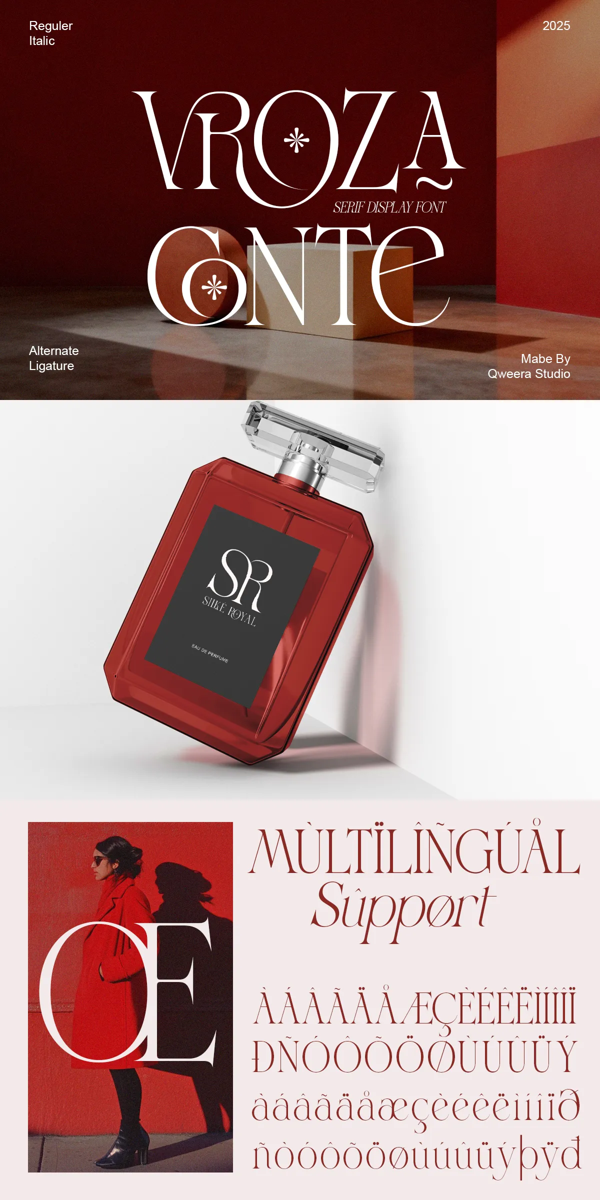
Vroza Conte features deliberate design choices that add both function and beauty to typographic work. The family includes a regular and italic voice that complement one another for dynamic editorial hierarchies. Alternates and ligatures provide bespoke connections and rhythmic word shapes suitable for logotypes and expressive headlines. Decorative serif elements introduce subtle ornamentation that reads as intentional sophistication at large sizes yet remains restrained for refined compositions. Multilingual support and PUA-encoded glyphs ensure accessibility and easy access to stylistic forms across design applications.
Complete Feature Set For Creative Workflows
- Regular and Italic styles that enable strong typographic hierarchy
- Full uppercase and lowercase alphabets for comprehensive typesetting
- Alternates and ligatures to craft custom wordmarks and flowing display text
- Decorative serif elements that add artistic refinement without overpowering designs
- Multilingual support to cover a broad range of Latin-based languages
- PUA encoding for direct access to special characters in common design software
Practical Applications And Creative Strategies With Vroza Conte
Apply Vroza Conte to fashion editorials, where large, confident headlines create mood and capture attention on covers and spreads. Use alternates and ligatures to compose bespoke logos for boutique brands and premium product lines, giving wordmarks an artisanal, handcrafted feel. On packaging, Vroza Conte communicates material quality and careful design choices, particularly when paired with tactile printing methods and refined color palettes. For invitations and stationery, the italic and decorative forms add motion and elegance, transforming simple wording into composed expressions of taste.
Pairing Recommendations And Implementation Tips
To maximize Vroza Conte’s impact, pair it with a neutral sans-serif for body copy to preserve legibility while letting the serif lead the design voice. Apply generous tracking and slightly increased leading in large display settings to highlight the decorative traits and maintain visual balance. When preparing files for print or web, test how the decorative elements reproduce at intended sizes and choose appropriate weights to prevent loss of detail on textured surfaces or in small-format applications. Document preferred alternates and ligature use in brand guidelines to ensure consistent application across teams.