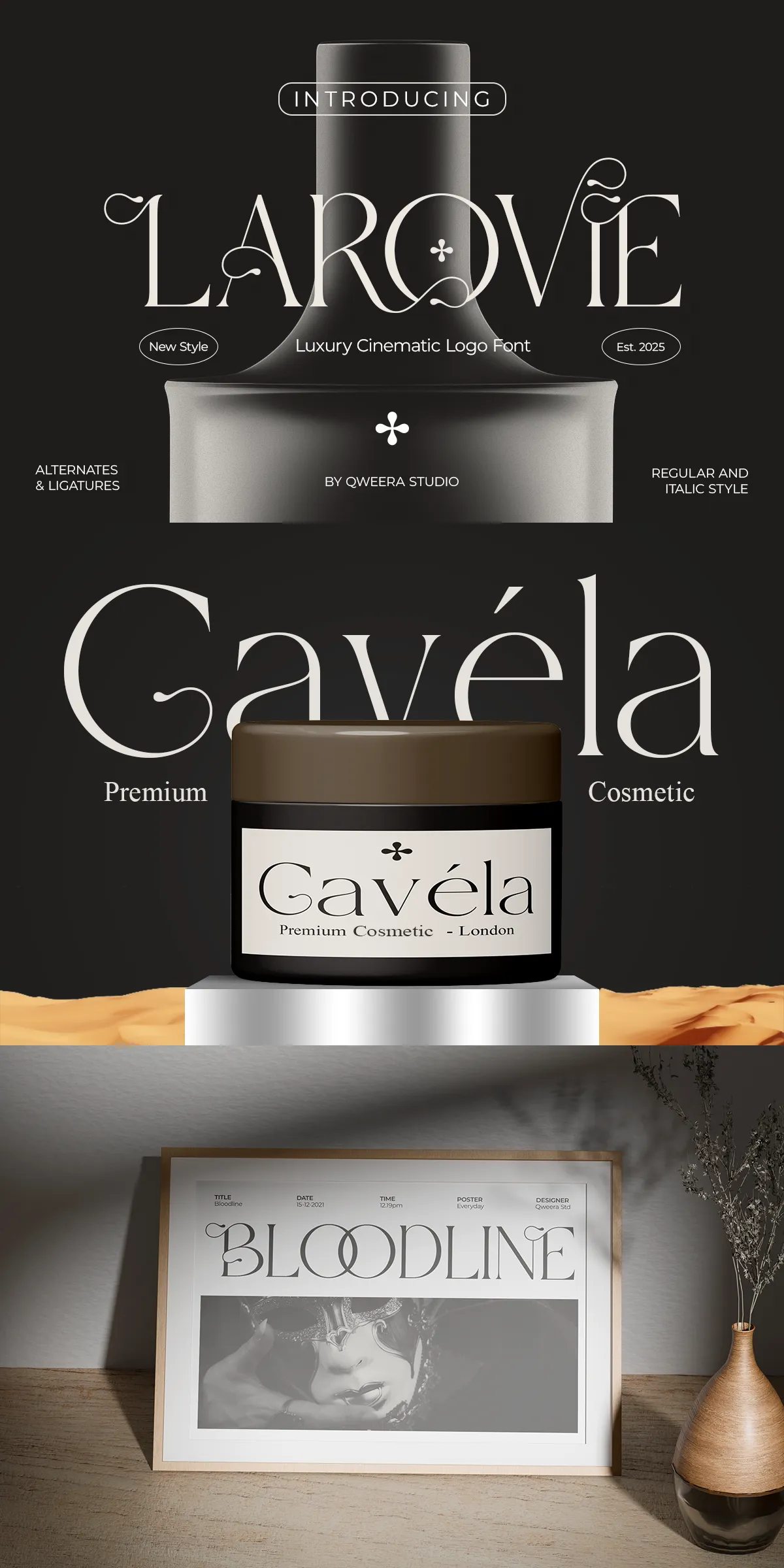
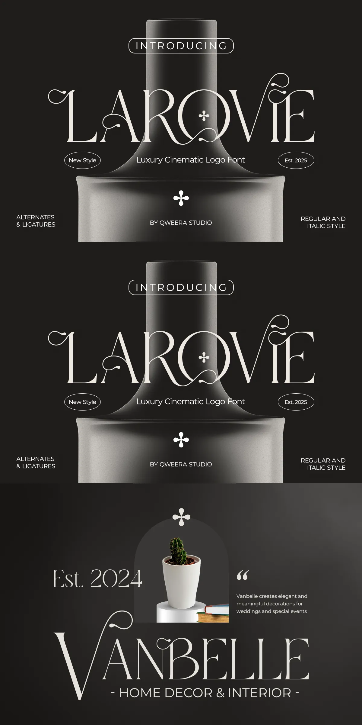
Larovie brings a cinematic flourish to contemporary design. This modern luxury serif emphasizes refined contrast, graceful curves, and decorative details that elevate any identity. Designers choose Larovie when projects require a confident, high-end typographic voice that reads clearly while projecting prestige. Built for both display and identity use, Larovie performs strongly in logos, editorial headlines, and premium packaging. Its carefully shaped serifs and elegant alternates allow designers to craft distinct wordmarks, impactful headlines, and polished layouts that feel both timeless and current.
Why Choose Larovie For Luxury Branding And Visual Storytelling
Larovie actively strengthens brand messages with type that communicates quality and intentionality. The typeface pairs pronounced vertical contrast with soft, sculpted terminals to create a look that reads cinematic and poised. When used in logos and headlines, Larovie asserts a premium presence; when paired with neutral body type, it anchors entire visual systems with refined hierarchy. Larovie also adapts to varied materials and scales: it prints beautifully on textured stock, performs online with optimized webfonts, and scales confidently across packaging and signage. Choose Larovie to signal sophistication, elevate product perception, and craft visual narratives that feel curated.
Distinctive Design Features And Decorative Details Of Larovie
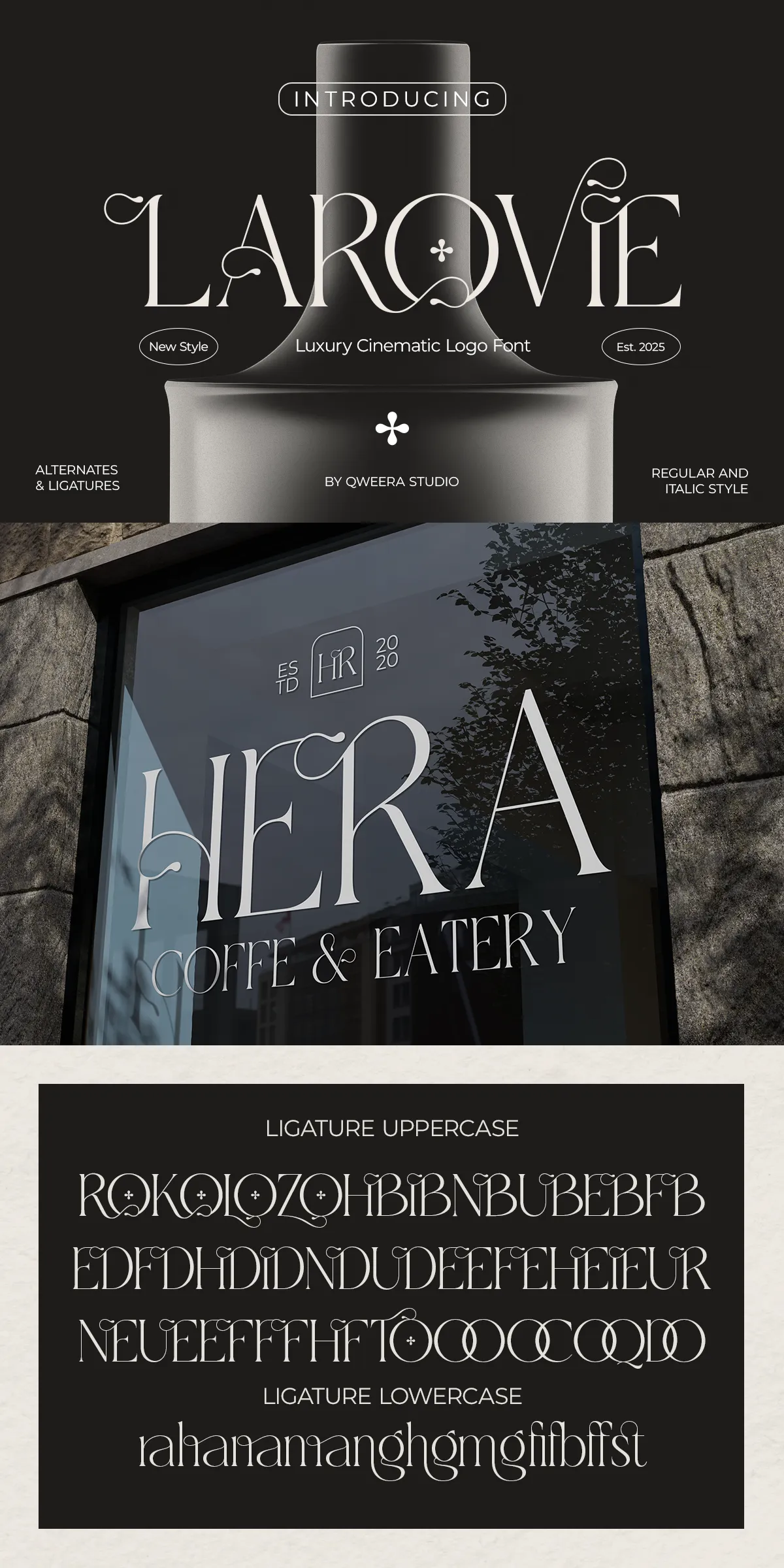
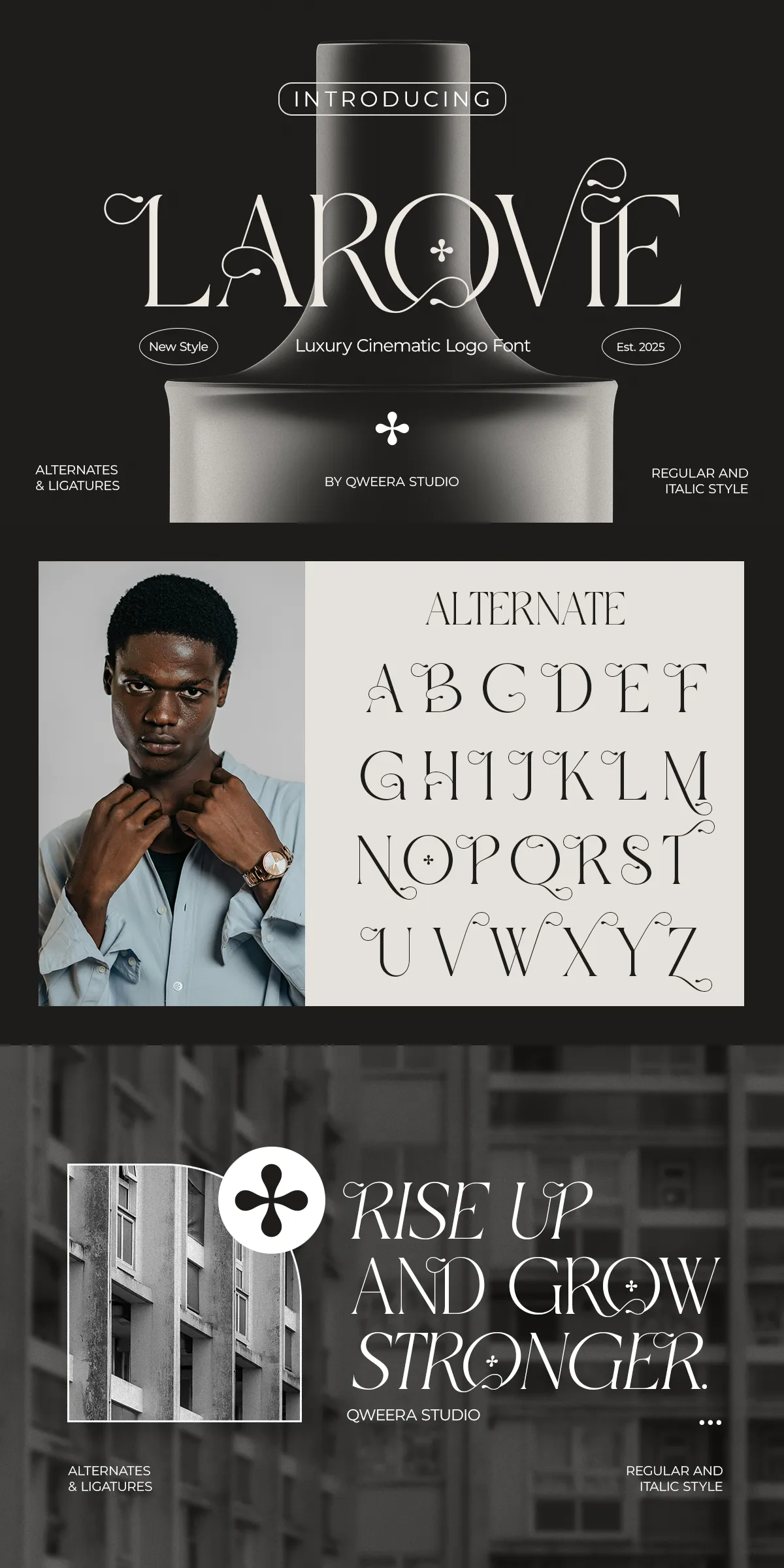
Larovie offers a suite of stylistic and functional features designed for high-impact typography. Its elegant decorative elements include alternate letters and ligatures that create smooth, organic connections in logotypes and display words. The italic style introduces dynamic motion for emphasis and subheads, while the regular style delivers structural clarity. Larovie’s refined counters and open bowls maintain legibility even at smaller sizes, whereas its display proportions shine in large-format headlines. Each glyph receives considered spacing and kerning to ensure reliable composition across different media.
Complete Feature Set And Technical Delivery For Seamless Workflow
- Uppercase and lowercase character set for full typographic flexibility
- Regular and italic styles to support hierarchy and expressive needs
- Alternates and ligatures for bespoke wordmarks and elegant display treatment
- PUA-encoded glyphs for direct access to decorative forms in design apps
- Multilingual support for broad Latin-based language coverage
- Delivered in OTF, TTF, WOFF formats for print and web workflows
- Optimized kerning and spacing to ensure consistent results at all sizes
How To Use Larovie In Real-World Creative Projects
Apply Larovie to craft boutique logos that demand a poised personality and instant recognition. Use the alternates and ligatures to design distinctive wordmarks that read as handcrafted. Employ the italic for invitation headlines and editorial pull quotes to add motion and elegance. Pair Larovie with a clean, neutral sans-serif for body copy to preserve readability while allowing the serif to carry the visual tone. When designing packaging, test proofs on both coated and uncoated stocks to fine-tune perceived weight and contrast.
Ideal Applications And Practical Examples For Larovie In Design
Larovie suits a wide range of premium use cases. Use it for luxury logos and brand identity systems that require a refined voice. Apply it to fashion campaigns and lookbooks where dramatic headlines establish mood. Deploy it in editorial layouts and magazine covers to create cinematic titles and expressive spreads. Use Larovie on beauty and skincare packaging to convey craftsmanship and material quality. It also works well for wedding stationery, invitations, and boutique signage where an elegant, timeless touch matters.