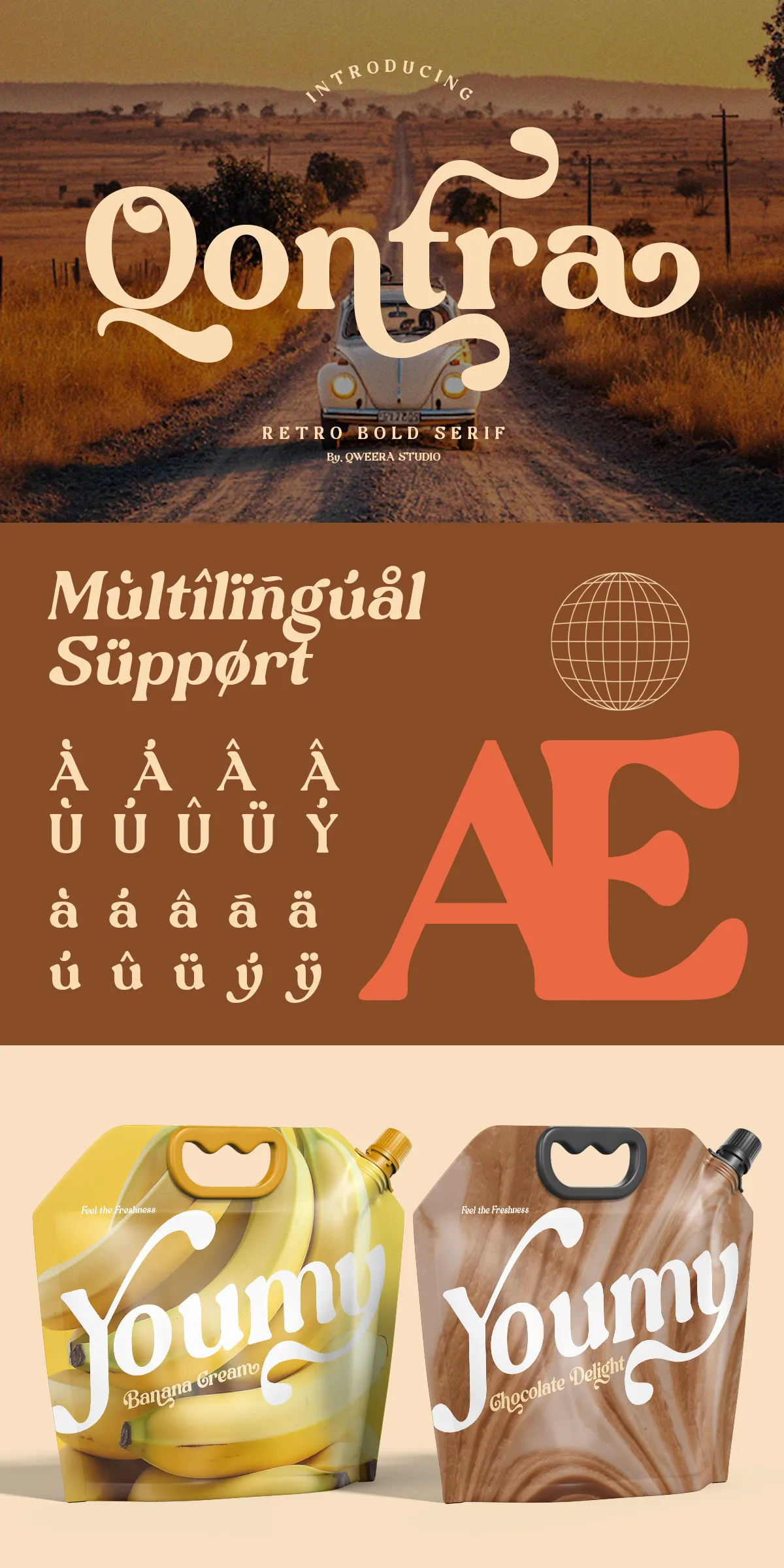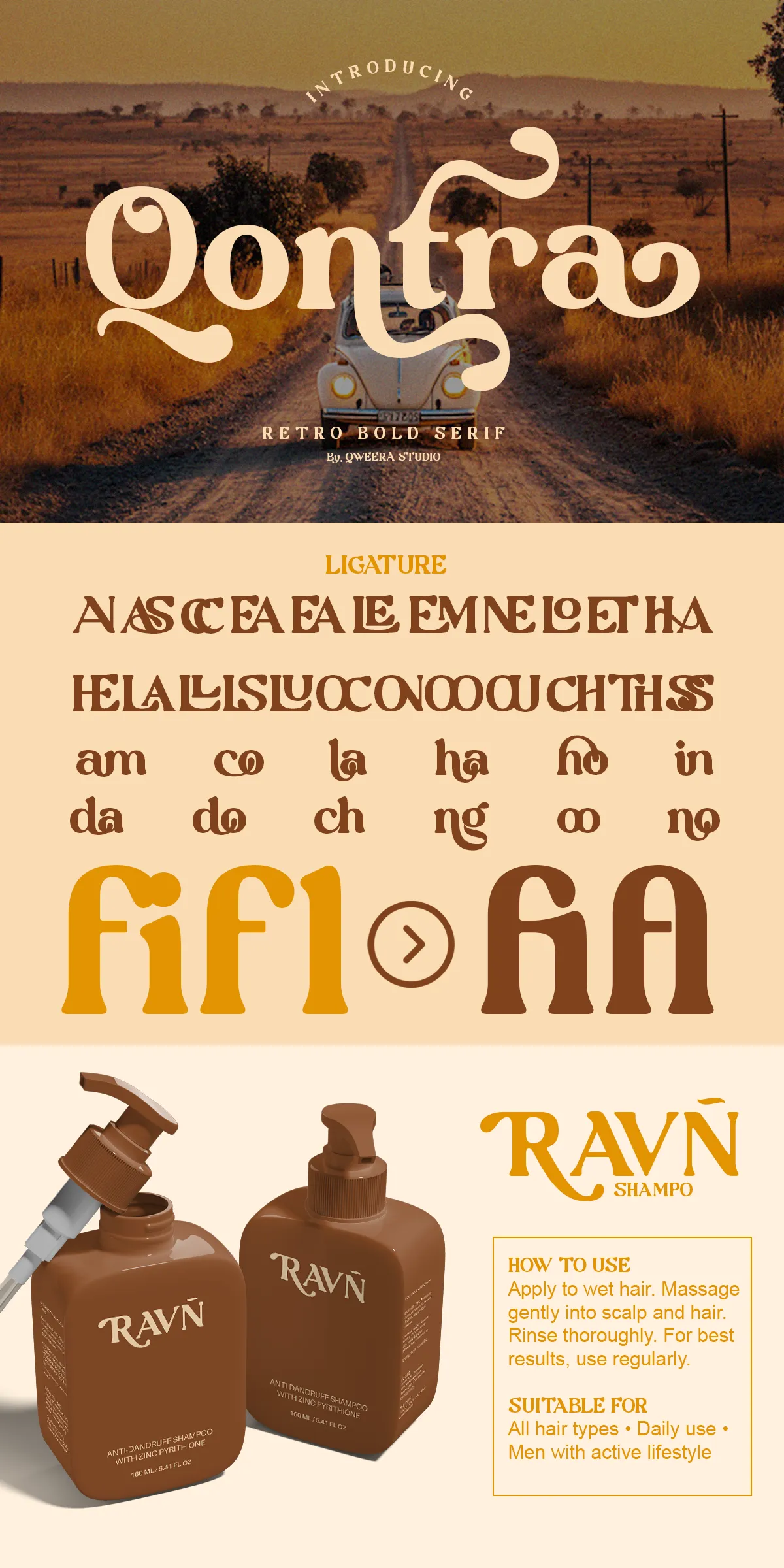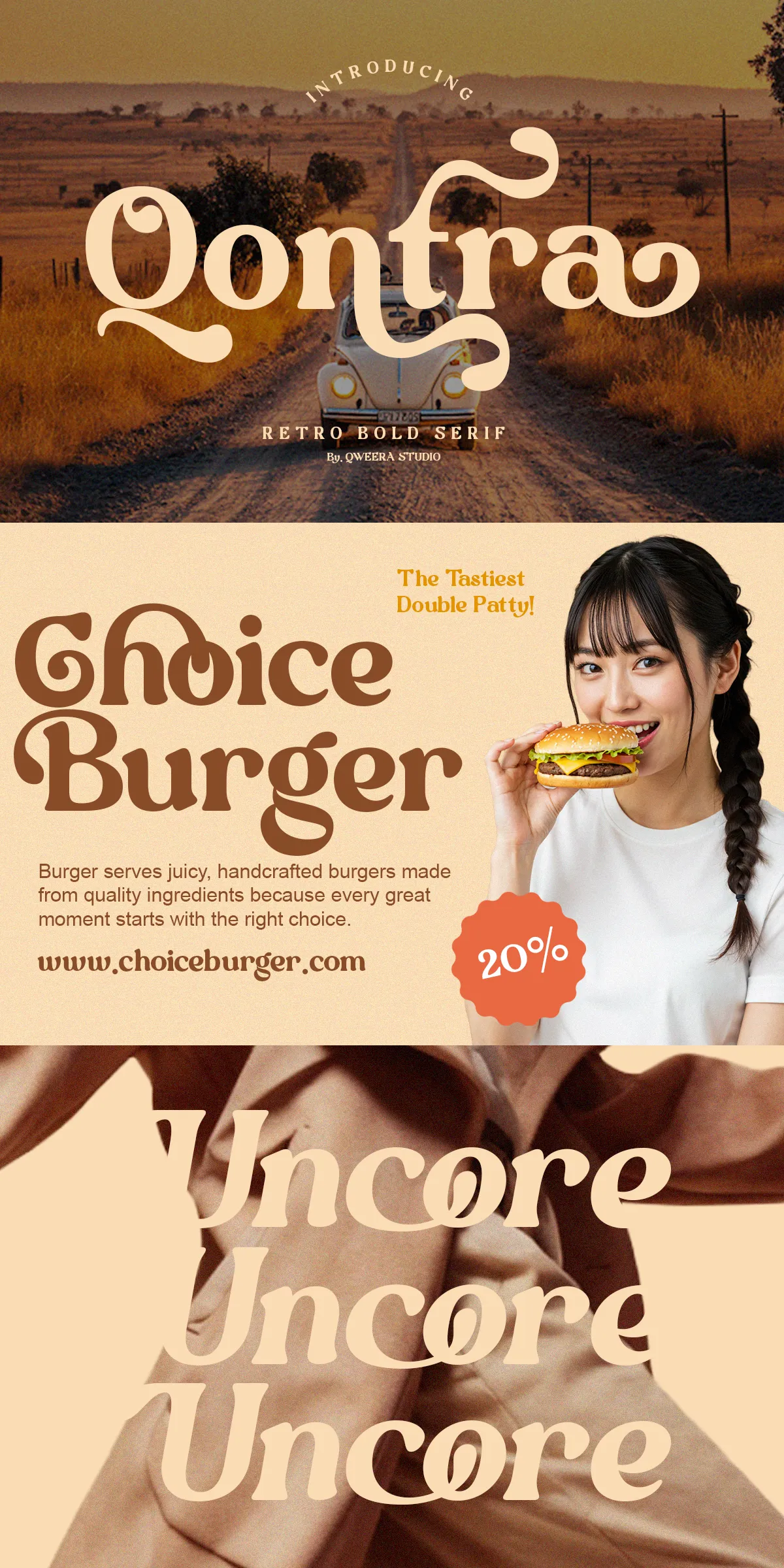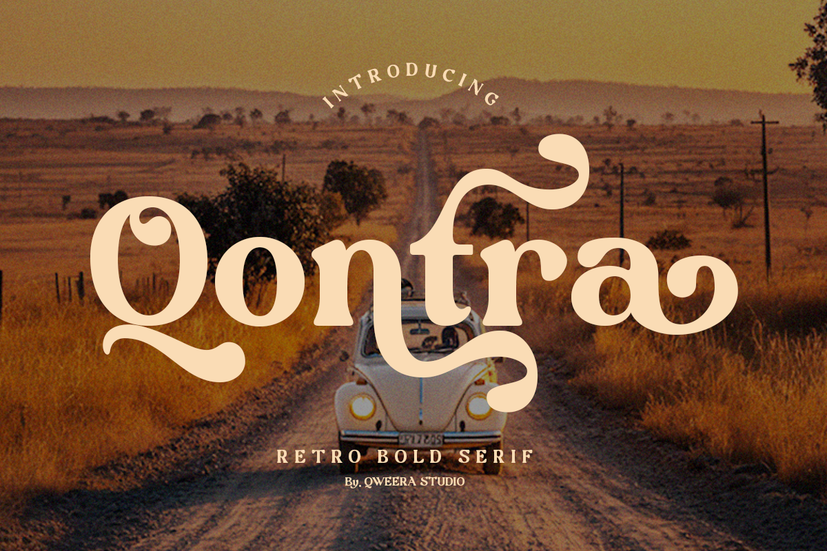

Qontra delivers a confident, retro-infused voice that actively anchors brand identities and creative projects. Crafted with strong curves, decorative swash elements, and purposeful contrast, Qontra revives classic typographic charm while preserving modern legibility. Use Qontra to create posters that demand attention, logos that feel timeless, and packaging that communicates character and authenticity. The typeface balances expressive vintage forms with practical features designers expect: alternates, ligatures, italics, and broad language support. Qontra is the tool for creatives who want bold, expressive typography that stands out and endures.
Distinctive Visual Features And Typographic Strengths
Qontra combines retro aesthetics and contemporary functionality. The design emphasizes pronounced serifs, sculpted terminals, and high-contrast strokes that create a theatrical, memorable silhouette at display sizes. Decorative swash elements and alternate glyphs expand creative options, enabling bespoke wordmarks and headline treatments. Carefully tuned kerning and a complementary italic style ensure that Qontra reads crisply in large-scale applications while maintaining consistent rhythm across lines of display copy. These details make Qontra equally suited for print posters and high-resolution digital banners.
Included Font Files And Practical Technical Notes
- Regular and Italic styles for flexible emphasis and hierarchy
- Complete uppercase and lowercase alphabets for full typographic control
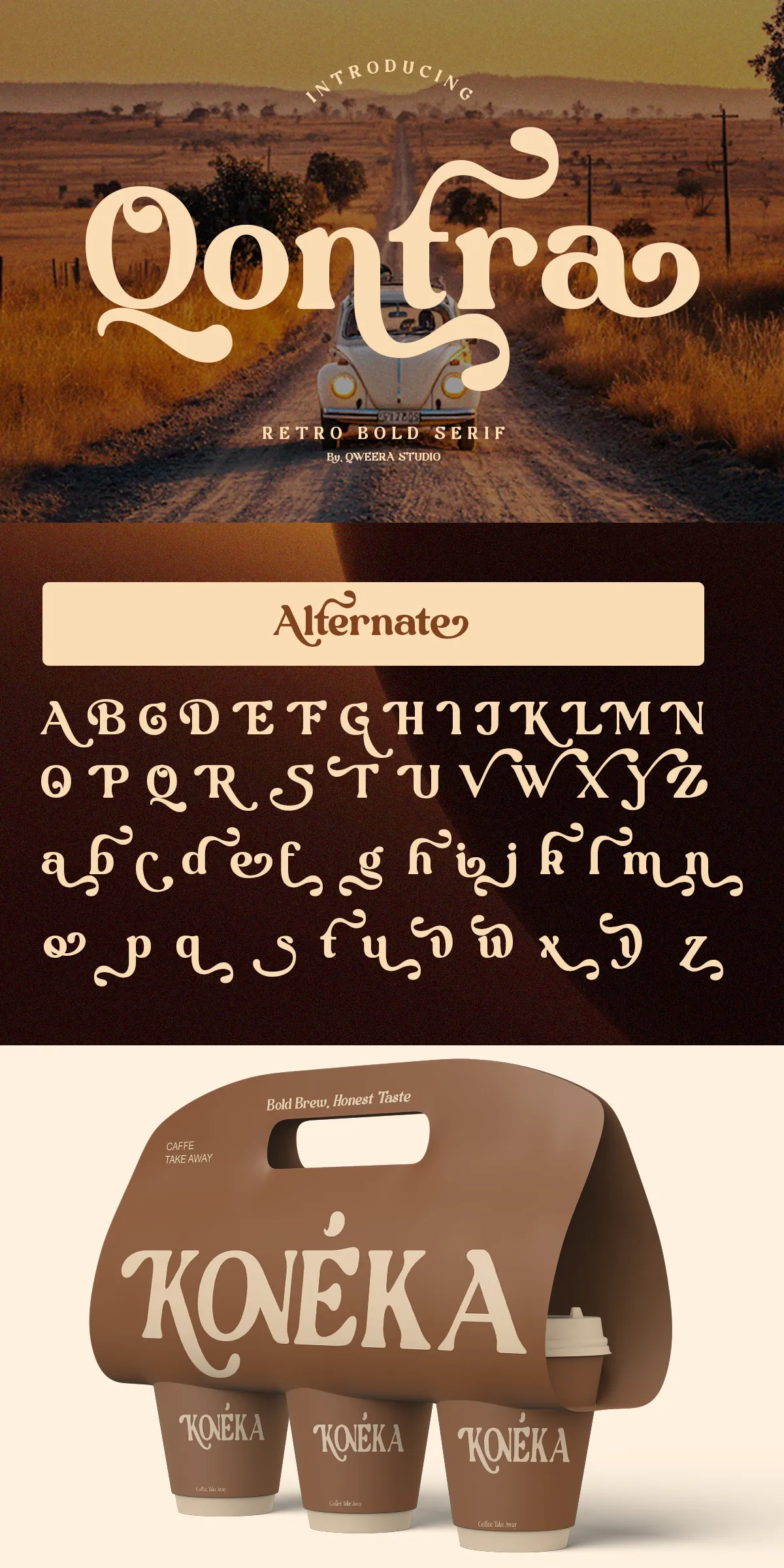
- Alternates and ligatures to craft custom logotypes and expressive headlines
- PUA-encoded glyphs and multilingual diacritics to support broad language coverage
- Recommended web formats: provide WOFF and WOFF2 for performance-conscious web use
Active Applications And Typical Creative Use Cases
Qontra excels wherever designers need a bold, nostalgic voice. Apply it to poster campaigns and event branding to seize attention and communicate mood instantly. Use Qontra for vintage logos and signage to evoke heritage and character. On packaging, the typeface enhances tactile and artisan cues—especially for specialty foods, beverages, and boutique goods that benefit from a handcrafted retro look. For editorial covers and striking headlines, Qontra provides dramatic presence without compromising readability at larger sizes. The typeface also performs well on merchandise, labels, and environmental graphics that require a commanding visual identity.
Styling Advice And Pairing Recommendations For Designers
- Pair Qontra with a neutral sans-serif for body text to preserve readability and highlight display typography.
- Reserve decorative alternates and swashes for wordmarks, titles, and focal headlines to maximize impact without clutter.
- Use restrained color palettes, textured paper, or subtle embossing to amplify Qontra’s vintage cues in print.
- Limit heavy swash use in long lines; deploy straight glyphs for tighter settings and better legibility.
Licensing, Implementation, And Best Practices
Before deploying Qontra, confirm licensing terms for commercial use, web embedding, and product distribution. For web projects, serve optimized WOFF/WOFF2 files and preload critical display fonts to reduce layout shifts. In print, test Qontra at intended headline sizes—this typeface shines above 24–30 points where its character details become unmistakable. For brand systems, establish guidelines that specify when to use alternates, swashes, and italics so teams can apply Qontra consistently across media.