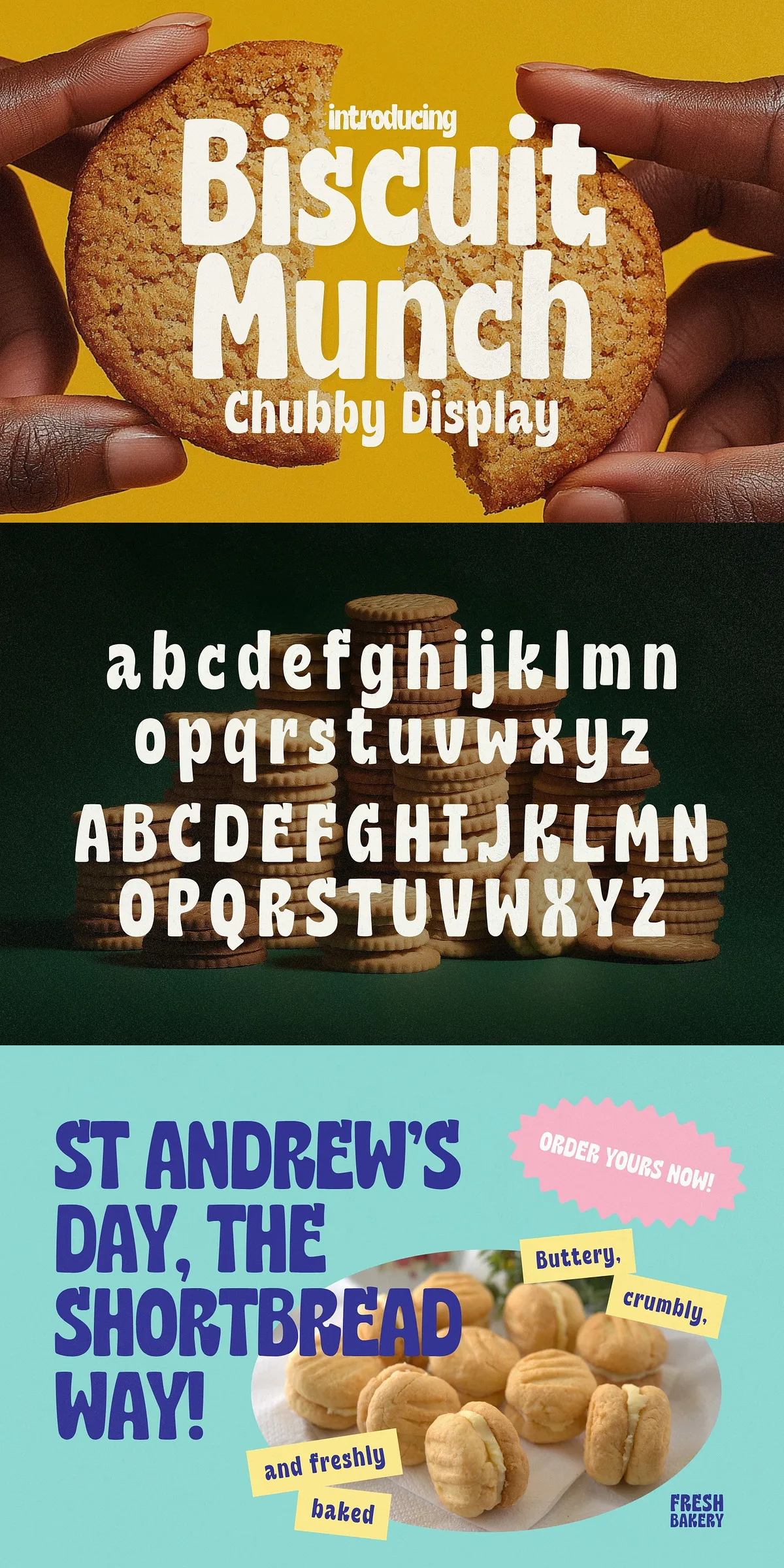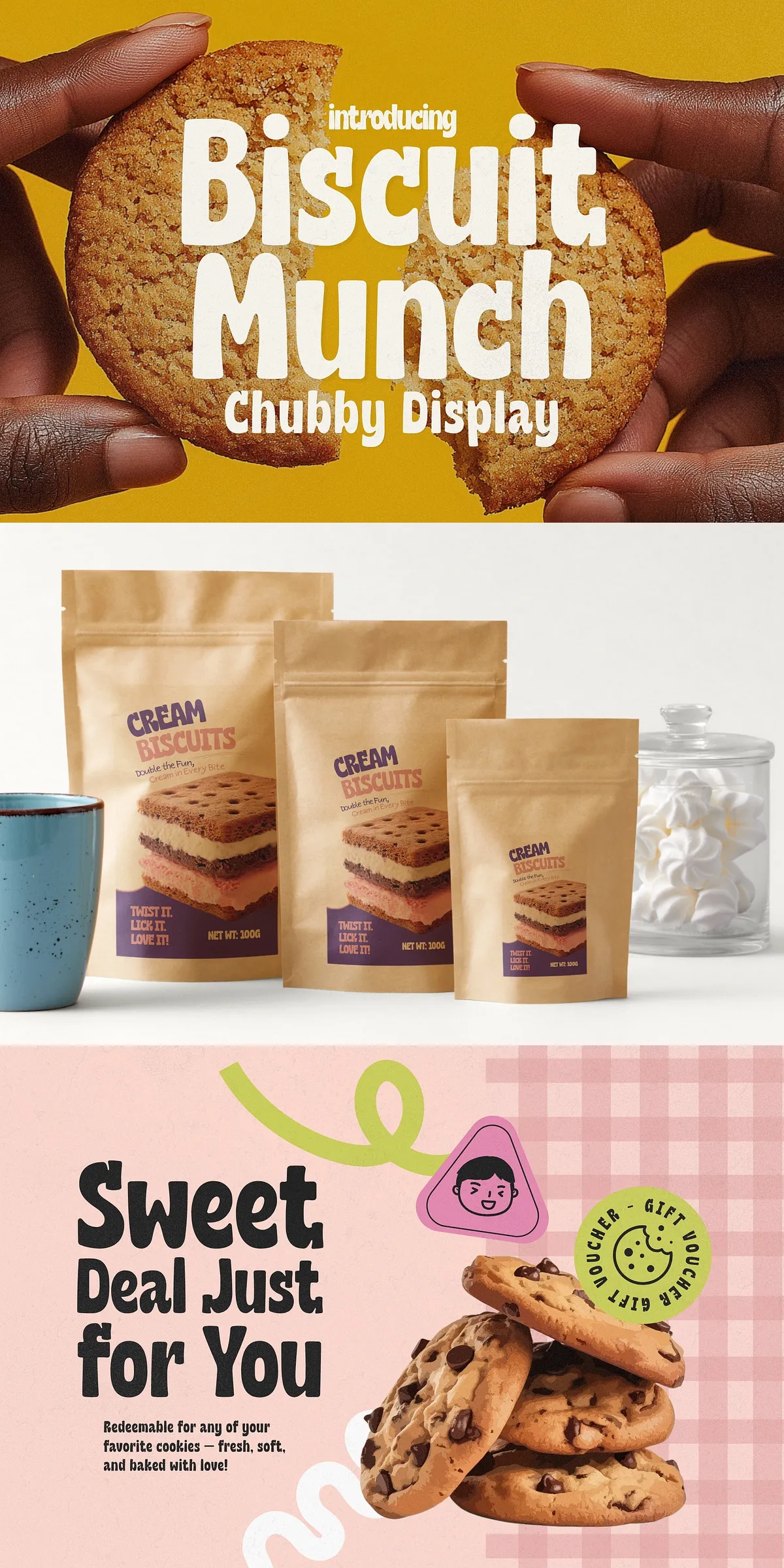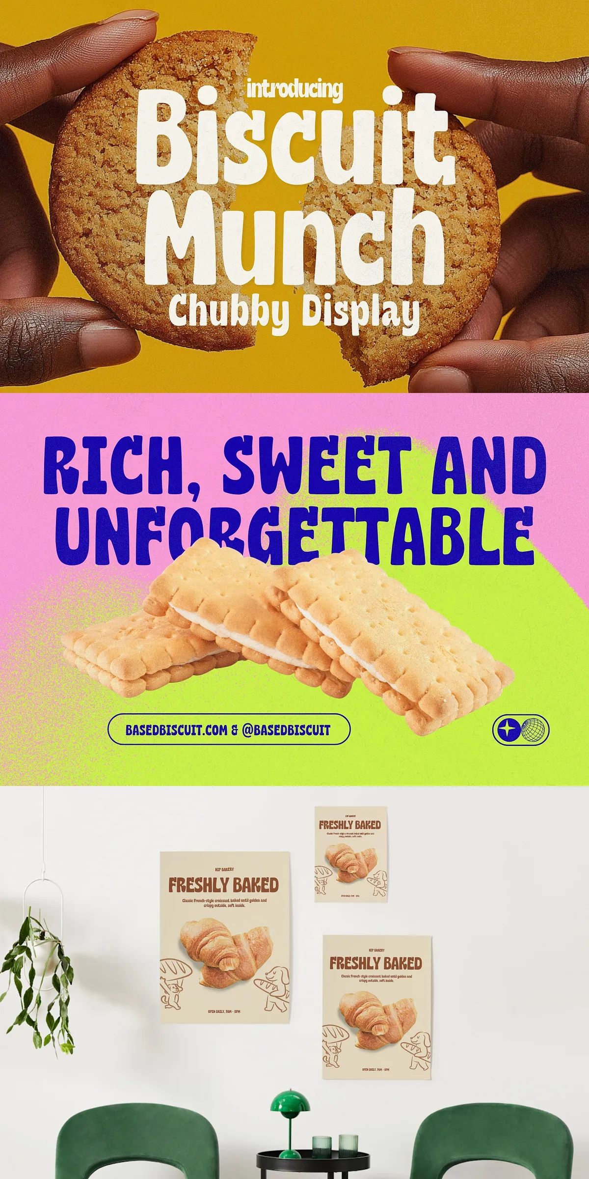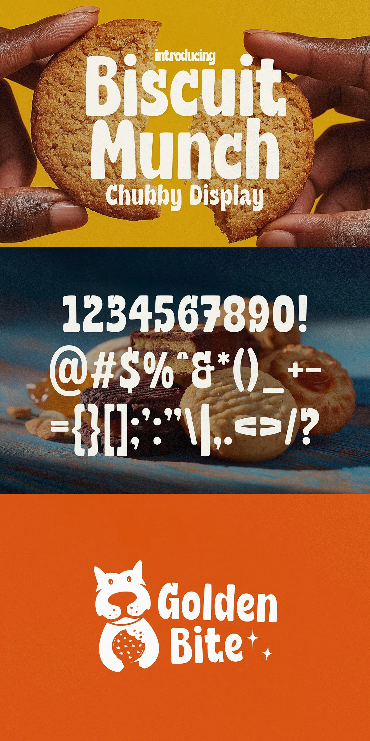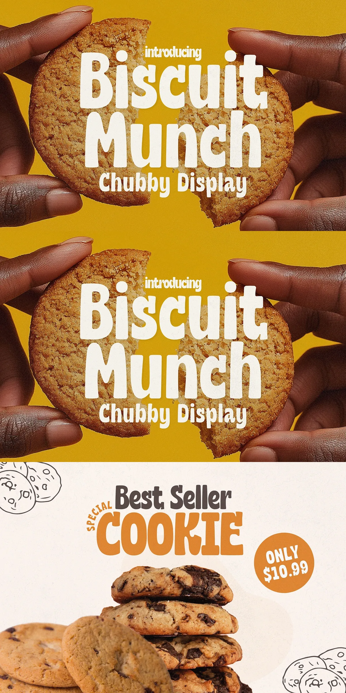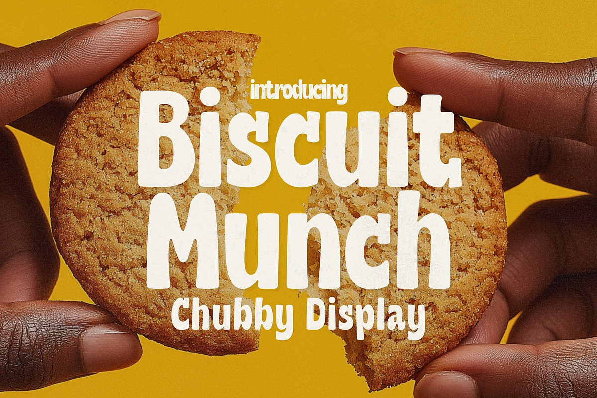

Biscuit Munch delivers an instantly friendly voice for any project that needs charm, approachability, and memorable personality. This chubby display font features rounded terminals, buoyant curves, and a hand-drawn rhythm that feels both handcrafted and professionally finished. Use Biscuit Munch to craft bold headlines, cozy café menus, adorable bakery signage, snack packaging, playful logos, children’s product labels, social media graphics, and apparel prints. The design intentionally emphasizes readability at display sizes while preserving a handcrafted, snackable character that invites interaction and boosts brand recall.
Distinctive Round Letterforms And Energetic Handcrafted Rhythm
Biscuit Munch uses soft, rounded strokes to create a warm tactile presence on the page. Each glyph balances chunky stems with open counters so the font remains legible when scaled for packaging or thumbnails. The typeface’s playful baseline rhythm and subtle irregularities suggest a human touch, making it ideal for brands that want to feel authentic and approachable rather than corporate. Designers will appreciate how the letters work together to produce an upbeat mood without sacrificing clarity.
Key Features That Make Biscuit Munch Highly Versatile
- Bold, rounded display glyphs designed for strong headlines and short statements
- High legibility at medium and large sizes for packaging and signage
- Playful alternates and stylistic sets to vary word rhythm and tone
- Support for numerals, punctuation, and basic diacritics for wider language use
- Available in OTF/TTF and web-friendly WOFF/WOFF2 formats for cross-platform use
Primary Use Cases For Food, Retail, And Children-Focused Brands
Biscuit Munch shines in contexts that require a friendly, snackable aesthetic. It lifts café branding and bakery logotypes with a cozy, handcrafted feel that reads well on menus and window decals. On product packaging, its chunky forms stand out on crowded shelves and translate well to stickers and labels. Designers creating children’s books, toy packaging, or educational products will find Biscuit Munch communicates warmth and accessibility. For social media and thumbnail art, its strong silhouette ensures legibility even at small sizes.
Practical Implementation Tips For Print And Digital Projects
For print, use Biscuit Munch at display sizes to emphasize its rounded personality; pair it with textured finishes—such as kraft paper, embossing, or soft matte coatings—to enhance tactile appeal. For web use, serve WOFF/WOFF2 and consider subsetting to reduce load times. When combining Biscuit Munch with body text, select a neutral sans-serif that preserves readability while allowing the display font to lead. Use generous letter-spacing in long headlines to avoid visual crowding and try stylistic alternates for decorative accents.
Styling Recommendations And Pairing Ideas For Cohesive Design
Pair Biscuit Munch with a clean geometric sans for paragraph copy—this contrast highlights the font’s playful nature while keeping layouts professional. Use warm, muted palettes or pastel tones to amplify cozy vibes; accent with hand-drawn illustrations, pastry photography, or playful icons to reinforce the snack-time theme. For logos, combine Biscuit Munch with a secondary mark or emblem that leverages negative space; for packaging, prioritize hierarchy by pairing large Biscuit Munch headlines with clear ingredient and pricing information in a simple sans-serif.
Why Biscuit Munch Strengthens Brand Connection And Recall
By combining approachable shapes, lively rhythm, and robust display presence, Biscuit Munch helps brands appear warm, human, and memorable. Its handcrafted quality appeals to slow-living, artisanal, and family-friendly audiences while remaining versatile enough for modern retail and digital environments. Whether you design a café identity, a line of snack products, or social-first promotional art, Biscuit Munch adds an irresistibly snackable personality that engages customers and elevates brand storytelling.