Altone 2.0 represents a focused evolution in geometric sans serif typography, engineered to deliver regularity, legibility, and a wide range of usability. Crafted with the intent to offer readers clarity and ease of reception, Altone embodies a balanced design grounded in simplicity and strength. Its character is shaped predominantly by Grotesk influences rather than classical Bauhaus stylings, featuring moderate and proportional widths that command attention while remaining approachable and functional.
Design Characteristics and Personality
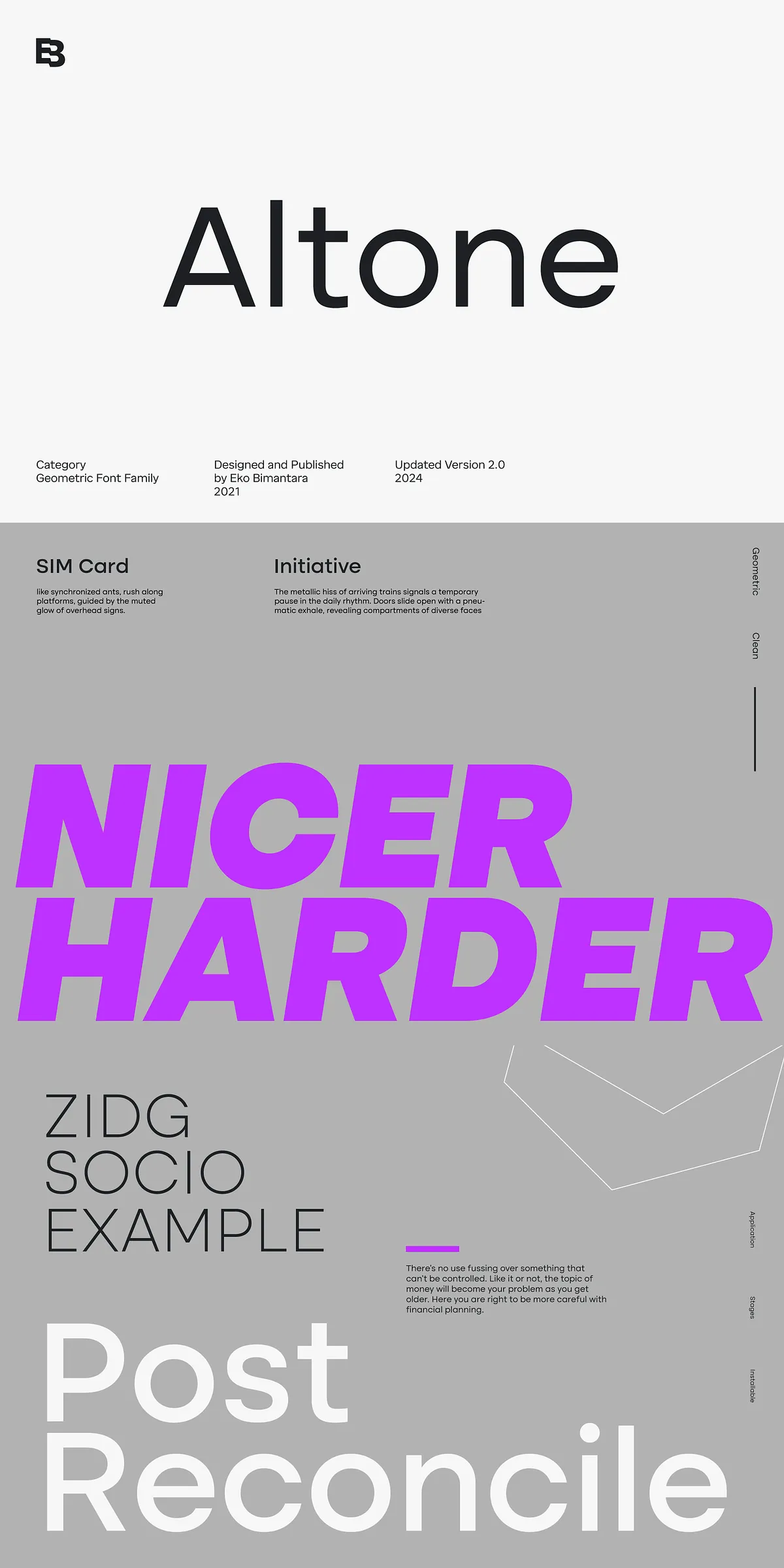
Altone’s letterforms are marked by flat apexes and closed apertures, projecting a disciplined and straightforward aesthetic. Straight stroke ends reinforce its bold and confident presence, imbuing the typeface with a strong personality that can adapt to many visual identities. This meticulous design approach ensures that Altone remains visually consistent and reliable across different contexts.
Grotesk Influence and Geometric Precision
Rejecting ornate embellishments, the design leans into a Grotesk style with geometrically precise shapes that are clear and direct. The moderate width of each character contributes to balanced text flow and superior readability, making it suitable for both display and body text use. This functional geometry grants Altone the ability to convey messages efficiently while maintaining an attractive, modern appearance.
Extensive Weight Range and Flexibility
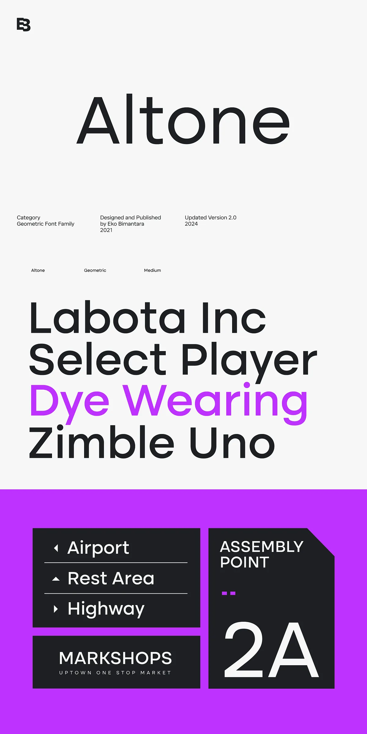
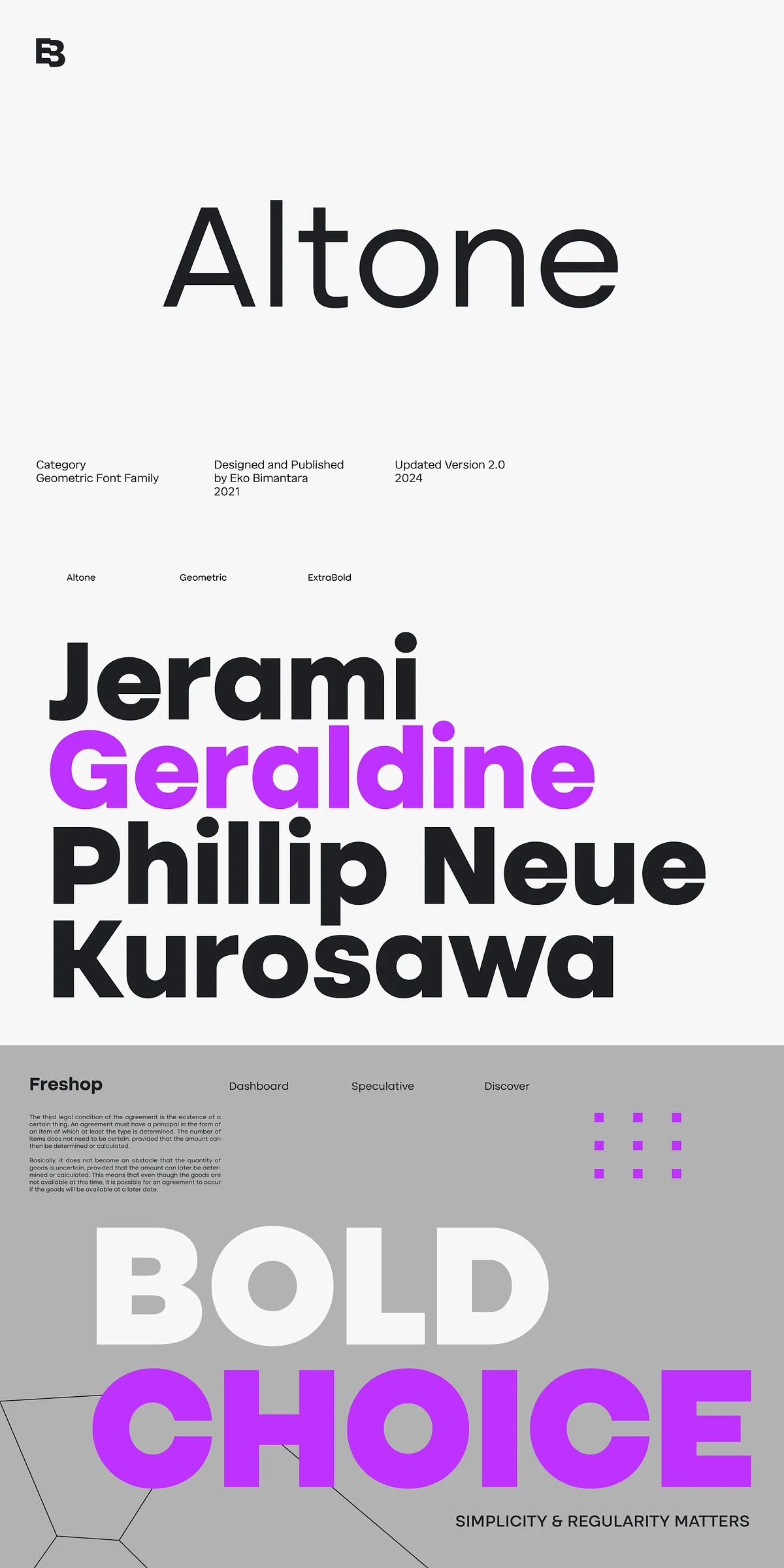
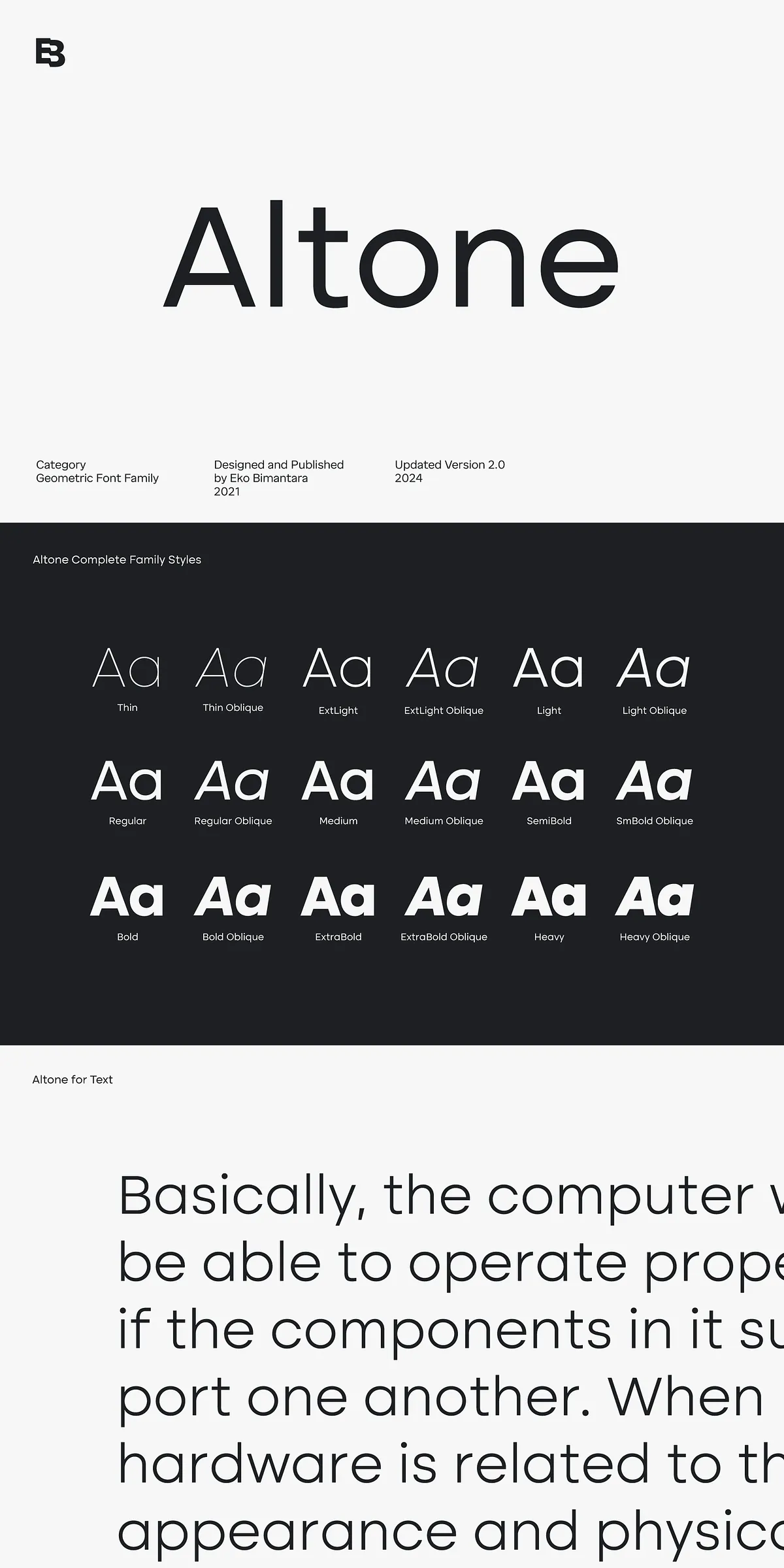
Altone offers an impressive nine weights ranging from Thin to Heavy, each complemented by matching oblique versions. This extensive range empowers designers to create dynamic typographic hierarchies without losing cohesiveness or style integrity. Whether crafting bold headlines or subtle supporting text, Altone adapts effortlessly to the intended design purpose.
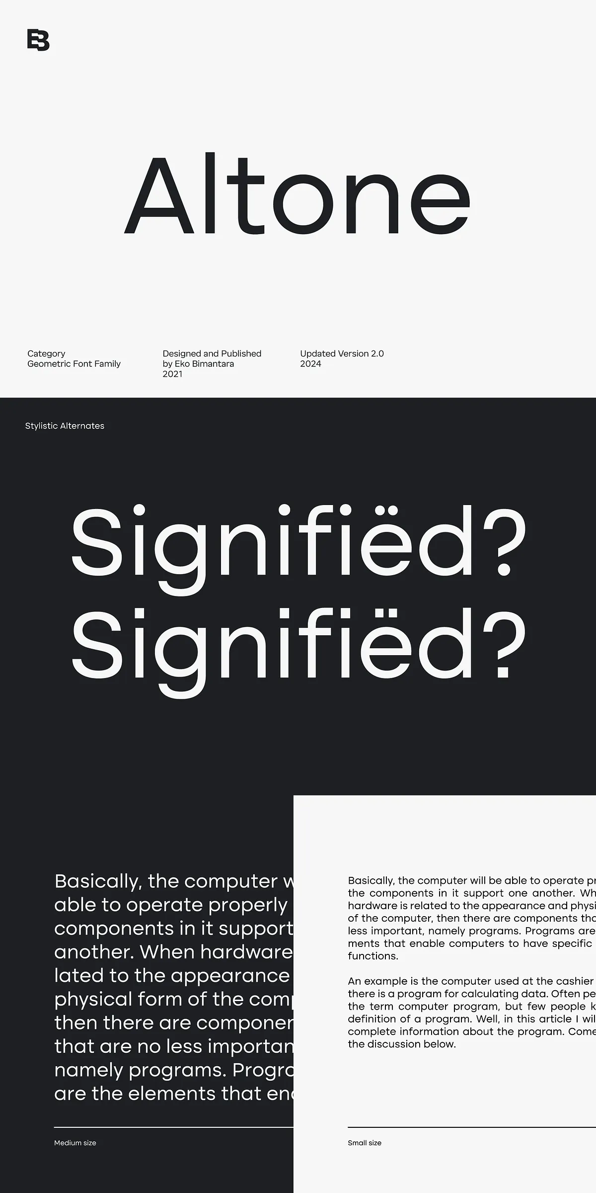
OpenType Features for Enhanced Typography
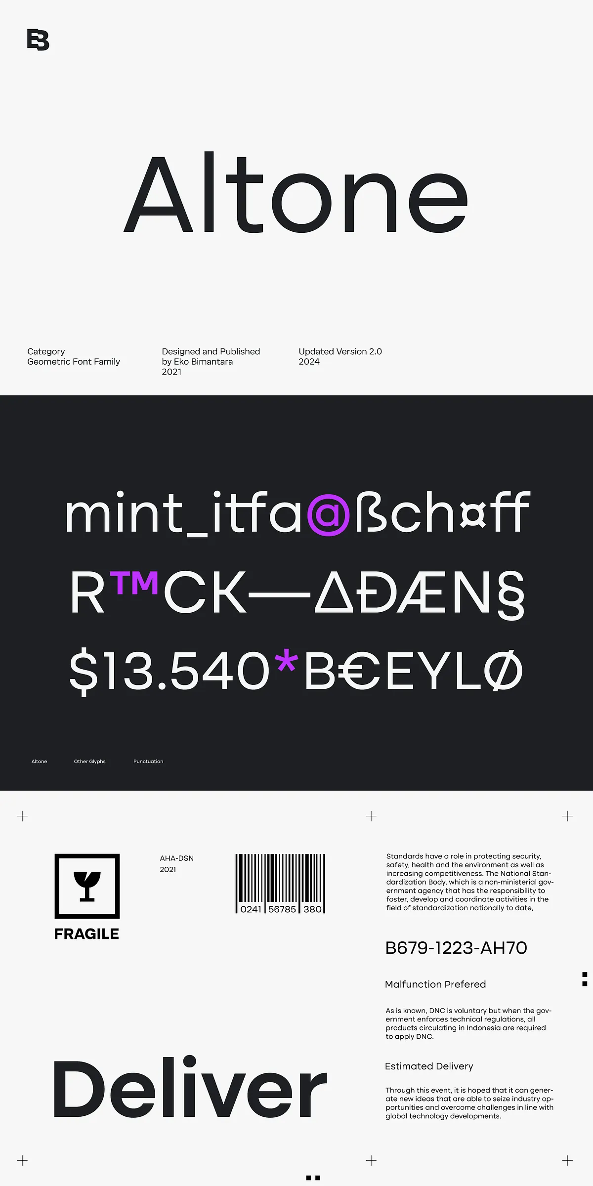
Equipped with a robust suite of OpenType features, Altone supports stylistic alternates that allow creative customization to suit various design needs. It also includes diverse figure variations such as fractions, tabular lining, numerators, and denominators—an asset for technical and editorial applications that require precise numerics. This comprehensive feature set enhances Altone’s versatility in professional design workflows.
Multilingual Support and Variable Font Options
Altone is designed to accommodate broad Latin language support, enabling global usage without compromising typographic harmony. Furthermore, the inclusion of variable fonts in two styles—Upright and Oblique—allows seamless adjustment of weight and style parameters, streamlining project variations and reducing file sizes. This makes Altone particularly attractive for digital applications demanding both flexibility and performance.
Use Cases and Practical Applications
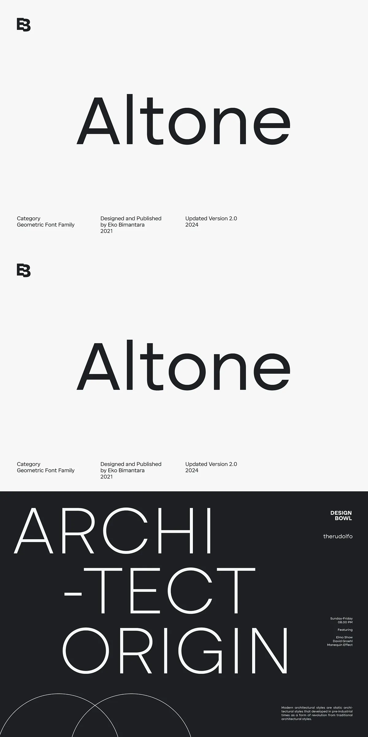
Ideal for branding, editorial, corporate communications, and user interface design, Altone’s strong and straightforward personality fosters clarity and distinction. Its geometric sans serif foundation ensures excellent legibility on screen and print, enhancing the user experience and reinforcing brand consistency. Designers can leverage Altone for logos, headlines, body copy, or interface text with confidence that their typography will remain impactful and readable.
Altone 2.0’s combination of geometric precision, stylistic strength, and broad functionality marks it as a dependable and compelling choice for contemporary typography projects. This typeface embraces the essence of simplicity and structure, making it a valuable asset in any designer’s font library ready to address diverse creative challenges.