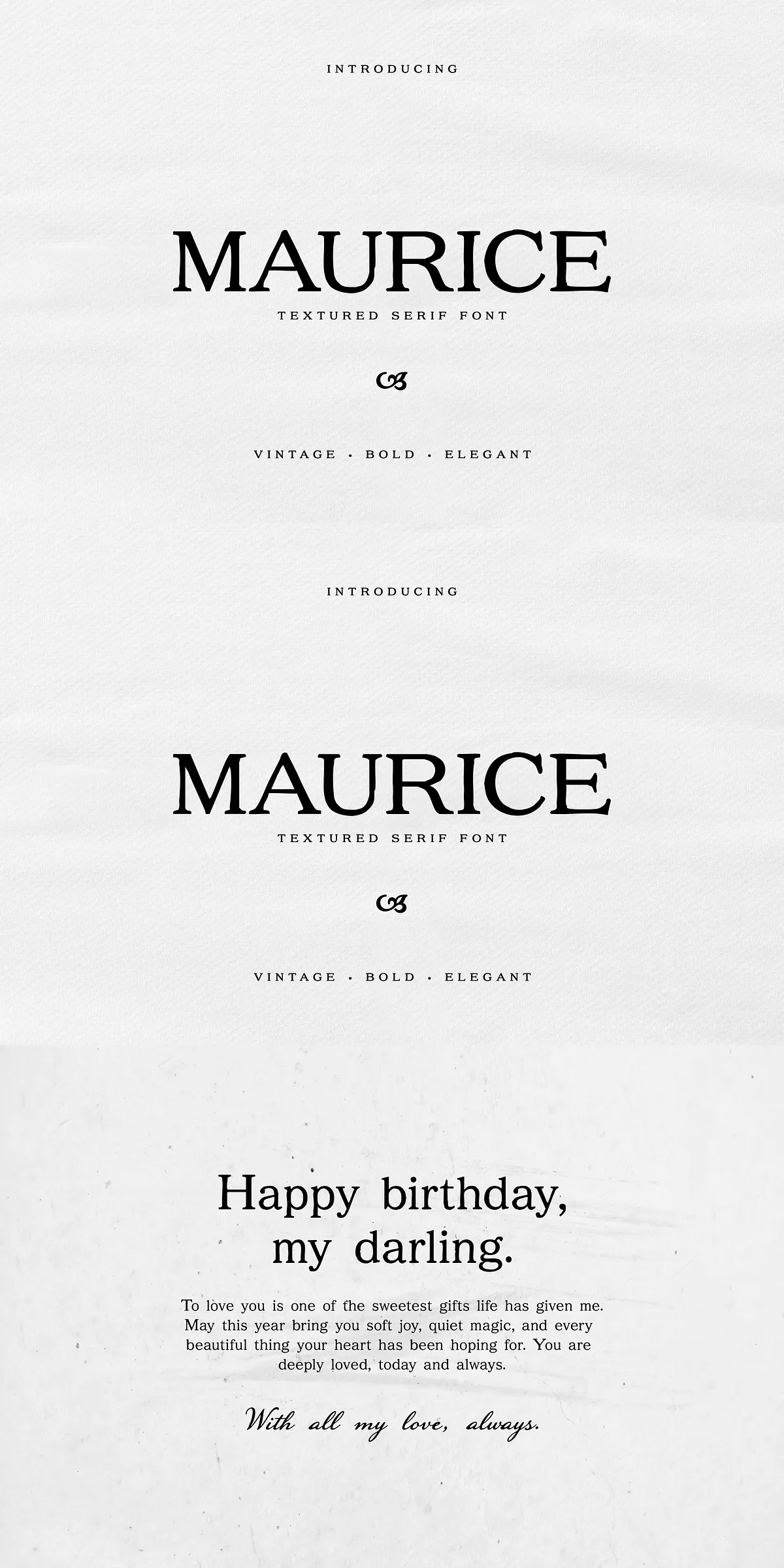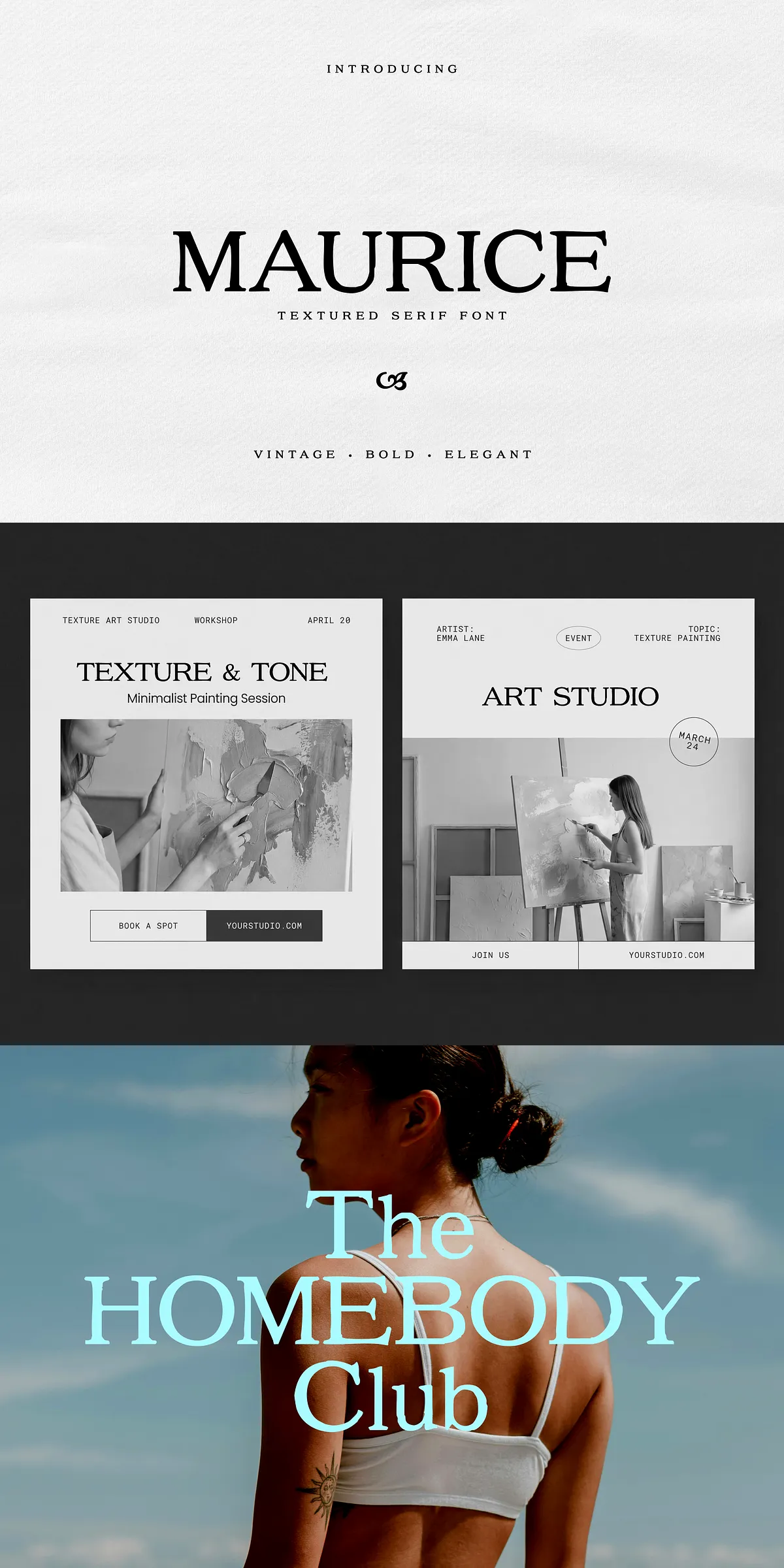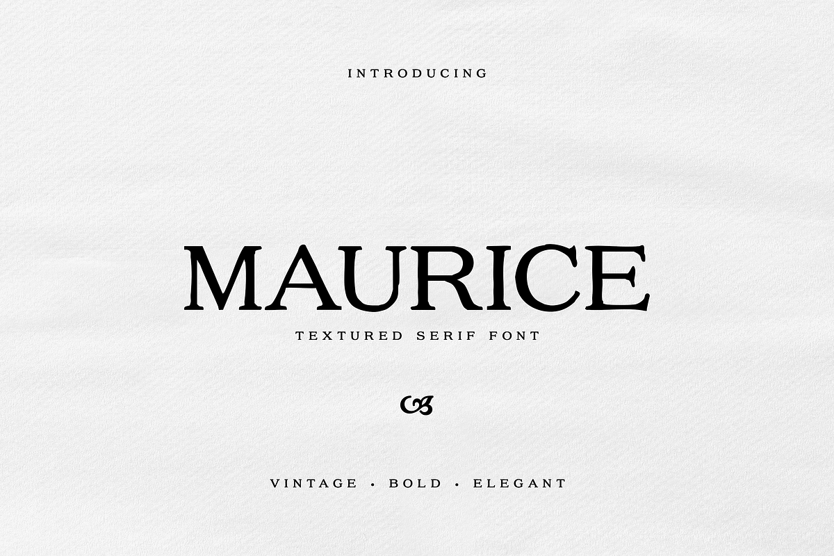

Maurice delivers a bold, textured serif voice that immediately commands attention. Designed to feel both handcrafted and refined, Maurice adds a tactile layer of personality to every composition. Use Maurice when you need a typeface that reads as authentic, nostalgic, and confidently modern. It performs exceptionally well in logos, product labels, packaging, wedding stationery, editorial headlines, posters, and any visual identity that benefits from warm, vintage character.
Active Features And Typographic Strengths Explained
Maurice pairs pronounced serifs with subtle surface texture to create depth without sacrificing legibility. Its letterforms exhibit intentional weight distribution, generous counters, and slightly imperfect edges that suggest artisanal production. These features give Maurice the power to anchor a brand identity while allowing supporting elements to breathe. The font includes full uppercase and lowercase alphabets, numerals, punctuation, and essential diacritics, enabling confident use across print and digital projects.
Included File Formats For Immediate Use
- Desktop-ready OTF and TTF files for professional layout and print workflows
- Web-optimized WOFF and WOFF2 files for fast page loads and consistent browser rendering
- Complete glyph set including numerals, punctuation, and basic multilingual support
Practical Use Cases And Implementation Guidance
Apply Maurice as a primary display face for headlines and identity marks. Increase point size and tighten tracking slightly for logotypes to emphasize the bold serif structures. For packaging and labels, combine Maurice with minimal layouts and elevated materials—embossing, foil stamping, and textured paper will enhance the font’s tactile quality. In editorial layouts, reserve Maurice for section headings and pull quotes, and pair it with a neutral sans-serif for long-form body text to preserve readability.
Recommended Typography Pairings And Layout Practices
Pair Maurice with a geometric or humanist sans for body copy to create clear contrast and hierarchy. Use a light or regular sans at 14–18px for body text on web pages and complement it with Maurice at larger sizes for hero headings. For print, set Maurice between 28–60pt for display uses and apply 120–140% line-height to maintain comfortable spacing. Avoid using strong textures or busy backgrounds behind Maurice when small sizes are required; the texture reads best when given generous whitespace.
Color, Contrast, And Accessibility Considerations
Choose high-contrast color combinations to maintain legibility—dark ink on light backgrounds or vice versa. When applying Maurice on textured or photographic backdrops, add a subtle overlay or stroke to preserve letterform clarity. Test color contrast for compliance with accessibility standards when Maurice appears in navigational elements or essential information to ensure legibility for all users.
Production Tips For Print And Web Workflows
For print production, supply OTF/TTF files to your printer or designer and confirm embedding support for specialty processes like embossing or foil. Convert text to outlines when preparing final print-ready files to avoid substitution issues, but retain original font files in your archive for future edits. For web deployment, use WOFF/WOFF2 and preload primary font assets to reduce layout shifts; subset the font to necessary glyphs where bandwidth is a concern.
Licensing And Commercial Use Recommendations
Verify the appropriate license tier before deploying Maurice commercially: a desktop license for print and static media, a web license for embedded fonts across domains, and an app or extended license where redistribution or product integration applies. Keep license documentation with project files and confirm any reseller or multi-seat needs prior to final delivery.
Why Maurice Strengthens Refined Visual Identities
Maurice combines vintage warmth with contemporary clarity, enabling brands to project authenticity and elegance. Its textured serif construction supports handcrafted narratives while offering practical versatility across applications. Whether crafting a luxury label, a boutique wedding suite, or a refined editorial spread, Maurice provides a confident typographic foundation that enhances perceived value and communicates a distinct visual personality.