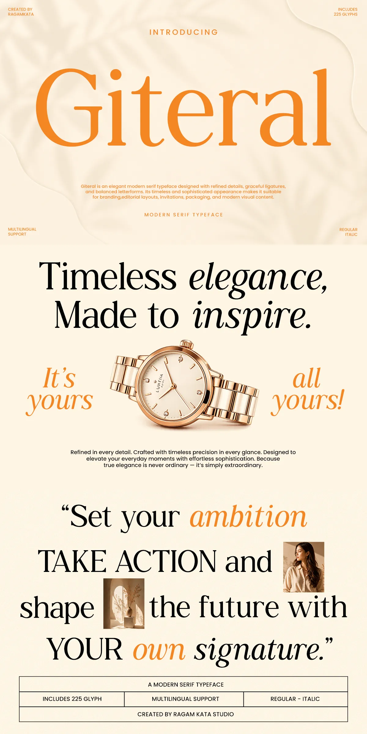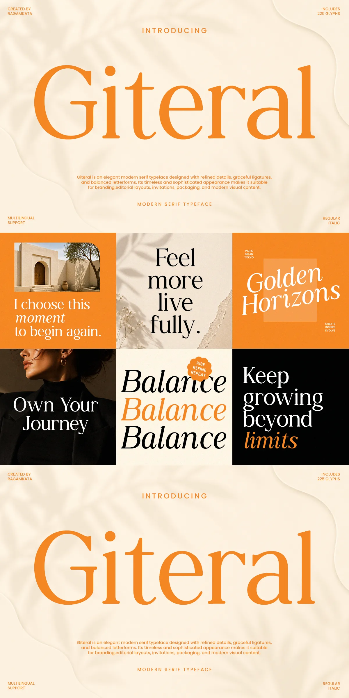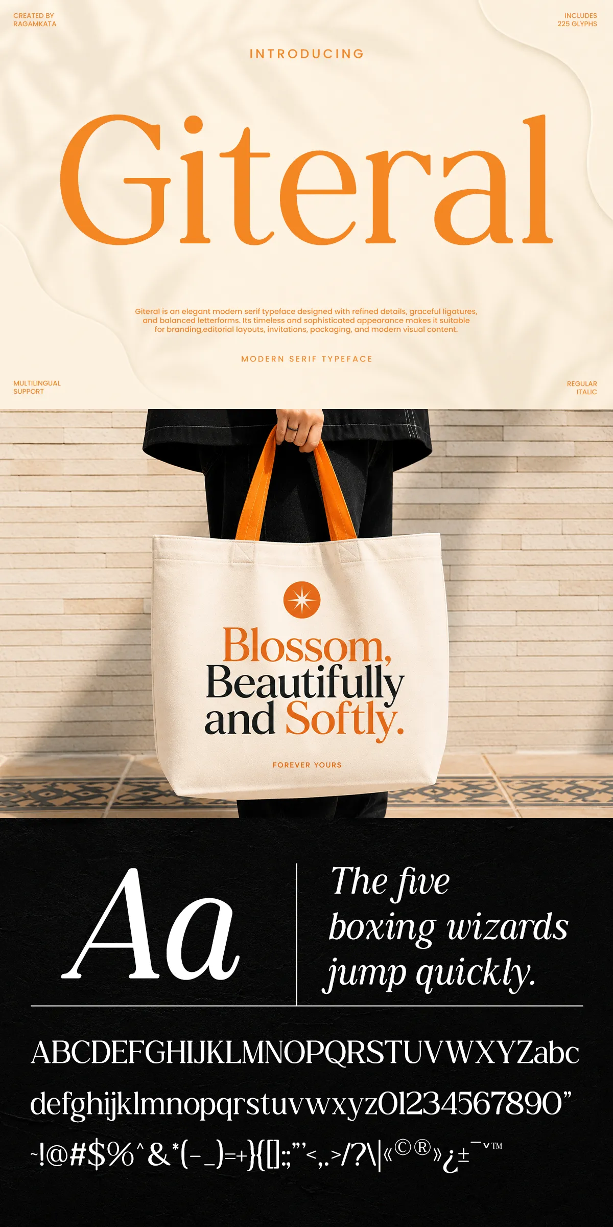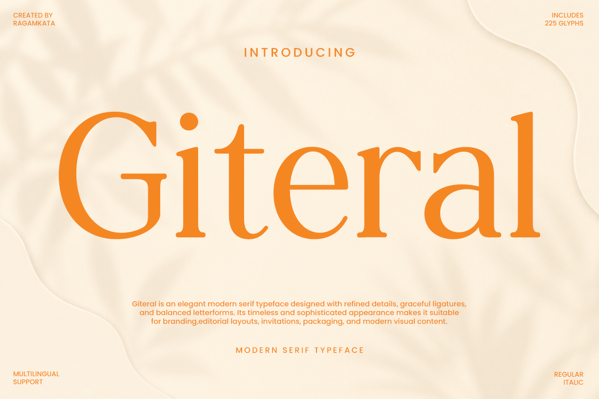

Giteral delivers a polished, contemporary serif voice that reads with authority and softness. Designed with delicate curves, purposeful contrast, and balanced proportions, Giteral transforms simple lines of copy into refined statements. The typeface uses active, intentional strokes to guide the eye through headlines, subheads, and body text, ensuring that each word appears stylish and memorable. Whether you need a poised headline or an elegant block of copy, Giteral performs consistently while communicating a high-end aesthetic.
Features and technical formats included for immediate use
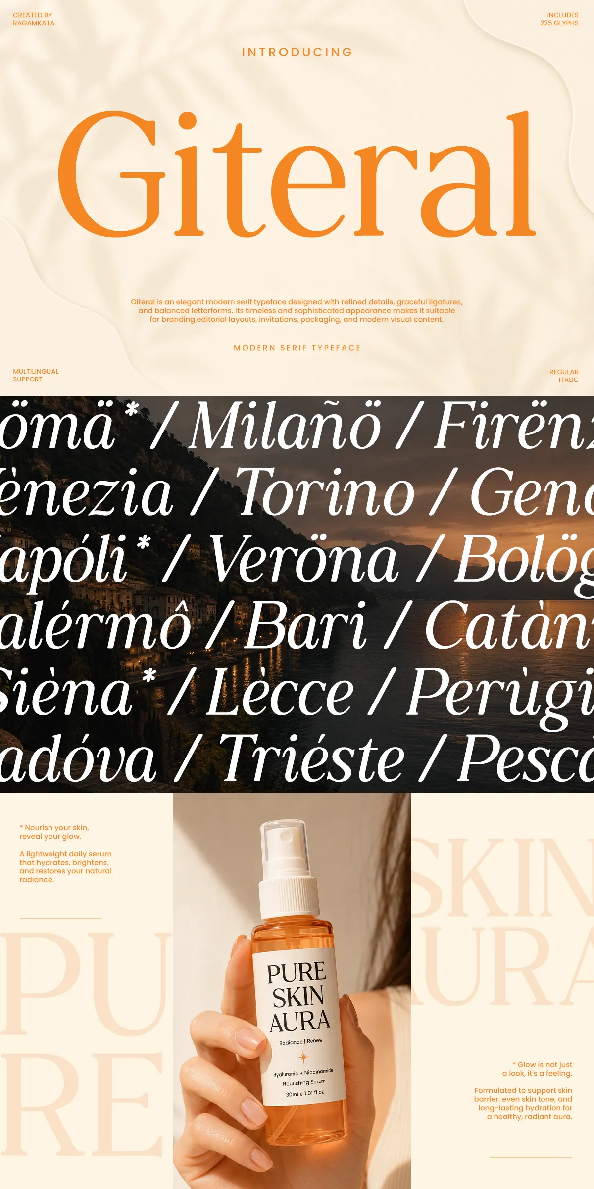
Giteral ships as a ready-to-use family that supports modern production workflows. The package includes a Regular style and an Italic style, full uppercase and lowercase alphabets, numerals, symbols, and punctuation. Designers receive OTF and TTF desktop files plus WOFF for web delivery, enabling smooth integration across print, web, and digital campaigns. The family also includes extended Latin diacritics to support international projects and multilingual content. These technical inclusions let you deploy Giteral across brand identities, editorial systems, and e-commerce platforms without extra conversion steps.
Accessibility and web deployment best practices
Serve the WOFF/WOFF2 files to reduce load times and preserve crisp rendering on high-resolution displays. Use font-display strategies (for example, swap) to avoid invisible text during font loading. Test Giteral across major browsers and devices to confirm consistent kerning and rendering, and embed fonts in PDFs to guarantee print fidelity when producing packaging and collateral.
Ideal use cases that communicate luxury and readability
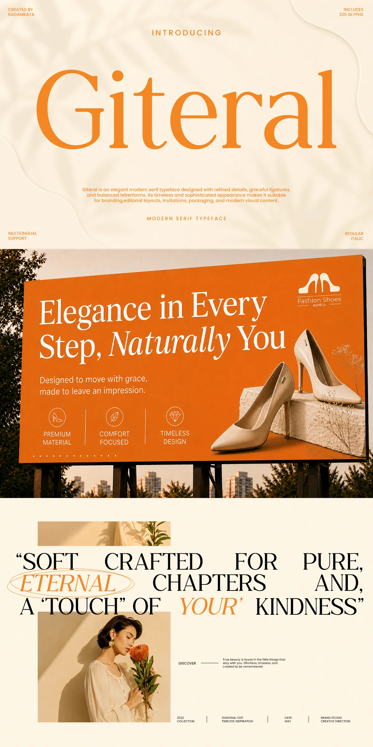
Giteral excels when paired with premium design contexts. Use it for luxury branding, fashion campaigns, beauty product packaging, wedding stationery, high-end magazines, and refined editorial layouts. Its graceful contrast and clean terminals make it effective for logo marks and logotypes where sophistication must remain legible at a range of sizes. For digital interfaces and social media content, Giteral creates an upscale visual identity that supports brand storytelling and aspirational messaging.
Recommended pairings for balanced typography systems
Pair Giteral with a neutral sans-serif to maintain readability in long-form content while allowing Giteral to dominate display elements. Choose a minimal geometric or humanist sans for user interfaces and body text—this contrast highlights Giteral’s elegant serifs without competing for attention. For packaging and editorial spreads, combine Giteral with subtle textures, generous margins, and measured whitespace to reinforce its premium character.
Design details and stylistic considerations for best results
Giteral’s letterforms show careful modulation between stems and hairlines, producing a sense of refinement without sacrificing legibility. Increase tracking slightly for large display settings to avoid crowding, and reserve Italic for emphasis, captions, and pull quotes. When creating headlines, rely on the Regular at larger sizes to showcase sculpted terminals and delicate curves. Keep decorative treatments minimal so the typeface’s natural elegance remains the focal point.