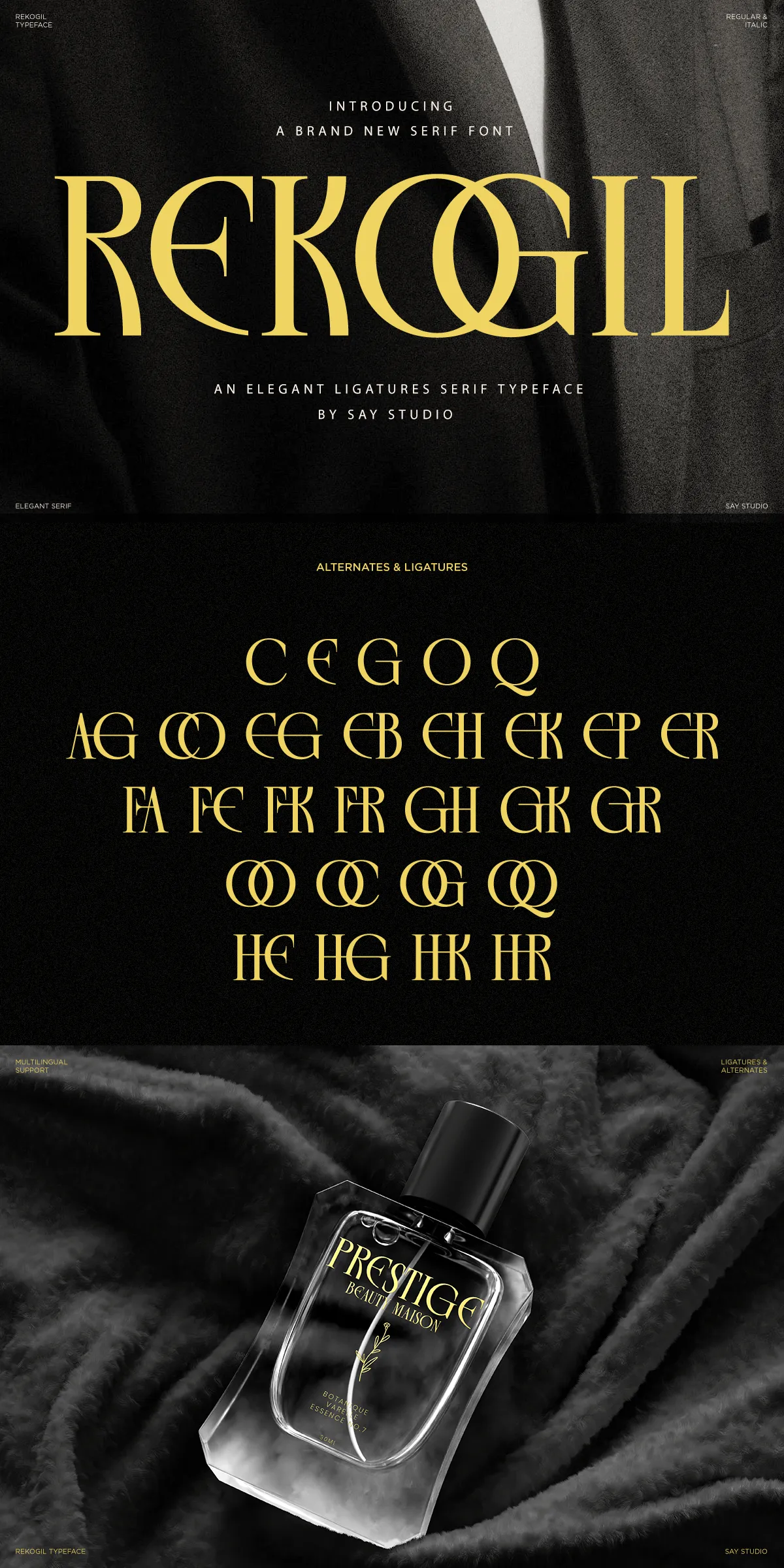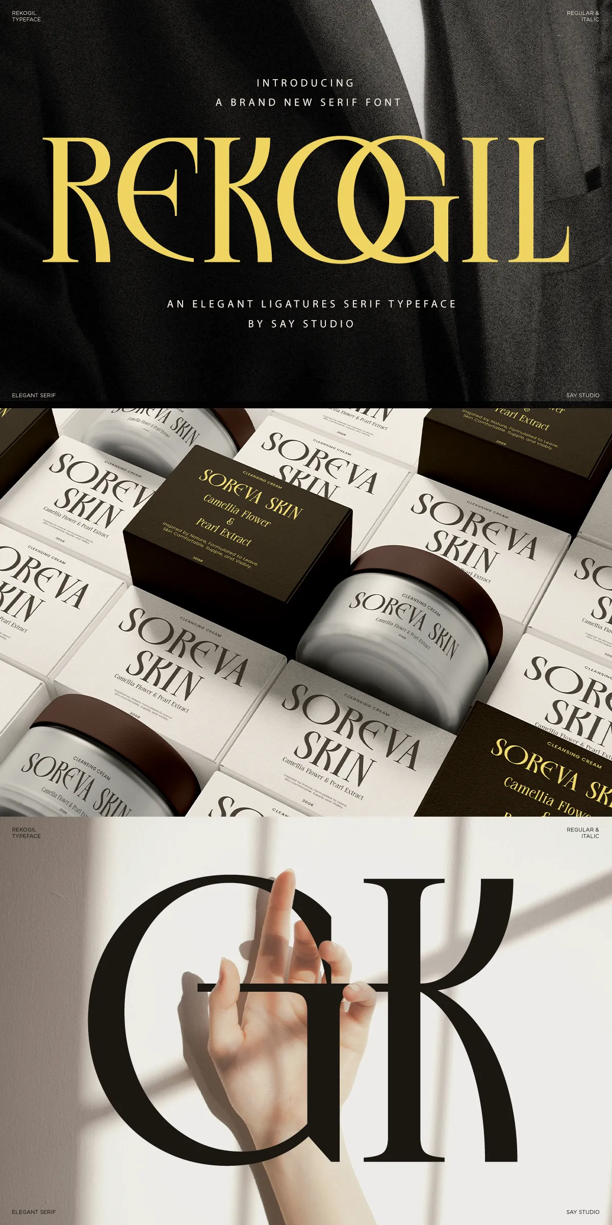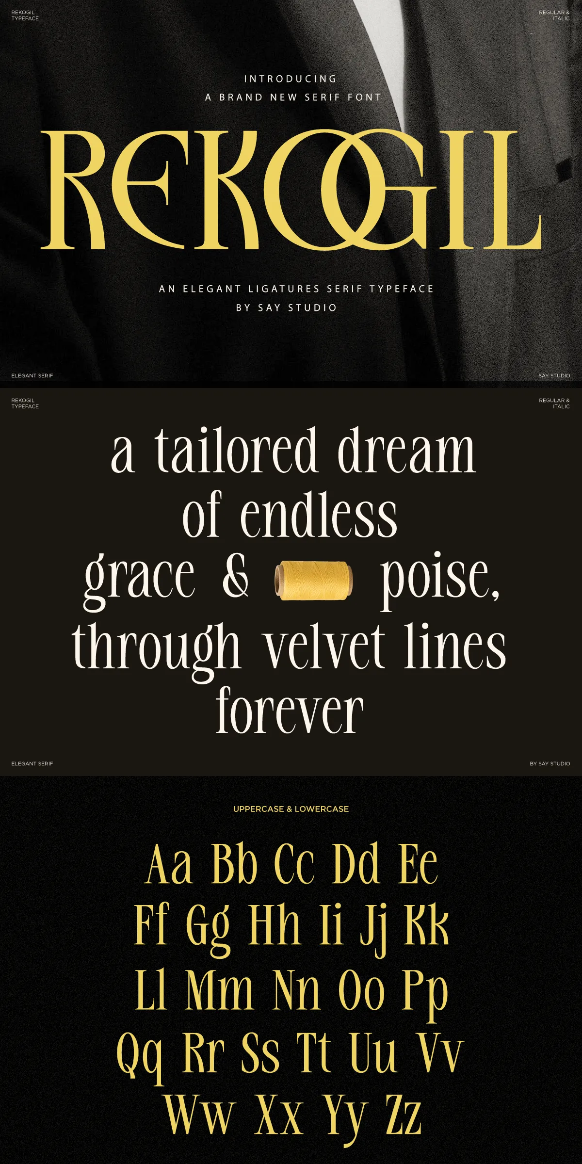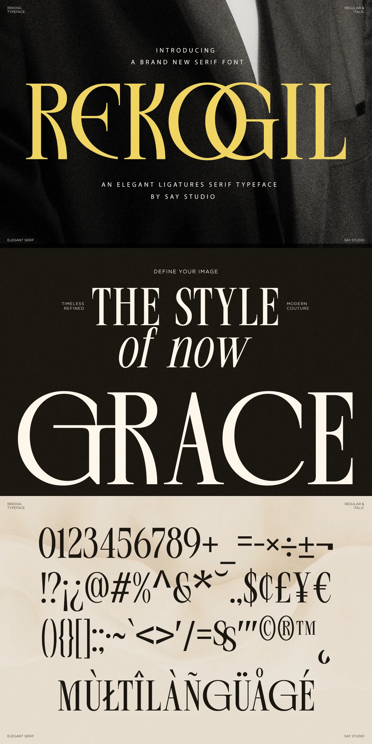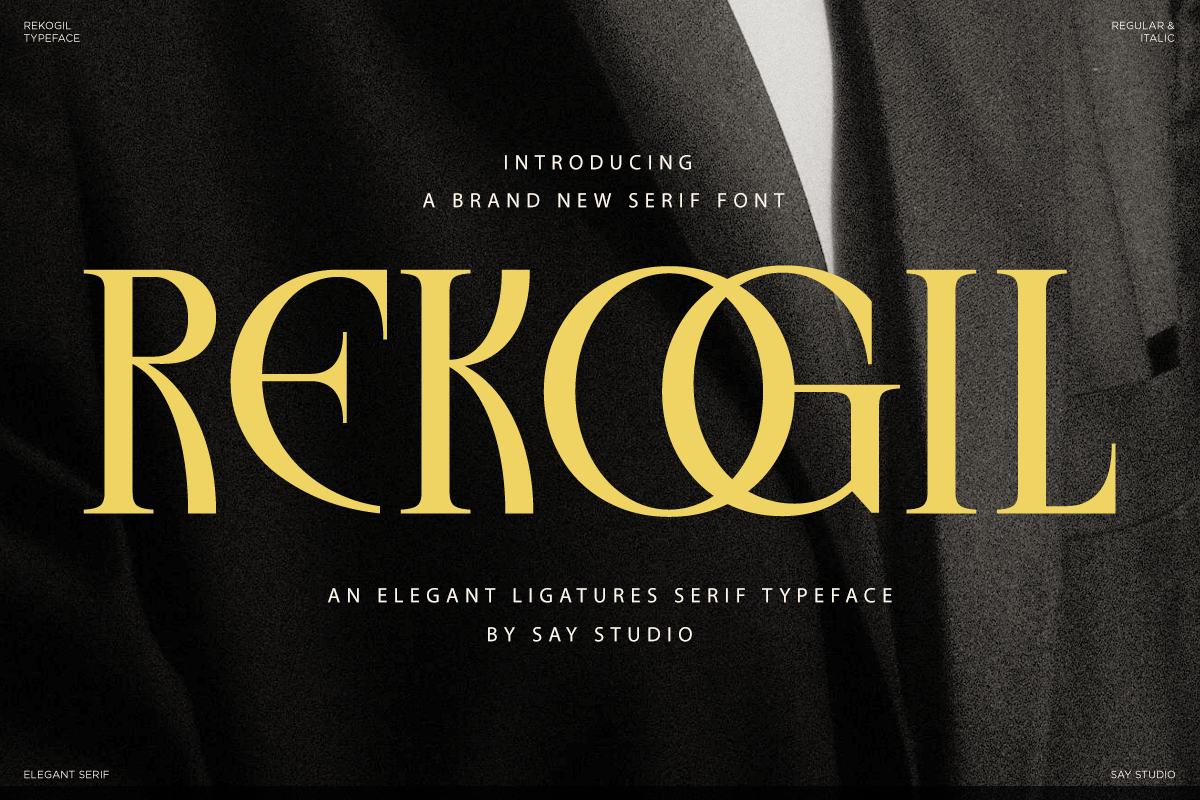

Rekogil delivers a commanding, fashionable voice by combining high-contrast strokes with elegantly balanced proportions. The design emphasizes refined terminals and purposeful contrast to create letterforms that read as both authoritative and beautiful. Every curve in Rekogil has been drawn to catch the eye and support legibility, enabling designers to use the family confidently in large display work as well as upscale longer text settings. The typeface actively communicates prestige while remaining adaptable to modern visual systems.
Distinctive ligatures and stylish alternates that elevate identity work
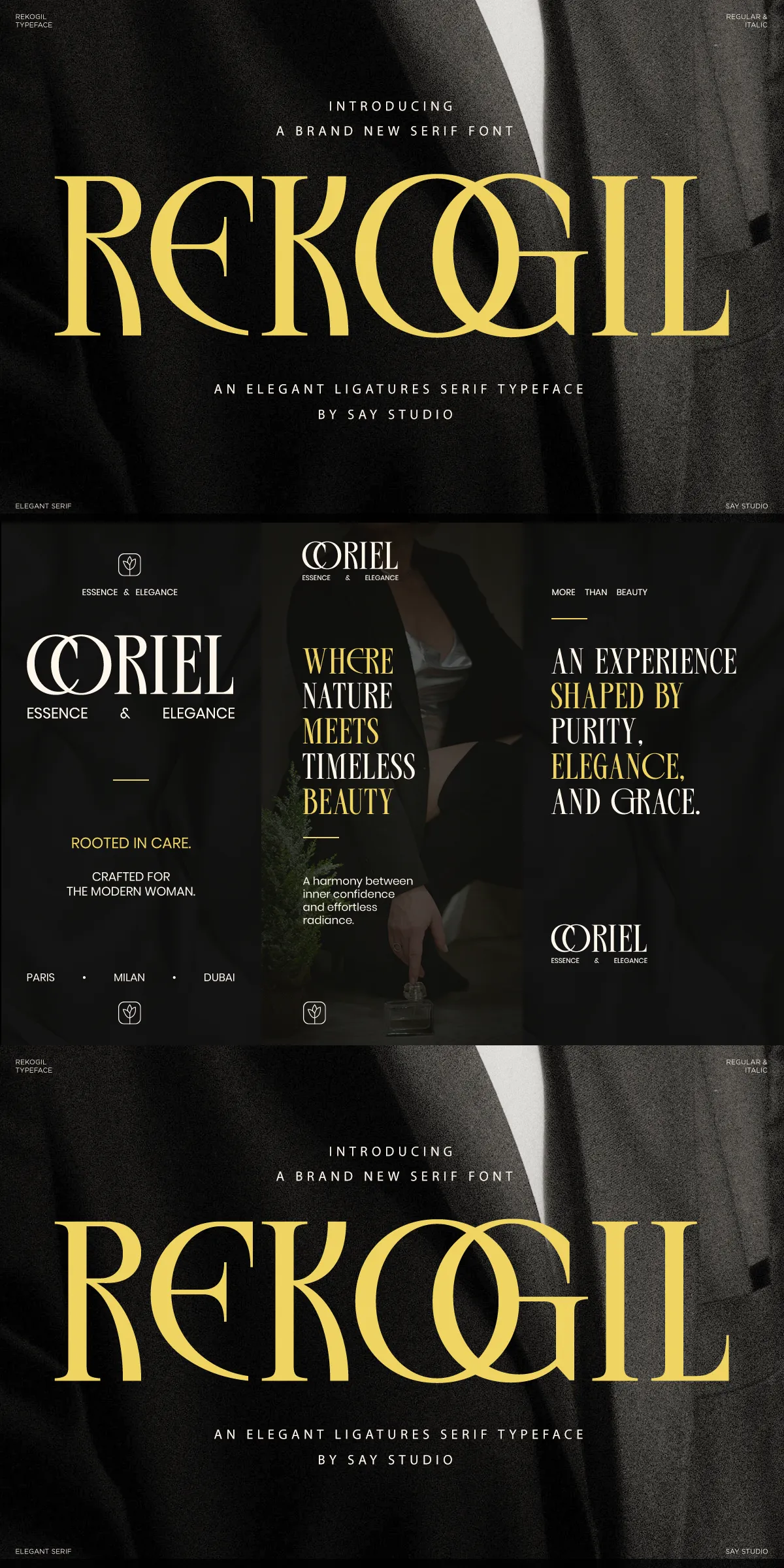
Rekogil includes thoughtfully crafted ligatures and stylistic alternates that empower designers to create unique logotypes and memorable headlines. Use ligatures to introduce fluid, editorial flair; apply alternates for bespoke wordmarks that feel handcrafted. These features give Rekogil the flexibility to perform across luxury packaging, perfume labels, and fashion editorials. When you apply alternates and ligatures judiciously, Rekogil transforms routine copy into expressive, signature typography.
Included files styles and full language support details
The family ships ready for professional production with comprehensive file support. Rekogil includes Regular and Italic styles and ships with ligature sets and stylistic alternates accessible via OpenType features. The character set covers uppercase and lowercase alphabets, numerals, punctuation, and extended Latin accents for broad multilingual support. Designers will find clear notes showing how to activate ligatures and alternates in common design apps, and PUA or OpenType access is provided for straightforward workflow integration.
Ideal use cases where Rekogil performs exceptionally for premium projects
Designers choose Rekogil for projects that demand an elevated visual tone. The font excels in luxury logos, cosmetic packaging, wedding stationery, and high-end editorial headlines. It also enhances jewelry branding, boutique identity systems, and premium marketing materials where refinement and visual distinction matter. Rekogil reads beautifully at large display sizes and remains legible on labels and packaging, giving brands consistent, upscale presence across print and digital touchpoints.
How to use ligatures and alternates for maximum impact
Activate ligatures to create smooth letter connections in display settings and mastheads. Reserve the most decorative alternates for primary logotypes and hero headlines to avoid visual clutter in long-form text. Increase tracking slightly on display words to emphasize the serif details and let the high contrast breathe. When typesetting body copy, pair Rekogil with a neutral sans-serif to maintain readability while preserving a refined headline voice.
Production-ready features and technical recommendations for designers
Rekogil supports standard OpenType features that streamline professional workflows. It includes well-tuned kerning, accessible stylistic sets, and clear activation instructions. For web use, serve WOFF2 to optimize loading and preserve crisp rendering on screen. For print, test on the intended substrate and examine contrast at smaller sizes to ensure the high-contrast strokes remain legible. Exporting vector outlines for logotypes will preserve the unique ligatures and alternates across production pipelines.
What you get and practical delivery notes for immediate use
- Included styles: Rekogil Regular and Rekogil Italic
- Feature set: Stylistic ligatures and alternates accessible via OpenType
- Character coverage: Uppercase, lowercase, numerals, symbols, punctuation
- Multilingual support: Extended Latin accents for broad European coverage
- Usage notes: Instructions for activating ligatures and alternates in common apps
- Recommended formats: OTF/TTF for desktop, WOFF/WOFF2 for web delivery
Rekogil offers a decisive combination of classic serif refinement and contemporary detail. Use it to craft identities that feel prestigious and memorable, to shape editorial spreads with fashion-forward elegance, and to elevate packaging with unmistakable typographic luxury.