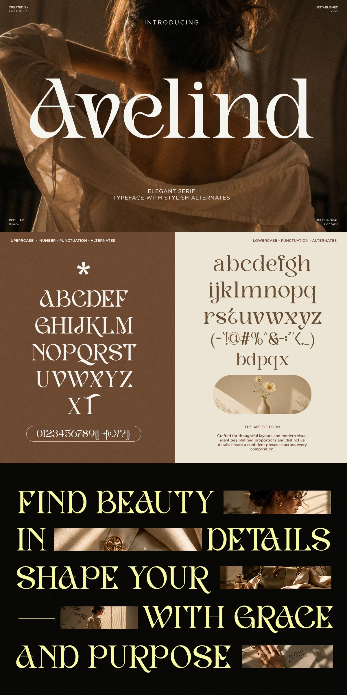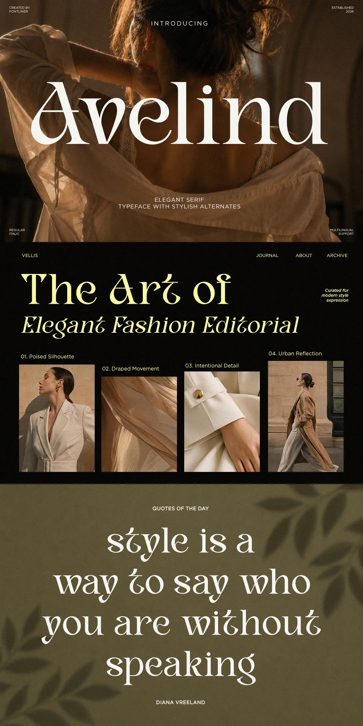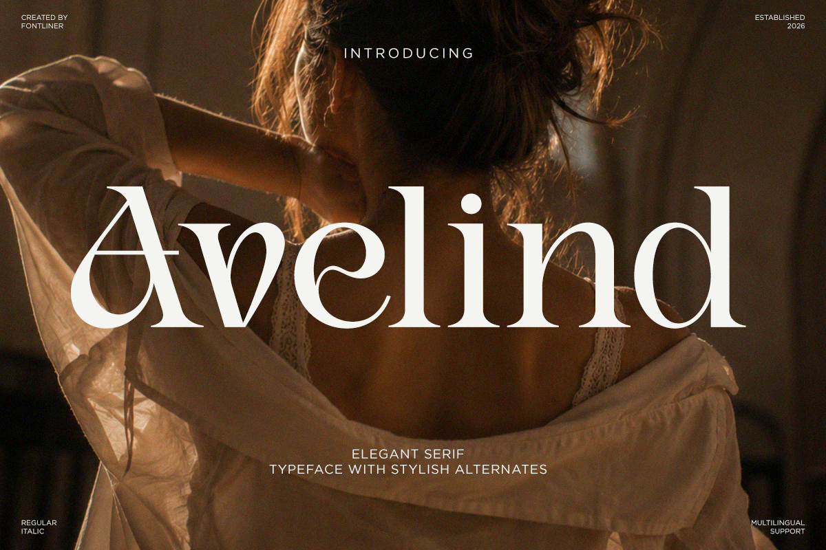

Avelind delivers a polished, confident voice for designers who demand elegance and legibility. Every character acts with intention: stems, serifs, and terminals align to create consistent rhythm and graceful movement across words and lines. The typeface stands tall in large display settings and remains poised when used for refined subheads. Its stylistic alternates and delicate ligatures infuse copy with bespoke character while preserving clear reading at display sizes. Use Avelind to make statements that feel cultured, decisive, and unmistakably premium.
Ideal applications where Avelind elevates design systems
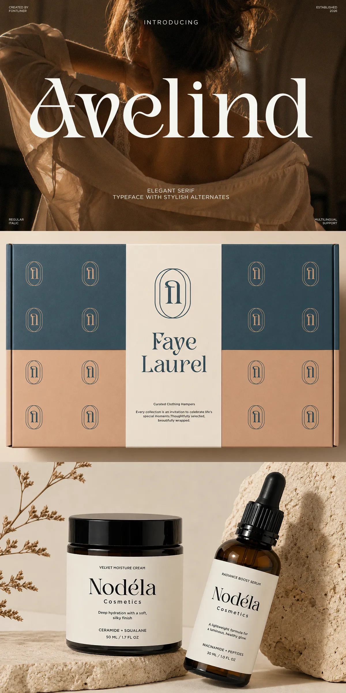
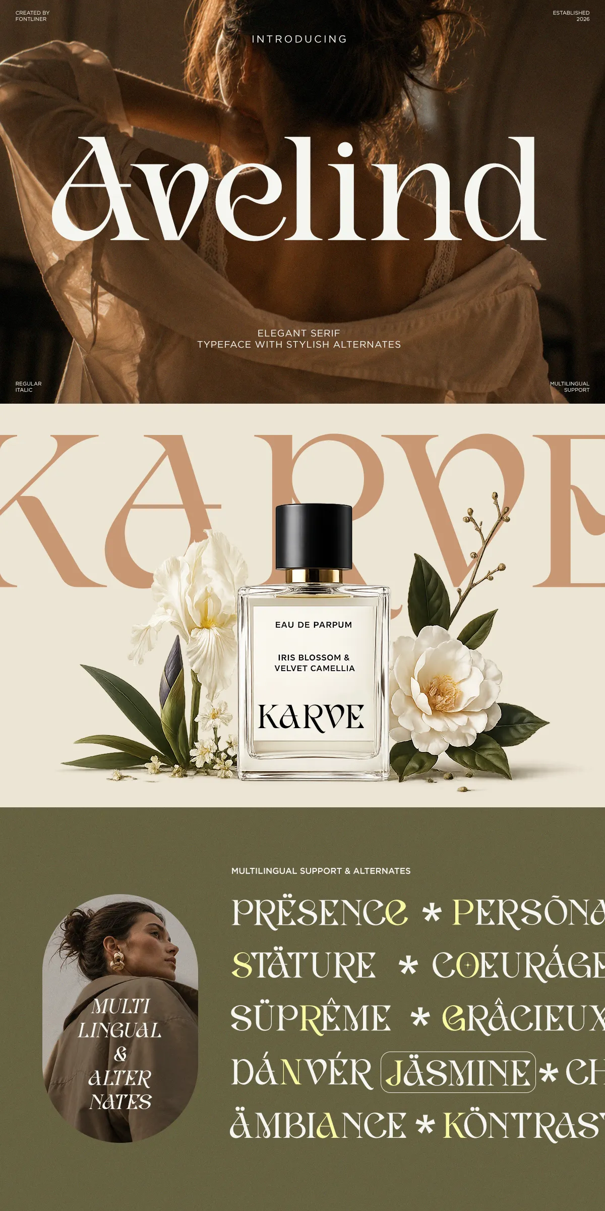
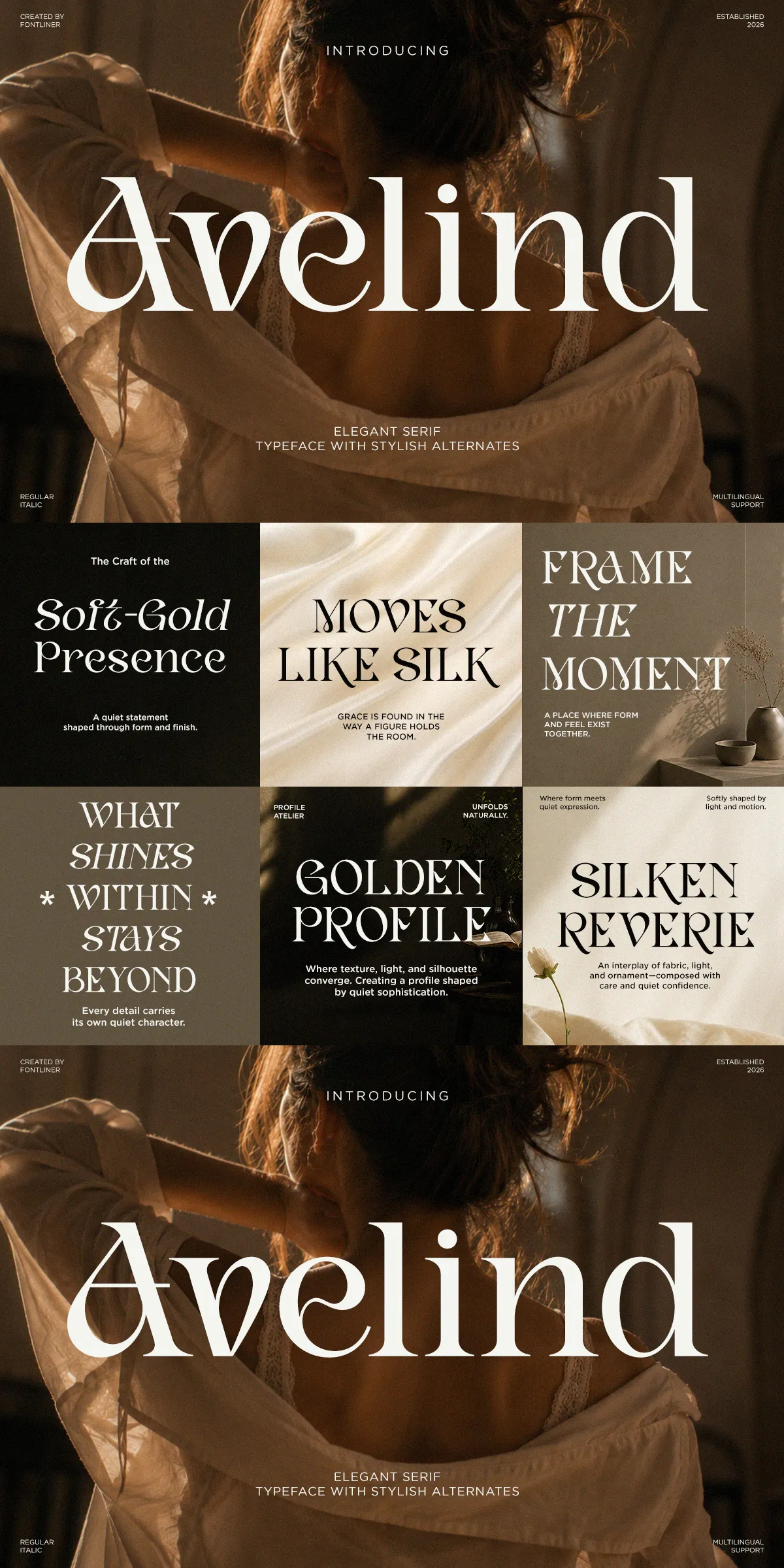
Avelind performs strongly across diverse premium contexts. It enhances luxury branding and fashion identities by providing a distinctive typographic signature. In editorial layouts, it anchors headlines and section headers with authoritative charm. For cosmetic and premium product packaging, Avelind tightens brand perception with elegant typographic structure that translates across materials. Wedding stationery and bespoke invitations gain a personal, handcrafted feel through its alternates and ligatures. Use it for logos, magazine covers, social media hero images, and anywhere a polished, high-end presence matters.
Suggested real-world uses and pairing strategies
- Brand identity systems: Apply Avelind for primary logotypes and headline hierarchies to reinforce premium positioning.
- Editorial and publishing: Anchor cover titles and feature spreads with Avelind; pair with a neutral sans-serif for extended body copy.
- Packaging and labels: Use uppercase or small-caps settings for product names and use alternates for decorative accents.
- Stationery and invitations: Employ ligatures and stylistic alternates to create refined, custom-feel letterforms.
- Digital marketing and social content: Retain visual luxury across screens by using WOFF/WOFF2 web formats for crisp rendering.
Design features that make Avelind production-ready
Avelind includes a robust feature set engineered for creative workflows. The family offers Regular and Italic styles that combine to give expressive contrast and emphasis options. Carefully tuned kerning and spacing ensure consistent results across sizes and platforms. Designers will find full uppercase and lowercase alphabets, numerals, punctuation, and useful symbol sets. Stylistic alternates and ligatures provide creative variations that add personality without sacrificing system consistency. These features accelerate the creation of cohesive brand systems and polished editorial layouts.
Technical specifications and language support
- Included styles: Regular and Italic for flexible typographic pairing
- Glyph coverage: Uppercase, lowercase, numbers, punctuation, and common symbols
- OpenType features: Stylistic alternates and ligatures for bespoke typographic details
- Multilingual support: Latin-based language coverage suitable for European and international campaigns
- Available file formats: OTF, TTF, WOFF for desktop and web usage
Practical tips to maximize Avelind’s impact
To emphasize Avelind’s refined character, increase tracking slightly for large display headlines to let the serifs breathe and reveal sculpted terminals. Pair Avelind with a low-contrast sans-serif to maintain readability in longform text while preserving the serif’s display authority. For packaging and labels, test different alternates to find the one that best complements your brand mark. On web projects, prefer WOFF or WOFF2 delivery for faster load times and crisp on-screen rendering.
Files included and ready-to-use formats
- Regular and Italic
- Stylistic alternates and ligatures
- Uppercase and lowercase alphabets
- Numbers, symbols, and punctuation
- Multilingual support for Latin languages
- OTF, TTF, and WOFF files for desktop and web