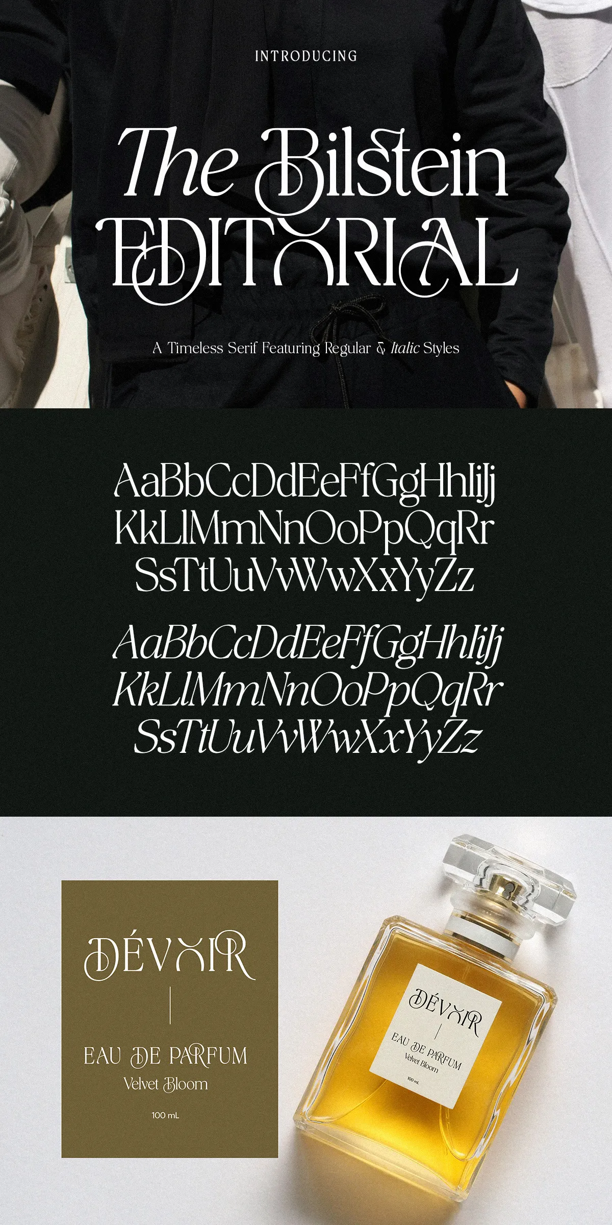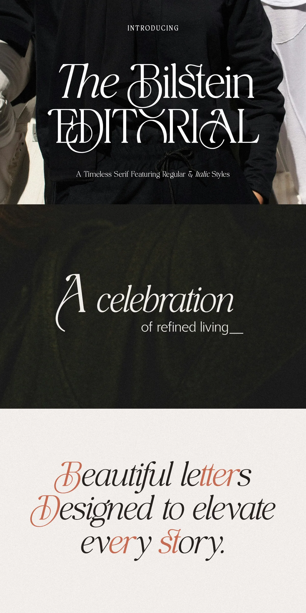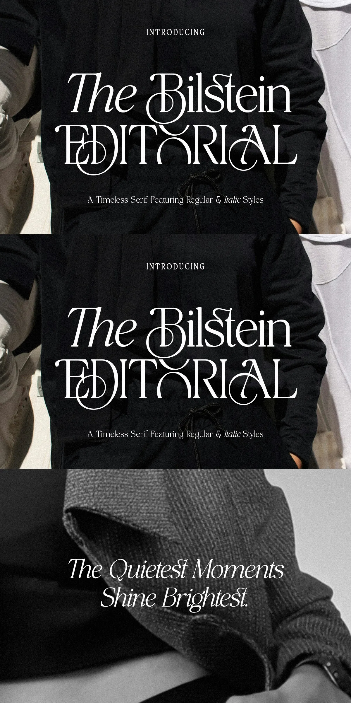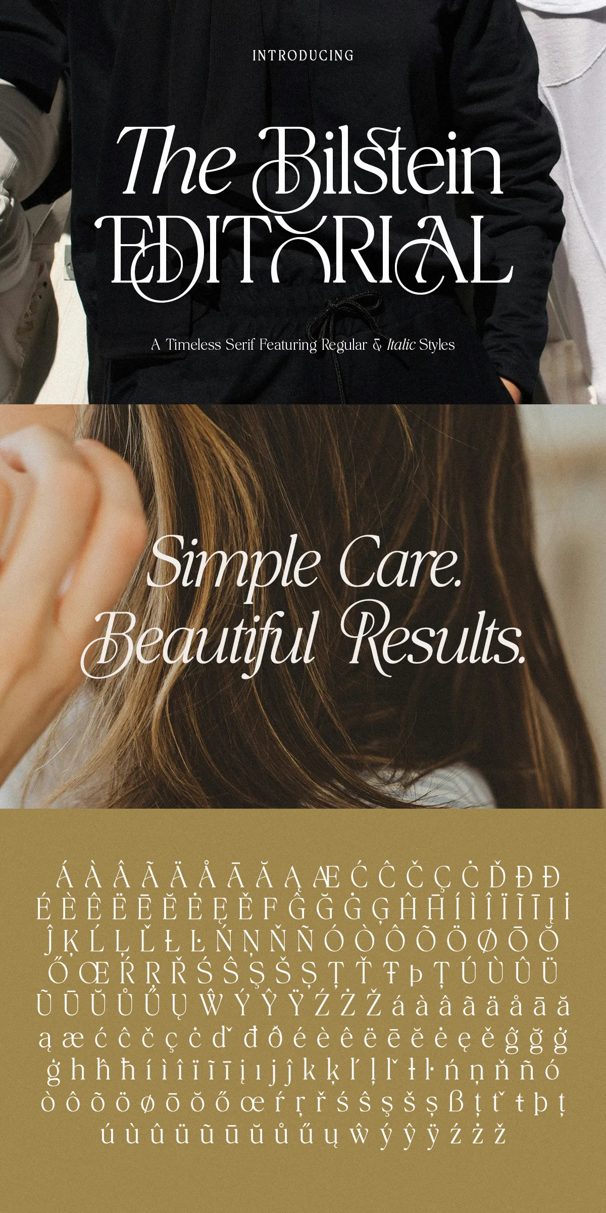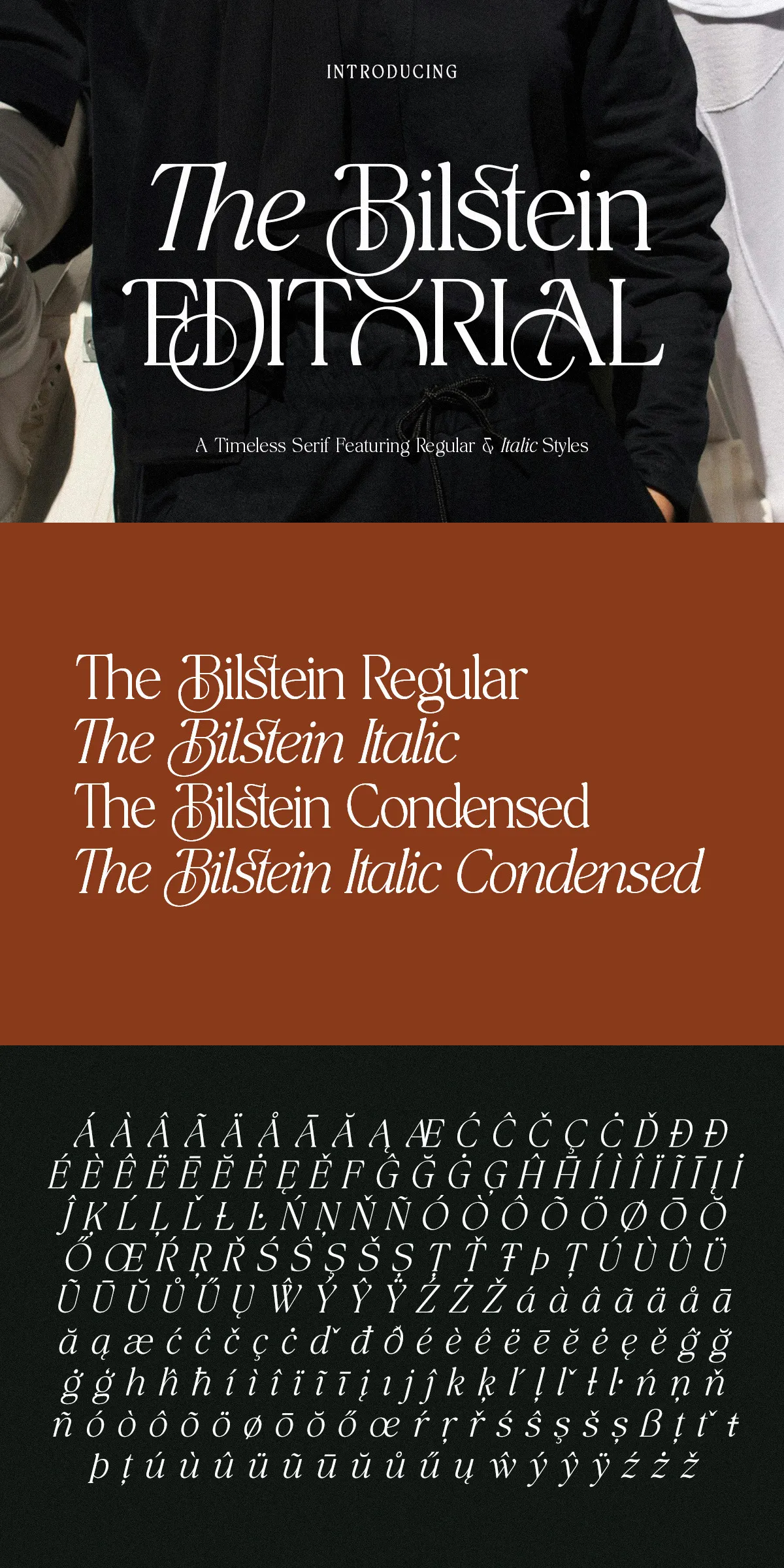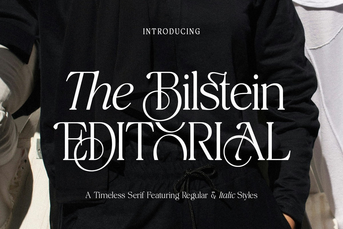

The Bilstein commands attention with graceful high-contrast strokes and luxurious letterforms that actively elevate any creative application. Built from editorial traditions yet tuned for contemporary workflows, the family injects a polished, professional voice into branding, magazine spreads, lookbooks, and premium product packaging. Designers will find The Bilstein directly supports visual systems that require both authority and subtlety: it strengthens headlines, clarifies subheads, and refines long-form body copy without losing personality.
Regular and Italic styles deliver expressive typography with harmony
The Bilstein includes both Regular and Italic styles that work together to form expressive typographic hierarchies. Use the Regular style to anchor headlines and display treatments; deploy the Italic to emphasize phrases, captions, or pull quotes while preserving optical balance. The interplay between upright and slanted styles creates natural contrast and rhythm, enabling typographic solutions that feel curated and intentional rather than improvised.
Optimized for print and digital use across modern production workflows
The Bilstein ships in production-ready formats and performs reliably in print and on screen. Available OTF and TTF files ensure predictable output for editorial PDFs, magazine spreads, and packaging dielines. Web-ready WOFF and WOFF2 deliver crisp rendering across modern browsers and responsive layouts. The family’s tuned kerning and metrics minimize layout adjustments, accelerating production timelines and reducing manual pass-through in high-volume projects.
Technical formats include OTF TTF WOFF and WOFF2 support
- Multiple file formats: OTF, TTF, WOFF, WOFF2 for print and web
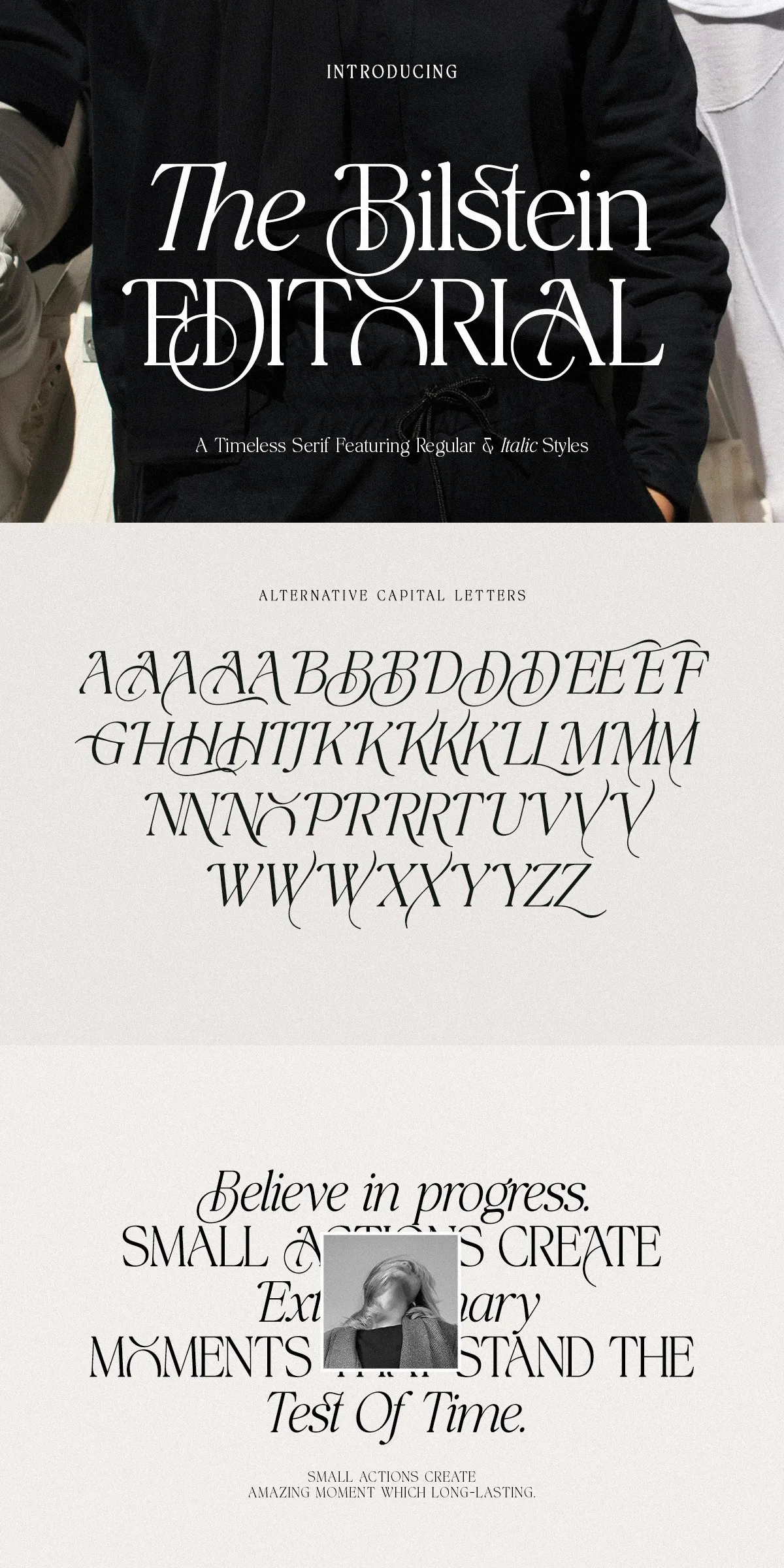
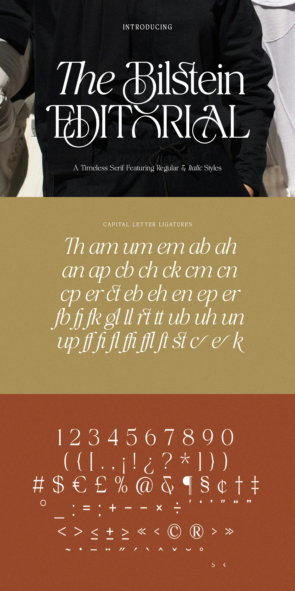
- Latin character set Pro with punctuation, numerals, and special characters
- Considered kerning pairs and balanced metrics for professional typesetting
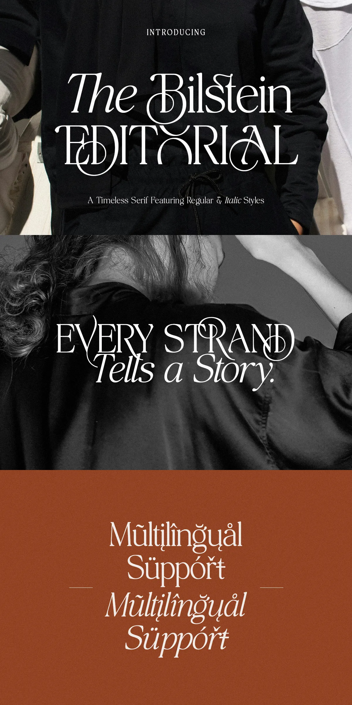
- Multilingual support for expanded project reach
Practical usage recommendations and pairing strategies for designers
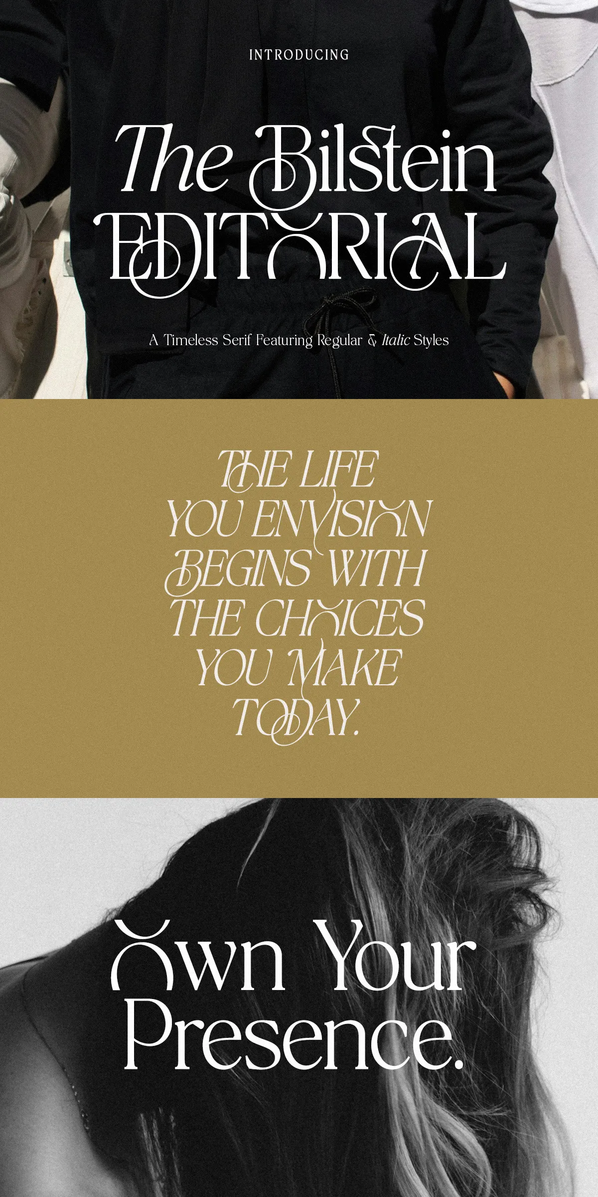
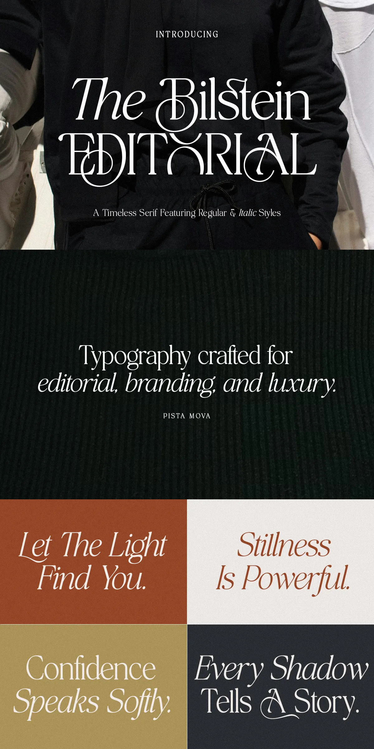
Apply The Bilstein where clarity and refinement matter. Use bold or display sizes to create commanding magazine covers and hero headlines. For identity systems, craft logotypes and wordmarks from the distinctive terminals and curves to communicate premium positioning. Pair The Bilstein with a neutral sans-serif for accessible body copy in digital interfaces, or choose a humanist sans for contemporary editorial systems that require warmth alongside sophistication. Slightly increase tracking for large display settings to accentuate the typeface’s elegant terminals.
Why The Bilstein strengthens luxury and editorial brands reliably
The Bilstein blends timeless serif traits with modern finishing: high-contrast strokes communicate luxury, while refined proportions maintain legibility at a range of sizes. These qualities make it especially well-suited to fashion campaigns, magazine editorials, premium packaging, invitations, and identity systems where both visual impact and readable content are essential. The Bilstein helps brands present cohesive, upscale narratives across print and digital touchpoints.
Production-ready features and project-ready advantages
Beyond style, The Bilstein emphasizes usability. It installs easily, integrates with common design applications, and scales from single-artwork use to enterprise-level design systems. Because it is optimized for print and web, design teams can maintain consistent typographic voice across product packaging, editorial content, ecommerce imagery, and social promotions. If you want a serif that actively enhances perceived product value while remaining practical for production, The Bilstein delivers.